mu29 / React Stepper
Licence: mit
Well-designed stepper component for react
Stars: ✭ 108
Programming Languages
javascript
184084 projects - #8 most used programming language
Projects that are alternatives of or similar to React Stepper
Ui Predicate
Finally a Predicate/Rule Editor UI component for the Web 🚀
Stars: ✭ 86 (-20.37%)
Mutual labels: react-component
Material Steppers
Angular Steppers directive for Angular Material
Stars: ✭ 95 (-12.04%)
Mutual labels: stepper
Zifi
zifi - Make Stories everywhere using React 😍
Stars: ✭ 87 (-19.44%)
Mutual labels: react-component
React Responsive Picture
A future-proof responsive image component that supports latest Picture specification
Stars: ✭ 91 (-15.74%)
Mutual labels: react-component
React Css Component
Injecting CSS via React Components
Stars: ✭ 98 (-9.26%)
Mutual labels: react-component
React Image Fallback
stop displaying broken images, have another image to fallback on.
Stars: ✭ 106 (-1.85%)
Mutual labels: react-component
React Cassette Player
Simple ReactJS HTML5 audio player component built with SVG icons from The Noun Project.
Stars: ✭ 93 (-13.89%)
Mutual labels: react-component
React Contextmenu
Project is no longer maintained
Stars: ✭ 1,361 (+1160.19%)
Mutual labels: react-component
React Promise
a react.js hook for general promise in typescript
Stars: ✭ 90 (-16.67%)
Mutual labels: react-component
Vue Stepper
👨🏻🚀 A renderless component for composing a Stepper
Stars: ✭ 90 (-16.67%)
Mutual labels: stepper
React Native Swipeable Parallax Carousel
React Native Swipeable Parallax Carousel
Stars: ✭ 98 (-9.26%)
Mutual labels: react-component
Babel Plugin Stateful Functional React Components
Stateful functional React components without runtime overhead
Stars: ✭ 86 (-20.37%)
Mutual labels: react-component
React Easy Swipe
Easy handler for common swipe operations
Stars: ✭ 85 (-21.3%)
Mutual labels: react-component
Stepbarview
Step Bar View (make your own customized StepBar)
Stars: ✭ 97 (-10.19%)
Mutual labels: stepper
React Color
🎨 Color Pickers from Sketch, Photoshop, Chrome, Github, Twitter & more
Stars: ✭ 10,287 (+9425%)
Mutual labels: react-component
Tagify
🔖 lightweight, efficient Tags input component in Vanilla JS / React / Angular / Vue
Stars: ✭ 2,305 (+2034.26%)
Mutual labels: react-component
React Textarea Autosize
<textarea /> component for React which grows with content
Stars: ✭ 1,357 (+1156.48%)
Mutual labels: react-component
react-stepper
Well-designed stepper component for react
Installation
npm install react-stepper-horizontal --save
Then just add import Stepper from 'react-stepper-horizontal'; into your file.
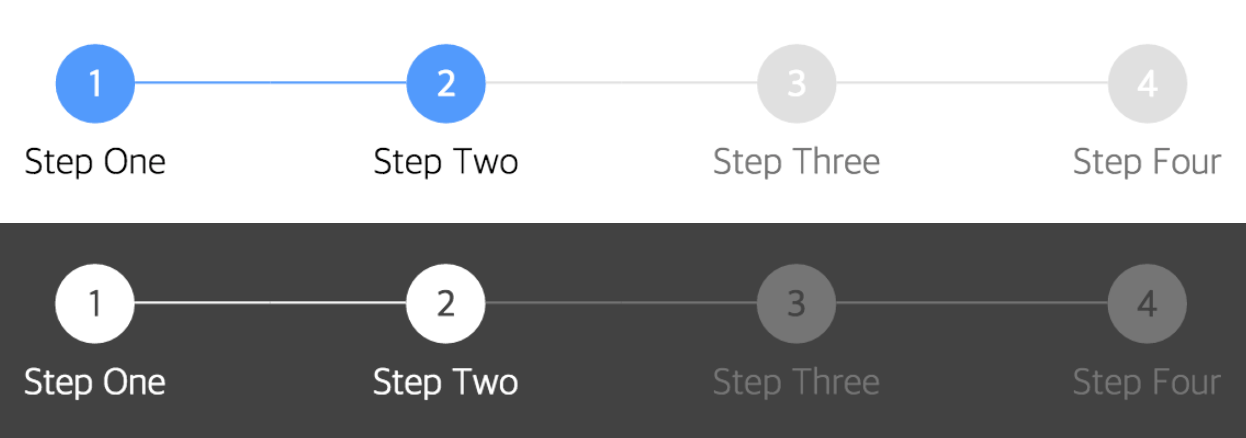
Screenshot
Usage
render() {
  return (
    <div>
      <Stepper steps={ [{title: 'Step One'}, {title: 'Step Two'}, {title: 'Step Three'}, {title: 'Step Four'}] } activeStep={ 1 } />
    </div>
  );
}
See full example here
API
Main Component
| name | description | default | type |
|---|---|---|---|
| activeStep | Active step index, starts at 0 | 0 | number |
| steps | List of step objects (see below) | array | |
| activeColor | Active circle color | #5096FF | string |
| completeColor | Completed circle color | #5096FF | string |
| defaultColor | Default circle color - not active or completed | #E0E0E0 | string |
| activeTitleColor | Active title color | #000 | string |
| completeTitleColor | Completed title color | #000 | string |
| defaultTitleColor | Default title color - not active or completed | #757575 | string |
| circleFontColor | Circle text color (for index) | #FFF | string |
| size | Circle size | 32 | number |
| circleFontSize | Circle text size | 16 | number |
| titleFontSize | Title text size | 16 | number |
| circleTop | Top margin of Stepper component |
24 | number |
| titleTop | Space between circle and title | 8 | number |
| defaultOpacity | Default circle opacity | 1 | string |
| completeOpacity | Completed circle opacity | 1 | string |
| activeOpacity | Active circle opacity | 1 | string |
| defaultTitleOpacity | Default title opacity | 1 | string |
| completeTitleOpacity | Completed title opacity | 1 | string |
| activeTitleOpacity | Active title opacity | 1 | string |
| barStyle | Style of bar separating steps | solid | string |
| defaultBorderColor | Default color of border surrounding circle | string | |
| completeBorderColor | Color of border surrounding completed circle | string | |
| activeBorderColor | Color of border surrounding active circle | string | |
| defaultBorderStyle | Default style of border surrounding circle | solid | string |
| completeBorderStyle | Style of border surrounding completed circle | solid | string |
| activeBorderStyle | Style of border surrounding active circle | solid | string |
| defaultBarColor | Default color of bar separating circles | #E0E0E0 | string |
| completeBarColor | Color of bar connected to a completed step | #E0E0E0 | string |
| lineMarginOffset | Offset for line margin | 4 | number |
| defaultBorderWidth | Default Border Width | 3 | number |
Step Objects
| name | description | default | type |
|---|---|---|---|
| title | Displayed text of the step below the number | undefined | string |
| icon | Displayed icon of the step | undefined | image/object |
| href | Link to send them to on click | undefined | string |
| onClick | Event handler for when the step is clicked | undefined | function |
Author
InJung Chung / @mu29
License
Note that the project description data, including the texts, logos, images, and/or trademarks,
for each open source project belongs to its rightful owner.
If you wish to add or remove any projects, please contact us at [email protected].