React-Styled-Floating-Label
Floating label component which works with any HTML input. Supports styling with styled-components. Check this live demo to see it in action.
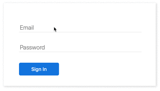
import FloatingLabel from 'react-styled-floating-label';

const email = (
    <FloatingLabel text="Email">
        <input type="email" />
    </FloatingLabel>
);
Installation
npm i react-styled-floating-label styled-components --save
Usage
Typical Usage Example
import styled from 'styled-components';
import FloatingLabel from 'react-styled-floating-label';

const BlueFloatingLabel = styled(FloatingLabel)`
    color: #0070e0;
`;

const Input = styled.input`
    -webkit-appearance: none;
    -moz-appearance: none;
    appearance: none;
    box-sizing: border-box;

    border: none;
    border-bottom: 0.5px solid #bdbdbd;

    font-size: 1.25em;
    padding-left: 0.25em;
    padding-top: 0.25em;
    min-width: 20em;

    :focus {
        border-color: #5eaefe;
        outline: none;
    }
`;

const email = (
    <BlueFloatingLabel text="Email">
        <Input type="email" />
    </BlueFloatingLabel>
);
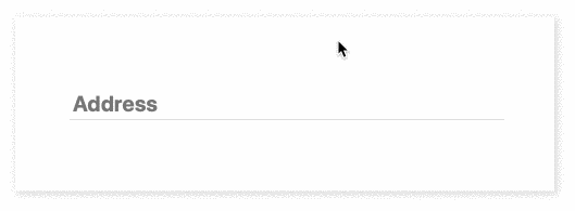
Styling With Props
import FloatingLabel from 'react-styled-floating-label';

const address = (
    <FloatingLabel
        text="Address"
        style={{
            color: '#0070e0',
        }}
        placeholderStyle={{
            fontWeight: 'bold',
        }}>
        <Input />
    </FloatingLabel>
);
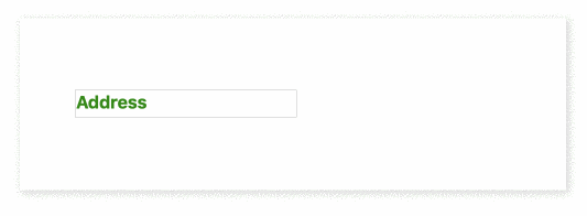
Styled Placeholder
import styled from 'styled-components';
import FloatingLabel from 'react-styled-floating-label';

const FloatingLabelWithStyledPlaceholder = styled(FloatingLabel)`
    --placeholder-color: #328a09;
    --placeholder-font-weight: bold;
`;

const Input = styled.input`
    font-size: 1em;
`;

const address = (
    <FloatingLabelWithStyledPlaceholder text="Address">
        <Input />
    </FloatingLabelWithStyledPlaceholder>
);
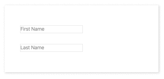
Custom Positioning
import styled from 'styled-components';
import FloatingLabel from 'react-styled-floating-label';

const VerticallyPositionedFloatingLabel = styled(FloatingLabel)`
    transform: translateY(-10px);
`;

const HorizontallyPositionedFloatingLabel = styled(FloatingLabel)`
    margin-left: 20px;
`;

const firstName = (
    <VerticallyPositionedFloatingLabel text="First Name">
        <Input />
    </VerticallyPositionedFloatingLabel>
);

const lastName = (
    <HorizontallyPositionedFloatingLabel text="Last Name">
        <Input />
    </HorizontallyPositionedFloatingLabel>
);
You can check all examples in action in this live demo.
API
Props
| Prop | Required | Default | Description |
|---|---|---|---|
| text | Yes | Label text | |
| style | Optional | {} |
Label style for projects which are not using styled-components |
| placeholderStyle | Optional | {} |
Placeholder style for projects which are not using styled-components |
| container | Optional | div |
Component container |
| label | Optional | label |
Label component |
styled-components
Label can be styled with styled-components:
import styled from 'styled-components';
import FloatingLabel from 'react-styled-floating-label';

const BlueFloatingLabel = styled(FloatingLabel)`
    color: #0070e0;
`;
To style placeholder use standard CSS properties with the "--placeholder-" prefix:
const BlueFloatingLabelWithBoldPlaceholder = styled(BlueFloatingLabel)`
    --placeholder-font-weight: bold;
`;
Demo
To run the demo, you need to clone the project and execute:
npm i && npm run demoOr you can check a live demo here.
Feedback
There are no mailing lists or discussion groups yet. Please use GitHub issues and pull request or follow me on Twitter @IhorBurlachenko