m0sk1t / React_email_editor
Programming Languages
Projects that are alternatives of or similar to React email editor
This project was bootstrapped with Create React App.
Summary
 This project is experimental! It's my attempt to create visual email template editor using React+Redux+etc... tools stack.
Inspired by Mosaico
Before start
You should have basic knowledge of NodeJS+npm, React+Redux, JS+JSX. It helps you to understand how to use and extend this project.
Обзорная статья на русском находится по этой ссылке https://habrahabr.ru/post/329488/.
Installation
Just download this repo, and after then run following commands:
npm install
npm start
your browser will be opened with address http://localhost:3000, and you will see this:

Or you may run:
npm run build
then copy build folder to server_nodejs folder, then run:
node app
in server_nodejs folder. This helps you to check save\send functions from client to server. Then open http://localhost:8888 in your browser.
Interface
Left panel contains block list, common options and block options tabs. In the middle of the screen you see template. If you click on some block, action buttons will appear. You can drag the block from block list to template, click on action button for remove block, save the template or send the test email:

Common options give you ability to apply color or background color to all blocks, which have false in customStyle options:

Block example
This is an example of the block with HR element:
import React from 'react';

const BlockHr = ({ blockOptions }) => {
    return (
        <table
            width="550"
            cellPadding="0"
            cellSpacing="0"
            role="presentation"
        >
            <tbody>
                <tr>
                    <td
                    width="550"
                    style={blockOptions.elements[0]}
                    height={blockOptions.container.height}
                    >
                    <hr />
                    </td>
                </tr>
            </tbody>
        </table>
    );
};
export default BlockHr;
Block options example
This is an example of the options of the block with HR element:
import React from 'react';

const OptionsHr = ({ block, language, onPropChange }) => {
    return (
        <div>
            <div>
                <label>{language["Custom style"]}: <input type="checkbox" checked={block.options.container.customStyle? 'checked': '' } onChange={(e) => onPropChange('customStyle', !block.options.container.customStyle, true)} /></label>
            </div>
            <hr />
            <div>
                <label>{language["Height"]}: <input type="number" value={block.options.container.height} onChange={(e) => onPropChange('height', e.target.value, true)} /></label>
            </div>
            <div>
                <label>{language["Background"]}: <input type="color" value={block.options.container.backgroundColor} onChange={(e) => onPropChange('backgroundColor', e.target.value, true)} /></label>
            </div>
        </div>
    );
};
export default OptionsHr;
Store structure
- template - Array of building blocks. Every block containing
- id
- block_type
- options
- container - style options for container
- elements - Array of block elements (mixed style properties and custom data, ex. source or text)
- common - Object containing common options for both template blocks and added blocks
- components - blocks available for adding
- tabs - tabs visibility settings
- tinymce_config - common options for TinyMCE
- language - localization of the interface
- templateId - template id
Diagram of conveyor of actions

How to build your own block
First you need to add new object containing block settings. To do this, add following json to public/components.json:
...previous blocks...
        {
            "preview": "images/3_icons.png",
            "block": {
                "block_type": "3_icons",
                "options": {
                    "container": {
                        "padding": "0 50px",
                        "color": "#333333",
                        "fontSize": "20px",
                        "customStyle": false,
                        "backgroundColor": "#F7F8FA"
                    },
                    "elements": [{
                        "source": "https://images.vexels.com/media/users/3/136010/isolated/preview/e7e28c15388e5196611aa2d7b7056165-ghost-skull-circle-icon-by-vexels.png"
                    },
                    {
                        "source": "http://www.1pengguna.com/1pengguna/uploads/images/tipimgdemo/kesihatan.gif"
                    },
                    {
                        "source": "https://upload.wikimedia.org/wikipedia/commons/thumb/5/56/Circle-icons-cloud.svg/2000px-Circle-icons-cloud.svg.png"
                    },
                    {
                        "text": "DEADS",
                        "textAlign": "center"
                    },
                    {
                        "text": "LOVES",
                        "textAlign": "center"
                    },
                    {
                        "text": "CLOUDS",
                        "textAlign": "center"
                    }]
                }
            }
        },
...next blocks...
when take this picture:

and save it to folder src/images and you should get something like this:

Now you need to add new file Block3Icons.js in folder src/components/blocks with this content:
import React from 'react';

const Block3Icons = ({ blockOptions, onPropChange }) => {
    const alt="cool image";
    return (
        <table
            width="450"
            cellPadding="0"
            cellSpacing="0"
            role="presentation"
        >
            <tbody>
                <tr>
                    <td width="150">
                        <a width="150" href={blockOptions.elements[0].source}>
                            <img alt={alt} width="150" src={blockOptions.elements[0].source} />
                        </a>
                    </td>
                    <td width="150">
                        <a width="150" href={blockOptions.elements[1].source}>
                            <img alt={alt} width="150" src={blockOptions.elements[1].source} />
                        </a>
                    </td>
                    <td width="150">
                        <a width="150" href={blockOptions.elements[2].source}>
                            <img alt={alt} width="150" src={blockOptions.elements[2].source} />
                        </a>
                    </td>
                </tr>
                <tr>
                    <td style={blockOptions.elements[3]}>{blockOptions.elements[3].text}</td>
                    <td style={blockOptions.elements[4]}>{blockOptions.elements[4].text}</td>
                    <td style={blockOptions.elements[5]}>{blockOptions.elements[5].text}</td>
                </tr>
            </tbody>
        </table>
    );
};
export default Block3Icons;
Now you need to add Options3Icons.js in folder src/components/options with this content:
import React from 'react';
const Options3Icons = ({ block, language, onFileChange, onPropChange }) => {
let textIndex = 3;
let imageIndex = 0;
return (
<div>
<div>
<label>{language["Custom style"]}: <input type="checkbox" checked={block.options.container.customStyle? 'checked': '' } onChange={(e) => onPropChange('customStyle', !block.options.container.customStyle, true)} /></label>
</div>
<hr />
<div>
<label>{language["Color"]}: <input type="color" value={block.options.container.color} onChange={(e) => onPropChange('color', e.target.value, true)} /></label>
</div>
<div>
<label>{language["Background"]}: <input type="color" value={block.options.container.backgroundColor} onChange={(e) => onPropChange('backgroundColor', e.target.value, true)} /></label>
</div>
<hr />
<div>
<label>
{language["URL"]}
<select onChange={e => imageIndex = +e.target.value}>
<option value="0">{language["URL"]} 1</option>
<option value="1">{language["URL"]} 2</option>
<option value="2">{language["URL"]} 3</option>
</select>
</label>
</div>
<div>
<label>
{language["URL"]} {imageIndex + 1}:
<label>
<input
type="file"
onChange={(e) => {
onFileChange(block, +imageIndex, e.target.files[0]);
}} />
<div>⊕</div>
</label>
<input type="text" value={block.options.elements[+imageIndex].source} onChange={(e) => onPropChange('source', e.target.value, false, +imageIndex)} />
</label>
</div>
<hr />
<div>
<label>
{language["Text"]}
<select onChange={e => textIndex = +e.target.value}>
<option value="3">{language["Text"]} 1</option>
<option value="4">{language["Text"]} 2</option>
<option value="5">{language["Text"]} 3</option>
</select>
</label>
</div>
<div>
<label>
{language["Text"]} {textIndex - 2}
<input type="text" value={block.options.elements[+textIndex].text} onChange={e => onPropChange('text', e.target.value, false, +textIndex)} />
</label>
</div>
</div>
);
};
export default Options3Icons;
Ok, now add in src/components/Block.js this code:
//...another imports...
import Block3Icons from './blocks/Block3Icons';
//...and here...

//...another cases...
        case '3_icons':
            return <Block3Icons id={block.id} blockOptions={block.options} />;
//...and here...
the same make with src/containers/Options.js:
//...another imports...
import Options3Icons from '../components/options/Options3Icons';
//...and here...

//...another cases...
            case '3_icons':
                return <Options3Icons block={block} language={language} onFileChange={onFileChange} onPropChange={onPropChange} />;
//...and here...
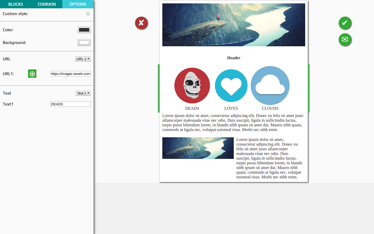
After saving all files, and dragging our new block to template you will see this picture:
That's all!!! Thank for reading. Try to make your own coolest block =)