All Projects β†’ Wildhoney β†’ Reactshadow

Wildhoney / Reactshadow

Licence: mit
πŸ”° Utilise Shadow DOM in React with all the benefits of style encapsulation.

Programming Languages

javascript
184084 projects - #8 most used programming language

Projects that are alternatives of or similar to Reactshadow

Switzerland
πŸ‡¨πŸ‡­Switzerland takes a functional approach to Web Components by applying middleware to your components. Supports Redux, attribute mutations, CSS variables, React-esque setState/state, etc… out-of-the-box, along with Shadow DOM for style encapsulation and Custom Elements for interoperability.
Stars: ✭ 261 (-72.47%)
Mutual labels:  components, webcomponents, shadow-dom
Calcite Components
Web Components for the Calcite Design System. Built with Stencil JS. Currently in Beta!
Stars: ✭ 96 (-89.87%)
Mutual labels:  components, webcomponents
Crab
JavaScript library for building user interfaces with Custom Elements, Shadow DOM and React like API
Stars: ✭ 22 (-97.68%)
Mutual labels:  webcomponents, shadow-dom
material-webcomponents
Material Design implemented in Web Components (Custom Elements v1)
Stars: ✭ 110 (-88.4%)
Mutual labels:  webcomponents, shadow-dom
Hybrids
Extraordinary JavaScript framework with unique declarative and functional architecture
Stars: ✭ 2,529 (+166.77%)
Mutual labels:  webcomponents, shadow-dom
Ioing
Implement the solutions of performance improvement and componentization for your SPA (single page application) products with this Progressive Web App Development Engine.
Stars: ✭ 224 (-76.37%)
Mutual labels:  webcomponents, shadow-dom
Panel
Web Components + Virtual DOM: web standards for powerful UIs
Stars: ✭ 206 (-78.27%)
Mutual labels:  components, webcomponents
Custom Element
A base class for Web Components (Custom Elements) which provides simple data binding.
Stars: ✭ 60 (-93.67%)
Mutual labels:  webcomponents, shadow-dom
codeceptjs-bdd
Javascript BDD UI Automation Framework. Exclusive LWC Shadow DOM Support. Playwright, Webdriver.io, Appium, Saucelabs.
Stars: ✭ 35 (-96.31%)
Mutual labels:  webcomponents, shadow-dom
cwco
Powerful and Fast Web Component Library with a Simple API
Stars: ✭ 27 (-97.15%)
Mutual labels:  components, webcomponents
anywhere-webcomponents
A UI work in progress based on custom elements (web components) for use in anywhere.
Stars: ✭ 17 (-98.21%)
Mutual labels:  components, webcomponents
Omi
Front End Cross-Frameworks Framework - ε‰η«―θ·¨ζ‘†ζžΆθ·¨εΉ³ε°ζ‘†ζžΆ
Stars: ✭ 12,153 (+1181.96%)
Mutual labels:  webcomponents, shadow-dom
Query Selector Shadow Dom
querySelector that can pierce Shadow DOM roots without knowing the path through nested shadow roots. Useful for automated testing of Web Components. Production use is not advised, this is for test environments/tools such as Web Driver, Playwright, Puppeteer
Stars: ✭ 115 (-87.87%)
Mutual labels:  webcomponents, shadow-dom
Dna
Progressive Web Components.
Stars: ✭ 22 (-97.68%)
Mutual labels:  webcomponents, shadow-dom
Nutmeg
Build, test, and publish vanilla Web Components with a little spice
Stars: ✭ 111 (-88.29%)
Mutual labels:  webcomponents, shadow-dom
Standalone
Create framework agnostic components that are truly reusable and interoperable with all the benefits of the React ecosystem – using the HTML5 custom elements API to extend HTML's vocabulary.
Stars: ✭ 205 (-78.38%)
Mutual labels:  components, webcomponents
crab
JavaScript library for building user interfaces with Custom Elements, Shadow DOM and React like API
Stars: ✭ 22 (-97.68%)
Mutual labels:  webcomponents, shadow-dom
orgenic-ui
ORGENIC UI is an MIT-licensed open source project for creating strong user interfaces with high quality web components.
Stars: ✭ 53 (-94.41%)
Mutual labels:  components, webcomponents
Mosaic
🎨 A front-end JavaScript library for building user interfaces!
Stars: ✭ 390 (-58.86%)
Mutual labels:  components, webcomponents
Ionic Custom Components
Ionic 3/4 Custom Components. Spend less time on design and more time on coding! Free to use for everyone! πŸ§™β€β™‚οΈ
Stars: ✭ 23 (-97.57%)
Mutual labels:  components

ReactShadow

Utilise Shadow DOM in React with all the benefits of style encapsulation.

Travis   Coveralls   npm   License MIT

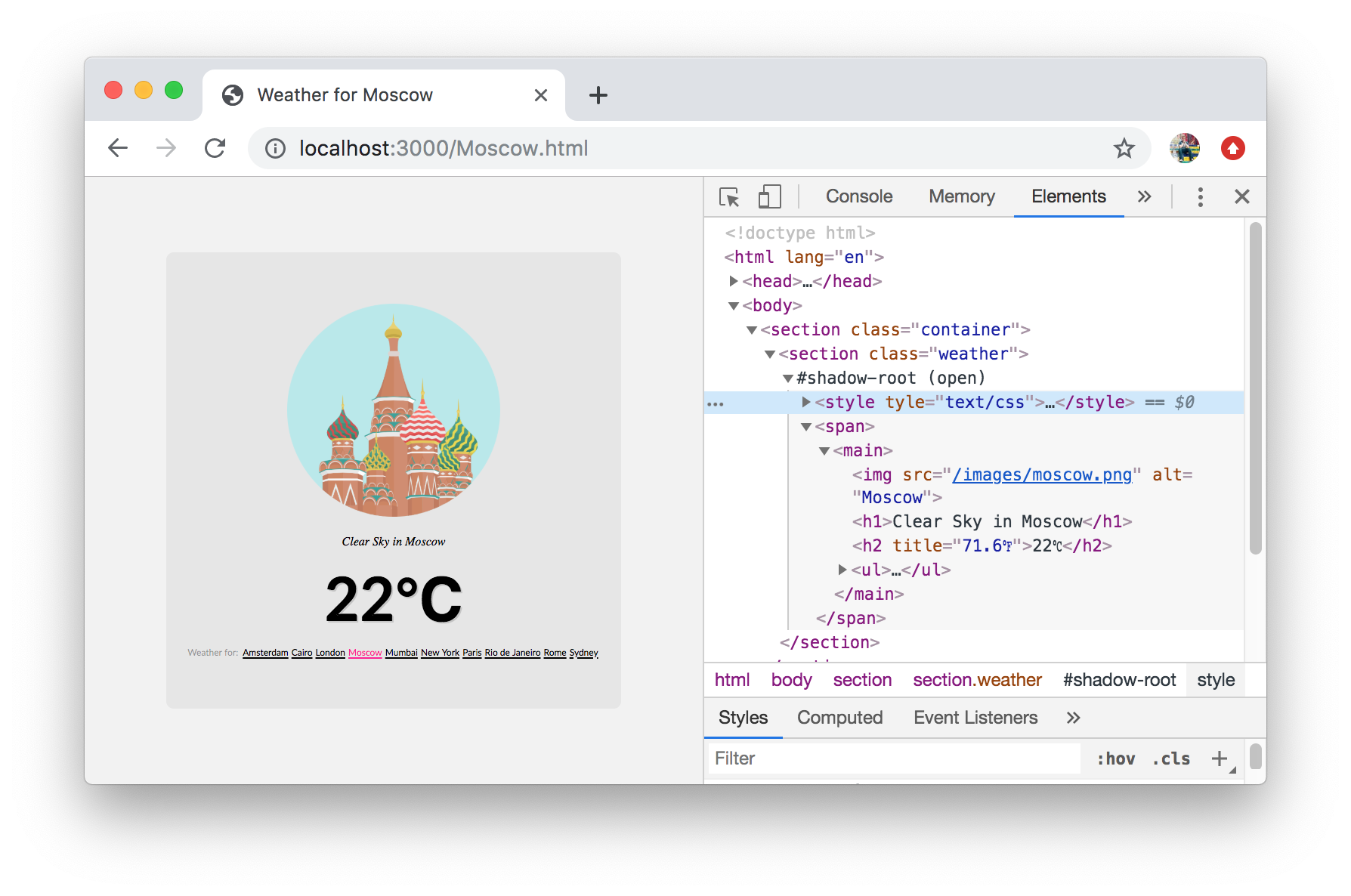
Screenshot


Getting Started

Creating the shadow root is as simple as using the default export to construct a shadow root using the node name provided – for example root.div would create a div as the host element, and a shadow root as its immediate descendant β€” all of the child elements would then be descendants of the shadow boundary.

import root from 'react-shadow';
import styles from './styles.css';

export default function Quote() {
    return (
        <root.div className="quote">
            <q>There is strong shadow where there is much light.</q>
            <span className="author">― Johann Wolfgang von Goethe.</span>
            <style type="text/css">{styles}</style>
        </root.div>
    );
}

Edit react-shadow

Applying styles requires either applying the styles directly to the component as a string, or importing the CSS documents as a string as part of your build process. You can then append the style component directly to your shadow boundary via your component's tree. In the example we use the following Webpack configuration to import CSS documents as strings.

{
    test: /\.css$/,
    loader: ['to-string-loader', 'css-loader']
}

Alternatively you can use styled-components normally, as each time a shadow boundary is created, a new StyleSheetManager context is also created which will encapsulate all related styles in their corresponding shadow root β€” to use this import react-shadow/styled-components instead of import react-shadow, likewise if you'd like to use emotion you can import react-shadow/emotion.

import root from 'react-shadow/styled-components';
import root from 'react-shadow/emotion';

// ...

<root.section />;

You may pass any props you like to the root.* component which will be applied directly to the host element, including event handlers and class names. There are also a handful of options that are used for the attachShadow invocation.

ShadowRoot.propTypes = {
    mode: PropTypes.oneOf(['open', 'closed']),
    delegatesFocus: PropTypes.bool,
    styleSheets: PropTypes.arrayOf(PropTypes.instanceOf(global.CSSStyleSheet)),
    children: PropTypes.node,
};

ShadowRoot.defaultProps = {
    mode: 'open',
    delegatesFocus: false,
    styleSheets: [],
    children: null,
};

In cases where you need the underlying element and its associated shadow boundary, you can use a standard ref which will be invoked with the host element – from that you can use shadowRoot to access its shadow root if the mode has been set to the default open value.

const node = useRef(null);

// ...

<root.section ref={node} />;

Recently and at long last there has been some movement in introducing a declarative shadow DOM which react-shadow tentatively supports – as it's experimental, open to sudden spec changes, and React finds it difficult to rehydrate – by using the ssr prop.

const node = useRef(null);

// ...

<root.section ssr />;
Note that the project description data, including the texts, logos, images, and/or trademarks, for each open source project belongs to its rightful owner. If you wish to add or remove any projects, please contact us at [email protected].