rsuite / Rsuite Table
Licence: mit
A React table component.
Stars: ✭ 374
Programming Languages
typescript
32286 projects
Projects that are alternatives of or similar to Rsuite Table
Ember Light Table
Lightweight, contextual component based table for Ember 2.3+
Stars: ✭ 310 (-17.11%)
Mutual labels: table
Grid.blazor
Grid component with CRUD for Blazor (client-side and server-side) and ASP.NET Core MVC
Stars: ✭ 335 (-10.43%)
Mutual labels: table
Material Table
Datatable for React based on material-ui's table with additional features
Stars: ✭ 3,198 (+755.08%)
Mutual labels: table
Vanilla Datatables
A lightweight, dependency-free javascript HTML table plugin
Stars: ✭ 314 (-16.04%)
Mutual labels: table
Libfort
C/C++ library to create formatted ASCII tables for console applications
Stars: ✭ 255 (-31.82%)
Mutual labels: table
React Tabulator
React Tabulator is based on tabulator - a JS table library with many advanced features.
Stars: ✭ 295 (-21.12%)
Mutual labels: table
Datatablesbundle
This Bundle integrates the jQuery DataTables plugin into your Symfony application.
Stars: ✭ 334 (-10.7%)
Mutual labels: table
Pandasvault
Advanced Pandas Vault — Utilities, Functions and Snippets (by @firmai).
Stars: ✭ 316 (-15.51%)
Mutual labels: table
Vue Data Grid
An example that complex table interaction in Vue.js
Stars: ✭ 266 (-28.88%)
Mutual labels: table
Android Extensions
An Android library with modules to quickly bootstrap an Android application.
Stars: ✭ 356 (-4.81%)
Mutual labels: table
rsuite-table
A React table component.


Features
- Support virtualized.
- Support fixed header, fixed column.
- Support custom adjustment column width.
- Support for custom cell content.
- Support for displaying a tree form.
- Support for sorting.
- Support for expandable child nodes
- Support for RTL
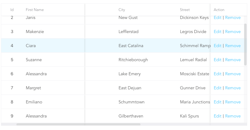
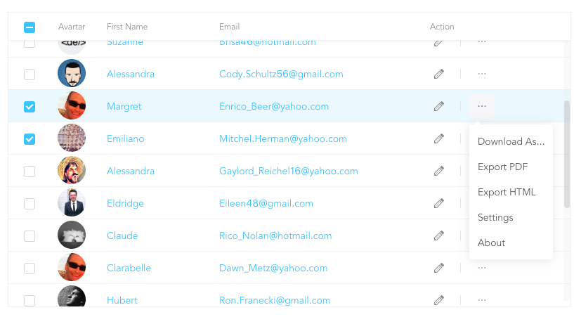
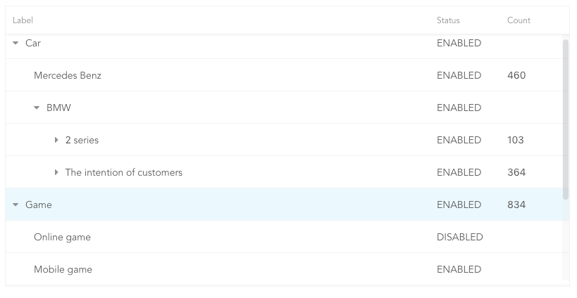
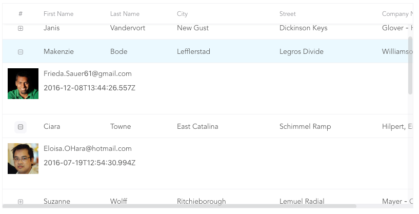
Preview
- Fixed Column
- Custom Cell
- Tree Table
- Expandable
Install
npm i rsuite-table --save
Usage
import { Table, Column, HeaderCell, Cell } from 'rsuite-table';
import 'rsuite-table/lib/less/index.less'; // or 'rsuite-table/dist/css/rsuite-table.css'

const dataList = [
  { id: 1, name: 'a', email: '[email protected]', avartar: '...' },
  { id: 2, name: 'b', email: '[email protected]', avartar: '...' },
  { id: 3, name: 'c', email: '[email protected]', avartar: '...' }
];

const ImageCell = ({ rowData, dataKey, ...rest }) => (
  <Cell {...rest}>
    <img src={rowData[dataKey]} width="50" />
  </Cell>
);

const App = () => (
  <Table data={dataList}>
    <Column width={100} sortable fixed resizable>
      <HeaderCell>ID</HeaderCell>
      <Cell dataKey="id" />
    </Column>

    <Column width={100} sortable resizable>
      <HeaderCell>Name</HeaderCell>
      <Cell dataKey="name" />
    </Column>

    <Column width={100} sortable resizable>
      <HeaderCell>Email</HeaderCell>
      <Cell>
        {(rowData, rowIndex) => {
          return <a href={`mailto:${rowData.email}`}>{rowData.email}</a>;
        }}
      </Cell>
    </Column>

    <Column width={100} resizable>
      <HeaderCell>Avartar</HeaderCell>
      <ImageCell dataKey="avartar" />
    </Column>
  </Table>
);
API
<Table>
| Property | Type (Default)
|
Description |
|---|---|---|
| affixHeader | boolean,number | Affix the table header to the specified position on the page |
| affixHorizontalScrollbar | boolean,number | Affix the table horizontal scrollbar to the specified position on the page |
| autoHeight | boolean | Automatic height |
| bodyRef | (ref: HTMLElement) => void | A ref attached to the table body element |
| bordered | boolean | Show border |
| cellBordered | boolean | Show cell border |
| data * | object[] | Table data |
| defaultExpandAllRows | boolean | Expand all nodes By default |
| defaultExpandedRowKeys | string[] | Specify the default expanded row by rowkey
|
| defaultSortType | enum: 'desc', 'asc' | Sort type |
| expandedRowKeys | string[] | Specify the default expanded row by rowkey (Controlled) |
| headerHeight | number(40)
|
Table Header Height |
| height | number(200)
|
Table height |
| hover | boolean (true)
|
The row of the table has a mouseover effect |
| isTree | boolean | Show as Tree table |
| loading | boolean | Show loading |
| locale | object: { emptyMessage: ('No data'), loading: ('Loading...') } |
Messages for empty data and loading states |
| minHeight | number (0)
|
Minimum height |
| onDataUpdated | (nextData: object[], scrollTo: (coord: { x: number; y: number }) => void) => void | Callback after table data update. |
| onExpandChange | (expanded:boolean,rowData:object)=>void | Tree table, the callback function in the expanded node |
| onRowClick | (rowData:object, event: SyntheticEvent)=>void | Click the callback function after the row and return to rowDate
|
| onRowContextMenu | (rowData:object, event: SyntheticEvent)=>void | Invoke the callback function on contextMenu and pass the rowData
|
| onScroll | (scrollX:object, scrollY:object)=>void | Callback function for scroll bar scrolling |
| onSortColumn | (dataKey:string, sortType:string)=>void | Click the callback function of the sort sequence to return the value sortColumn, sortType
|
| renderEmpty | (info: React.ReactNode) => React.ReactNode | Customized data is empty display content |
| renderLoading | (loading: React.ReactNode) => React.ReactNode | Customize the display content in the data load |
| renderRowExpanded | (rowDate?: Object) => React.ReactNode | Customize what you can do to expand a zone |
| renderTreeToggle | (icon:node,rowData:object,expanded:boolean)=> node | Tree table, the callback function in the expanded node |
| rowClassName | string , (rowData:object)=>string | Add an optional extra class name to row |
| rowExpandedHeight | number (100)
|
Set the height of an expandable area |
| rowHeight | number(46), (rowData: object) => number |
Row height |
| rowKey | string ('key')
|
Each row corresponds to the unique key in data
|
| rtl | boolean | Right to left |
| shouldUpdateScroll | boolean(true)
|
Whether to update the scroll bar after data update |
| showHeader | boolean (true)
|
Display header |
| sortColumn | string | Sort column name ˝ |
| sortType | enum: 'desc', 'asc' | Sort type (Controlled) |
| virtualized | boolean | Effectively render large tabular data |
| width | number | Table width |
<Column>
| Property | Type (Default)
|
Description |
|---|---|---|
| align | enum: 'left','center','right' | Alignment |
| colSpan | number | Merges column cells to merge when the dataKey value for the merged column is null or undefined. |
| fixed | boolean, 'left', 'right' | Fixed column |
| flexGrow | number | Set the column width automatically adjusts, when set flexGrow cannot set resizable and width property |
| minWidth | number(200)
|
When you use flexGrow, you can set a minimum width by minwidth
|
| onResize | (columnWidth?: number, dataKey?: string) => void | Callback after column width change |
| resizable | boolean | Customizable Resize Column width |
| sortable | boolean | Sortable |
| treeCol | boolean | A column of a tree. |
| verticalAlign | enum: 'top', 'middle', 'bottom' | Vertical alignment |
| width | number | Column width |
sortableis used to define whether the column is sortable, but depending on whatkeysort needs to set adataKeyinCell. The sort here is the service-side sort, so you need to handle the logic in the ' Onsortcolumn ' callback function of<Table>, and the callback function returnssortColumn,sortTypevalues.
<ColumnGroup>
| Property | Type (Default)
|
Description |
|---|---|---|
| align | enum: 'left','center','right' | Alignment |
| fixed | boolean, 'left', 'right' | Fixed column |
| verticalAlign | enum: 'top', 'middle', 'bottom' | Vertical alignment |
| header | React.ReactNode | Group header |
<Cell>
| Property | Type (Default)
|
Description |
|---|---|---|
| dataKey | string | Data binding key, but also a sort of key
|
| rowData | object | Row data |
| rowIndex | number | Row number |
There are three ways to use <Cell>, as follows:
- 1.Associate the fields in the data with
dataKey.
<Column width="{100}" align="center">
  <HeaderCell>Name</HeaderCell>
  <Cell dataKey="name" />
</Column>
- 2.Customize a
<Cell>.
const NameCell = ({ rowData, ...props }) => (
  <Cell {...props}>
    <a href={`mailto:${rowData.email}`}>{rowData.name}<a>
  </Cell>
);

<Column width={100} align="center">
  <HeaderCell>Name</HeaderCell>
  <NameCell />
</Column>
- 3.Customize functions directly within the
<Cell>.
<Column width={100} align="center">
  <HeaderCell>Name</HeaderCell>
  <Cell>
    {(rowData, rowIndex) => {
      return <a href={`mailto:${rowData.email}`}>{rowData.name}</a>;
    }}
  </Cell>
</Column>
(For nested data read this: https://github.com/rsuite/rsuite-table/issues/158)
Methods
- scrollTop(top:number = 0)
- scrollLeft(left:number = 0)
Note that the project description data, including the texts, logos, images, and/or trademarks,
for each open source project belongs to its rightful owner.
If you wish to add or remove any projects, please contact us at [email protected].