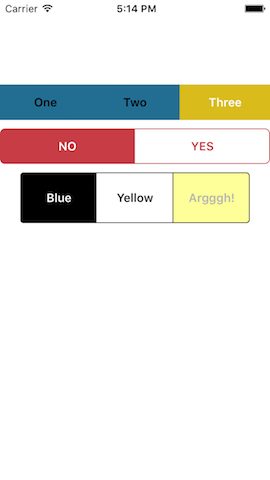
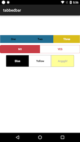
skypanther / Segmentedcontrol
Programming Languages
Labels
Projects that are alternatives of or similar to Segmentedcontrol
#Tabbed Bar Widget
Cross-platform segmented control (TabbedBar) widget for Appcelerator Titanium apps, by @skypanther
Note: This widget uses a custom component on both iOS and Android. In other words, it does not fall back to Ti.UI.iOS.TabbedBar.
Installation and usage
Recommended
$ gittio install com.skypanther.segmentedcontrol
###Manual method (works, but why not use gittio?):
- Download this repo (git clone, zip, whatever)
- Copy the widgets/com.skypanther.segmentedcontrol to your project's widgets folder
- Update your app/config.json to add:
"dependencies": {
    "com.skypanther.segmentedcontrol": "1.1.0"
}
In your XML file, add the widget:
<Widget src="com.skypanther.segmentedcontrol" id="tbar" top="100"/>
Add styling as desired in your tss:
"#tbar": {
	borderRadius: 6,
	borderColor: "#C73C45",
	selectedButtonColor: "#C73C45",
	unselectedButtonColor: "#fff",
	selectedButtonTextColor: "#fff",
	unselectedButtonTextColor: "#C73C45",
	index: 0,
	withDividers: true,
	font: {
		fontWeight: 'bold',
		fontSize: '15'
	}
}
Initialize it in the controller:
$.tbar1.init(['One', 'Two', 'Three'], callback);

function callback(e) {
	alert('You clicked button ' + (e.index+1));
}

// Get current selected value
alert($.tbar1.getIndex());
New in version 1.1, you can skip an index. See below for the rationale and further details:
$.tbar1.init(['One', 'Two', 'Four'], callback, {
	skipindex: 2 // 0-based numbering!
});
Styling options
You can set these style options in the TSS or in your XML tag.
| Property | Description | Default |
|---|---|---|
selectedButtonColor |
background color of the selected button |
#d9bc1b (yellow) |
unselectedButtonColor |
background color of buttons that are not selected |
#226e92 (blue) |
selectedButtonTextColor |
color of text on the selected button |
#fff |
unselectedButtonTextColor |
color of text on unselected buttons |
#000 |
disabledTextColor |
color of text on a disabled button |
#aaa (light grey) |
disabledButtonBackgroundColor |
background color of a disabled button |
#444 (dark grey) |
font |
font properties of the button labels |
{fontFamily: 'Avenir-Light', fontSize: 11} (ios){fontWeight: 'normal', fontSize: '15dp'} (android) |
withDividers |
whether to add dividers between button (color matches selected backgroundcolor) | false |
Additionally, most other properties you set on the widget (via its xml tag or id/class selectors) will be passed down to the widget's components.
Methods
| Method | Notes |
|---|---|
init(labels, callback) |
You must call this method to initialize the control, passing to it an array of labels and a function to be called when a button is tapped. That function will receive an object whose index property is the number of the button that was tapped |
select(num) |
Selects the button specified |
getIndex() |
Gets the current selected button |
setIndex(num) |
Synonym for select()
|
deselect(num) |
Deselects (unselects) the button specified |
enable() |
Enables click events for the whole control |
disable() |
Disables click events for the whole control |
deselectAll() |
Deselects all the buttons in the control |
disableButton(num) |
Disables the specified button, making it unclickable while the rest remain clickable |
enableButton(num) |
Enables the specified button, making it clickable. |
disableAllButtons() |
Disable all buttons, making them all unclickable. Essentially the same as disable()
|
enableAllButtons() |
Enable all buttons, making them all clickable unless you have called disable(). In that case, you'd need to call enable()
|
Skipping an index
We had an odd requirement at work that involves skipping a button in the middle of the set. Our app had a four-button control but our next version was to replace that with a three-button control. Anyone who loaded old data needed to have the four possible selections mapped to the three buttons. The kicker was that we were dropping one of the values in the middle. Like this:
- Our buttons used to be Excellent, Good, Fair, Poor (thus, indexes 0, 1, 2, & 3)
- Our buttons now needed to be Clean, Average, Rough which would come from or get sent to the server as values 0, 1, & 3. In other words, anything that had been Good or Fair needed to show up as Average (index 1). Anthing that had been Excellent would be Clean (index 0) and all the Poors would be shown as Rough (index 3).
Thus, skipindex was born. You pass in the new opts.skipindex value and the segmented control pretends that index doesn't exist. Let's say this is our tabbed bar:
$.tbar.init(['One', 'Two', 'Four'], callback, {
	skipindex: 2 // 0-based numbering!
});

// when the button labeled One is tapped
$.tbar.getIndex(); // -> 0
// when "Two" is tapped
$.tbar.getIndex(); // -> 1
// when "Four" is tapped
$.tbar.getIndex(); // -> 3, because we skipped 2!

// Likewise
$.tbar.setIndex(3); // would highlight the third button, the
                    // one labeled Four
History
- 23-Nov-2016: Ver 1.1.1 default/unselected index is now
undefinedand fix for width calculations to resolve "missing" buttons on some devices with percent-based widths for the control (this might result in a 1px uncolored edge of the right-most button in your set on some devices, sorry) - 28-Oct-2016: Ver 1.1.0 adds skipindex support, assume the iOS simulator is an @3x device
- 18-Mar-2016: Ver 1.0.6 resolves a bug with select (not deselecting old value) and adds getIndex()
- 3-Mar-2016: Ver 1.0.5 resolves #5, yet another attempt! (it would help if I owned more iOS devices, donations welcome 😀)
- 29-Feb-2016: Ver 1.0.4 resolves #5, thanks Will Dent! (last button in set not filling entire area on iPhone 6s+)
- 16-Feb-2016: Ver 1.0.3 resolves last button in set not filling entire area on iPhone 6s+
- 08-Feb-2016: Ver 1.0.2 resolves issue where selecting/setIndexing a button didn't deselect the other buttons
- 05-Feb-2016: Ver 1.0.1 resolves layout issues on larger iOS devices when using percentage-based widths
- 29-Jan-2016: Initial release of the widget-ized version of my old Classic-style component
- Ancient history, like 2011, initial release with a few interim releases thereafter
Limitations
- I have not tested this with more than 4 buttons. Too many and it will surely fail.
- I haven't tested it on a tablet. Layout might be screwed up.
- I'm pretty sure it won't handle rotation of the device well.
- It doesn't support anything fancy, like icons instead of text on the buttons. Note: it will support icon fonts for your text labels, so you can achieve a similar effect.
Contributions are welcome!
#License / Copyright
© 2016 Tim Poulsen
MIT licensed


