diegohaz / Singel
Programming Languages
Projects that are alternatives of or similar to Singel


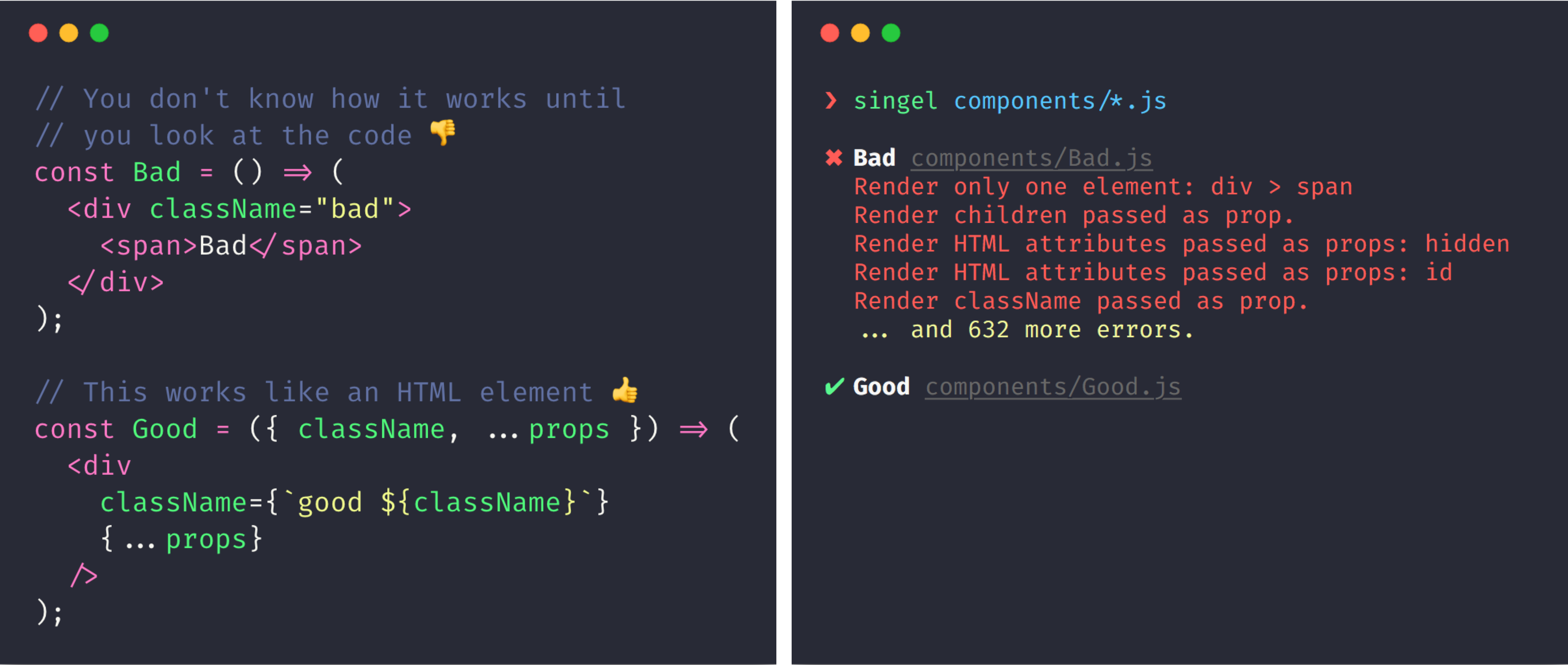
Single Element Pattern (Singel) is a set of rules/best practices to create consistent, reliable and maintainable components in React and other component-based libraries. This is based on the idea that the building blocks of an application should resemble as most as possible native HTML elements. Read full article
This repo is a CLI tool for checking whether React components conform to the Singel pattern.
Installation
$ npm i -g singel
Usage
$ singel path/to/**/Component.js --ignore "path/to/**/ignored/Component.js"
Projects applying Singel
Feel free to send a PR adding your open source project
Rules
Render only one element
// bad - 2 elements
const Element = props => (
  <div {...props}>
    <span />
  </div>
);

// good
const Element = props => (
  <div {...props} />
);

// good - if Element is good
const Element2 = props => (
  <Element {...props} />
);
Never break the app
// good
const Element = props => (
  <div {...props} />
);

// bad - will break if getId wasn't provided
const Element = ({ getId, ...props }) => (
  <div id={getId()} {...props} />
);

// bad - will break if foo wasn't provided
const Element = ({ foo, ...props }) => (
  <div id={foo.bar} {...props} />
);
Render all HTML attributes passed as props
// good
const Element = props => (
  <div {...props} />
);

// bad - not rendering id
const Element = ({ id, ...props }) => (
  <div {...props} />
);

// good
const Element = ({ id, ...props }) => (
  <div id={id} {...props} />
);
Always merge the styles passed as props
// good
const Element = props => (
  <div {...props} />
);

// bad - not rendering className
const Element = ({ className, ...props }) => (
  <div {...props} />
);

// bad - not rendering style
const Element = ({ style, ...props }) => (
  <div {...props} />
);

// bad - replacing className instead of appending
const Element = props => (
  <div className="foo" {...props} />
);

// bad - replacing style instead of merging
const Element = props => (
  <div style={{ padding: 0 }} {...props} />
);

// good
const Element = ({ className, ...props }) => (
  <div className={`foo ${className}`} {...props} />
);

// good
const Element = ({ style, ...props }) => (
  <div style={{ padding: 0, ...style }} {...props} />
);
Add all the event handlers passed as props
// good
const Element = props => (
  <div {...props} />
);

// bad - not passing onClick
const Element = ({ onClick, ...props }) => (
  <div {...props} />
);

// bad - replacing onClick prop
const Element = props => (
  <div {...props} onClick={myFunction} />
);

// good
const Element = ({ onClick, ...props }) => (
  <div onClick={onClick} {...props} />
);

// good - it's ok to replace internal event handlers
const Element = props => (
  <div onClick={myFunction} {...props} />
);

// good - calling internal and prop
const callAll = (...fns) => (...args) =>
  fns.forEach(fn => fn && fn(...args));

const Element = ({ onClick, ...props }) => (
  <div onClick={callAll(myFunction, onClick)} {...props} />
);
FAQ
How to handle nested elements?
Say you have a Button element and you want to display a Tooltip when it's hovered. The first rule you'll want to break is rendering only one element. To handle that you have some options:
- Use CSS pseudo-elements (such as
:afterand:before); - Create a non-singel element, which is fine;
- Nest styles instead of components.
Here's an example of how you can accomplish tha latter one:
/* could also be CSS-in-JS */
.button {
  position: relative;
  /* more button css */
}

.button:hover .tooltip {
  display: block;
}

.button .tooltip {
  display: none;
  position: absolute;
  /* more tooltip css */
}
const Button = ({ className, ...props }) => (
  <button className={`button ${className}`} {...props} />
);

Button.Tooltip = ({ className, ...props }) => (
  <div className={`tooltip ${className}`} {...props} />
);
Usage:
<Button className="my-specific-button">
  <Button.Tooltip className="my-specific-tooltip">
    😁
  </Button.Tooltip>
  Hover me
</Button>
Both Button and Button.Tooltip are single elements. You have all the benefits you would have by nesting them, but now with complete control over Button.Tooltip from outside.
License
MIT © Diego Haz