React Sliding Pane
Pane that slides out of the window side. Like panes from Google Tag Manager.
Features:
- Animated open-close
- Smooth animation based on CSS translate
- Outside click or left top arrow click to close
- Efficient: pane content is not rendered when pane is closed
- Based on react-modal
- Close on escape support
- Typescript support
- Runtime props validation in dev via "prop-types"
- React Strict mode covered
- Small — 8 Kb gzip (react-sliding-pane + react-modal as dependency)
See changelog.
Thanks BrowserStack for support!
Table of contents
Example
When to use (UX)
I've found sliding pane very helpful in situations when normal modal window (or just popup) is not enough: long list with pagination, multi-step form or nested popups.
How to use
Install module and peer dependencies:
npm i --save react react-dom react-sliding-pane
import React, { Component, useState } from "react";
import { render } from "react-dom";
import SlidingPane from "react-sliding-pane";
import "react-sliding-pane/dist/react-sliding-pane.css";
const App = () => {
const [state, setState] = useState({
isPaneOpen: false,
isPaneOpenLeft: false,
});
return (
<div>
<button onClick={() => setState({ isPaneOpen: true })}>
Click me to open right pane!
</button>
<div style={{ marginTop: "32px" }}>
<button onClick={() => setState({ isPaneOpenLeft: true })}>
Click me to open left pane with 20% width!
</button>
</div>
<SlidingPane
className="some-custom-class"
overlayClassName="some-custom-overlay-class"
isOpen={state.isPaneOpen}
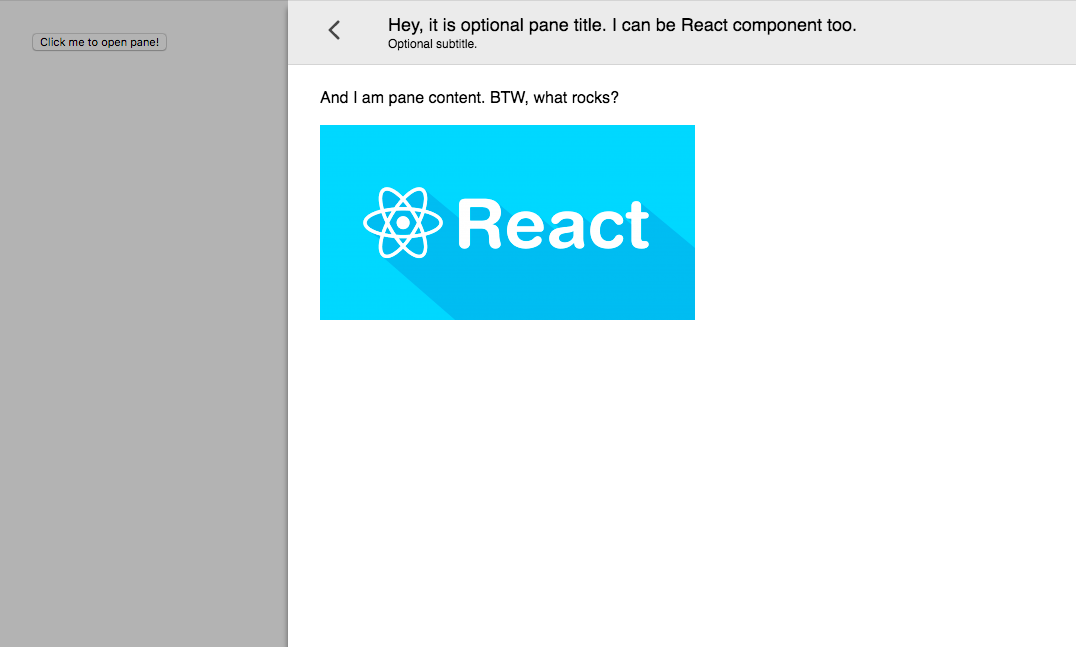
title="Hey, it is optional pane title. I can be React component too."
subtitle="Optional subtitle."
onRequestClose={() => {
// triggered on "<" on left top click or on outside click
setState({ isPaneOpen: false });
}}
>
<div>And I am pane content. BTW, what rocks?</div>
<br />
<img src="img.png" />
</SlidingPane>
<SlidingPane
closeIcon={<div>Some div containing custom close icon.</div>}
isOpen={state.isPaneOpenLeft}
title="Hey, it is optional pane title. I can be React component too."
from="left"
width="200px"
onRequestClose={() => setState({ isPaneOpenLeft: false })}
>
<div>And I am pane content on left.</div>
</SlidingPane>
</div>
);
};
render(<App />, document.getElementById("app"));Properties
| Prop | Required | Default | Description |
|---|---|---|---|
| isOpen | Is pane open | ||
| title | Title in header | ||
| subtitle | Subtitle in header | ||
| from | "right" | Direction from pane will appear | |
| children | Content of pane | ||
| className | CSS class name. See react-modal | ||
| overlayClassName | CSS class name of overlay. See react-modal | ||
| width | CSS string for width pane. | ||
| closeIcon | Custom close icon | ||
| shouldCloseOnEsc | Enable pane close on ESC | ||
| hideHeader | Hide pane header | ||
| onRequestClose | Called on close icon press | ||
| onAfterOpen | Called after open |
How to develop
npm run docs
open docs/example.html