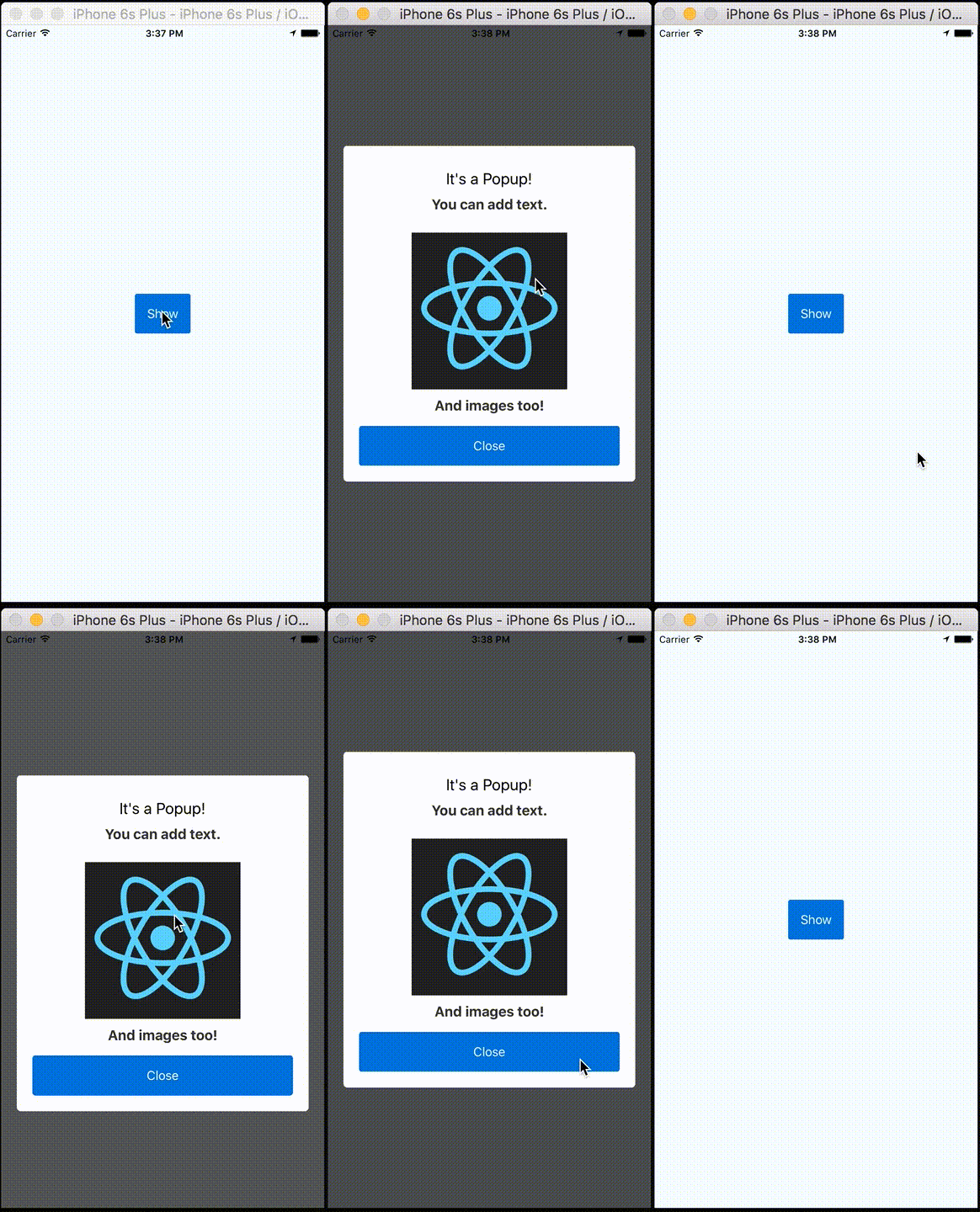
NativepopupClone of Apple iOS App's feedback popup, and easily customizable.
Stars: ✭ 247 (+1200%)
Mutual labels: alert, modal, popup
PmalertcontrollerPMAlertController is a great and customizable alert that can substitute UIAlertController
Stars: ✭ 2,397 (+12515.79%)
Mutual labels: alert, modal, popup
PopupdialogA simple, customizable popup dialog for iOS written in Swift. Replaces UIAlertController alert style.
Stars: ✭ 3,709 (+19421.05%)
Mutual labels: alert, modal, popup
React Native Alert ProThe Pro Version of React Native Alert (Android & iOS)
Stars: ✭ 69 (+263.16%)
Mutual labels: alert, modal, popup
CustomalertviewdialogueCustom AlertView Dialogue is the world's most advanced alert view library. Custom AlertView Dialogue includes simple message popups, confirmation alerts, selector popups, action sheet bottom menus, and input/feedback contact forms.
Stars: ✭ 100 (+426.32%)
Mutual labels: alert, modal, popup
react-redux-modal-flex[DEPRECATED] Make easy a modal/popup with Redux
Stars: ✭ 14 (-26.32%)
Mutual labels: alert, modal, popup
SweetalertA beautiful replacement for JavaScript's "alert"
Stars: ✭ 21,871 (+115010.53%)
Mutual labels: alert, modal, popup
JalertjQuery alert/modal/lightbox plugin
Stars: ✭ 73 (+284.21%)
Mutual labels: alert, modal, popup
JboxjBox is a jQuery plugin that makes it easy to create customizable tooltips, modal windows, image galleries and more.
Stars: ✭ 1,251 (+6484.21%)
Mutual labels: alert, modal, popup
React PopupReact popup component
Stars: ✭ 198 (+942.11%)
Mutual labels: alert, modal, popup
eins-modalSimple to use modal / alert / dialog / popup. Created with pure JS. No javascript knowledge required! Works on every browser and device! IE9
Stars: ✭ 30 (+57.89%)
Mutual labels: alert, modal, popup
SpstorkcontrollerNow playing controller from Apple Music, Mail & Podcasts Apple's apps.
Stars: ✭ 2,494 (+13026.32%)
Mutual labels: alert, popup
Jspanel4A JavaScript library to create highly configurable floating panels, modals, tooltips, hints/notifiers/alerts or contextmenus for use in backend solutions and other web applications.
Stars: ✭ 217 (+1042.11%)
Mutual labels: alert, modal
PresentriOS let's you modally present any view controller, but if you want the presented view controller to not cover the whole screen or modify anything about its presentation or transition you have to use the Custom View Controller Presentation API's.
Stars: ✭ 2,816 (+14721.05%)
Mutual labels: alert, modal
Wc Messagebox基于 Vue 2.0 开发的 Alert, Toast, Confirm 插件, UI仿照 iOS 原生
Stars: ✭ 203 (+968.42%)
Mutual labels: alert, modal
react-st-modalSimple and flexible modal dialog component for React JS
Stars: ✭ 41 (+115.79%)
Mutual labels: alert, modal
SHPopupA lightweight library for popup view
Stars: ✭ 36 (+89.47%)
Mutual labels: alert, popup
jpopupSimple lightweight (<2kB) javascript popup modal plugin
Stars: ✭ 27 (+42.11%)
Mutual labels: modal, popup
LSDialogViewControllerCustom Dialog for iOS written in Swift
Stars: ✭ 74 (+289.47%)
Mutual labels: modal, popup
react-layer-stackLayering system for React. Useful for popover/modals/tooltip/dnd application
Stars: ✭ 158 (+731.58%)
Mutual labels: modal, popup

