tobihagemann / Thlabel
Projects that are alternatives of or similar to Thlabel
THLabel
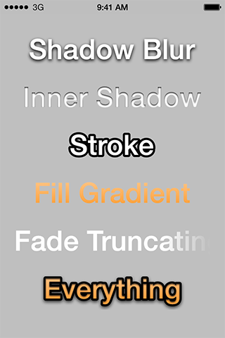
THLabel is a subclass of UILabel, which additionally allows shadow blur, inner shadow, stroke text and fill gradient.
Requirements
- iOS 4.0 or higher (below iOS 7.0 is untested though)
- ARC enabled
Installation
The easiest way to use THLabel in your app is via CocoaPods.
- Add the following line in the project's Podfile file:
pod 'THLabel', '~> 1.4.0' - Run the command
pod installfrom the Podfile folder directory.
Manual Installation
- Add
CoreText.frameworkto your Link Binary with Libraries list. - Drag these files into your project:
THLabel.h,THLabel.m
IBDesignable / IBInspectable
There is an ibdesignable branch, if you're interested in this feature. It has been removed from the master branch, because IBDesignable and IBInspectable cause problems with CocoaPods, if you're not using use_frameworks! in your Podfile.
Usage
You can create THLabels programmatically, or create them in Interface Builder by dragging an ordinary UILabel into your view and setting its Custom Class to THLabel. With Xcode 6 you can set most of the properties within Interface Builder, which will preview your changes immediately.
Properties
Spacing
@property CGFloat letterSpacing;
@property CGFloat lineSpacing;
You can modify letter spacing of the text (also known as kerning) by changing the letterSpacing property. The default value is 0.0. A positive value will separate the characters, whereas a negative value will make them closer.
Modify line spacing of the text (also known as leading) by changing the lineSpacing property. The default value is 0.0. Only positive values will have an effect.
Shadow Blur
@property CGFloat shadowBlur;
Additionally to UILabel's shadowColor and shadowOffset, you can set a shadow blur to soften the shadow.
Inner Shadow
@property CGFloat innerShadowBlur;
@property CGSize innerShadowOffset;
@property UIColor *innerShadowColor;
The inner shadow has similar properties as UILabel's shadow, once again additionally with a shadow blur. If an inner shadow and a stroke are overlapping, it will appear beneath the stroke.
Stroke Text
@property CGFloat strokeSize;
@property UIColor *strokeColor;
@property THLabelStrokePosition strokePosition;
You can set an outer, centered or inner stroke by setting the strokePosition property. Default value is THLabelStrokePositionOutside. Other options are THLabelStrokePositionCenter and THLabelStrokePositionInside.
Fill Gradient
@property UIColor *gradientStartColor;
@property UIColor *gradientEndColor;
@property NSArray *gradientColors;
@property CGPoint gradientStartPoint;
@property CGPoint gradientEndPoint;
The gradient can consist of multiple colors, which have to be saved as UIColor objects in the gradientColors array. For more convenience, gradientStartColor and gradientEndColor will fill up the array accordingly.
The starting and ending points of the gradient are in the range 0 to 1, where (0, 0) is the top-left and (1, 1) the bottom-right of the text. The default value for gradientStartPoint is (0.5, 0.2) and for gradientEndPoint it is (0.5, 0.8).
Fade Truncating
@property THLabelFadeTruncatingMode fadeTruncatingMode;
You can fade in/out your label by setting the fadeTruncatingMode property. Default value is THLabelFadeTruncatingModeNone. The options are THLabelFadeTruncatingModeTail, THLabelFadeTruncatingModeHead and THLabelFadeTruncatingModeHeadAndTail.
Text Insets / Padding
@property UIEdgeInsets textInsets;
@property BOOL automaticallyAdjustTextInsets;
Effects like stroke and shadow can't be drawn outside of the bounds of the label view. You may need to set text insets to move a bit away from the edge so that the effects don't get clipped. This will be automatically done if you set automaticallyAdjustTextInsets to YES, which is also the default value.
Notes
THLabel respects (unlike UILabel) the contentMode property, which is used for vertical alignment. The textAlignment still has the higher priority, when it comes to horizontal alignment.
However THLabel doesn't respect the numberOfLines property, because Core Text doesn't support it natively. If you would like to have multiple lines, set lineBreakMode to NSLineBreakByWordWrapping.
THLabels are slower to draw than UILabels, so be aware of that.
Credits
Original source and inspiration from:
- FXLabel by Nick Lockwood, https://github.com/nicklockwood/FXLabel
- KSLabel by Kai Schweiger, https://github.com/vigorouscoding/KSLabel
- GTMFadeTruncatingLabel by Google, https://github.com/google/google-toolbox-for-mac/tree/master/iPhone
Big thanks to Jason Miller for showing me sample code of his implementation using Core Text! It inspired me to dig deeper and move away from drawing with NSAttributedString on iOS 7, which caused a lot of problems.
License
Distributed under the permissive zlib license. See the LICENSE file for more info.
Contact
Tobias Hagemann


