Uptime Card


A minimalist card inspired by the reddit status UI to display binary sensors in a nice way.
Install 🏠
HACS (recommended)
This card is available in HACS (Home Assistant Community Store).
Manual install
- Download and copy
uptime-card.jsfrom the latest release into yourconfig/wwwdirectory. - Add the resource reference inside your
configuration.yamlwith URL/local/uptime-card.jsand typemodule. - Add the custom card to your panel and
🚀 .
Configuration ⚙️
Uptime card is highly customizable.
Global config
| Name | Type / Options | Default | Since | Description |
|---|---|---|---|---|
| entity (required) | string | v0.0.1 | Specify entity ID of the sensor | |
| attribute | string | v0.5.0 | Set the attribute name if the state to monitor isn't the default one. | |
| ok | string | v0.0.1 | Specify the on state for the entity, either ok or ko should be set if entity isn't a binary sensor. More info. |
|
| ko | string | v0.0.1 | Specify the off state for the entity, either ok or ko should be set if entity isn't a binary sensor. More info. |
|
| icon | string | icon attribute || mdi:heart |
v0.0.1 | Specify a custom icon from mdi icons or an image from /local path (since v0.4.0), e.g. mdi:home |
| ko_icon | string | icon option || icon attribute || mdi:heart |
v0.2.0 | Specify a custom icon for ko status, e.g. mdi:home |
| hours_to_show | number | 24 |
v0.0.1 | Set the number of hours to show, you can go to the minute, you can go up to the minute (1 minute == 0.0167 hours_to_show). |
| update_interval | number | 30 | v0.0.1 | Set the minimum update interval for the card in seconds. |
| title_template | string | [[[ return entity.attributes.friendly_name; ]]] |
v0.8.0 | Set the template for the title. More info. |
| average_template | string | % |
v0.5.0 | Set the template for the average. More info. |
| severity | number | 100 |
v0.0.1 | Set a threshold in percentage to specify when a bar both ok and ko is red instead of yellow. |
| status_template | string | [[[ return variables.current ]]] |
v0.1.0 | Set the template for the status. More info. |
| title_adaptive_color | true/false |
false |
v0.0.2 | Make the title color adapt with the entity color. |
| status_adaptive_color | true/false |
false |
v0.0.2 | Make the name color adapt with the entity color. |
| icon_adaptive_color | true/false |
false |
v0.0.2 | Make the name color adapt with the entity color. |
| tooltip_adaptive_color | true/false |
false |
v0.1.0 | Make the name color adapt with the entity color. |
| color_thresholds | list of thresholds | v0.4.0 | Set the color thesholds. |
Bar config
Parent key: bar
| Name | Type / Options | Default | Since | Description |
|---|---|---|---|---|
| height | number | 46 |
v0.0.1 | Set the height of the bars. |
| round | number | 1 |
v0.0.1 | Set the round radius for the bars. |
| spacing | number | 4 |
v0.0.1 | Set the spacing between the bars. |
| amount | number | 36 |
v0.0.1 | Set the number of bars. |
Color config
Parent key: color
| Name | Type / Options | Default | Since | Description |
|---|---|---|---|---|
| ok | color | #45C669 |
v0.0.1 | Set the ok color. |
| ko | color | #C66445 |
v0.0.1 | Set the ko color. |
| half | color | #C6B145 |
v0.0.1 | Set the half color. |
| none | color | #C9C9C9 |
v0.0.1 | Set the none color. |
| title | color | grey |
v0.0.2 | Set the title text color, title_adaptive_color must be false. |
| status | color | grey |
v0.0.2 | Set the status text color, status_adaptive_color must be false. |
| icon | color | var(--state-icon-color) |
v0.0.2 | Set the icon text color, icon_adaptive_color must be set to false. |
| tooltip | color | grey |
v0.1.0 | Set the tooltip text color, tooltip_adaptive_color must be false. |
Show config
Parent key: show
| Name | Type / Options | Default | Since | Description |
|---|---|---|---|---|
| header | true/false |
true |
v0.0.1 | Show/hide the header. |
| title | true/false |
true |
v0.1.0 | Show/hide the title. |
| icon | true/false |
true |
v0.0.1 | Show/hide the icon. |
| status | true/false |
true |
v0.0.1 | Show/hide the status. |
| timeline | true/false |
true |
v0.0.1 | Show/hide the timeline. |
| average | true/false |
true |
v0.0.2 | Show/hide the average. |
| footer | true/false |
true |
v0.0.1 | Show/hide the footer. |
Alias config
Parent key: alias
| Name | Type / Options | Default | Since | Description |
|---|---|---|---|---|
| ok | string | v0.0.1 | Set a friendly name for ok state. |
|
| ko | string | v0.0.1 | Set a friendly name for ko state. |
Tooltip config
Parent key: tooltip
| Name | Type / Options | Default | Since | Description |
|---|---|---|---|---|
| hour24 | true/false |
false |
v0.1.0 | Set to true to display time in 24-hour format. |
| template | string | [[[ return variables.from_date ]]] - [[[ return variables.to_date ]]] | [[[ return variables.average ]]]% |
v0.1.0 | Set a template for the tooltip More info. |
| animation | true/false |
true |
v0.1.0 | Set to true to show bar animation on hover. |
Action config
Parent key: tap_action
| Name | Type / Options | Default | Since | Description |
|---|---|---|---|---|
| action | more-info/url/navigate/toggle/call-service/fire-dom-event |
more-info |
v0.2.0 (more-info/url) v0.3.0 (navigate/toggle/call-service/fire-dom-event) |
Action to perform. |
| entity | string | v0.3.0 | (Only for more-info) Override the entity for more information. |
|
| navigation_path | string | v0.3.0 | (Only for navigate) Path to navigate to (e.g. /lovelace/0/). |
|
| string | (Only for url) URL to open. |
|||
| service | string | v0.3.0 | (Only for call-service) Service to call. |
|
| service-data | string | v0.3.0 | (Only for call-service) Service data to include. |
|
| haptic | success/warning/failure/light/medium/heavy/selection |
v0.3.0 | Haptic feedback for the [Beta IOS App].(https://www.home-assistant.io/ios/beta) | |
| confirmation | object | v0.3.0 | Display a confirmation popup. |
Parent key: tap_action.confirmation
| Name | Type / Options | Default | Since | Description |
|---|---|---|---|---|
| text | string | v0.3.0 | This text will be displayed in the popup. | |
| exemptions | array | v0.3.0 | Any user declared in this list will not see the confirmation dialog. |
Alignment config
Parent key: alignment
| Name | Type / Options | Default | Since | Description |
|---|---|---|---|---|
| header | left/right/center/spaced |
spaced |
v0.2.0 | Select the spacing strategy between title and icon. |
| icon_first | true/false |
false |
v0.2.0 | Set the icon before the title. |
| status | left/right/center/spaced |
spaced |
v0.2.0 | Select the spacing strategy between state and tooltip. |
| tooltip_first | true/false |
false |
v0.2.0 | Set the tooltip before the status. |
Blink config
Parent key: blink
| Name | Type / Options | Default | Since | Description |
|---|---|---|---|---|
| effect | fade/shadow |
v0.4.0 | The blink effect (shadow only works with card target). |
|
| target | card/status/title/icon |
v0.4.0 | Set the component to blink. | |
| speed | number | v0.4.0 | The animation speed. |
Initialisation config
Parent key: init
| Name | Type / Options | Default | Since | Description |
|---|---|---|---|---|
| animation | none/raise/slide/reveal |
raise |
v0.9.0 | The initialization animation More info. |
| duration | number | 0.5 | v0.9.0 | The initialization animation duration. |
Clipping config
Parent key: clip
| Name | Type / Options | Default | Since | Description |
|---|---|---|---|---|
| title | number | 25 | v0.11.0 | The max length of the title before clipping. |
| status | number | 25 | v0.11.0 | The max length of the status before clipping. |
Examples 📊
Example 1
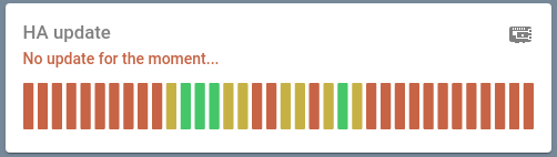
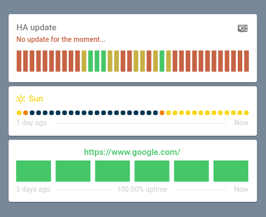
type: 'custom:uptime-card'
entity: binary_sensor.updater
icon: 'mdi:raspberry-pi'
title_template: HA update
hours_to_show: 168
status_adaptive_color: true
alias:
  ok: Update available !
  ko: No update for the moment...
color:
  icon: grey
show:
  footer: false
Example 2
type: 'custom:uptime-card'
entity: sun.sun
title_template: Sun
icon: 'mdi:weather-sunny'
ko_icon: 'mdi:weather-sunny-off'
ko: below_horizon
icon_adaptive_color: true
title_adaptive_color: true
color:
  ok: '#F9d71C'
  ko: '#053752'
  half: '#EF810E'
bar:
  spacing: 4
  height: 10
  round: 4
show:
  average: false
  status: false
alignment:
  status: spaced
  header: left
  icon_first: true
tap_action:
  action: more-info
Example 3

type: 'custom:uptime-card'
entity: binary_sensor.ping_google
# Home Assistant ping integration - https://www.home-assistant.io/integrations/ping
title_template: 'https://www.google.com/'
icon: 'mdi:heart'
hours_to_show: 72
title_adaptive_color: true
average_template: '[[[ return variables.uptime.toFixed(2); ]]]% uptime'
bar:
  height: 46
  round: 0
  spacing: 10
  amount: 6
show:
  status: false
  icon: false
tap_action:
  action: url
  url_path: 'https://www.google.com/'
alignment:
  status: spaced
  header: center
Additional information ℹ️
ok and ko options
For non binary sensors, the uptime card will be in unknown state because the card cannot ascertain whether it's state corresponds to ok or ko.
These can be indiviually specified with either ok or ko.
These options follow these rules:
- if ok is not defined and ko is not defined ->
unknown - if ok is defined and ko is not defined:
- if the state name equals ok ->
ok - if not ->
ko
- if the state name equals ok ->
- if ok is not defined and ko is defined:
- if the state name equals ko ->
ko - if not ->
ok
- if the state name equals ko ->
- if ok is defined and ok is defined:
- if the state name equals ok ->
ok - if the state name equals ko ->
ko - if not ->
unknown
- if the state name equals ok ->
Color thresholds
You can specify the color of the bars using color.ok, color.ko, color.half and the severity, however you can have only three colors for your bars and you can't control them as much as you may want. That's the reason why color_thresholds exists.
You can specify color_thresholds to erase the color.ok, color.ko, color.half behaviour by specifing a list of thresholds with the following data structure:
| Name | Type / Options | Default | Since | Description |
|---|---|---|---|---|
| value | number | v0.4.0 | Threshold value. | |
| color | string | v0.4.0 | CSS color which will be used for levels below or equal the value field. |
Example:
color_thresholds:
  - value: 20
    color: red
  - value: 40
    color: blue
  - value: 60
    color: orange
  - value: 100
    color: green
With the above configuration, if the uptime of the current bar is less or equal than 20 then the bar will be red or else if it is less or equal than 40 then the bar will be blue and so on. The repartition looks like:
|________]________]________]________]
0        20       40       60      100
    red     blue    orange    green
Initialization
Since v0.9.0 you can customize the initialization animation.
You have three choices:
Raise

Reveal

Slide

Templating
Custom templates can be used to customize the displayed text of status, average and tooltip.
Generally speaking, templates allows the ability to print either current values from the sensor or special variables, available either for the status or the tooltip.
Either generic or specific interpolations exist using [[[ my.function ]]] structure.
Under the hood, since v0.5.0, it uses the javascript Function. It allows you to freely customize the fields using javascripts.
Generic interpolations
By default, for both all templates you can print sensor data using the variable entity.
For example, using sensor sun.sun has the following attributes:
next_dawn: 2021-04-03T04:35:43+00:00
next_dusk: 2021-04-02T18:49:59+00:00
next_midnight: 2021-04-02T23:43:38+00:00
next_noon: 2021-04-02T11:44:03+00:00
next_rising: 2021-04-03T05:10:32+00:00
next_setting: 2021-04-02T18:15:16+00:00
elevation: 38.83
azimuth: 148.33
rising: true
friendly_name: Sun
The attribute friendly_name can be used using template, [[[ return entity.attributes.friendly_name ]]].
Since v0.7.0, you can get the yaml card configuration inside the template using the variable configuration.
As an example, you can print the average uptime as HH:MM:SS instead of the average pourcentage using the following code in average_template:
[[[
let date = new Date(0);
seconds = Math.trunc((configuration.hours_to_show * 3600) * variables.uptime / 100);
date.setSeconds(seconds);
return date.toISOString().substr(11, 8)
]]]
Specific interpolations
By default some templates has their own interpolations using the variable variables.
Status
status has the following interpolations:
[[[ return variables.current ]]]: the current status.[[[ return variables.ok ]]]: theokstatus.[[[ return variables.ko ]]]: thekostatus.
Tooltip
tooltip has the following interpolations:
[[[ return variables.from_date ]]]: the start date of the bar.[[[ return variables.to_date ]]]: the end date of the bar.[[[ return variables.average ]]]: the percentage ofonduring the period.
Example
These can be combined to create a sentence.
As an example, to retrieve the status of a sun.sun entity, template [[[ return entity.attributes.friendly_name ]]] is [[[ return variables.current ]]] can be specified.
Which will print Sun is Above Horizon (if the sensor is in ok state and if alias is Above Horizon.)
Contribution
Don't hesitate to ask for features or to contribute by yourself
For developers 👨💻
If you want to add a feature or fix a bug by yourself, follow these instructions:
- Open the project inside a devcontainer.
- Run
npm start. - Open the browser and go to
http://localhost:8123/. - Make changes and see the changes into the home assistant instance.
Inspiration
This repository is inspired by two other cards, mini-graph-card and boilerplate-card.