<vaadin-split-layout>
⚠️ Starting from Vaadin 20, the source code and issues for this component are migrated to thevaadin/web-componentsmonorepository. This repository contains the source code and releases of<vaadin-split-layout>for the Vaadin versions 10 to 19.
<vaadin-split-layout> is a Web Component implementing a split layout for two content elements with a draggable splitter between them, part of the Vaadin components.
Live Demo


<vaadin-split-layout>
  <vaadin-split-layout orientation="vertical">
    <div>First layout content</div>
    <div>Second layout content</div>
  </vaadin-split-layout>
  <vaadin-split-layout orientation="vertical">
    <div>Third layout content</div>
    <div>Fourth layout content</div>
  </vaadin-split-layout>
</vaadin-split-layout>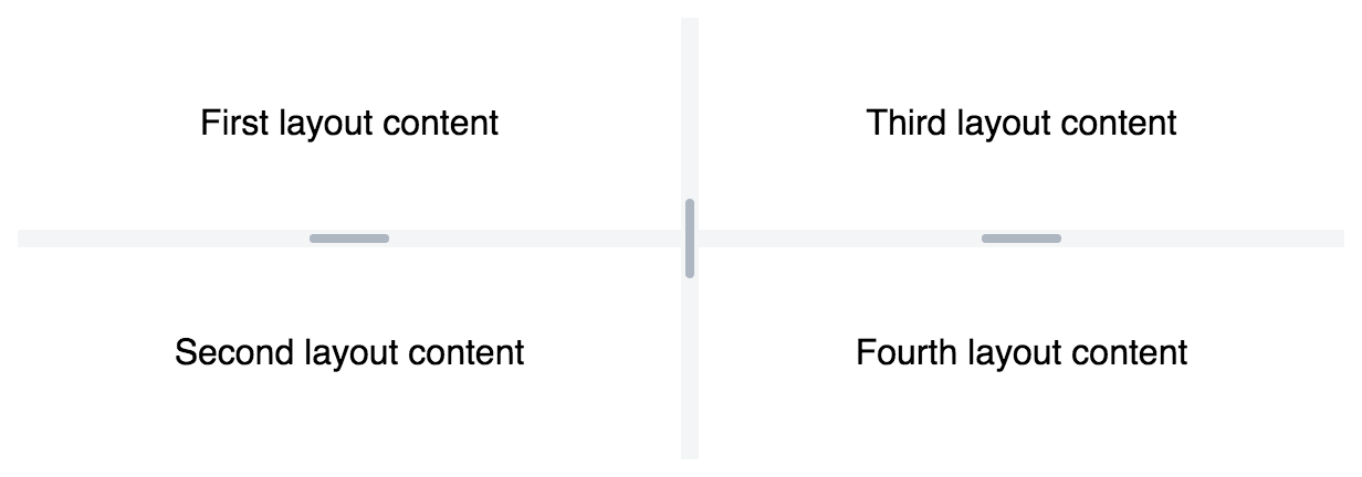
Installation
The Vaadin components are distributed as Bower and npm packages. Please note that the version range is the same, as the API has not changed. You should not mix Bower and npm versions in the same application, though.
Unlike the official Polymer Elements, the converted Polymer 3 compatible Vaadin components are only published on npm, not pushed to GitHub repositories.
Polymer 2 and HTML Imports Compatible Version
Install vaadin-split-layout:
bower i vaadin/vaadin-split-layout --saveOnce installed, import it in your application:
<link rel="import" href="bower_components/vaadin-split-layout/vaadin-split-layout.html">Polymer 3 and ES Modules Compatible Version
Install vaadin-split-layout:
npm i @vaadin/vaadin-split-layout --saveOnce installed, import it in your application:
import '@vaadin/vaadin-split-layout/vaadin-split-layout.js';Getting started
Vaadin components use the Lumo theme by default.
To use the Material theme, import the correspondent file from the theme/material folder.
Entry points
-
The component with the Lumo theme:
theme/lumo/vaadin-split-layout.html -
The component with the Material theme:
theme/material/vaadin-split-layout.html -
Alias for
theme/lumo/vaadin-split-layout.html:vaadin-split-layout.html
Running demos and tests in a browser
-
Fork the
vaadin-split-layoutrepository and clone it locally. -
When in the
vaadin-split-layoutdirectory, runnpm installand thenbower installto install dependencies. -
Make sure you have polymer-cli installed globally:
npm i -g polymer-cli. -
Run
npm start, browser will automatically open the component API documentation. -
You can also open demo or in-browser tests by adding demo or test to the URL, for example:
- http://127.0.0.1:3000/components/vaadin-split-layout/demo
- http://127.0.0.1:3000/components/vaadin-split-layout/test
Running tests from the command line
- When in the
vaadin-split-layoutdirectory, runpolymer test
Following the coding style
We are using ESLint for linting JavaScript code. You can check if your code is following our standards by running npm run lint, which will automatically lint all .js files as well as JavaScript snippets inside .html files.
Big Thanks
Cross-browser Testing Platform and Open Source <3 Provided by Sauce Labs.
Contributing
To contribute to the component, please read the guideline first.
License
Apache License 2.0
Vaadin collects development time usage statistics to improve this product. For details and to opt-out, see https://github.com/vaadin/vaadin-usage-statistics.