StevenYuysy / Vue Content Placeholder
Licence: mit
Facebook content placeholder using Vue.js component
Stars: ✭ 123
Programming Languages
javascript
184084 projects - #8 most used programming language
Labels
Projects that are alternatives of or similar to Vue Content Placeholder
Ssplaceholdertableview
SSPlaceholderTableView is Placeholder Library for different different state wise placeHolder for UITableView/UICollectionView. Check https://www.cocoacontrols.com/controls/ssplaceholdertableview
Stars: ✭ 39 (-68.29%)
Mutual labels: placeholder
Eleventy Plugin Lazyimages
Eleventy plugin that adds blurry placeholders & lazy loading to your images
Stars: ✭ 108 (-12.2%)
Mutual labels: placeholder
Placekeanu.com
For when you need a little more Keanu in your life
Stars: ✭ 63 (-48.78%)
Mutual labels: placeholder
Shimmerlayout
Memory efficient, simple yet highly customizable shimmer effect for Android.
Stars: ✭ 81 (-34.15%)
Mutual labels: placeholder
Superplaceholder.js
⚡Super charge your input placeholders
Stars: ✭ 978 (+695.12%)
Mutual labels: placeholder
Blurhash Rust Wasm
A Rust and WASM implementation of the blurhash algorithm
Stars: ✭ 119 (-3.25%)
Mutual labels: placeholder
Placeholder Loading
Simple and flexible, css only, content placeholder loading animation. https://zalog.github.io/placeholder-loading/
Stars: ✭ 1,137 (+824.39%)
Mutual labels: placeholder
Broccoli
📟An Android library that shows the placeholder of the view.
Stars: ✭ 1,390 (+1030.08%)
Mutual labels: placeholder
Wynullview
An easy way to use for view's empty state 一行代码显示空视图,高度自定义
Stars: ✭ 44 (-64.23%)
Mutual labels: placeholder
Babel Plugin Partial Application
[DEPRECATED] Please use https://github.com/citycide/param.macro
Stars: ✭ 60 (-51.22%)
Mutual labels: placeholder
Uitextview Placeholder
A missing placeholder for UITextView
Stars: ✭ 1,317 (+970.73%)
Mutual labels: placeholder
Inputaccessoryview
Input Accessory View for Commenting and Chat User Interfaces built in Swift, if you like it please "☆"
Stars: ✭ 39 (-68.29%)
Mutual labels: placeholder
Acfloatingtextfield
It is a subclass of UITextfield to Provide the floating label and customisations.
Stars: ✭ 110 (-10.57%)
Mutual labels: placeholder
React Shimmer
🌠 Async loading, performant Image component for React.js
Stars: ✭ 990 (+704.88%)
Mutual labels: placeholder
Localizationprovider
Database driven localization provider for .NET applications (core assemblies)
Stars: ✭ 77 (-37.4%)
Mutual labels: placeholder
Ng Image Appear
AngularJS Module to make images appear with transition as they load.
Stars: ✭ 120 (-2.44%)
Mutual labels: placeholder
Skeletonview
☠️ An elegant way to show users that something is happening and also prepare them to which contents they are awaiting
Stars: ✭ 10,804 (+8683.74%)
Mutual labels: placeholder
Kaloader
Beautiful animated placeholders for showing loading of data
Stars: ✭ 99 (-19.51%)
Mutual labels: placeholder
vue-content-placeholder
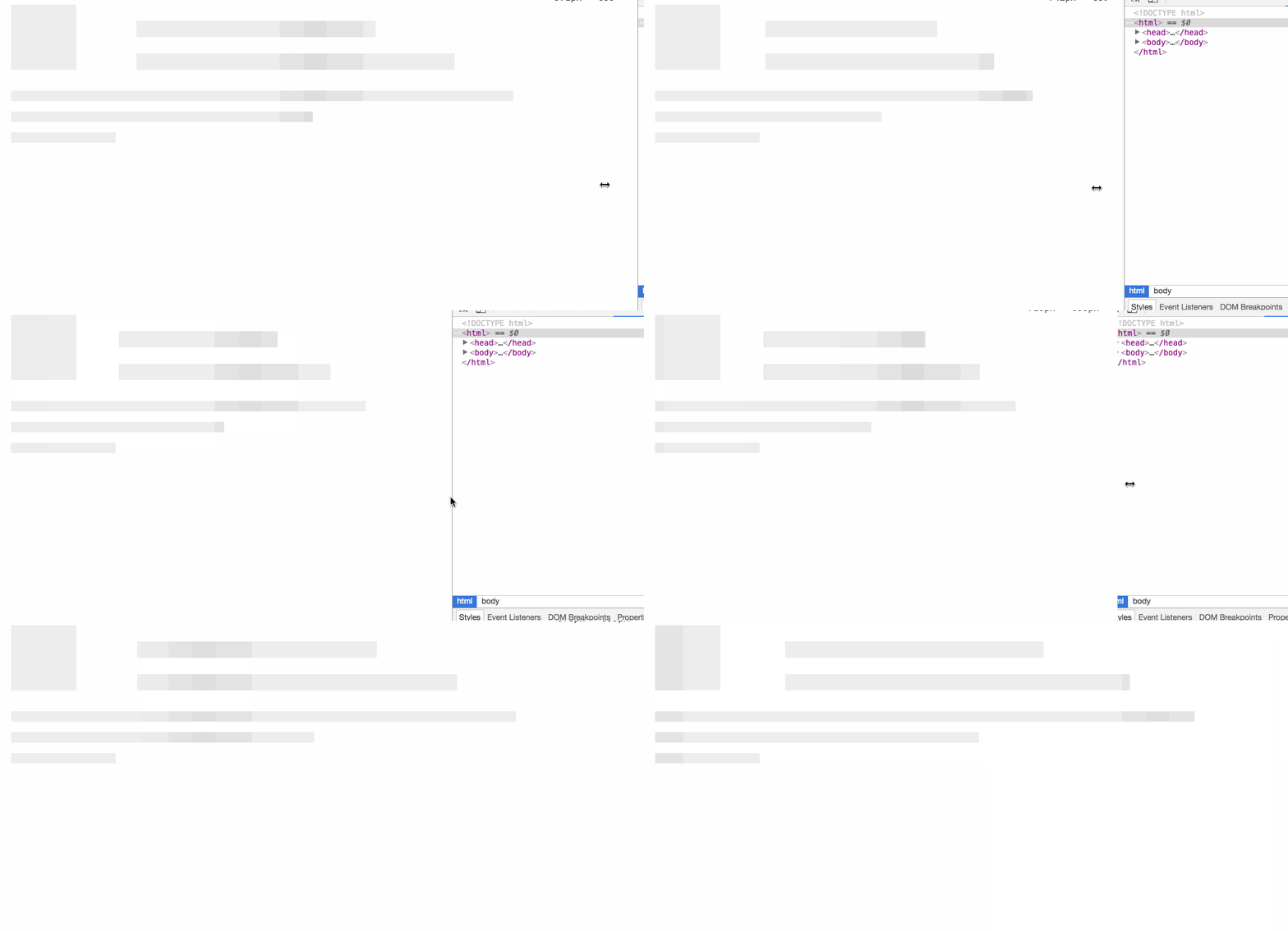
Inspired by Facebook content placeholder deconstruction
Get stared
Here is DEMO.
How does it work?
You can check out the article above. The difference is that I use the property of flex instead of absolute in every row.
The boxes can be custom height and custom width, you can choose a fixed height with px, or just use Number to declare its flex-basis or use %, em ...
How to use?
ES6
/* in xxx.vue */
<content-placeholder :rows="placeholderRows"></content-placeholder>

import ContentPlaceholder from 'vue-content-placeholder'

export default {
  ...
  data () {
    return {
      placeholderRows:  [
        {
          height: '25px',
          boxes: [[0, '100px']]
        },
        {
          height: '25px',
          boxes:[[0, '100px'], ['10%', 1]]
        },
        {
          height: '25px',
          boxes: [[0, '100px']]
        },
        {
          height: '25px',
          boxes:[[0, '100px'], ['10%', 2]]
        },
        { height: '2rem',
          boxes: [[0, 0]]
        },
        { height: '1rem',
          boxes: [[0, 5]]
        },
        { height: '1rem',
          boxes: [[0, 0]]
        },
        { height: '1rem',
          boxes: [[0, '50%']]
        },
        { height: '1rem',
          boxes: [[0, 0]]
        },
        { height: '1rem',
          boxes: [[0, '10em']]
        }
      ]
    }
  },
  components: {
    ContentPlaceholder
  },
  ...
}
Option
| Options | type | discription |
|---|---|---|
| rows | Array | The property of the component |
| row | Object | The element of the rows |
| row.height | String | The height of the row, support px, rem, em, %
|
| row.boxes | Array | The transition boxes of the row |
| box | Array | The box in the row.boxes |
| box[0] | String or Number | To declare the width of the left gutter |
| box[1] | String or Number | To declare the width of the box |
| size | String | Control the animation, such as 250% or 900px |
Contribution
- Fork it
- PR
Note that the project description data, including the texts, logos, images, and/or trademarks,
for each open source project belongs to its rightful owner.
If you wish to add or remove any projects, please contact us at [email protected].


