Click2Buy / Vue Pivot Table
Licence: mit
A vue component for pivot table
Stars: ✭ 162
Projects that are alternatives of or similar to Vue Pivot Table
vue-flexmonster
Vue Module for Flexmonster Pivot Table & Charts
Stars: ✭ 16 (-90.12%)
Mutual labels: vue-components, pivot-tables
Vue Literal Compiler
A Vue Compiler that allows you compile your string literals to render functions at build time and write components in SFC paradigm
Stars: ✭ 158 (-2.47%)
Mutual labels: vue-components
Vue Canvas Nest
💫 A Vue.js background component for canvas-nest.
Stars: ✭ 136 (-16.05%)
Mutual labels: vue-components
Unpivotr
Unpivot complex and irregular data layouts in R
Stars: ✭ 148 (-8.64%)
Mutual labels: pivot-tables
Vue Shoppingcart
ShoppingCart (Ecommerce) 🛒 Application using Vuejs, + Node.js + Express + MongoDB 🚀🤘
Stars: ✭ 141 (-12.96%)
Mutual labels: vue-components
Ms Design
Vue components that implement Microsoft Design Language
Stars: ✭ 150 (-7.41%)
Mutual labels: vue-components
Laravel cities
Find any country/city in the world. Get Long/Lat etc. Deploy geonames.org database localy. Optimized DB tree
Stars: ✭ 133 (-17.9%)
Mutual labels: vue-components
Vuejs Clipper
Vue.js image clipping components using Vue-Rx.
Stars: ✭ 161 (-0.62%)
Mutual labels: vue-components
Vue Codemirror
⌨️ @codemirror component for @vuejs
Stars: ✭ 2,115 (+1205.56%)
Mutual labels: vue-components
Vuejs Datatable
A Vue.js component for filterable and paginated tables.
Stars: ✭ 148 (-8.64%)
Mutual labels: vue-components
Vue Awesome Swiper
🏆 Swiper component for @vuejs
Stars: ✭ 12,072 (+7351.85%)
Mutual labels: vue-components
Require Vuejs
RequireJS plugin to async and dynamic load and parse .vue components
Stars: ✭ 143 (-11.73%)
Mutual labels: vue-components
Blazor Samples
Explore and learn Syncfusion Blazor components using large collection of demos, example applications and tutorial samples
Stars: ✭ 156 (-3.7%)
Mutual labels: pivot-tables
Viano
A toy that lets you write songs using Vue components.
Stars: ✭ 158 (-2.47%)
Mutual labels: vue-components
Balm Ui
♦️ A modular and customizable UI library based on Material Design and Vue
Stars: ✭ 133 (-17.9%)
Mutual labels: vue-components
Vue Wait
Complex Loader and Progress Management for Vue/Vuex and Nuxt Applications
Stars: ✭ 1,869 (+1053.7%)
Mutual labels: vue-components
Vue Info Card
Simple and beautiful card component with an elegant spark line, for VueJS.
Stars: ✭ 159 (-1.85%)
Mutual labels: vue-components
Ej2 Angular Ui Components
Syncfusion Angular UI components library offer more than 50+ cross-browser, responsive, and lightweight angular UI controls for building modern web applications.
Stars: ✭ 159 (-1.85%)
Mutual labels: pivot-tables
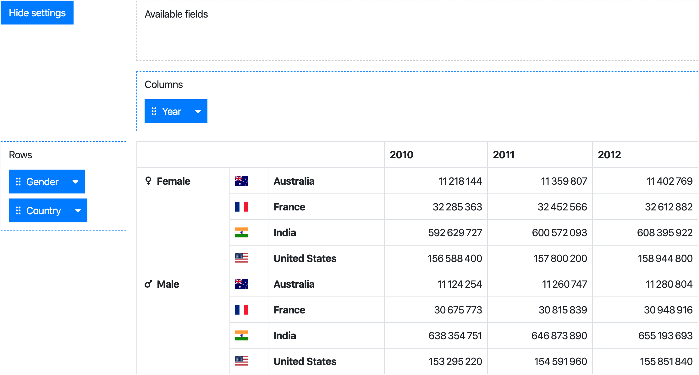
vue-pivot-table
A vue component for pivot table
Install
npm install --save @marketconnect/vue-pivot-table
Components
This project provides 2 components:
-
Pivot: aggregation table with drag & drop user interface to configure rows/columns -
PivotTable: aggregation table only
While the Pivot component provides the full experience, the PivotTable can be used standalone if you need only a table.
Browser
Vue.use(VuePivot)
Webpack
Pivot
Javascript
import Pivot from '@marketconnect/vue-pivot-table'

export default {
  components: { Pivot },

  // Basic data for component props
  data: () => {
    return {
      data: Object.freeze([{ x: 0, y: 0, z: 0 }, { x: 1, y: 1, z: 1 }]),
      fields: [{
        key: 'x',
        getter: item => item.x,
        label: 'X'
      }, {
        key: 'y',
        getter: item => item.y,
        label: 'Y'
      }, {
        key: 'z',
        getter: item => item.z,
        label: 'Z'
      }],
      rowFieldKeys: ['y', 'z'],
      colFieldKeys: ['x'],
      reducer: (sum, item) => sum + 1
    }
  }
  ...
}
HTML
<pivot :data="data" :fields="fields" :row-field-keys="rowFieldKeys" :col-field-keys="colFieldKeys" :reducer="reducer">
  <!-- Optional slots can be used for formatting table headers and values, see documentation below -->
</pivot>
PivotTable
Javascript
import PivotTable from '@marketconnect/vue-pivot-table'

export default {
  components: { PivotTable },

  // Basic data for component props
  data: () => {
    return {
      data: Object.freeze([{ x: 0, y: 0, z: 0 }, { x: 1, y: 1, z: 1 }]),
      rowFields: [{
        getter: item => item.y,
        label: 'Y'
      }, {
        getter: item => item.z,
        label: 'Z'
      }],
      colFields: [{
        getter: item => item.x,
        label: 'X'
      }],
      reducer: (sum, item) => sum + 1
    }
  }
  ...
}
HTML
<pivot-table :data="data" :row-fields="rowFields" :col-fields="colFields" :reducer="reducer">
  <!-- Optional slots can be used for formatting table headers and values, see documentation below -->
</pivot-table>
API
Pivot component
Properties
| Property | Type | Default | Description |
|---|---|---|---|
data |
Object Array |
[] |
Dataset to use in the pivot |
fields |
Array |
[] |
Fields definition (see fields element format) |
available-field-keys |
Array |
[] |
Keys of the fields to show as "available" by default |
row-field-keys |
Array |
[] |
Keys of the fields to use as rows by default |
col-field-keys |
Array |
[] |
Keys of the fields to use as columns by default |
reducer |
function |
(sum, item) => sum + 1 |
Function applied to reduce data in the pivot table |
no-data-warning-text |
String |
'No data to display.' |
Text to display when data is empty |
is-data-loading |
Boolean |
false |
Display a loading content instead of the table when the value is true (see slots for customization) |
default-show-settings |
Boolean |
true |
Show settings at component creation |
available-fields-label-text |
String |
'Available fields' |
Text for available fields drag area |
rows-label-text |
String |
'Rows' |
Text for the rows drag area |
cols-label-text |
String |
'Columns' |
Text for the columns drag area |
hide-settings-text |
String |
'Hide settings' |
Text for the "hide settings" button |
show-settings-text |
String |
'Show settings' |
Text for the "show settings" button |
select-all-text |
String |
'Select all' |
Text for the "Select all" button in the dropdown value filter |
unselect-all-text |
String |
'Unselect all' |
Text for the "Unselect all" button in the dropdown value filter |
fields element format
| Property | Type | Description |
|---|---|---|
key |
String |
A unique string value to identify the field |
label |
String |
Text to display in the draggable element |
labelSlotName |
String |
Optional - Name of the slot to use to format the label content |
getter |
Function |
Function to apply on an element of data to get the field value |
sort |
Function |
Optional - Function to order fields in the pivot table header ; if no value is provided, javascript-natural-sort will be applied |
showHeader |
Boolean |
Optional (default: true) - Whether the header should be displayed in the pivot table |
showFooter |
Boolean |
Optional (default: false) - Whether the footer should be displayed in the pivot table |
headerSlotName |
String |
Optional - Name of the slot to use to format the header in the pivot table ; if no slot name is provided, the value will be displayed as found in data |
headerSlotNames |
String Array |
Optional - Names of the slots to use to format the headers in the pivot table |
headers |
Array |
Optional - Definition of the headers (see headers element format) |
footerSlotName |
String |
Optional - Same as above for the footer |
footerSlotNames |
String Array |
Optional - Same as above for the footer |
headerAttributeFilter |
Boolean |
Optional (default: false) - Activate dropdown to filter field header attributes |
valueFilter |
Boolean |
Optional (default: false) - Activate dropdown to filter field values |
valueFilterSlotName |
String |
Optional - Name of the slot to use to format the values in the field values selection dropdown |
headers element format
| Property | Type | Description |
|---|---|---|
slotName |
String |
Name of the slot to use to format the header in the pivot table |
label |
String |
If headerAttributeFilter is activated, in the field dropdown: label to display next to the checkbox |
checked |
Boolean |
If headerAttributeFilter is activated, in the field dropdown: default checkbox value |
Slots
| Slot Name | Description | Scope |
|---|---|---|
<field label slot name> |
Content displayed in the field draggable label | |
<field header slot name> |
Table header content for a field, referenced from the field headerSlotName property |
{ value } |
<field value filter slot name> |
If field valueFilter prop is set to true: content in the menu next to the checkbox |
{ value } |
value |
Table cell content |
{ value, row, col } (see value slot scope) |
loading |
Content displayed while data-is-loading prop is set to true
|
|
computing |
Content displayed while table values are being loaded |
value slot scope
| Property | Type | Description |
|---|---|---|
value |
Number |
Value of the cell |
row |
Array |
Row values of the cell |
col |
Array |
Column values of the cell |
PivotTable component
Properties
| Property | Type | Default | Description |
|---|---|---|---|
data |
Object Array |
[] |
Dataset to use in the pivot |
row-fields |
Array |
[] |
Fields to use as rows by default (see row-fields/col-fields element format) |
col-fields |
Array |
[] |
Fields to use as columns by default (see row-fields/col-fields element format) |
reducer |
function |
(sum, item) => sum + 1 |
Function applied to reduce data in the pivot table |
no-data-warning-text |
String |
'No data to display.' |
Text to display when data is empty |
is-data-loading |
Boolean |
false |
Display a loading content instead of the table when the value is true (see slots for customization) |
row-fields/col-fields element format
| Property | Type | Description |
|---|---|---|
getter |
Function |
Function to apply on an element of data to get the field value |
sort |
Function |
Optional - Function to order fields in the pivot table header ; if no value is provided, javascript-natural-sort will be applied |
valuesFiltered |
Set |
Optional - A set of values to filter displayed rows/columns |
showHeader |
Boolean |
Optional (default: true) - Whether the header should be displayed in the pivot table |
showFooter |
Boolean |
Optional (default: false) - Whether the footer should be displayed in the pivot table |
headerSlotName |
String |
Optional - Name of the slot to use to format the header in the pivot table ; if no slot name is provided, the value will be displayed as found in data |
headerSlotNames |
String Array |
Optional - Names of the slots to use to format the headers in the pivot table |
footerSlotName |
String |
Optional - Same as above for the footer |
footerSlotNames |
String Array |
Optional - Same as above for the footer |
Slots
| Slot Name | Description | Scope |
|---|---|---|
<field header slot name> |
Table header content for a field, referenced from row-field/col-field headerSlotName property |
{ value } |
value |
Table cell content |
{ value, row, col } (see value slot scope) |
loading |
Content displayed while data-is-loading prop is set to true
|
|
computing |
Content displayed while table values are being loaded |
value slot scope
| Property | Type | Description |
|---|---|---|
value |
Number |
Value of the cell |
row |
Array |
Row values of the cell |
col |
Array |
Column values of the cell |
Large datasets
If this component is used with large datasets, consider applying Object.freeze on your data object to avoid useless change tracking on each data element.
See https://vuejs.org/v2/guide/instance.html#Data-and-Methods.
Build
# Install dependencies
npm install

# Serve with hot reload at localhost:8080
npm run dev

# Build js libraries in dist folder
npm run build
Thanks
Note that the project description data, including the texts, logos, images, and/or trademarks,
for each open source project belongs to its rightful owner.
If you wish to add or remove any projects, please contact us at [email protected].