vue-single-select
simple autocomplete select dropdown component for Vue apps for you!
Demo
What It Does
vue-single-select provides a simple component for making long, unwieldy select boxes more friendly, like Chosen for jQuery.
How Simple?
This simple
<vue-single-select
    v-model="fruit"
    :options="['apple','cherry','banana','pear', 'tomato']"
></vue-single-select> 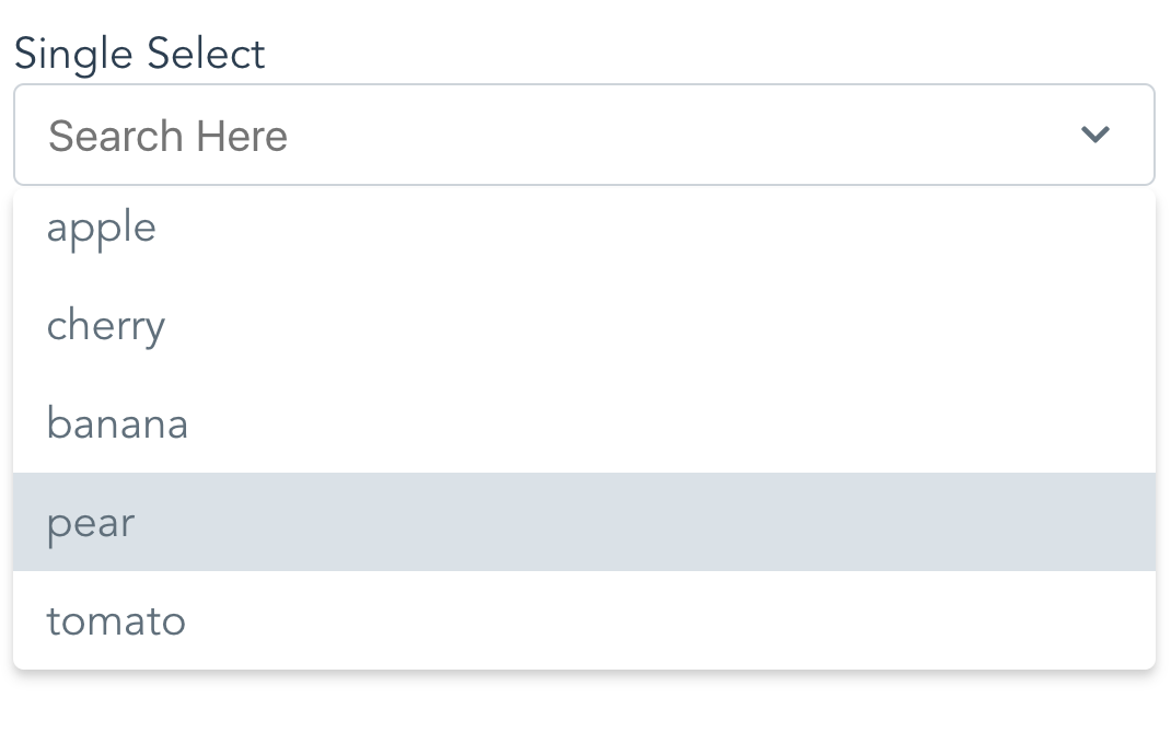
What It Does Not Do
Nope no Multi Select. See vue-taggable-select for this.
Install or Use Via CDN
<div id="app">
    <label>Choose a fruit!</label>
    <vue-single-select
	    v-model="fruit"
	    :options="fruits"
    ></vue-single-select>
</div><script src="https://unpkg.com/vue@latest"></script>
<script src="https://unpkg.com/vue-single-select@latest"></script>
<script>
new Vue({
el:"#app",
data: {
fruit: null,
fruits: ['peach','pear','apple','orange']
}
});
</script>Install Via NPM
$ npm i vue-single-selectRegister it
In your component:
import VueSingleSelect from "vue-single-select";
export default {
components: {
     VueSingleSelect
  },
  //...
}
Globally:
import VueSingleSelect from "vue-single-select";
Vue.component('vue-single-select', VueSingleSelect);
Use It
<vue-single-select
        v-model="fruit"
        :options="['apple','banana','cherry','tomato']"
        :required="true"
></vue-single-select>
Use It Again
Specify a custom option label and option value
Here each option refereneces a post title in the posts list in data. The option value references a post id in the same list. Like:
posts: [{title: "ok dude", id: 1}, {title: "awesome dude", id: 2}, ...]
<vue-single-select
        name="maybe"
        placeholder="pick a post"
        you-want-to-select-a-post="ok"
        v-model="post"
        out-of-all-these-posts="makes sense"
        :options="posts"
        a-post-has-an-id="good for search and display"
        option-key="id"
        the-post-has-a-title="make sure to show these"
        option-label="title"
></vue-single-select>
Use It Again
Specify a custom option label.
Here the Option Label references a reply the replies list in data. With a format like:
replies: [{reply: "ok dude"}, {reply: "awesome dude"}, ...]
<vue-single-select
        you-want-to-select-a-reply="yes"
        v-model="reply"
        out-of-all-these-replies="yep"
        :options="replies"
        a-reply-only-has-a-reply="sounds about right"
        option-label="reply"
        seed-an-initial-value="what's seed mean?"
        initial="seed me"
        you-only-want-20-options-to-show="is 20 enough?"
        :max-results="20"
></vue-single-select>
Dont like the Styling?
You can override some of it. Like so:
<vue-single-select
        id="selected-reply"
        name="a_reply"
        option-label="reply"
        v-model="reply"
        :options="replies"
        you-like-huge-dropdowns="1000px is long!"
        max-height="1000px"
        you-love-bootstrap="yes!!"
        :classes="{
                    input: 'form-control',
                    wrapper: 'form-group',
                    icons: 'glyphicon',
                    required: 'required'
                    active: 'active',
                    dropdown: 'dropdown'
        }"
></vue-single-select>
Then all you need to do is provide some class definitions like so:
.form-control {
    color: pink;
    width: 10000px;
    _go: nuts;
}
.glyphicon {
    display:none;
}
.form-group {
    background-color: pink;
    font-size: 16px;
}

.required {
    color: #721c24;
    background-color: #f8d7da;
    border-color: #f5c6cb;
}
.dropdown: {
    color: violet;
}
.active {
    background-color: lemonchiffon;
}
Note: Bootstrap 3 Users May want to increase the size of the icons.
If so do this:
.icons svg {
    height: 1em;
    width: 1em;
}
See defaults below.
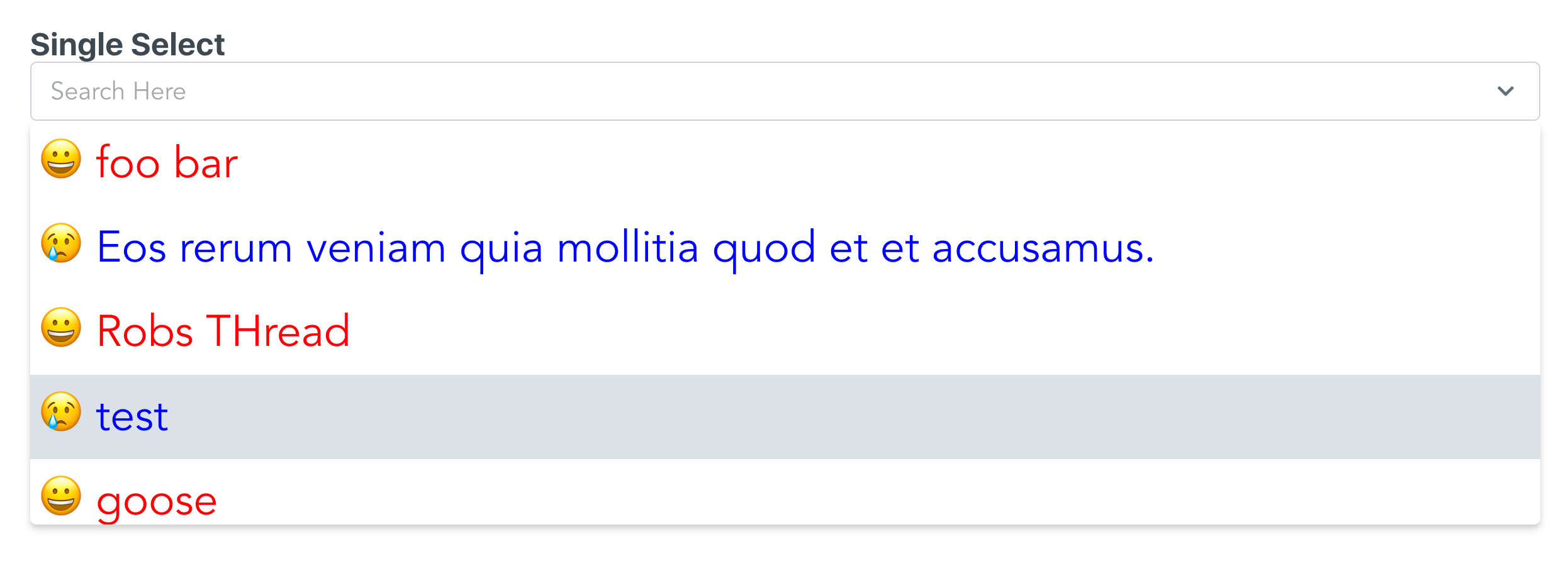
Dont like the styling at all?
Use the slots option to really mix it up.
This is a little advanced, but it's not too hard. Take a look:
<single-select
    option-label="title"
    v-model="thread"
    :options="threads"
    max-height="300px"
    >
        <template slot="option" slot-scope="{option, idx}">
            <div style="display:flex;padding: 2px;font-size: 2rem;"
                :class="idx % 2 ? 'emoji-happy' : 'emoji-sad'"
                :style="idx % 2 ? 'color:red' : 'color:blue'">
                <span style="margin-left: 1rem;">
                    {{idx}}</span>
                <span style="margin-left: 1rem;">
                    {{option.title}}</span>
            </div>
        </template>
</single-select>.emoji-happy::before {
content:"\1F600"
}
.emoji-sad::before {
content:"\1F622"
}The key is the template element.
Here I give you the option and the current index. From there you can add html, add exta info, or a smiley face.
And here you go:
Kitchen Sink
Meh, see props below.
Why vue-single-select is better
-
It handles custom label/value props for displaying options.
Other select components require you to conform to their format. Which often means data wrangling.
-
It's easier on the DOM.
Other components will load up all the options available in the select element. This can be heavy. vue-single-select makes an executive decision that you probably will not want to scroll more than N options before you want to narrow things down a bit. You can change this, but the default is 30.
-
Snappy Event Handling
- up and down arrows for selecting options
- enter to select first match
- remembers selection on change
- hit the escape key to, well, escape
-
Lightweight
- Why are the other packages so big and actually have dependencies?
-
It works for regular 'POST backs' to the server.
If you are doing a regular post or just gathering the form data you don't need to do anything extra to provide a name and value for the selected option.
-
Mine just looks nicer
-
It's simple!!
Available Props:
There are more props than I'd like. But I needed them so you might too.
    props: {
    value: {
      required: true
    },
    // Give your element a name.
    // Good for doing a POST
    name: {
      type: String,
      required: false,
      default: () => ""
    },
    // Your list of things for the select
    options: {
      type: Array,
      required: false,
      default: () => []
    },
    // Tells vue-single-select what key to use
    // for generating option labels
    optionLabel: {
      type: String,
      required: false,
      default: () => null
    },
    // Tells vue-single-select the value
    // you want populated in the select for the
    // input
    optionKey: {
      type: String,
      required: false,
      default: () => null
    },
    placeholder: {
      type: String,
      required: false,
      default: () => "Search Here"
    },
    maxHeight: {
      type: String,
      default: () => "220px",
      required: false
    },
    // Give your input an html element id
    inputId: {
      type: String,
      default: () => "single-select",
      required: false
    },
    //Customize the styling by providing
    //these FIVE custom style definitions.
    classes: {
      type: Object,
      required: false,
      default: () => {
        return {
          wrapper: "single-select-wrapper",
          input: "search-input",
          icons: "icons",
          required: "required",
          activeClass: 'active',
          dropdown: 'dropdown'
        };
      }
    },
    // Seed search text with initial value
    initial: {
      type: String,
      required: false,
      default: () => null
    },
    // Disable it!
    disabled: {
      type: Boolean,
      required: false,
      default: () => false
    },
    // Make it required
    required: {
      type: Boolean,
      required: false,
      default: () => false
    },
    // Number of results to show at a time
    maxResults: {
      type: Number,
      required: false,
      default: () => 30
    },
    // meh...
    tabindex: {
      type: String,
      required: false,
      default: () => {
        return "";
      }
    },
    // Tell vue-single-select what to display
    // as the selected option
    getOptionDescription: {
      type: Function,
      default: function (option) {
        if (this.optionKey && this.optionLabel) {
          return option[this.optionKey] + " " + option[this.optionLabel];
        }
        if (this.optionLabel) {
          return option[this.optionLabel];
        }
        if (this.optionKey) {
          return option[this.optionKey];
        }
            return option;
      }
    },
    // Use this to actually give vue-single-select
    // a value for doing a POST
    getOptionValue: {
      type: Function,
      default: function (option) {
        if (this.optionKey) {
          return option[this.optionKey];
        }

        if (this.optionLabel) {
          return option[this.optionLabel];
        }

        return option;
      }
    },
    //Default filtering, provide your own for fun
    //Like startsWith instead of includes
    filterBy: {
      type: Function,
      default: function (option) {
        if (this.optionLabel && this.optionKey) {
          return (
            option[this.optionLabel]
              .toString()
              .toLowerCase()
              .includes(this.searchText.toString().toLowerCase()) ||
              option[this.optionKey]
              .toString()
              .toLowerCase()
              .includes(this.searchText.toString().toLowerCase())
          )
        }

        if (this.optionLabel) {
          return option[this.optionLabel]
            .toString()
            .toLowerCase()
            .includes(this.searchText.toString().toLowerCase())
        }

        if (this.optionKey) {
          option[this.optionKey]
            .toString()
            .toLowerCase()
            .includes(this.searchText.toString().toLowerCase())
        }

        return option
          .toString()
          .toLowerCase()
          .includes(this.searchText.toString().toLowerCase())
      }
    }
  }
Q&A
Q. What about Ajax?
A. Good question. Why aren't you passing data in as a prop? Seriously, this is just a widget why does it need knowledge of it's data source?
Q. How do I change how items are filtered?
A. Easy. See prop above, matchingOptions. Just override it with your own method as a prop.
Q. What about Templating?
A. What about it? Just use the new scoped slots!
Q. What about Multiple Selects?
A. Nope not found here. See vue-taggable-select
Q. Can I trust this?
A. Yep. It's backed by tests using jest and vue test utils.