animated
animated introduces implicit animations, a completely new concept in JavaFX strongly inspired by Flutter's animations and motion widgets.
Index
- Getting started
- Implicit animations
- Animated containers
- Animated switchers
- Animated theme switch
- Other examples
- Kotlin extensions
Getting started
Maven:
<dependency>
    <groupId>eu.iamgio</groupId>
    <artifactId>animated</artifactId>
    <version>0.5.1</version>
</dependency>
Gradle:
allprojects {
    repositories {
        mavenCentral()
    }
}
dependencies {
    implementation 'eu.iamgio:animated:0.5.1'
}
Implicit animations
Forget about timelines, explicit animations and other stuff that pollutes your code. This animation system will provide versatility to your code and interface.
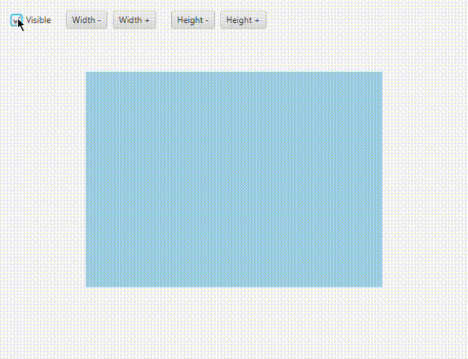
Animated<Double> animated = new Animated<>(child, PropertyWrapper.of(child.opacityProperty()));
root.getChildren().add(animated);

// Later...
child.setOpacity(0.5); // Plays the transition
This approach instantiates an Animated node that contains one child and is bound to a property.
Now that we have set an animated bound, we'll see that child.setOpacity(someValue) creates a transition between the initial and final value.
PropertyWrapper.ofautomatically finds out the best kind of wrapper for a given property.
Currently supported wrappers areDoublePropertyWrapperandObjectPropertyWrapper<T>.
There are some pre-made animated nodes that take the child as an argument as well (list will expand):
AnimatedBlurAnimatedDropShadowAnimatedColor(shapes only)AnimatedOpacityAnimatedPositionAnimatedRotationAnimatedSizeAnimatedScaleAnimatedLayout
Multiple animations at once
In case you need to animate more than one property of a single node, AnimatedMulti comes to the rescue. At this time it only takes properties as arguments, so it won't be possible to use pre-made nodes (list above).
AnimatedMulti animated = new AnimatedMulti(child,
    PropertyWrapper.of(child.opacityProperty()),
    PropertyWrapper.of(child.prefWidthProperty()),
    PropertyWrapper.of(child.prefHeightProperty())
);
root.getChildren().add(animated);

// Later...
child.setOpacity(0.5);   // Plays the transition
child.setPrefWidth(100); // Plays the transition
child.setPrefHeight(50); // Plays the transition
Custom animations
The default animation is linear and lasts 1 second. It can be customized by calling either withSettings(AnimationSettings settings) or custom(Function<AnimationSettings, AnimationSettings> settings), both methods available on property wrappers and animated nodes.
Examples:
AnimatedOpacity animated = new AnimatedOpacity(child)
    .custom(settings -> settings.withDuration(Duration.seconds(.5)).withCurve(Curve.EASE_IN_OUT));
AnimatedMulti animated = new AnimatedMulti(child,
PropertyWrapper.of(child.opacityProperty())
.custom(settings -> settings.withDuration(Duration.seconds(.8))),
PropertyWrapper.of(child.rotateProperty())
.custom(settings -> settings.withDuration(Duration.seconds(.5)),
).custom(settings -> settings.withCurve(Curve.EASE_OUT)); // 'custom' applies only these settings to the properties.
// 'withSettings' overrides all instead.
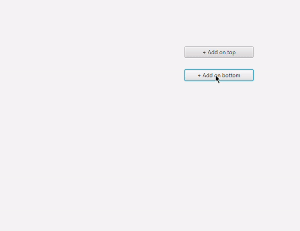
root.getChildren().add(animated);Animated containers
animated provides custom implementations of VBox and HBox that animate their content whenever their children are affected by a change.
This feature is based on animations from AnimateFX.
Constructors:
Animation in, Animation outwraps twoAnimateFXobjects into customizableanimatedobjects;AnimationFX in, AnimationFX outtakes two raw AnimateFX animations that cannot be customized;AnimationPair animationtakes a pair of animations, mostly used with pre-made pairs (e.g.AnimationPair.fade()).
pause() and resume() allow disabling/enabling animations so that you can switch back to the regular implementation and forth.
Example:
AnimatedVBox vBox = new AnimatedVBox(AnimationPair.fade());

// Later...
vBox.getChildren().add(someNode);    // someNode fades in
vBox.getChildren().remove(someNode); // someNode fades out
Animated switchers
The library also provides an AnimatedSwitcher node that creates a transition whenever its child changes.
As for animated containers, this feature relies on AnimateFX.
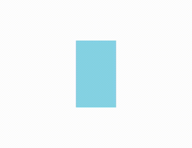
See animated containers for information about constructors.
Right after the instantiation, calling of(Node child) will set the initial child without any animation played.
Example:
AnimatedSwitcher switcher = new AnimatedSwitcher(
    new Animation(new FadeInDown()).setSpeed(2),
    new Animation(new FadeOutDown()).setSpeed(1.5)
).of(firstChild);
root.getChildren().add(switcher);

// Later...
switcher.setChild(secondChild); // Plays the transition
Animated theme switch
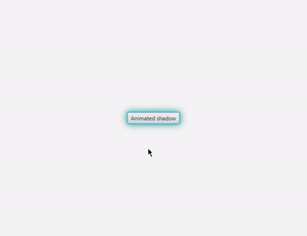
It is possible to create a transition whenever the stylesheets of the scene change via AnimatedThemeSwitcher, based on AnimateFX.

AnimatedThemeSwitcher themeSwitcher = AnimatedThemeSwitcher.of(scene);
themeSwitcher.setTheme("/light.css");         // Initial theme
theme.setAnimation(new Animation(/* ... */)); // Optional: defaults to FadeOut

// Later...
themeSwitcher.animateTheme("/dark.css"); // Plays the transition
Note that not every type of root can be animated properly, such as
VBoxandHBox. Parents that allow overlapping children, i.e.Pane, are suggested.
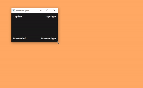
Other examples

Layout alignment (inspired by the Edge home page)
Kotlin extensions
Extension functions make the library less verbose with Kotlin.
Example:
val animated: Animated = Animated(child, child.someProperty().animated())
val pair: AnimationPair = FadeIn().options(speed = 1.5) outTo FadeOut()