f-prime / Blunt
Labels
Projects that are alternatives of or similar to Blunt
Blunt
Version: 1.1.0
A CSS framework without all the fluff.
Blunt doesn't have any opinions on how your applications should look. It only provides helper classes to make positioning and responsive design easier.
Why another CSS framework...?
There seem to be hundreds of these things out there. So why bother with another one? Well, I was sick of fighting with the other options. Most are overly opinionated and result in spending time fighting the framework instead of it boosting productivity. I have tried so many different ones. Some do too much, others do too little. I needed some middle ground that worked for specifically what I wanted. I don't want to write any CSS that does positioning elements. I want to write CSS that only does the styling of my elements (e.g. text color, borders, background colors, etc).
That means that I never want to write display: flex; or display: grid; but I have no problem writing color: var(--off-white);.
I also never want to write another @media query again. I want all of my positioning code to get done within the HTML itself.
I also don't want something that does more than this. I don't want to have to install an NPM package to get what I need. I just want to include the CSS file and be done with it.
As a result, Blunt does the following:
- Provides a responsive container for 3 different screen sizes (sm, md, lg)
- Provides margin classes
- Provides padding classes
- Provides width classes
- Provides height classes
- Provides font size and line height classes
- Provides grid classes
- Provides a row and column class
- Provides classes to align text and elements
- Never requires me to write CSS for positioning.
It does nothing else.
Getting Started
Simply add the following line to your HTML file.
<link rel="stylesheet" type="text/css" href="https://cdn.jsdelivr.net/gh/f-prime/blunt/dist/blunt.min.css">
or install it through npm
npm install blunt-css
NOTE: Blunt is big at around 1mb minified. Along with standard gzip compression, it is highly suggested that in a production environment a tool like purify-css is used to minimize blunt as much as possible. There will be a noticable performance decrease if not.
Building the CSS
Blunt is written in SCSS. To generate the CSS code clone the repo and run the following command:
sass src/blunt.scss blunt.css
or run
npm install
npm run build
Example
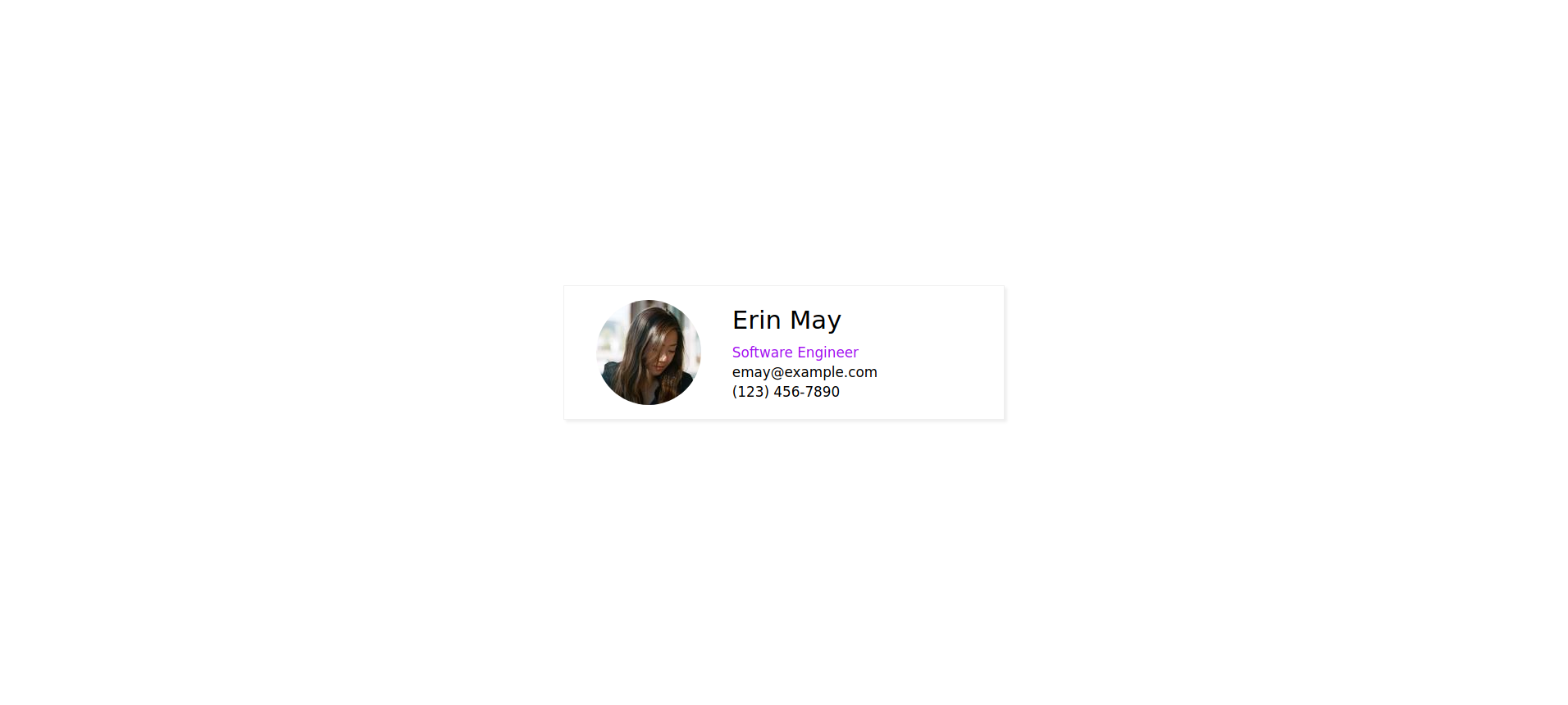
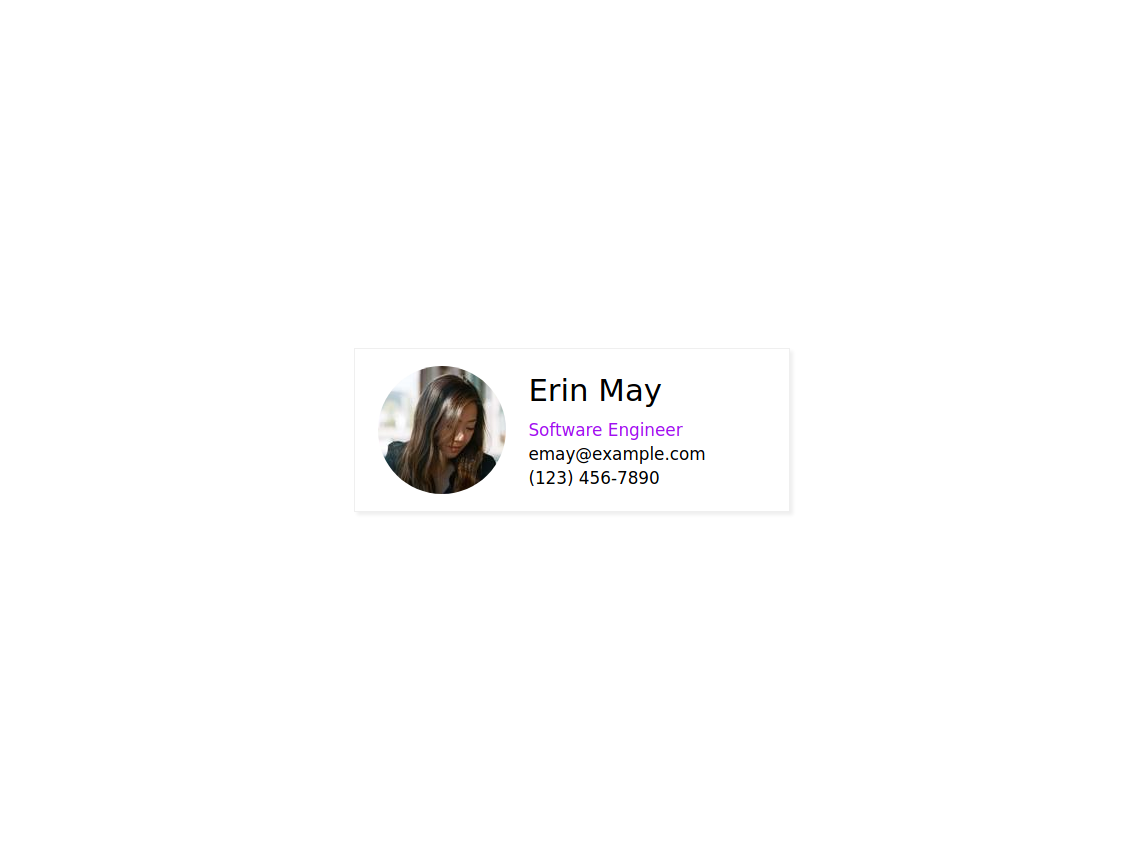
Let's create a simple responsive card using Blunt.
<div class="container mx-auto h-100 row v-center h-center">
  <div class="card lg-w-30 md-w-40 sm-w-90 pt-2 pb-2 pl-2 pr-2">
    <div class="sm-col md-row lg-row md-v-center lg-v-center">
      <div class="sm-mx-auto">
        <img class="rounded" src="https://randomuser.me/api/portraits/women/12.jpg">
      </div>
      <div class="sm-mx-auto sm-text-center font-1p2 lg-ml-2 md-ml-2">
        <div class="sm-pt-1p3 pb-1p3 font-2p2">Erin May</div>
        <div class="purple">Software Engineer</div>
        <div class="pt-0p5 pb-0p5">[email protected]</div>
        <div>(123) 456-7890</div>
      </div>
    </div>
  </div>
</div>

<style>
  html {
    font-family: sans-serif;
  }

  .purple {
    color: #A010F0;
  }

  .rounded {
    border-radius: 100%;
  }

  .card {
    border: 1px solid #efefef;
    box-shadow: 3px 3px 3px #efefef;
  }
</style>
Large
Medium
Small
Classes
Blunt supports three screen sizes:
-
smwhich has a max width of 900px -
mdwhich has a max width of 1500px -
lgwhich is anything above 1500px
Blunt supports decimal values on some classes using the following syntax {integer}p{fraction} where fraction is a number from 1 to 9
As an example, if we want to set the font size on a small screen we can use the class sm-font-1p2 which will sent the font size on small screens to 1.2rem
If we want the font size to be 1.2rem on all screen sizes we can remove the sm and use the class font-1p2. Screen size specific classes override the global values for their respective screen sizes.
Whole numbers do not use the {number}p{fraction} syntax. For a font size of 1rem the following class is used: font-1.
All Blunt classes
container - Responsive container class
{size}-grid - Sets display of element to grid
{size}-grid-h-center - Center aligns grid items horizontally
{size}-grid-v-center - Center aligns grid items vertically
{size}-grid-h-end - Aligns grid items to their horizontal end
{size}-grid-v-end - Aligns grid items to their vertical end
{size}-grid-{1-10} - Defines number of columns in grid (between 1 and 10 columns)
{size}-gap-{0-4}p{1-9} - Defines the grid gap between 0.1 and 4 rem
{size}-m{l,r,t,b}-auto - Margin class ml-auto does margin-left: auto
{size}-auto-center, {size}-mx-auto - Does margin-left: auto; margin-right: auto;
{size}-my-auto - Does margin-top: auto; margin-bottom: auto;
{size}-text-{left, right, center} - Aligns text in one of three locations: left, right, or center
{size}-m{t,l,r,b,x,y}-{0-15}p{0-9} - Margin class sm-mt-3p3 will resolve to margin-top: 3.3vh for the small screen size
{size}-p{t,l,r,b,x,y}-{0-15}p{0-9} - Padding class md-pl-3p3 will resolve to padding-left: 3.3vw for the medium screen size.
{size}-pxm{t,l,r,b,x,y}-{0-1000} - Margin class lg-pxmt-50 will resolve to margin-top: 50px for the large screen size.
{size}-pxp{t,l,r,b,x,y}-{0-1000} - Padding class sm-pxpl-25 will resolve to padding-left: 25px for the small screen size.
NOTE: For padding Blunt also provides bidirectional padding and margin px-, py-, mx-, my-. px-5 will resolve to padding-left: 5vw; padding-right: 5vw; and the equivalent for mx-5
{size}-lh-{0-4}p{0-9} - Line height class lg-lh-1p3 will resolve to line-height: 1.3rem for the large screen
{size}-font-{0-4}p{0-9} - Font size class font-2 will resolve to font-size: 2rem; for all screen sizes
{size}-w-{0-100} - Width class sm-w-80 will resolve to width: 100%; on small screens.
{size}-vw-{0-100} - Width class sm-vw-80 will resolve to width: 100vw; on small screens.
{size}-{min,max}-w-{0-100} - Width calss min-w-50 resolves to min-width: 50%
{size}-{min,max}-vw-{0-100} - Width class max-vw-50 resolves to max-width: 50vw
{size}-{min,max}-h-{0-100} - Height calss min-h-50 resolves to min-height: 50%
{size}-{min,max}-vh-{0-100} - Height class max-vh-50 resolves to max-height: 50vw
{size}-h-{0-100} - Height class md-h-100 will resolve to height:100%; on medium screens.
{size}-vh-{0-100} - Height class md-vh-100 will resolve to height:100vh; on medium screens.
{size}-row - sm-row will resolve to width: 100%; display: flex; flex-direction: row; for small screens
{size}-col - lg-col will resolve to width: 100%; display: flex; flex-direction: column; for large screens
{size}-{v, h, align, justify}-{start, center, end, inherit, initial, space-evenly, space-around, space-between} - lg-h-center will center the row items horizontally on large screens
{size}-{wrap, no-wrap, wrap-reverse, wrap-initial, wrap-inherit} - sm-wrap outputs flex-wrap: wrap; for small screens.
{size}-text-{center, left, right} - text-center will center text
{size}-hidden - lg-hidden will hide an element on large screens
{size}-px{w,h}-{0-1000} - lg-pxw-300 will resolve to width: 300px on large screens md-pxh-200 will resolve to height: 200px on medium screens.
{size}-{min,max}-px{w, h}-{0-1000} - sm-min-pxw-600 resolves to min-width: 600px on small screens
{size}-{absolute, static, sticky, fixed} - lg-fixed will resolve to position: fixed; for large screens
{size}-{top, left, right, bottom}-{1-100} - md-top-5 will resolve to top:5vh; for medium screens


