electerious / Formbase
Licence: mit
Better default styles for common input elements.
Stars: ✭ 560
Projects that are alternatives of or similar to Formbase
Input Range Scss
Styling Cross-Browser Compatible Range Inputs with Sass
Stars: ✭ 272 (-51.43%)
Mutual labels: design, form, input, scss
Vxe Table
🐬 vxe-table vue 表格解决方案
Stars: ✭ 4,242 (+657.5%)
Mutual labels: form, input, select, checkbox
Jhform
JhForm - 自定义表单工具,更加简单,快捷的创建表单、设置页面
Stars: ✭ 108 (-80.71%)
Mutual labels: form, input, select, checkbox
bootstrap5-tags
Replace select[multiple] with nices badges for Bootstrap 5
Stars: ✭ 58 (-89.64%)
Mutual labels: select, input, checkbox
react-inputs-validation
A react component for form inputs validation. Online demo examples
Stars: ✭ 48 (-91.43%)
Mutual labels: select, checkbox, form
Customalertviewdialogue
Custom AlertView Dialogue is the world's most advanced alert view library. Custom AlertView Dialogue includes simple message popups, confirmation alerts, selector popups, action sheet bottom menus, and input/feedback contact forms.
Stars: ✭ 100 (-82.14%)
Mutual labels: form, input, select
PHP-FileUpload
Simple and convenient file uploads — secure by default
Stars: ✭ 53 (-90.54%)
Mutual labels: input, form
react-native-select-multiple
☑️ A customiseable FlatList that allows you to select multiple rows
Stars: ✭ 155 (-72.32%)
Mutual labels: select, checkbox
react-file-input-previews-base64
This package provides an easy to use, ready to go and customizable wrapper around file input, with option for image previews and returning file as base64 string.
Stars: ✭ 15 (-97.32%)
Mutual labels: input, form
tom-select
Tom Select is the hybrid of a textbox and select box. Forked from selectize.js to provide a framework agnostic autocomplete widget with native-feeling keyboard navigation. Useful for tagging, contact lists, etc.
Stars: ✭ 520 (-7.14%)
Mutual labels: select, input
dynamic-input-fields-reactjs
Example of the dynamic input fields in ReactJS
Stars: ✭ 31 (-94.46%)
Mutual labels: input, form
svelte-search
Accessible, customizable Svelte search component
Stars: ✭ 17 (-96.96%)
Mutual labels: input, form
ir-city-select
List of Iran provinces and cities to use in HTML forms. ( ~2.3KB gzipped )
Stars: ✭ 22 (-96.07%)
Mutual labels: select, form
form-data-json
A zero dependency, cross browser library to easily get or set/manipulate form input values as/from a json object.
Stars: ✭ 37 (-93.39%)
Mutual labels: select, form
insect
🛠 Highly customisable, minimalistic input x select field for React.
Stars: ✭ 33 (-94.11%)
Mutual labels: select, input
hierarchy-select
Hierarchy Select jQuery Plugin for Twitter Bootstrap
Stars: ✭ 40 (-92.86%)
Mutual labels: select, form
Nouislider
noUiSlider is a lightweight, ARIA-accessible JavaScript range slider with multi-touch and keyboard support. It is fully GPU animated: no reflows, so it is fast; even on older devices. It also fits wonderfully in responsive designs and has no dependencies.
Stars: ✭ 5,127 (+815.54%)
Mutual labels: input, form
Formvuelar
Vue form components with server-side validation in mind
Stars: ✭ 263 (-53.04%)
Mutual labels: form, select
Md Date Time Picker
An implementation of Material Design Picker components in vanilla CSS, JS, and HTML
Stars: ✭ 272 (-51.43%)
Mutual labels: design, input
formbase

Better default styles for common input elements.
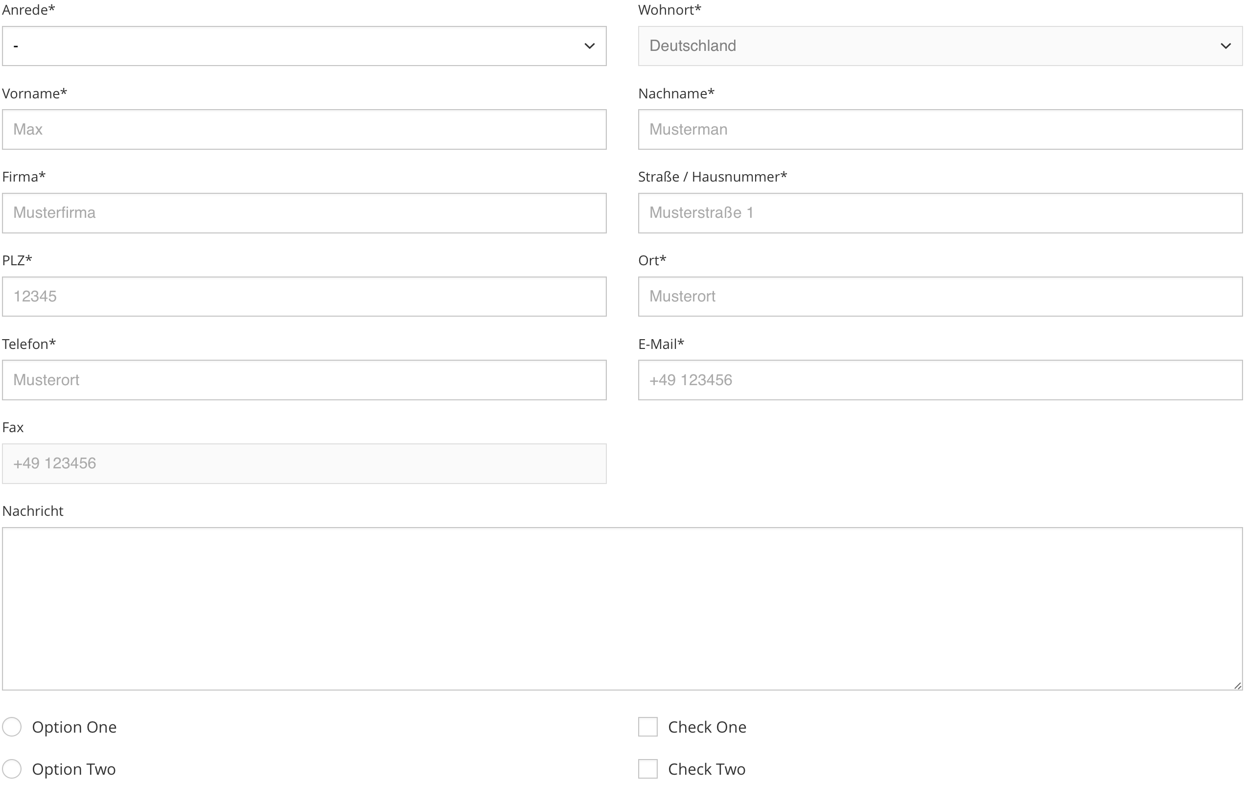
formbase eliminates cross browser bugs, inconsistencies across systems and applies a beautiful default styling to several input elements.
Contents
Demos
| Name | Description | Link |
|---|---|---|
| Default | Includes all features. | Try it on CodePen |
Features
- Works in all modern browsers and IE11
- No JavaScript, just CSS
- Works with inputs, textareas, selects, checkboxes and radio buttons
- Consistent styling across browsers
- Zero dependencies
Setup
We recommend installing formbase using npm or yarn.
npm install formbase
yarn add formbase
Include the CSS file in the head…
<link rel="stylesheet" href="dist/formbase.min.css">
…or import the SASS file directly:
@import 'src/styles/main';
Usage
Input
<input class="input" type="text">
Textarea
<textarea class="input" rows="8" cols="40"></textarea>
Select
<select class="select">
	<option selected disabled>-</option>
	<option value="one">One</option>
	<option value="two">Two</option>
</select>
Radio
<div class="control">
	<input class="control__input" id="Radio" type="radio">
	<label class="control__label" for="Radio">Radio</label>
</div>
Checkbox
<div class="control">
	<input class="control__input" id="checkbox" type="checkbox">
	<label class="control__label" for="checkbox">Checkbox</label>
</div>
Options
Import src/styles/main.scss directly to customize the look of formbase:
$formbase__prefix: ''; // Class name prefix
$formbase__margin: .9rem; // Margin
$formbase__padding: .6rem; // Padding
$formbase__select_size: 12px; // Size of the select arrow
$formbase__control_size: 20px; // Size of the checkbox and radio button (1)
$formbase__radius: 0; // Input border radius
$formbase__svg: #000; // Hex color for svgs (2)
$formbase__color: #000; // Input and label color
$formbase__placeholder: #999; // Input placeholder color
$formbase__background: #fff; // Background color
$formbase__border: #bbb; // Border color
$formbase__active: #17f; // Active highlight color
$formbase__shadow: inset 0 1px 3px rgba(0, 0, 0, .05); // Shadow styling
$formbase__duration: .3s; // Transition duration
$formbase__timing: ease; // Transition timing

// (1) It's recommended to use an absolute unit (px) for the control size to avoid half pixels. Half pixels can transform the circle of the radio control into an egg.
// (2) Only works with hex values

@import 'src/styles/main';
Semver strategy
Any change to CSS rules whatsoever is considered backwards-breaking and will result in a new major release. Others changes with no impact on rendering are considered backwards-compatible and will result in a new patch release. No changes to CSS rules can add functionality in a backwards-compatible manner, therefore no changes are considered minor.
Note that the project description data, including the texts, logos, images, and/or trademarks,
for each open source project belongs to its rightful owner.
If you wish to add or remove any projects, please contact us at [email protected].