bendichter / Brokenaxes
Licence: mit
Create matplotlib plots with broken axes
Stars: ✭ 266
Programming Languages
python
139335 projects - #7 most used programming language
Projects that are alternatives of or similar to Brokenaxes
Scientific Visualization Book
An open access book on scientific visualization using python and matplotlib
Stars: ✭ 6,336 (+2281.95%)
Mutual labels: matplotlib, plotting
2021-bordeaux-dataviz
Scientific Visualization Crash Course (Python & Matplotlib)
Stars: ✭ 20 (-92.48%)
Mutual labels: matplotlib, plotting
SciPlot-PyQt
A Matplotlib-wrapped user-interface for creating and editing publication-ready images and plots
Stars: ✭ 32 (-87.97%)
Mutual labels: matplotlib, plotting
Pandoc Plot
Render and include figures in Pandoc documents using your plotting toolkit of choice
Stars: ✭ 75 (-71.8%)
Mutual labels: matplotlib, plotting
texfig
Utility to generate PGF vector files from Python's Matplotlib plots to use in LaTeX documents.
Stars: ✭ 58 (-78.2%)
Mutual labels: matplotlib, plotting
Pyplot.jl
Plotting for Julia based on matplotlib.pyplot
Stars: ✭ 347 (+30.45%)
Mutual labels: matplotlib, plotting
joypy
Joyplots in Python with matplotlib & pandas 📈
Stars: ✭ 418 (+57.14%)
Mutual labels: matplotlib, plotting
Mplcyberpunk
"Cyberpunk style" for matplotlib plots
Stars: ✭ 762 (+186.47%)
Mutual labels: matplotlib, plotting
Matplotlib Venn
Area-weighted venn-diagrams for Python/matplotlib
Stars: ✭ 260 (-2.26%)
Mutual labels: matplotlib, plotting
Adjusttext
A small library for automatically adjustment of text position in matplotlib plots to minimize overlaps.
Stars: ✭ 731 (+174.81%)
Mutual labels: matplotlib, plotting
Cmasher
Scientific colormaps for making accessible, informative and 'cmashing' plots
Stars: ✭ 149 (-43.98%)
Mutual labels: matplotlib, plotting
Chartpy
Easy to use Python API wrapper to plot charts with matplotlib, plotly, bokeh and more
Stars: ✭ 426 (+60.15%)
Mutual labels: matplotlib, plotting
EOmaps
A library to create interactive maps of geographical datasets
Stars: ✭ 193 (-27.44%)
Mutual labels: matplotlib, plotting
Matplotlib
matplotlib: plotting with Python
Stars: ✭ 14,738 (+5440.6%)
Mutual labels: matplotlib, plotting
Joypy
Joyplots in Python with matplotlib & pandas 📈
Stars: ✭ 322 (+21.05%)
Mutual labels: matplotlib, plotting
planetMagFields
Routines to plot magnetic fields of planets in our solar system
Stars: ✭ 27 (-89.85%)
Mutual labels: matplotlib, plotting
geneview
Genomics data visualization in Python by using matplotlib.
Stars: ✭ 38 (-85.71%)
Mutual labels: matplotlib, plotting
brokenaxes

brokenaxes makes matplotlib plots with breaks in the axes for showing data across a discontinuous range.


Features
- Break x and y axes.
- Supports multiple breaks on a single axis.
- Automatically scales axes according to relative ranges.
- Plot multiple lines.
- Legend with positioning relative to entire broken axes object
- x and y label centered to entire plot
- Make brokenaxes object a subplot itself with
matplotlib.GridSpec.subplot_spec. - xlims and ylims may be
datetime.datetimeobjects - Supports log scales.
Installation
I recommend the Anaconda python distribution and this package is available via pypi:
pip install brokenaxes
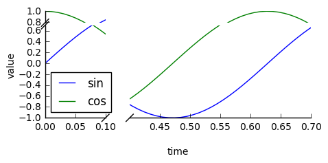
Usage
import matplotlib.pyplot as plt
from brokenaxes import brokenaxes
import numpy as np

fig = plt.figure(figsize=(5, 2))
bax = brokenaxes(xlims=((0, .1), (.4, .7)), ylims=((-1, .7), (.79, 1)), hspace=.05)
x = np.linspace(0, 1, 100)
bax.plot(x, np.sin(10 * x), label='sin')
bax.plot(x, np.cos(10 * x), label='cos')
bax.legend(loc=3)
bax.set_xlabel('time')
bax.set_ylabel('value')
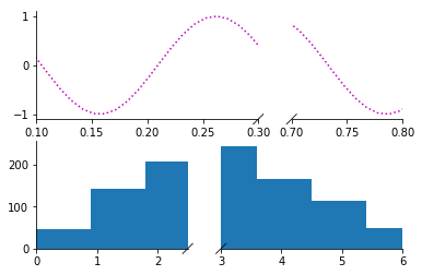
Create subplots
from brokenaxes import brokenaxes
from matplotlib.gridspec import GridSpec
import numpy as np

sps1, sps2 = GridSpec(2,1)

bax = brokenaxes(xlims=((.1, .3), (.7, .8)), subplot_spec=sps1)
x = np.linspace(0, 1, 100)
bax.plot(x, np.sin(x*30), ls=':', color='m')

x = np.random.poisson(3, 1000)
bax = brokenaxes(xlims=((0, 2.5), (3, 6)), subplot_spec=sps2)
bax.hist(x, histtype='bar')
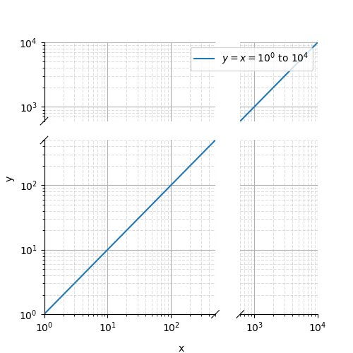
Log scales
import matplotlib.pyplot as plt
from brokenaxes import brokenaxes
import numpy as np

fig = plt.figure(figsize=(5, 5))
bax = brokenaxes(xlims=((1, 500), (600, 10000)),
	     ylims=((1, 500), (600, 10000)),
		 hspace=.15, xscale='log', yscale='log')

x = np.logspace(0.0, 4, 100)
bax.loglog(x, x, label='$y=x=10^{0}$ to $10^{4}$')

bax.legend(loc='best')
bax.grid(axis='both', which='major', ls='-')
bax.grid(axis='both', which='minor', ls='--', alpha=0.4)
bax.set_xlabel('x')
bax.set_ylabel('y')
plt.show()
Gallery
If you make a plot with this tool that you are proud of, send me a png and code and I'll add it to the gallery!
Life advice
Please use this tool wisely. Any data visualization techique can be used to elucidate trends in the data, and can be used to manipulate and mislead. The latter is particularly true for broken axes plots, so please try to use them responsibly. Other than that, this software is free to use. See the license file for details.
Note that the project description data, including the texts, logos, images, and/or trademarks,
for each open source project belongs to its rightful owner.
If you wish to add or remove any projects, please contact us at [email protected].