Buttons TabBar

Open source Flutter package, tabbar where each tab indicator is a toggle button.
Made by Afonso Raposo.
See the full example here
Install and import the package. Then just customize its parameters.
Installation
dependencies:
flutter:
sdk: flutter
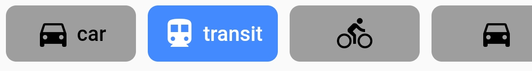
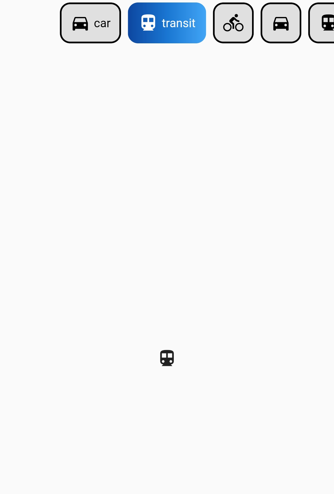
buttons_tabbar: ^1.3.6Screenshots
Default
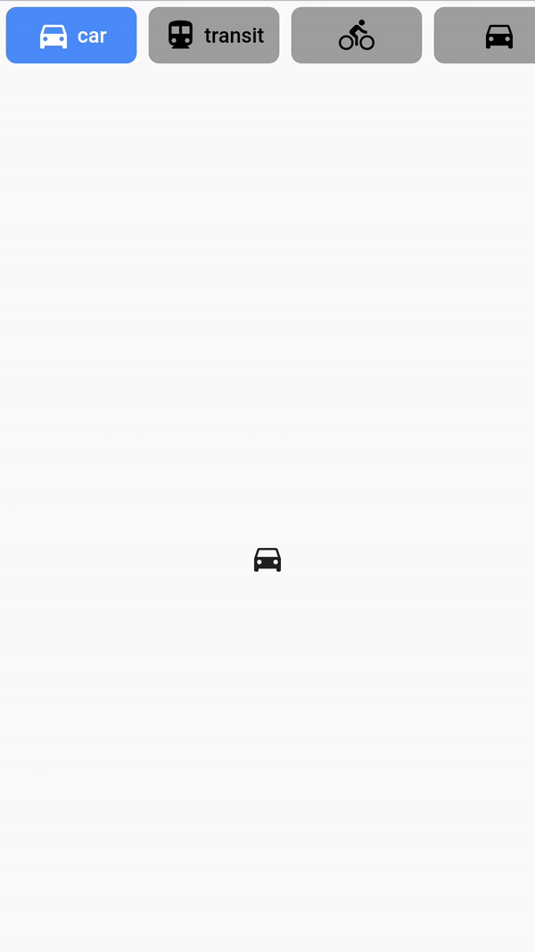
ButtonsTabBar - Examples
Example #1
DefaultTabController(
          length: ...,
          child: Column(
            children: <Widget>[
              ButtonsTabBar(
                backgroundColor: Colors.red,
                tabs: ...,
              ),
              Expanded(
                child: TabBarView(
                  children: ...,
                ),
              ),
            ],
          ),
        )
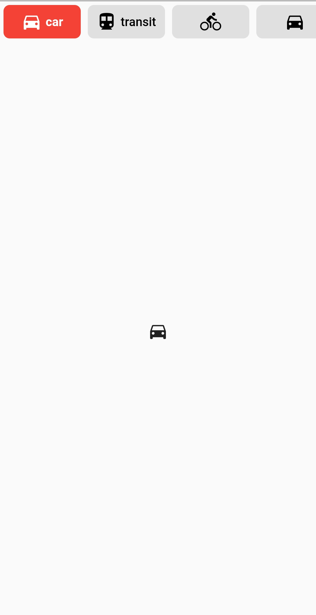
Example #2
DefaultTabController(
          length: ...,
          child: Column(
            children: <Widget>[
              ButtonsTabBar(
                backgroundColor: Colors.blue[600],
                unselectedBackgroundColor: Colors.white,
                labelStyle:
                    TextStyle(color: Colors.white, fontWeight: FontWeight.bold),
		unselectedLabelStyle: TextStyle(
                    color: Colors.blue[600], fontWeight: FontWeight.bold),
                borderWidth: 1,
                unselectedBorderColor: Colors.blue[600],
                radius: 100,
                tabs: ...,
              ),
              Expanded(
                child: TabBarView(
                  children: ...,
                ),
              ),
            ],
          ),
        )
Example #3
DefaultTabController(
  length: 6,
  child: Column(
    children: <Widget>[
      ButtonsTabBar(
        radius: 12,
        contentPadding: EdgeInsets.symmetric(horizontal: 12),
        borderWidth: 2,
        borderColor: Colors.transparent,
        center: true,
        decoration: BoxDecoration(
          gradient: LinearGradient(
            colors: <Color>[
              Color(0xFF0D47A1),
              Color(0xFF1976D2),
              Color(0xFF42A5F5),
            ],
          ),
        ),
        unselectedLabelStyle: TextStyle(color: Colors.black),
        labelStyle: TextStyle(color: Colors.white),
        height: 56,
        tabs: ...,
      ),
      Expanded(
        child: TabBarView(
          children: ...,
        ),
      ),
    ],
  ),
)
ButtonsTabBar Parameters
| Parameter | Type | Description | Default |
|---|---|---|---|
| tabs | List<Widget> |
The tabs to display. Typically a list of two or more Tab widgets. |
@required |
| controller | TabController |
This widget's selection and animation state. | DefaultTabController.of |
| duration | int |
The duration in milliseconds of the transition animation. | 250 |
| backgroundColor | Color |
The background color of the button on its selected state. | Theme.of(context).accentColor |
| unselectedBackgroundColor | Color |
The background color of the button on its unselected state. | Colors.grey[300] |
| decoration | BoxDecoration |
The BoxDecoration of the button on its selected state. |
null |
| unselectedDecoration | BoxDecoration |
The BoxDecoration of the button on its unselected state. |
null |
| splashColor | Color |
The splash color of the button | null |
| borderWidth | double |
The with of solid Border for each button. |
0 |
| borderColor | Color |
The border color of the button on its selected state. | Colors.black |
| unselectedBorderColor | Color |
The border color of the button on its unselected state. If it's value is null, the Color of borderColor is used. |
null |
| labelStyle | TextStyle |
The TextStyle of the button's Text on its selected state. The color provided on the TextStyle will be used for the Icon's color. |
TextStyle(color: Colors.white) |
| unselectedLabelStyle | TextStyle |
The TextStyle of the button's Text on its unselected state. The color provided on the TextStyle will be used for the Icon's color. |
TextStyle(color: Colors.black) |
| physics | ScrollPhysics |
The physics used for the ScrollControllerof the tabs list. |
BouncingScrollPhysics |
| contentPadding | EdgeInsets |
The EdgeInsets used for the Padding of the buttons' content. |
EdgeInsets.symmetric(horizontal: 4.0) |
| buttonMargin | EdgeInsets |
The EdgeInsets used for the Margin of the buttons. |
EdgeInsets.all(4.0) |
| labelSpacing | double |
The spacing between the Icon and the Text. If only one of those is provided, no spacing is applied. |
4.0 |
| radius | double |
The value of the BorderRadius.circular applied to each button. |
7.0 |
| height | double |
Override the material TabBar height value. | 46.0 |
| center | bool |
Center the tab buttons. | false |
| elevation | double |
The value of elevation applied to each button. |
0 |
Future
If you have any suggestion or problem, let me know and I'll try to improve or fix it.
License
GNU General Public License v3.0, see the LICENSE.md file for details.