radianttap / Cardpresentationcontroller
Programming Languages
Projects that are alternatives of or similar to Cardpresentationcontroller
CardPresentationController
Custom UIPresentationController which mimics the behavior of Apple Music UI. Should work just fine from iOS 10 and beyond.
DEMO video on iPhone Xs simulator
Modal presentation in iOS 13
iOS 13 changed the behavior of the ordinary present(vc, ...) calls - all modals now look like cards. Thus you don’t need this library on iOS 13. I always recommend to use system stuff as much as possible thus this library will, by default, fallback to system look & behavior if you are on iOS 13.
To toggle this off and still use this library to present modal cards, set this at some point before presenting your first UIViewController:
CardPresentationController.useSystemPresentationOniOS13 = false
Keep in mind that visual display of multiple cards in this library is different from what iOS 13 does. (I don’t intend to change this, it’s not really worth it.)
Installation
Manually
Add the folder CardPresentationController into your project. It's only five files.
If you prefer to use dependency managers, see below. Releases are tagged with Semantic Versioning in mind.
CocoaPods
CocoaPods is a dependency manager for Cocoa projects. For usage and installation instructions, visit their website. To integrate Coordinator into your Xcode project using CocoaPods, specify it in your Podfile:
pod 'CardPresentationController', :git => 'https://github.com/radianttap/CardPresentationController.git'
Setting up with Carthage
Carthage is a decentralized dependency manager that automates the process of adding frameworks to your Cocoa application.
You can install Carthage with Homebrew using the following command:
$ brew update
$ brew install carthage
To integrate CardPresentationController into your Xcode project using Carthage, specify it in your Cartfile:
github "radianttap/CardPresentationController"
Usage
From anywhere you want to present some UIViewController, call
let vc = ...
presentCard(vc, animated: true)
You dismiss it as any other modal:
dismiss(animated: true)
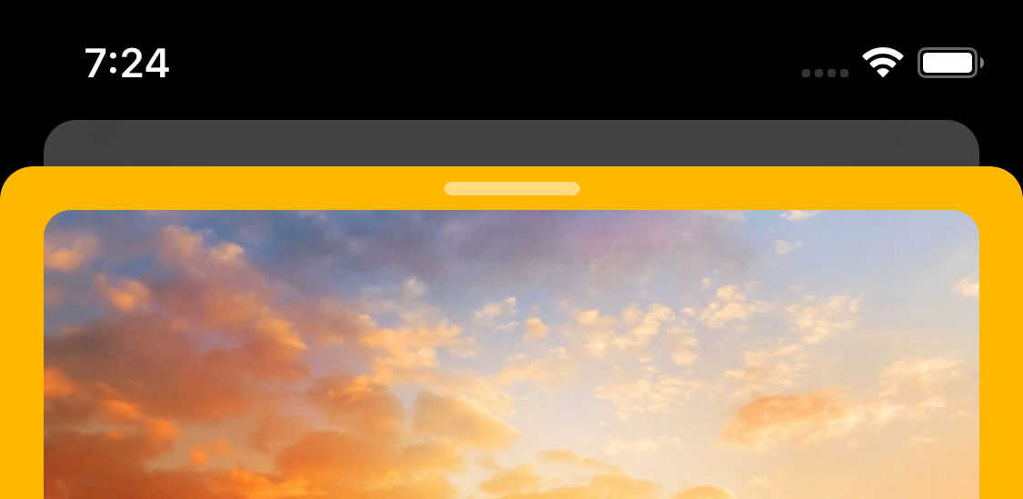
This will present vc modally, flying-in from the bottom edge. Existing view will be kept shown as dimmed background card, on black background.
You can present card from another card; library will stack the cards nicely. Do use common sense as popups over popups don’t make pleasant user experience.
Advanced behavior
View of the presenting Controller will be (by default) 20% transparent to blend into the background a bit, thus looking dimmed.
That back "card" is also inset a bit from the edges.
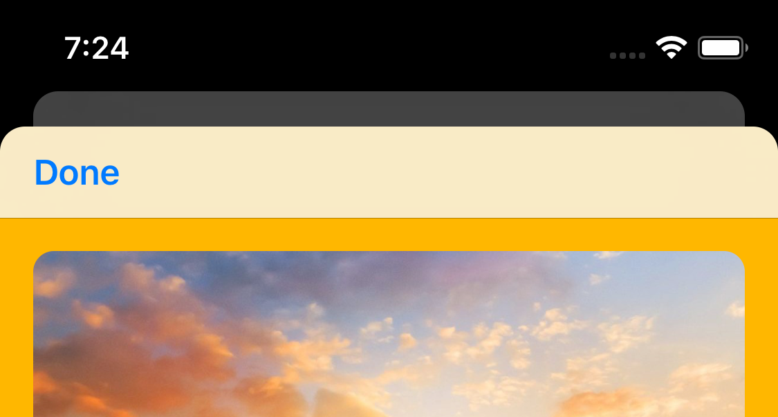
If the presented VC is UINavigationController instance, nothing special happens. It’s assumed that you will add UIBarButtonItem which will facilitate dismissal.
If it is not, then CardPresentationController will automatically add a button at the middle of the shown card. Tapping on that will dismiss the card.
As you present card over card, back cards will be ever more transparent and horizontally inset. In most cases, this should look rather nice.
Library also supports interactive dismissal — simply pan from top to bottom and UI will obey you. You can pan up or down and the direction and position where you let go will determine will the card finish dismissing or return to presented state.
Status bar style
CardPresentationController tries its best to enforce .lightContent status bar style. You can help it, by adding this into your UIVC subclass:
override var preferredStatusBarStyle: UIStatusBarStyle {
	return .lightContent
}
If you are presenting UINC, then my advice is to subclass it and override preferredStatusBarStyle property in the same way.
Requirements
Requires iOS 10, since it uses UIViewPropertyAnimator, UISpringTimingParameters and a bunch of other modern UIKit animation APIs.
On iOS 11 it uses maskedCorners property to round just the top corners. On iOS 10.x it will fallback to rounding all corners.
How it works
The main object here is CardTransitionManager, which acts as UIViewControllerTransitioningDelegate. It is internally instantiated and assigned as property on UIVC which called presentCard() – that's sourceController in the UIPresentationController parlance.
This instance of CTM is automatically removed on dismissal.
CTM creates and manages the other two required objects:
-
CardPresentationController: manages additional views (like dismiss handle at the top of the card) and other aspects of the custom presentation -
CardAnimator: which performs the animated transition
In case you missed it — you don’t deal with any of that. It’s all implementation detail, hidden inside these 3 classes. You never instantiate them directly.
The only object you can put to use, if you want to, is…
CardConfiguration
When calling presentCard, you can supply optional CardConfiguration instance. This is simple struct containing the following parameters:
///	Vertical inset from the top or already shown card
var verticalSpacing: CGFloat = 16

///	Leading and trailing inset for the existing (presenting) view
/// when it's being pushed further back
var horizontalInset: CGFloat = 16

///	Height of the "empty" area at the top of the card
///	where dismiss handle glyph will be centered.
public var dismissAreaHeight: CGFloat = 16

///	Cards have rounded corners, right?
var cornerRadius: CGFloat = 12

///	The starting frame for the presented card.
var initialTransitionFrame: CGRect?

///	How much to fade the back card.
var backFadeAlpha: CGFloat = 0.8

///	Set to false to disable interactive dismissal
var allowInteractiveDismissal = true
There’s a very handy init for it where you can supply any combination of these parameters.
If you don't supply config, then CardConfiguration.shared will be used, consisting of the default values shown above.
You can override this property early in app's lifecycle so adjust default look of the cards for the entire app (see AppDelegate.swift for an example).
Advanced example
Thus if you want to control where the card originates — say if you want to mimic Apple Music's now-playing card — you can:
let vc = ContentController.instantiate()

let f = container.convert(sender.bounds, to: view.window!)
let config = CardConfiguration(initialTransitionFrame: f)

presentCard(vc, configuration: config, animated: true)
The important bit here is setting initialTransitionFrame property to the frame in the UIWindow coordinating space, since transition happens in it.
Caveats
CardAnimator animates layout of its own subviews – from and to views included in transitionContext. Behavior and layout of the internal subviews of both presented and presenting/source views is up to you but CardAnimator will try its best to animate them along.
Depending on the complexity of your UI, in may be impossible to make the transition perfect. Usually in cases where UIKit applies its own private API magic related to status / navigation bars.
See EmbeddedNCExample where I have UINavigationController embedded inside ordinary UIViewController. This is very unusual UIVC stack which I would love to solve since I have project using just that.
LICENSE
MIT, as usual for all my stuff.


