amirdew / Collectionviewpaginglayout
Programming Languages
Labels
Projects that are alternatives of or similar to Collectionviewpaginglayout
CollectionViewPagingLayout


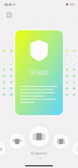
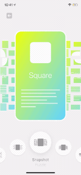
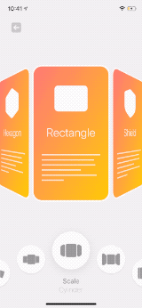
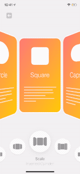
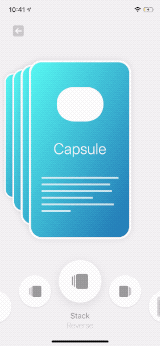
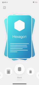
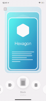
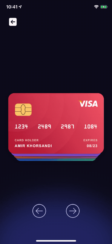
Layout Designer

SnapshotTransformView


ScaleTransformView


StackTransformView
Custom implementations


About
CollectionViewPagingLayout is a simple but powerful tool for making complex layouts for your UICollectionView.
The implementation is very simple, there is a custom UICollectionViewLayout that gives you the ability to apply transforms on the cells.
No inheritance or anything like that.
See How to use for more details.
Installation
CollectionViewPagingLayout doesn't contain any external dependencies.
CocoaPods
# Podfile
use_frameworks!

target 'YOUR_TARGET_NAME' do
    pod 'CollectionViewPagingLayout'
end
Replace YOUR_TARGET_NAME and then, in the Podfile directory, type:
$ pod install
Carthage
Add this to Cartfile
github "CollectionViewPagingLayout"
and then, in the Cartfile directory, type:
$ carthage update
Swift Package Manager
using Xcode:
File > Swift Packages > Add Package Dependency
Manually
Just add all the files under Lib directory to your project
How to use
Using Layout Designer
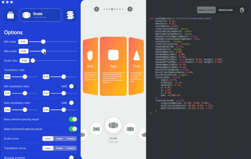
There is a macOS app to make it even easier for you to build your own custom layout.
It allows you to tweak many options and see the result in real time.
- You can download the app from App Store and support this repository or build it yourself from the source.
- Open the app, tweak options and design your layout.
- Copy the code from the right panel and paste it on Xcode or click on "save it as project" and open it with Xcode.
- Don't forget to install the libray.
Manually
- Make sure you imported the library
import CollectionViewPagingLayout
- Set up your
UICollectionViewas you always do (you need to use a custom class for cells) - Set the layout for your collection view: (in most cases you want a paging effect so enable that too)
let layout = CollectionViewPagingLayout()
collectionView.collectionViewLayout = layout
collectionView.isPagingEnabled = true // enabling paging effect
- Now you just need to conform your
UICollectionViewCellclass toTransformableViewand start implementing your custom transforms. By conforming your cell class toTransformableViewprotocol you will get aprogressvalue and you can use it to apply any changes on your cell view.
Note: you can use Prepared Transformable Protocols instead of TransformableView if you want to use prepared effects!
extension MyCollectionViewCell: TransformableView {
    func transform(progress: CGFloat) {
      ...
    }
}
progressis a float value that represents the current position of your cell in the collection view.
When it's0that means the current position of the cell is exactly in the center of your collection view.
the value could be negative or positive and that represents the distance to the center of your collection view.
for instance1means the distance between the center of the cell and the center of your collection view is equal to your collection view width.
you can start with a simple transform like this:
extension MyCollectionViewCell: TransformableView {
    func transform(progress: CGFloat) {
        let transform = CGAffineTransform(translationX: bounds.width/2 * progress, y: 0)
        let alpha = 1 - abs(progress)

        contentView.subviews.forEach { $0.transform = transform }
        contentView.alpha = alpha
    }
}
- Don't forget to set
numberOfVisibleItems, by default it's null and that means it will load all of the cells at a time
layout.numberOfVisibleItems = ...
Prepared Transformable Protocols
There are prepared transformables to make it easier to use this library,
using them is very simple, you just need to conform your UICollectionViewCell to the prepared protocol
and then set the options for that to customize it as you want.
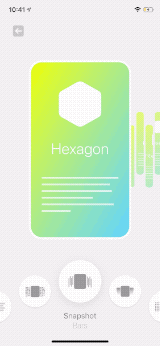
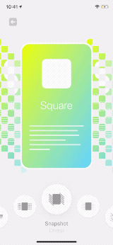
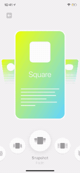
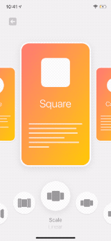
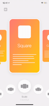
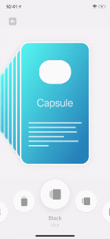
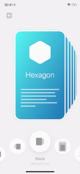
there are three types of transformables protocol at the moment ScaleTransformView, SnapshotTransformView, and StackTransformView.
as you can see in the samples app these protocols are highly customizable and you can make tons of different effects with them.
here is a simple example for ScaleTransformView which gives you a simple paging with scaling effect:
extension MyCollectionViewCell: ScaleTransformView {
    var scaleOptions = ScaleTransformViewOptions(
        minScale: 0.6,
        scaleRatio: 0.4,
        translationRatio: CGPoint(x: 0.66, y: 0.2),
        maxTranslationRatio: CGPoint(x: 2, y: 0),
    )
}
there is an options struct for each transformable where you can customize the effect, check the struct to find out what each parameter does.
a short comment on the top of each parameter explains how you can use it.
ScaleTransformView -> ScaleTransformViewOptions
SnapshotTransformView -> SnapshotTransformViewOptions
StackTransformView -> StackTransformViewOptions
you can see some examples in the samples app for these transformables.
check here to see used options for each: /PagingLayoutSamples/Modules/Shapes/ShapeCell/
Target view
You may wonder how does it figure out the view for applying transforms on, if you check each transformable protocol you can see the target views are defined for each, you can also see there is an extension to provide the default target views.
for instance we have ScaleTransformView.scalableView which is the view that we apply scale transforms on, and for UICollectionViewCell the default view is the first subview of contentView:
public extension ScaleTransformView where Self: UICollectionViewCell {

    /// Default `scalableView` for `UICollectionViewCell` is the first subview of
    /// `contentView` or the content view itself if there is no subview
    var scalableView: UIView {
        contentView.subviews.first ?? contentView
    }
}
of course you can easily override this
Customize Prepared Transformables
Yes, you can customize them or even combine them, to do that like before conform your cell class to the transformable protocol(s) and then implement TransformableView.transform function and call the transformable function manually, like this:
extension LayoutTypeCollectionViewCell: ScaleTransformView {

    func transform(progress: CGFloat) {
        applyScaleTransform(progress: progress)
        // customize views here, like this:
        titleLabel.alpha = 1 - abs(progress)
        subtitleLabel.alpha = titleLabel.alpha
    }

}
as you can see applyScaleTransform applies the scale transforms and right after that we change the alpha for titleLabel and subtitleLabel.
to find the public function(s) for each tansformable check the protocol definition.
Other features
Control current page
You can control the current page by the following functions of CollectionViewPagingLayout:
func setCurrentPage(_ page: Int, animated: Bool = true)func goToNextPage(animated: Bool = true)func goToPreviousPage(animated: Bool = true)
these are safe wrappers for setting ContentOffset of UICollectionview
you can also get current page by a public variable CollectionViewPagingLayout.currentPage or listen to changes by using CollectionViewPagingLayout.delegate:
public protocol CollectionViewPagingLayoutDelegate: class {
    func onCurrentPageChanged(layout: CollectionViewPagingLayout, currentPage: Int)
}
Handle touches
There is built-in solution for handling tap gestues on the views
- Implement
TransformableView.selectableViewand pass the view that you would like to handle tap gestues for (by default this is the first subview of yourUICollectionViewCell.contentView) - Call
CollectionViewPagingLayout.configureTapOnCollectionView()after setting the layout for you collection view - Set the delegate for layout (
CollectionViewPagingLayout.delegate) - Use didSelectItemAt function
func collectionViewPagingLayout(_ layout: CollectionViewPagingLayout, didSelectItemAt indexPath: IndexPath)
Limitations
-
Specify the number of visible cells: You need to specify the number of visible cells since this layout gives you the flexibility to show the next and previous cells.
By default, the layout loads all of the cells in the collection view frame and that means it keeps all of them in memory. You can specify the number of cells that you need to show at a time by considering your design. -
Touches on cells: The way that this layout works is putting all the cells in the collectionview frame (doesn't matter which TransformView you use)
and then it applies transforms on the target view (StackTransformView.cardView, ScaleTransformView.scalableView etc).
so you can usefunc collectionView(_ collectionView: UICollectionView, didSelectItemAt indexPath: IndexPath)but only for one cell at the same time you can implementfunc zPosition(progress: CGFloat) -> Intto specify wich cell should be on top this also means you can't handle any gesture for the cell that is not on the top!
if you would like to handle tap on multiple cells at the same time see Handle touches
- It doesn't support RTL layouts
License
CollectionViewPagingLayout is available under the MIT license. See LICENSE file for more info.