All Projects → daranzolin → compareBars

daranzolin / compareBars

Licence: other
Simplify comparative bar charts 📊

Programming Languages

javascript
184084 projects - #8 most used programming language
r
7636 projects
CSS
56736 projects

Projects that are alternatives of or similar to compareBars

d3Tree
htmlwidget that binds d3js collapsible trees to R and Shiny to make an interactive search tool
Stars: ✭ 79 (+182.14%)
Mutual labels:  d3js, htmlwidgets
Collapsibletree
Create Interactive Collapsible Tree Diagrams in R using D3.js
Stars: ✭ 126 (+350%)
Mutual labels:  d3js, htmlwidgets
Scatterd3
R scatter plot htmlwidget based on D3.js
Stars: ✭ 135 (+382.14%)
Mutual labels:  d3js, htmlwidgets
graphPlayground
Create graphs by adding your vertices and edges and see them react!! 🎨
Stars: ✭ 32 (+14.29%)
Mutual labels:  d3js
you-draw-it
Datenjournalismus: Nutzer können schätzen, wie sich Statistiken verändert haben und ihre Einschätzung danach überprüfen.
Stars: ✭ 24 (-14.29%)
Mutual labels:  d3js
d3js
Experiments with D3.js
Stars: ✭ 17 (-39.29%)
Mutual labels:  d3js
DraggableRegressionPoints
Draggable regression points in R Shiny
Stars: ✭ 18 (-35.71%)
Mutual labels:  d3js
rAmCharts4
An R interface to amCharts 4
Stars: ✭ 26 (-7.14%)
Mutual labels:  htmlwidgets
D3partitionR
R package to visualise interactively hierarchical data.
Stars: ✭ 36 (+28.57%)
Mutual labels:  d3js
github-visualization
simple github visualization
Stars: ✭ 106 (+278.57%)
Mutual labels:  d3js
disaster-crawler
Data sources from Kimono currently unavailable
Stars: ✭ 13 (-53.57%)
Mutual labels:  d3js
phyd3
Phylogenetic tree viewer based on D3.js
Stars: ✭ 47 (+67.86%)
Mutual labels:  d3js
stroke-dasharray-interpolation-talk
Slides from 2015 D3.js talk
Stars: ✭ 17 (-39.29%)
Mutual labels:  d3js
visual-explain
explain the mechanism visually
Stars: ✭ 26 (-7.14%)
Mutual labels:  d3js
3d-earth
🌏🌎🌍 3D Earth with Mapbox GL, D3.js and Three.js
Stars: ✭ 68 (+142.86%)
Mutual labels:  d3js
jsTreeR
A wrapper of the jQuery plugin `jsTree`.
Stars: ✭ 36 (+28.57%)
Mutual labels:  htmlwidgets
spatialwidget
Utility package to convert R data into JSON for use in htmlwidget mapping libraries
Stars: ✭ 17 (-39.29%)
Mutual labels:  htmlwidgets
d3-force-reuse
Faster force-directed graph layouts by reusing force approximations
Stars: ✭ 110 (+292.86%)
Mutual labels:  d3js
skos-play
SKOS-Play allows to print SKOS files in HTML or PDF. It also embeds xls2rdf to generate RDF from Excel.
Stars: ✭ 58 (+107.14%)
Mutual labels:  d3js
Online Travel Reservation
A replica of online travel booking site KAYAK(www.kayak.com) for cmpe-273. Visit ->
Stars: ✭ 37 (+32.14%)
Mutual labels:  d3js

compareBars

Travis build status

“Less is more.”

“Simplify simplify.”

Alt Text

The goal of compareBars is to reduce the clutter of comparative bar charts.

Installation

You can install compareBars from github with:

# install.packages("devtools")
devtools::install_github("daranzolin/compareBars")

A simpler alternative

Consider the following bar charts:

library(tidyverse)
library(gapminder)
library(patchwork)

d <- gapminder %>% 
  filter(continent %in% c("Americas", "Europe")) %>% 
  group_by(continent, year) %>% 
  summarize(pop = sum(pop))

p1 <- ggplot(d, aes(year, pop, fill = continent)) + geom_col()
p2 <- ggplot(d, aes(year, pop, fill = continent)) + geom_col(position = "dodge")

p1 + p2 + plot_layout(ncol = 1)

cb1

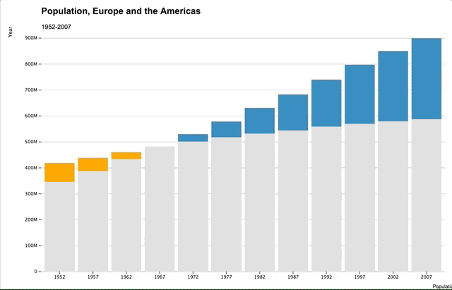
When did the total population of the Americas exceed the total population of Europe? With the top chart, you’d have to guess sometime between 1960 and 1980, but it’s hard to tell at a glance. And while it’s easier to tell with the second plot, the clarity comes at the sake of clutter.

compareBars offers a simpler, cleaner alternative with d3.js:

library(compareBars)
d %>% 
  spread(continent, pop) %>% 
  mutate(year = factor(year)) %>% 
  compareBars(year, Americas, Europe)

cb1

Not only is the moment when the Americas’ population exceeded Europe’s immediately clear, but you also get a much better sense of the magnitude by year. Approximating this kind of chart with ggplot requires a great deal of reshaping and wizardry.

An interactive tooltip shows the magnitude of difference between the two levels.

Other options

You can adjust the chart by adding axis labels, titles, subtitles, specifying your own fill colors, changing the label fonts, and even the bar orientation:

d %>% 
  spread(continent, pop) %>% 
  mutate(year = factor(year)) %>% 
  compareBars(year, 
              Americas, 
              Europe,
              xLabel = "Population",
              yLabel = "Year",
              titleLabel = "Population, Europe and the Americas",
              subtitleLabel = "1952-2007",
              fontFamily = "Arial",
              compareVarFill1 = "pink",
              compareVarFill2 = "green",
              orientation = "horizontal")

cb2

Note that you must reshape your data into a ‘non-tidy’ form.

Note that the project description data, including the texts, logos, images, and/or trademarks, for each open source project belongs to its rightful owner. If you wish to add or remove any projects, please contact us at [email protected].