hacktons / Convex_bottom_bar
Programming Languages
Labels
Projects that are alternatives of or similar to Convex bottom bar


The official BottomAppBar can only display a notch FAB with app bar, sometimes we need a convex FAB. This ConvexAppBar is inspired by BottomAppBar and NotchShape's implementation.
Online example can be found at https://appbar.codemagic.app.
convex_bottom_bar is now a Flutter Favorite package!

Here are some supported style:
| fixed | react | badge chip |
|---|---|---|
 |
 |
 |
| fixedCircle | reactCircle | flip |
 |
 |
 |
| textIn | titled | tab image |
 |
 |
 |
| button | fixed corner | |
 |
 |
How to use
Typically ConvexAppBar can work with Scaffold by setup its bottomNavigationBar.
The ConvexAppBar has to two constructors, the ConvexAppBar() will use default style to simplify the tab creation.
Add this to your package's pubspec.yaml file, use the latest version :
dependencies:
  convex_bottom_bar: ^latest_version
import 'package:convex_bottom_bar/convex_bottom_bar.dart';

Scaffold(
  bottomNavigationBar: ConvexAppBar(
    items: [
      TabItem(icon: Icons.home, title: 'Home'),
      TabItem(icon: Icons.map, title: 'Discovery'),
      TabItem(icon: Icons.add, title: 'Add'),
      TabItem(icon: Icons.message, title: 'Message'),
      TabItem(icon: Icons.people, title: 'Profile'),
    ],
    initialActiveIndex: 2,//optional, default as 0
    onTap: (int i) => print('click index=$i'),
  )
);
Flutter Version Support
As Flutter is developing fast. There can be breaking changes, we will trying to support the
stable version and beta version through different package version.
| Stable Flutter Version | Package Version | More |
|---|---|---|
| >=1.20 | >=2.4.0 | Since v1.20, the stable version changed the Stack api |
| <1.20 | <=2.3.0 | Support for stable version such as v1.17, v1.12 is not going to be updated |
Features
- Provide multiple internal styles
- Ability to change the theme of AppBar
- Provide builder API to customize new style
- Add badge on tab menu
- Elegant transition animation
- Provide hook API to override some of internal styles
- RTL support
Table of contents
Theming
The bar will use default style, you may want to theme it. Here are some supported attributes:

| Attributes | Description |
|---|---|
| backgroundColor | AppBar background |
| gradient | gradient will override backgroundColor |
| height | AppBar height |
| color | tab icon/text color |
| activeColor | tab icon/text color when selected |
| curveSize | size of the convex shape |
| top | top edge of the convex shape relative to AppBar |
| cornerRadius | draw the background with topLeft and topRight corner; Only work with fixed tab style |
| style | style to describe the convex shape: fixed, fixedCircle, react, reactCircle, ... |
| chipBuilder | custom badge builder, use ConvexAppBar.badge for default badge |
Badge
If you need to add badge on the tab, use ConvexAppBar.badge to get it done.
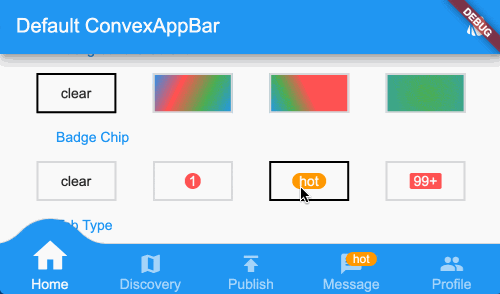
ConvexAppBar.badge({0: '99+', 1: Icons.assistant_photo, 2: Colors.redAccent},
  items: [
    TabItem(icon: Icons.home, title: 'Home'),
    TabItem(icon: Icons.map, title: 'Discovery'),
    TabItem(icon: Icons.add, title: 'Add'),
  ],
  onTap: (int i) => print('click index=$i'),
);
The badge() method accept an array of badges; The badges is map with tab items, each value of entry can be either String, IconData, Color or Widget.
Single Button
If you only need a single button, checkout the ConvexButton.

Scaffold(
  appBar: AppBar(title: const Text('ConvexButton Example')),
  body: Center(child: Text('count $count')),
  bottomNavigationBar: ConvexButton.fab(
    onTap: () => setState(() => count++),
  ),
);
Style Hook
Hook for internal tab style. Unlike the ConvexAppBar.builder, you may want to update the tab style without define a new tab style.
Warning:
This hook is limited, and can lead to overflow broken if the size you provide does no match with internal style.
StyleProvider(
  style: Style(),
  child: ConvexAppBar(
    initialActiveIndex: 1,
    height: 50,
    top: -30,
    curveSize: 100,
    style: TabStyle.fixedCircle,
    items: [
      TabItem(icon: Icons.link),
      TabItem(icon: Icons.import_contacts),
      TabItem(title: "2020", icon: Icons.work),
    ],
    backgroundColor: _tabBackgroundColor,
  ),
)
class Style extends StyleHook {
  @override
  double get activeIconSize => 40;

  @override
  double get activeIconMargin => 10;

  @override
  double get iconSize => 20;

  @override
  TextStyle textStyle(Color color) {
    return TextStyle(fontSize: 20, color: color);
  }
}
RTL Support
RTL is supported internally, if you define the TextDirection inside app, the AppBar should work fine.
Both RTL and LTR can be configured through Directionality:
Directionality(
  textDirection: TextDirection.rtl,
  child: Scaffold(body:ConvexAppBar(/*TODO ...*/)),
)
Custom Example
If the default style does not match with your situation, try with ConvexAppBar.builder(), which allow you to custom nearly all the tab features.
Scaffold(
  bottomNavigationBar: ConvexAppBar.builder(
    count: 5,
    backgroundColor: Colors.blue,
    style: TabStyle.fixed,
    itemBuilder: Builder(),
  )
);

// user defined class
class Builder extends DelegateBuilder {
  @override
  Widget build(BuildContext context, int index, bool active) {
    return Text('TAB $index');
  }
}
Full custom example can be found at example.
FAQ
Please file feature requests and bugs at the issue tracker.
- How to block tab event?
- Crash on flutter dev/beta channel
- Change active tab index programmatically
- Using an image instead of an icon for actionItem
- Is there anyway to remove elevation in the bottom bar?
Donate
You like the package ? Buy me a coffee :)