jakemarsh / Core Layout
Labels
Projects that are alternatives of or similar to Core Layout
Core Layout 📐 📏
Flexbox & CSS-style Layout in Swift.
Core Layout is a simple system to compute layout trees. It wraps the wonderful work done in facebook/yoga in a richly typed, Swift framework.
While no assumptions are made about how the computed layouts will be used, Core Layout does provide a way to apply them to a tree of UIViews, since that's likely the most common use case.
TLDR
Create and configure Layouts.
Create and configure other Layouts. Add them as children. Repeat.
compute the tree of Layouts inside a given container CGSize.
Use the CGRects from the resulting tree of ComputedLayouts for something interesting.
How it Works
The main type in Core Layout is Layout. We'll create and nest these types to make a tree of layouts that can be computed.
Here's a simple example:
let layout = Layout(
  container: ContainerBehavior(primaryAxis: .vertical),
  padding: Edges(all: 8)
)
Now, we can compute this layout, contained within a size:
let computed = layout.compute(with: CGSize(width: 160, height: 284))

// computed is:

// ComputedLayout(
//   frame: CGRect(x: 0, y: 0, width: 160, height: 284),
// )
Nice. Nothing too fancy yet, let's add a second layout to the mix:
let layout = Layout(
  container: ContainerBehavior(primaryAxis: .vertical),
  padding: Edges(all: 8),
  children: [
    Layout(size: SizeBehavior(minHeight: 44))
  ]
)
We've added one child layout, with a minimum height of 44 points. Now, lets compute it again:
let computed = layout.compute(with: CGSize(width: 160, height: 284))

// computed is now:

//  let computed = ComputedLayout(
//    frame: CGRect(x: 0, y: 0, width: 160, height: 284),
//    children: [
//      ComputedLayout(frame: CGRect(x: 8, y: 8, width: 144, height: 44))
//    ]
//  )
Neat! That's the basic idea.
Basic Concepts
Most of this is just plain Flexbox (at least conceptually).
Containers
Any Layout can become a container for other Layouts by setting its container property to a new ContainerBehavior value.
Then, when children are added to the Layout, they'll be arranged according to the settings inside the container property.
By default, Layouts have a nil container property.
Let's take a look at the many properties of a CotnainerBehavior, and how each affects the arrangement of a Layout's children.
Primary Axis
.primaryAxis:
Defines the primary axis. This defines which axis any children will be placed along.
We can choose .vertical: (the default value)
Layout(
  container: ContainerBehavior(primaryAxis: .vertical),
  padding: Edges(all: 8),
  children: [
    Layout(margin: Edges(bottom: 8), size: .absolute(width: 44, height: 44)),
    Layout(margin: Edges(bottom: 8), size: .absolute(width: 44, height: 44)),
    Layout(margin: Edges(bottom: 8), size: .absolute(width: 44, height: 44))
  ]
)

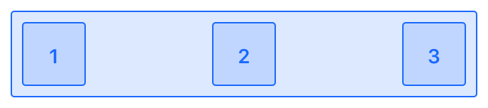
Or .horizontal:
Layout(
  container: ContainerBehavior(primaryAxis: .horizontal),
  padding: Edges(all: 8),
  children: [
    Layout(margin: Edges(bottom: 8), size: .absolute(width: 44, height: 44)),
    Layout(margin: Edges(bottom: 8), size: .absolute(width: 44, height: 44)),
    Layout(margin: Edges(bottom: 8), size: .absolute(width: 44, height: 44))
  ]
)

Primary Axis Distribution
.primaryAxisDistribution:
The primaryAxisDistribution property describes how children should be distributed along the primary axis.
First let's initialize an array of child Layouts (so we don't have to repeat them in each example):
let children = [
  Layout(margin: Edges(trailing: 8), size: .absolute(width: 44, height: 44)),
  Layout(margin: Edges(trailing: 8), size: .absolute(width: 44, height: 44)),
  Layout(size: .absolute(width: 44, height: 44)),
]
Great. Now we can try out each of the primaryAxisDistribution options:
.leading: (the default value)
Layout(
  container: ContainerBehavior(primaryAxis: .horizontal, primaryAxisDistribution: .leading),
  padding: Edges(all: 8),
  children: children
)

.center:
Layout(
  container: ContainerBehavior(primaryAxis: .horizontal, primaryAxisDistribution: .center),
  padding: Edges(all: 8),
  children: children
)

.trailing:
Layout(
  container: ContainerBehavior(primaryAxis: .horizontal, primaryAxisDistribution: .trailing),
  padding: Edges(all: 8),
  children: children
)

.spaceAround:
Layout(
  container: ContainerBehavior(primaryAxis: .horizontal, primaryAxisDistribution: .spaceAround),
  padding: Edges(all: 8),
  children: children
)

.spaceBetween:
Layout(
  container: ContainerBehavior(primaryAxis: .horizontal, primaryAxisDistribution: .spaceBetween),
  padding: Edges(all: 8),
  children: children
)
Secondary Axis Distribution
.secondaryAxisDistribution:
The secondaryAxisDistribution property describes how children should be placed along the seconday axis. (i.e. the opposite of the primary axis).
If primaryAxis is set to .horizontal, then the secondary axis is vertical.
Again, we'll set up some children up front, then try out each option:
let size = SizeBehavior(minWidth: 44, minHeight: 44)

let children = [
  Layout(margin: Edges(trailing: 8), size: minSize),
  Layout(margin: Edges(trailing: 8), size: minSize),
  Layout(size: minSize),
]
.leading:
Layout(
  container: ContainerBehavior(primaryAxis: .horizontal, secondaryAxisDistribution: .leading),
  padding: Edges(all: 8),
  children: children
)

.center:
Layout(
  container: ContainerBehavior(primaryAxis: .horizontal, secondaryAxisDistribution: .center),
  padding: Edges(all: 8),
  children: children
)

.trailing:
Layout(
  container: ContainerBehavior(primaryAxis: .horizontal, secondaryAxisDistribution: .trailing),
  padding: Edges(all: 8),
  children: children
)

.stretch: (the default value)
Layout(
  container: ContainerBehavior(primaryAxis: .horizontal, secondaryAxisDistribution: .stretch),
  padding: Edges(all: 8),
  children: children
)

Secondary Axis Distribution (When Wrapping)
.secondaryAxisDistributionWhenWrapping:
This property is only needed when using shouldWrap: true, and there are enough children to wrap onto multiple "lines".
Setting secondaryAxisDistributionWhenWrapping does nothing if there's only a single "line" of children.
Again, we'll set up some children up front, then try out each option:
let size = .absolute(width: 40, height: 40)
let margin = Edges(bottom: 8, trailing: 8)

let children = [
  Layout(margin: margin, size: size),
  Layout(margin: margin, size: size),
  Layout(margin: margin, size: size),
  Layout(margin: margin, size: size),
  Layout(size: size)
]
.leading:
Layout(
  container: ContainerBehavior(
    primaryAxis: .horizontal,
    secondaryAxisDistributionWhenWrapping: .leading,
    shouldWrap: true
  ),
  padding: Edges(top: 8, leading: 8),
  children: children
)

.center:
Layout(
  container: ContainerBehavior(
    primaryAxis: .horizontal,
    secondaryAxisDistributionWhenWrapping: .center,
    shouldWrap: true
  ),
  padding: Edges(top: 8, leading: 8),
  children: children
)
.trailing:
Layout(
  container: ContainerBehavior(
    primaryAxis: .horizontal,
    secondaryAxisDistributionWhenWrapping: .trailing,
    shouldWrap: true
  ),
  padding: Edges(top: 8, leading: 8),
  children: children
)

.stretch:
Layout(
  container: ContainerBehavior(
    primaryAxis: .horizontal,
    secondaryAxisDistributionWhenWrapping: .leading,
    shouldWrap: true
  ),
  padding: Edges(top: 8, leading: 8),
  children: children
)

.spaceAround:
Layout(
  container: ContainerBehavior(
    primaryAxis: .horizontal,
    secondaryAxisDistributionWhenWrapping: .leading,
    shouldWrap: true
  ),
  padding: Edges(top: 8, leading: 8),
  children: children
)

.spaceBetween:
Layout(
  container: ContainerBehavior(
    primaryAxis: .horizontal,
    secondaryAxisDistributionWhenWrapping: .leading,
    shouldWrap: true
  ),
  padding: Edges(top: 8, leading: 8),
  children: children
)

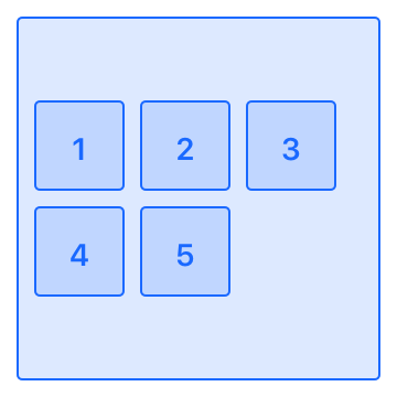
Wrapping
.shouldWrap:
When the shouldWrap property is false (the default value), children won't wrap to a new row or column. Instead, they'll try to fit themselves into a single "line".
In this next example, because the children have an AbsoluteSizeBehavior for .size, and they're not allowed to wrap, they end up trailing off the edge:
Layout(
  container: ContainerBehavior(primaryAxis: .horizontal, shouldWrap: false),
  padding: Edges(top: 8, leading: 8),
  children: [
    Layout(margin: Edges(bottom: 8), size: .absolute(width: 44, height: 44)),
    Layout(margin: Edges(bottom: 8), size: .absolute(width: 44, height: 44)),
    Layout(margin: Edges(bottom: 8), size: .absolute(width: 44, height: 44)),
    Layout(margin: Edges(bottom: 8), size: .absolute(width: 44, height: 44)),
    Layout(margin: Edges(bottom: 8), size: .absolute(width: 44, height: 44))
  ]
)

When the wrap property is true however, children will be allowed to naturally flow onto the next row or column (depending on the primaryAxis of the Layout).
Layout(
  container: ContainerBehavior(primaryAxis: .horizontal, shouldWrap: true),
  padding: Edges(top: 8, leading: 8),
  children: [
    Layout(margin: Edges(bottom: 8), size: .absolute(width: 44, height: 44)),
    Layout(margin: Edges(bottom: 8), size: .absolute(width: 44, height: 44)),
    Layout(margin: Edges(bottom: 8), size: .absolute(width: 44, height: 44)),
    Layout(margin: Edges(bottom: 8), size: .absolute(width: 44, height: 44)),
    Layout(margin: Edges(bottom: 8), size: .absolute(width: 44, height: 44))
  ]
)

Overriden Secondary Axis Distribution
.overriddenSecondaryAxisDistribution:
The overriddenSecondaryAxisDistribution property is nil by default. (Meaning no override takes place). When set to a non-nil value, this allows a single child to override its parent container's instructions for how to arrange itself along the secondary axis.
Put another way: The value of this property on a child Layout, will supercede the value its parent Layout has set for its container?.secondaryAxisDistribution property when computing the tree of Layouts.
Let's take a look at what kind of behavior we can achieve with the overriddenSecondaryAxisDistribution property:
nil (The default value):
let size = SizeBehavior(minWidth: 44, minHeight: 44)

Layout(
  container: ContainerBehavior(primaryAxis: .horizontal, secondaryAxisDistribution: .leading),
  padding: Edges(all: 8),
  children: [
    Layout(size: size, margin: Edges(trailing: 8)),
    Layout(size: size, margin: Edges(trailing: 8)),
    Layout(size: size)
  ]
)

.leading:
let size = SizeBehavior(minWidth: 44, minHeight: 44)

Layout(
  container: ContainerBehavior(primaryAxis: .horizontal, secondaryAxisDistribution: .leading),
  padding: Edges(all: 8),
  children: [
    Layout(size: size, margin: Edges(trailing: 8)),
    Layout(size: size, margin: Edges(trailing: 8)),
    Layout(overriddenSecondaryAxisDistribution: .leading, size: size))
  ]
)

.center:
let size = SizeBehavior(minWidth: 44, minHeight: 44)

Layout(
  container: ContainerBehavior(primaryAxis: .horizontal, secondaryAxisDistribution: .leading),
  padding: Edges(all: 8),
  children: [
    Layout(size: size, margin: Edges(trailing: 8)),
    Layout(size: size, margin: Edges(trailing: 8)),
    Layout(overriddenSecondaryAxisDistribution: .center, size: size))
  ]
)

.trailing:
let size = SizeBehavior(minWidth: 44, minHeight: 44)

Layout(
  container: ContainerBehavior(primaryAxis: .horizontal, secondaryAxisDistribution: .leading),
  padding: Edges(all: 8),
  children: [
    Layout(size: size, margin: Edges(trailing: 8)),
    Layout(size: size, margin: Edges(trailing: 8)),
    Layout(overriddenSecondaryAxisDistribution: .trailing, size: size)
  ]
)

.stretch:
let size = SizeBehavior(minWidth: 44, minHeight: 44)

Layout(
  container: ContainerBehavior(primaryAxis: .horizontal, secondaryAxisDistribution: .leading),
  padding: Edges(all: 8),
  children: [
    Layout(size: size, margin: Edges(trailing: 8)),
    Layout(size: size, margin: Edges(trailing: 8)),
    Layout(overriddenSecondaryAxisDistribution: .trailing, size: size)
  ]
)

Overriding Position
.overriddenPosition:
In many cases, we'll let the container define how a child Layout is arranged. Sometimes though, we'd like to specify an exact value for the position of a Layout. We can do this through the Layout's overriddenPosition property.
We can set values relative to the Layout's container:
Layout(
  container: ContainerBehavior(primaryAxis: .vertical),
  padding: Edges(leading: 50),
  children: [
    Layout(
      container: ContainerBehavior(primaryAxis: .horizontal),
      size: .absolute(width: 100, height: 60),
      children: [
        Layout(
          overriddenPosition: Edges(top: 8, leading: 8),
          size: .absolute(width: 44, height: 44)
        )
      ]
    )
  ]
)

Note how we've included a container Layout inside another container Layout, then included a third Layout inside that. The third layout (shown here with a number 3 on it), is positioned relative to its parent container Layout, using the values we've specified in its overriddenPosition property.
Size Behavior
Every Layout has a value for its .size. These are SizeBehaviors and they have a few different modes. The default mode is .flexibleShrinksButDoesntGrow.
Modes
Let's take a look at each mode and how it behaves.
.flexibleShrinksButDoesntGrow:
This is the default value. This mode says the Layout (only if needed) will shrink down, but will not be stretched up to fill the available space along the primary axis. The Layout will also respect the value for its size.minimum property.
.flexible(units: UInt):
This mode says the Layout can be shrunken down during computation, and will be stretched up to fill the available space along the primary axis. The Layout will also respect the value for its size.minimum, and size.maximum properties.
The units parameter is 1 by default. This means if multiple .flexible Layouts are arranged in a line, they will all stretch to fill the space evenly. We can alter this behavior by supplying units value of some other positive integer. Doing so will adjust how the available space in the line is filled by the Layouts.
For example, lets try out a few .flexible sized Layouts, using the default value (1) for units:
Layout(
  container: ContainerBehavior(primaryAxis: .vertical, secondaryAxisDistribution: .stretch),
  size: .flexible(),
  padding: Edges(top: 8, leading: 8, trailing: 8),
  children: [
    Layout(size: .flexible(units: 1), margin: Edges(bottom: 8)),
    Layout(size: .flexible(units: 1), margin: Edges(bottom: 8)),
    Layout(size: .flexible(units: 1), margin: Edges(bottom: 8))
  ]
)

Now, let's try the same example, but pass in different values for the flexible units of the child Layouts:
Layout(
  container: ContainerBehavior(primaryAxis: .vertical, secondaryAxisDistribution: .stretch),
  size: .flexible(),
  padding: Edges(top: 8, leading: 8, trailing: 8),
  children: [
    Layout(size: .flexible(units: 1), margin: Edges(bottom: 8)),
    Layout(size: .flexible(units: 2), margin: Edges(bottom: 8)),
    Layout(size: .flexible(units: 3), margin: Edges(bottom: 8))
  ]
)

.absolute(width: Float?, height: Float?):
Absolute sizing is pretty straightforward. You supply a width and/or height value, and those values are used explicitly for that dimension of the Layout:
Layout(
  container: ContainerBehavior(primaryAxis: .vertical),
  children: [Layout(size: .absolute(width: 97, height: 58))]
)

.relative(closure: RelativeSizeClosure):
Relative sizing is a bit more involved. Here we're passed in some options we can use to do our own computations based on the available space of our parent/container Layout.
Essentially this means, we're handed the size of our parent, (i.e. the size we're going to be constrained to) and we're expected to return back an exact CGSize for our Layout.
This is useful for basic relative sizing (i.e. my parent's width - X), however it's most useful in the case of arranging Layouts containing variable sized content, such as text.
Let's look at an example of creating a Layout tree where one of the Layout's content needs to be "measured" before it can be obtained:
Layout(
  container: ContainerBehavior(
    primaryAxis: .vertical,
    secondaryAxisDistribution: .leading
  ),
  children: [
    Layout(
      identifier: "Core Layout",
      size: .relative { (options) -> CGSize in
        let string = NSAttributedString(string: "Core Layout", attributes: [
          NSFontAttributeName : ComputedLayout.debugIdentifierFont
        ])

        return string.boundingRect(
          with: options.containerSize,
          options: [.usesLineFragmentOrigin, .usesFontLeading],
          context: nil
        ).size
      },

      margin: Edges(leading: 8)
    )
  ]
)

We use the NSAttributedString function boundRect(with:options:content:) to calculate the size of a String using a given font. We pass in the containerSize property to constrain this measurement to the parent's (already computed) size.
Margins, Padding & Borders
All 3 of these properties work basically how they do in CSS. Let's take a quick look at them:
.margins:
Adds space on the outside of Layout. Pushes sibling Layouts out of the way.
Layout(
  container: ContainerBehavior(primaryAxis: .vertical),
  children: [
    Layout(identifier: "1", size: .absolute(width: 30, height: 30), margin: Edges(bottom: 10)),
    Layout(identifier: "2", size: .absolute(width: 30, height: 30), margin: Edges(bottom: 20)),
    Layout(identifier: "3", size: .absolute(width: 30, height: 30), margin: Edges(leading: 20))
  ]
)

.padding:
Adds space on the inside of a Layout. Pushes contained Layouts inward.
Layout(
  container: ContainerBehavior(primaryAxis: .vertical),
  padding: Edges(all: 20),
  children: [
    Layout(identifier: "1", size: .absolute(width: 30, height: 30)),
    Layout(identifier: "2", size: .absolute(width: 30, height: 30)),
    Layout(identifier: "3", size: .absolute(width: 30, height: 30))
  ]
)

.border:
Adds space on the inside of a Layout, increasing its size.
Note: Core Layout doesn't handle any kind of rendering, just layout computation.
Layout(
  container: ContainerBehavior(primaryAxis: .horizontal),
  children: [
    Layout(identifier: "1", size: .absolute(width: 30, height: 30), border: Edges(all: 20)),
    Layout(identifier: "2", size: .absolute(width: 30, height: 30), border: Edges(all: 20)),
    Layout(identifier: "3", size: .absolute(width: 30, height: 30), border: Edges(all: 20))
  ]
)

More Advanced Example
We can combine multiple Layouts, nesting them inside one another, to achieve complex arrangements with ease.
Here's an example representing a row of content in an iOS app:
Layout(
  container: ContainerBehavior(primaryAxis: .vertical, secondaryAxisDistribution: .stretch),
  padding: Edges(all: 8),
  children: [
    Layout(
      container: ContainerBehavior(
        primaryAxis: .horizontal,
        primaryAxisDistribution: .spaceBetween,
        secondaryAxisDistribution: .center
      ),
      padding: Edges(all: 8),
      children: [
        Layout(
          container: ContainerBehavior(
            primaryAxis: .horizontal,
            secondaryAxisDistribution: .center
          ),

          children: [
            Layout(size: .absolute(width: 30, height: 30)),

            Layout(
              size: .relative(closure: { (options) -> CGSize in /* ...hidden for brevity... */ }),

              margin: Edges(leading: 8)
            )
          ]
        ),

        Layout(size: .absolute(width: 8, height: 8))
      ]
    )
  ]
)

Using ComputedLayouts
We've seen how we can turn Layouts into ComputedLayouts, but... then what?
Core Layout intentionally tries not to assume anything about how ComputedLayouts will be used, but does provide a very basic way to use ComputedLayouts to arrange UIViews:
let rootView = createViewTree()
let layoutTree = createLayoutTree()

let computedLayout = layoutTree.compute(with: view.bounds.size)

rootView.apply(layout: computedLayout)
This will set all the frame properties of rootView and its subviews (and so on) to match those in the ComputedLayout tree.
Note: This will throw if the two trees ever don't match up.
Debugging
Care has been taken to include a couple of useful debugging tools. ComputedLayout types have been extended to render an initializer of themselves when passed to print. This allows us to easily copy/paste computed layouts into tests (for example).
let layout = Layout(
  container: ContainerBehavior(primaryAxis: .vertical),
  children: [
    Layout(
      overriddenPosition: .absolute(Edges(top: 8, leading: 8)),
      size: .absolute(width: 44, height: 44)
    )
  ]
)

let computed = layout.compute(with: CGSize(width: 160, height: 284))

print(computed)

// Prints:
//
//  ComputedLayout(
//    frame: CGRect(x: 0.0, y: 0.0, width: 160.0, height: 284.0),
//    children: [
//      ComputedLayout(frame: CGRect(x: 8.0, y: 8.0, width: 44.0, height: 44.0))
//    ]
//  )
Last but not least, ComputedLayout implements the debugQuickLookObject() function and renders a custom UIImage representing the computed layout.
This is great (for example) when we're stopped at a break point:

Sharp-eyed readers have probably already guessed, but these quick look images are where the diagrams in this README came from. 😎
CostumeKit 🎩
Core Layout works great with CostumeKit.
For example, we can expose "standard padding" in a Costume:
open class MyAppCostume : Costume {
  let spacing = CGFloat(8)

  // standard padding is 2 spacing units in all directions
  public func wearStandardPadding(_ layout: Layout) {
    layout.padding = Edges(all: spacing * 2)
  }

  public var name: String { return "Default" }
  public var description: String { return "The default costume." }

  public init() { }
}
Cheers.
Building Core Layout
git clone https://github.com/jakemarsh/core-layout.gitcd core-layoutgit submodule init && git submodule update --recursive- Open Xcode, Build.
Installation (Carthage)
Add github "jakemarsh/core-layout" to your Cartfile