▥ Flex Box Grid


Responsive, mobile first Flexbox Grid
Installation
via npm
npm install flex-box-grid
and use CSS or Sass version from node_modules/flex-box-grid folder
Manual
with CSS
Download css and include inside <head> section.
with Sass
Download flexboxgrid.zip. Extract it to Sass working directory
Demo & Documentation
Demo and most detailed documentation you can find here "Flex Box Grid Demo & Documentation").
Basic
Flex Box Grid systems are used for creating page layouts through a series of rows and columns that house your content. By default Flex Box Grid have 12 columns.
- Rows must be placed within a
.containerwith predefined paddings that equal half column gutter. - Use rows .row to create horizontal groups of columns.
- Content should be placed within columns with classes
.X-n, .S-n, .M-n, .L-n, .XL-nwhere n is columns number from 1 to 12 (by default). - Columns create gutters (gaps between column content) via padding. That padding is offset in rows for the first and last column via negative margin on
.row, by default it's 10px.
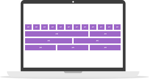
<div class="container">
<div class="row">
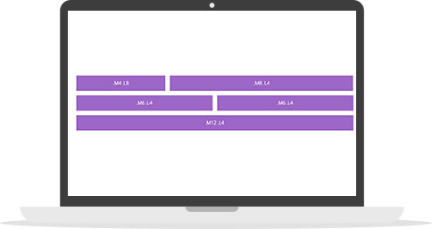
<div class="M1">...</div> * 12
<div class="M8">...</div><div class="M4">...</div>
<div class="M6">...</div><div class="M6">...</div>
<div class="M4">...</div> * 3
</div>
</div>Media Queries
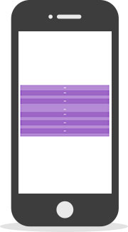
Media queries is a basis of any Responsive Grid System. To change column behavior each media query breakpoint connected with column class name with simply recognizing size name: X, S, M, L, XL.
As example column with .M6 class will be halfwidth until the window width becomes equal to 768px or less matching $screen--M.
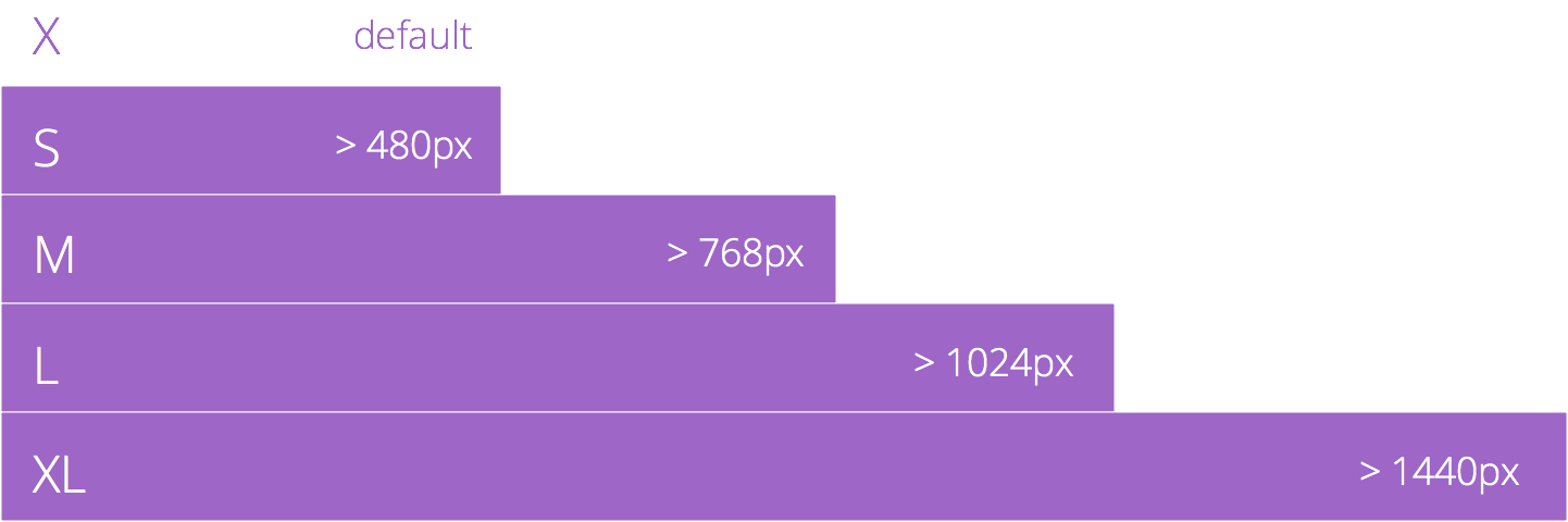
Predefined break points:
$break--S:  480px;
$break--M:  768px;
$break--L:  1024px;
$break--XL: 1440px;
To change column content behavior...
<div class="container">
    <div class="row">
        <div class="M6">
            <div class="foo">...</div>
        </div>
    </div>
</div>
...use appropriate media query
@media (min-width: $screen--M) {
    .foo {
        ...
    }
}
Mixing columns
Wanna different behavior on multiple devices? Try to mix columns.
<div class="container">
<div class="row">
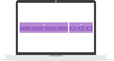
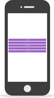
<div class="M4 L8">...</div>
<div class="M8 L4">...</div>
</div>
<div class="row">
<div class="M6 L4">...</div>
<div class="M6 L4">...</div>
<div class="M12 L4">...</div>
</div>
</div>You can mix any number of different grid classes
Nesting columns
Grid columns can be nested one into another.
<div class="container">
    <div class="row">
        <div class="M8">
            <div class="row">
                <div class="M6">...</div>
                <div class="M6">...</div>
            </div>
        </div>
        <div class="M4">
            <div class="row">
                <div class="M4">...</div>
                <div class="M4">...</div>
                <div class="M4">...</div>
            </div>
        </div>
    </div>
</div>
Offseting columns
Move columns right using --offsetN suffix on grid classes. These will increase left indent of a column. As example .M--offset2 moves .M6 block over 2 columns.
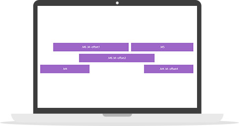
<div class="container">
    <div class="row">
        <div class="M6 M--offset1">...</div>
        <div class="M5">...</div>
    </div>
    <div class="row">
        <div class="M6 M--offset2">...</div>
    </div>
    <div class="row">
        <div class="M4">...</div>
        <div class="M4 M--offset4">...</div>
    </div>
</div>
Reordering columns
Grid columns order can be changed in any way with --orderN suffix.
You can change swap blocks position on different devices. No need to duplicate blocks anymore.
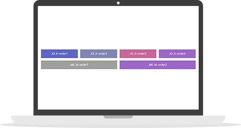
<div class="container">
<div class="row">
<div class="M3 X--order4">...</div>
<div class="M3 X--order1">...</div>
<div class="M3 X--order2">...</div>
<div class="M3 X--order3">...</div>
</div>
<div class="row">
<div class="M6 M--order6">...</div>
<div class="M3 M--order6">...</div>
</div>
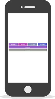
</div>Reversing columns
Well, hard to say what for, but columns can be also reversed with N--reverse
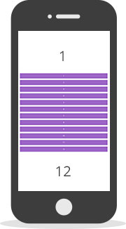
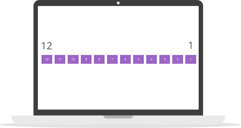
<div class="container">
    <div class="row X--reverse">
        <div class="M1">1</div>
        <div class="M1">2</div>
        <div class="M1">3</div>
        <div class="M1">4</div>
        <div class="M1">5</div>
        <div class="M1">6</div>
        <div class="M1">7</div>
        <div class="M1">8</div>
        <div class="M1">9</div>
        <div class="M1">10</div>
        <div class="M1">11</div>
        <div class="M1">12</div>
    </div>
</div>
Aligning columns
Horizontal
There is predefined classes for horizontal alignment with --start, --center, --end.
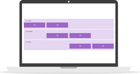
<div class="container">
    <div class="row X--start">
        <div class="X3">...</div>
        <div class="X3">...</div>
    </div>
    <div class="row X--center">
        <div class="X3">...</div>
        <div class="X3">...</div>
    </div>
    <div class="row X--end">
        <div class="X3">...</div>
        <div class="X3">...</div>
    </div>
</div>
Vertical
There is also predefined classes for vertical alignment with --top, --middle, --bottom.
Also you can do full height stretch with N--stretch.
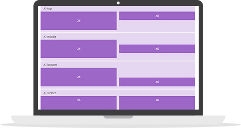
<div class="container">
    <div class="row X--top">
        <div class="X3">...</div>
        <div class="X3">...</div>
    </div>
    <div class="row X--middle">
        <div class="X3">...</div>
        <div class="X3">...</div>
    </div>
    <div class="row X--bottom">
        <div class="X3">...</div>
        <div class="X3">...</div>
    </div>
    <div class="row X--stretch">
        <div class="X6">...</div>
        <div class="X6">...</div>
    </div>
</div>
Distribution column space
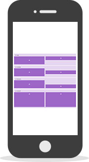
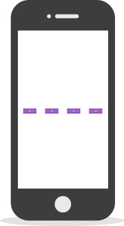
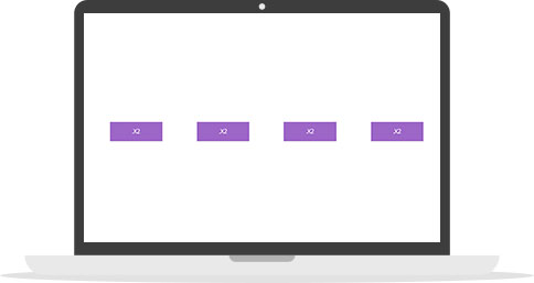
Between
Another helpful feature can be distribution columns space between or around columns.
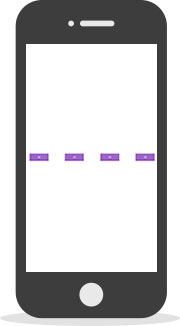
<div class="container">
<div class="row X--between">
<div class="X2">...</div>
<div class="X2">...</div>
<div class="X2">...</div>
<div class="X2">...</div>
</div>
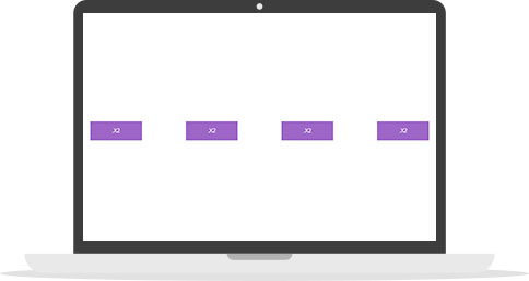
</div>Around
<div class="container">
    <div class="row X--around">
        <div class="X2">...</div>
        <div class="X2">...</div>
        <div class="X2">...</div>
        <div class="X2">...</div>
    </div>
</div>
Browsers support
 IE / Edge |
 Firefox |
 Chrome |
 Safari |
 Opera |
 iOS Safari |
 Opera Mini |
 Chrome for Android |
|---|---|---|---|---|---|---|---|
| IE10, IE11, Edge | last 2 versions | last 2 versions | last 2 versions | last 2 versions | last 2 versions | last 2 versions | last 2 versions |
FAQ
What is Grid?
The vast majority of websites out there use a grid. They may not explicitly have a grid system in place, but if they have a "main content area" floated to the left a "sidebar" floated to the right, it's a simple grid.
Why use Grid at all?
Using grid system can significant speed up your work, keep you code understandable, solid and DRY.
Why use Flexbox Grid System (FGS) instead float one?
Simply. It's more flexible :) FGS provides you not only the same functionality as float one, it allows significant expand Grid functionality with sorting, reordering, aligning and distribution features.
Concerns?
If you can't say, "Screw IE9" you probably not ready for Flexboxes model in general yet.
Also at the moment FGS should contain vendor prefixes -ms- for IE10 and -webkit- for Safari, which increase little bit styles size.
Why use Flex Box Grid? What alternatives are exist?
I tried to use Foundation Grid by Zurb, Flexbox Grid by Kristofer Joseph, Solved by Flexbox by Philip Walton and others. All of them not bad, but in my opinion too complicated for first meet, have specific namespaces and have not full features that Flexboxes model provides.
Flex Box Grid uses simple object oriented name spacing, provides ease customization via Sass variables and have full list of Flexbox features.