abraztsov / Reactsimpleflexgrid
Programming Languages
Projects that are alternatives of or similar to Reactsimpleflexgrid
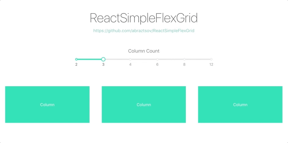
ReactSimpleFlexGrid
A way to quickly add a Flexbox Grid Layout to your app 🚀
Layout based on 12 Grids System.
Basic Usage
-
Install via
npmandyarnnpm i -S react-simple-flex-grid // or yarn add react-simple-flex-grid -
Import
Row,Coland grid stylesimport { Row, Col } from 'react-simple-flex-grid'; import "react-simple-flex-grid/lib/main.css"; -
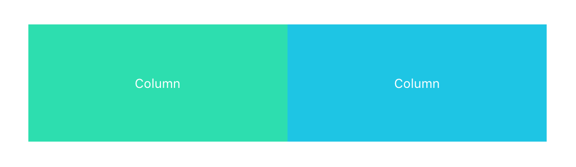
Enjoy
<Row>
   <Col span={6}>Column</Col>
   <Col span={6}>Column</Col>
</Row>
Customize
Basic steps to customize grid.
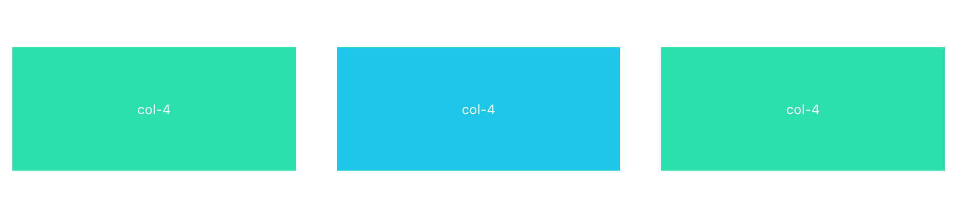
Gutter 🌟
You can use the gutter (px) property of Row as grid spacing.
<Row gutter={40}>
   <Col span={4}>col-4</Col>
   <Col span={4}>col-4</Col>
   <Col span={4}>col-4</Col>
</Row>
Column Offset 😃
Offset can set the column to the right side.
<Row gutter={40}>
   <Col span={4} offset={4}>col-4</Col>
   <Col span={4}>col-4</Col>
</Row>

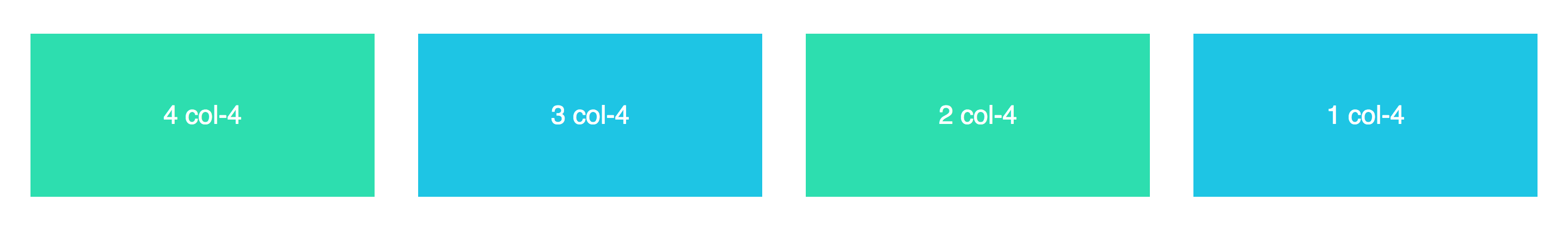
Column Order 🤙
Order property can easily change column order.
<Row gutter={40}>
   <Col span={4} order={4}>4 col-4</Col>
   <Col span={4} order={3}>3 col-4</Col>
   <Col span={4} order={2}>2 col-4</Col>
   <Col span={4} order={1}>1 col-4</Col>
</Row>
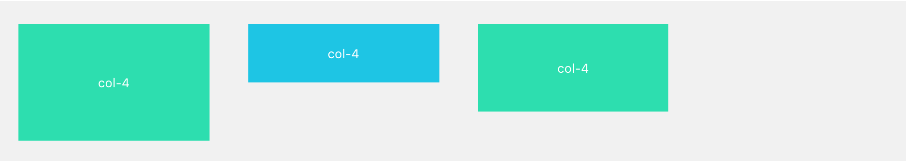
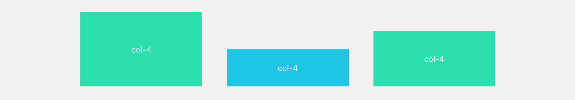
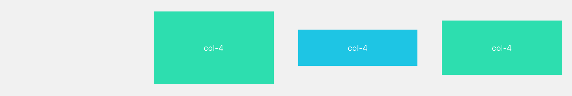
Column Sort 🤘
Flexbox params start, center, end, space-between and space-around can be passed to Row and sort columns inside.
<Row gutter={40} justify="start" align="top">
   <Col span={4}>col-4</Col>
   <Col span={4}>col-4</Col>
   <Col span={4}>col-4</Col>
</Row>
<Row gutter={40} justify="center" align="bottom">
   <Col span={4}>col-4</Col>
   <Col span={4}>col-4</Col>
   <Col span={4}>col-4</Col>
</Row>
<Row gutter={40} justify="end" align="middle">
   <Col span={4}>col-4</Col>
   <Col span={4}>col-4</Col>
   <Col span={4}>col-4</Col>
</Row>
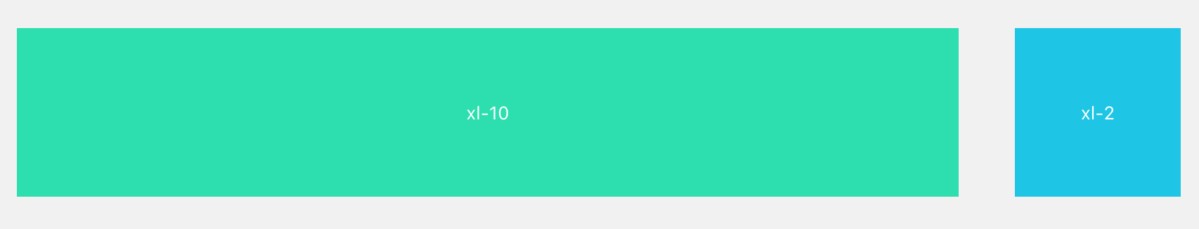
Responsive 💫
Based on Bootstrap media queries here five dimensions: xs, sm, md, lg, xl.
<Row gutter={40}>
  <Col xs={2} sm={4} md={6} lg={8} xl={10}>xl-10</Col>
  <Col xs={10} sm={8} md={6} lg={4} xl={2}>xl-2</Col>
</Row>
Exotic Responsive 🏝️
Span and offset property can be embedded into xs, sm, md, lg, xl such as xl = {{span: 10}}.
<Row gutter={40}>
  <Col xs={{ span: 6, offset: 2 }}>xs-6</Col>
  <Col span={4}>col-4</Col>
</Row>

API
Row
| Property | Description | Type | Default |
|---|---|---|---|
| gutter | grid spacing | number | 0 |
| align | the vertical alignment of the layout of flex: top middle bottom stretch
|
string | start |
| justify | horizontal arrangement of the layout of flex: start end center space-around space-between
|
string | start |
Col
| Property | Description | Type | Default |
|---|---|---|---|
| span | the number of cells,0 corresponds to display: none | number | none |
| offset | the number of cells to the left of the grid spacing, no cell in grid spacing | number | 0 |
| order |
col number in the row |
number | none |
| xs | <768px and also default setting, could be a span value or a object contain above props | number/object | - |
| sm | ≥768px, could be a span value or a object contain above props | number/object | - |
| md | ≥992px, could be a span value or a object contain above props | number/object | - |
| lg | ≥1200px, could be a span value or a object contain above props | number/object | - |
| xl | ≥1600px, could be a span value or a object contain above props | number/object | - |
How to test example locally ?
git clone https://github.com/abraztsov/ReactSimpleFlexGrid.gitcd ReactSimpleFlexGridnpm start- Go to
localhost:8080
Feature Requests / Find Bug ?
Have an idea for a package or a feature you'd love to see in ReactSimpleFlexGrid? Search for existing GitHub issues and join the conversation or create new!
FAQ
This component based on ant design grid. Huge thanks them for a such an awesome work.
Updates
You can see table for update information.
| No. | Version | Breakdown | Ket. |
|---|---|---|---|
| 1. | 1.0.1 | First Release | |
| 2. | 1.0.2 | - Added autoprefixer | |
| - Fixed Safari bug | |||
| 3. | 1.0.3 | Removed unnecessary package | |
| 4. | 1.1.0 | Added order parameter | |
| 5. | 1.3.0 | Added stretch option to align property |