leinardi / Floatingactionbuttonspeeddial
Programming Languages
Projects that are alternatives of or similar to Floatingactionbuttonspeeddial
Floating Action Button Speed Dial
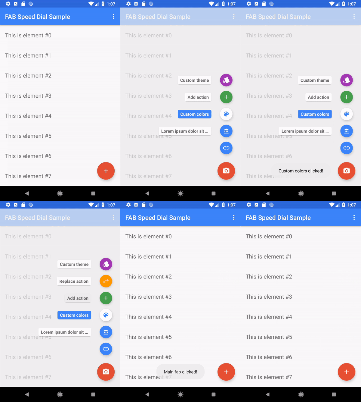
Android library providing an implementation of the Material Design Floating Action Button Speed Dial.
Features
- [x] MinSdk 14
- [x] Highly customizable (label, icon, ripple, fab and label background colors, themes support)
- [x] Same animations as in Inbox by Gmail
- [x] Option to have different icons for open/close state
- [x] Optional overlay/touch guard layout
- [x] Support for bottom, left and right menu expansion (left and right have no labels)
- [x] Out-of-the box support for Snackbar behavior
- [x] Optional support for
RecyclerViewandNestedScrollViewbehavior - [x] Support for VectorDrawable
- [x] Easy to use
How to use
Gradle setup
Official releases
The library is available on Jcenter so no additonal repository is required.
Dependencies entry (latest version on Jcenter 
implementation "com.leinardi.android:speed-dial:3.1.1"
Snapshots (development branch)
You can use JitPack to test the latest master (remember that master is the development branch and can be unstable or completely broken).
Add the JitPack repository to your build file:
maven { url 'https://jitpack.io' }
Add the dependency
implementation 'com.github.leinardi:FloatingActionButtonSpeedDial:master-SNAPSHOT'
Basic use
SpeedDialView
Add the SpeedDialView to your layout:
<com.leinardi.android.speeddial.SpeedDialView
    android:id="@+id/speedDial"
    android:layout_width="wrap_content"
    android:layout_height="wrap_content"
    android:layout_gravity="bottom|end"
    app:sdMainFabClosedSrc="@drawable/ic_add_white_24dp" />
Action items
Add the items to the SpeedDialView:
val speedDialView = findViewById<SpeedDialView>(R.id.speedDial)
speedDialView.addActionItem(
    SpeedDialActionItem.Builder(R.id.fab_no_label, R.drawable.ic_link_white_24dp)
        .create())
If the color customization is not requested, it is also possible to inflate the Action items form a Menu Resource:
speedDialView.inflate(R.menu.menu_speed_dial)
Only the attributes android:id, android:icon and android:title are supported.
Click listeners
Add the click listeners:
speedDialView.setOnActionSelectedListener(SpeedDialView.OnActionSelectedListener { actionItem ->
    when (actionItem.id) {
        R.id.fab_no_label -> {
            showToast("No label action clicked!\nClosing with animation")
            speedDialView.close() // To close the Speed Dial with animation
            return@OnActionSelectedListener true // false will close it without animation
        }
    }
    false
})
Optional steps
Add the main action click listener
speedDialView.setOnChangeListener(object : SpeedDialView.OnChangeListener {
    override fun onMainActionSelected(): Boolean {
        showToast("Main action clicked!")
        return false // True to keep the Speed Dial open
    }

    override fun onToggleChanged(isOpen: Boolean) {
        Log.d(TAG, "Speed dial toggle state changed. Open = $isOpen")
    }
})
Customizing the items
The SpeedDialActionItem.Builder provides several setters to customize the aspect of one item:
speedDialView.addActionItem(SpeedDialActionItem.Builder(R.id.fab_custom_color, drawable)
        .setFabBackgroundColor(ResourcesCompat.getColor(getResources(), R.color.material_white_1000, getTheme()))
        .setFabImageTintColor(ResourcesCompat.getColor(getResources(), R.color.inbox_primary, getTheme()))
        .setLabel(getString(R.string.label_custom_color))
        .setLabelColor(Color.WHITE)
        .setLabelBackgroundColor(ResourcesCompat.getColor(getResources(), R.color.inbox_primary, getTheme()))
        .setLabelClickable(false)
        .create())
Is is also possible to specify a theme to easily change the FAB background and ripple effect color:
speedDialView.addActionItem(SpeedDialActionItem.Builder(R.id.fab_custom_theme, R.drawable.ic_theme_white_24dp)
        .setLabel(getString(R.string.label_custom_theme))
        .setTheme(R.style.AppTheme_Purple)
        .create())
<style name="AppTheme.Purple" parent="AppTheme">
    <item name="colorPrimary">@color/material_purple_500</item>
    <item name="colorPrimaryDark">@color/material_purple_700</item>
    <item name="colorAccent">@color/material_purple_a700</item>
    <item name="colorControlHighlight">@color/material_purple_200</item>
</style>
Adding an overlay/touch guard when the menu is open (like Inbox by Gmail)
You simply need to add the SpeedDialOverlayLayout to your layout:
<com.leinardi.android.speeddial.SpeedDialOverlayLayout
    android:id="@+id/overlay"
    android:layout_width="match_parent"
    android:layout_height="match_parent" />
and then provide the instance of that layout to the SpeedDialView:
<com.leinardi.android.speeddial.SpeedDialView
    android:id="@+id/speedDial"
    android:layout_width="wrap_content"
    android:layout_height="wrap_content"
    app:sdMainFabClosedSrc="@drawable/ic_add_white_24dp"
    app:sdOverlayLayout="@id/overlay" />
or
val overlayLayout = findViewById<SpeedDialOverlayLayout>(R.id.overlay)
speedDialView.setSpeedDialOverlayLayout(overlayLayout)
Hiding the FAB when scrolling a RecyclerView or a NestedScrollView
Just apply the ScrollingViewSnackbarBehavior to the SpeedDialView. This can be done via XML using
the convenience string resource @string/speeddial_scrolling_view_snackbar_behavior:
<com.leinardi.android.speeddial.SpeedDialView
    android:id="@+id/speedDial"
    android:layout_width="wrap_content"
    android:layout_height="wrap_content"
    app:layout_behavior="@string/speeddial_scrolling_view_snackbar_behavior" />
Or programmatically:
val params = speedDialView.layoutParams as CoordinatorLayout.LayoutParams
params.behavior = SpeedDialView.ScrollingViewSnackbarBehavior()
speedDialView.requestLayout()
NB: for the behaviors to work, SpeedDialView needs to be a direct child of CoordinatorLayout
Disabling SnackbarBehavior
Since the SnackbarBehavior is enabled by default and, afaik, it is not possible to remove a Behavior, simply use apply the SpeedDialView.NoBehavior instead:
val params = speedDialView.layoutParams as CoordinatorLayout.LayoutParams
params.behavior = SpeedDialView.NoBehavior()
speedDialView.requestLayout()
Sample project
A fully working example is available here.
Demo
Video
https://www.youtube.com/watch?v=tWowiF5ElAg
Sample app
Screenshots
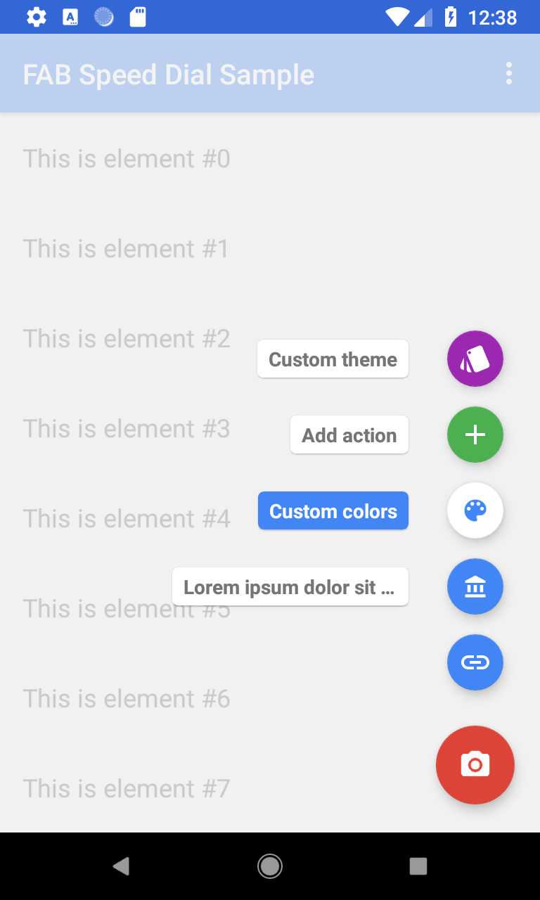
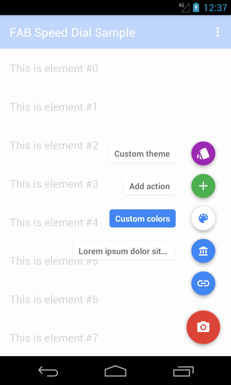
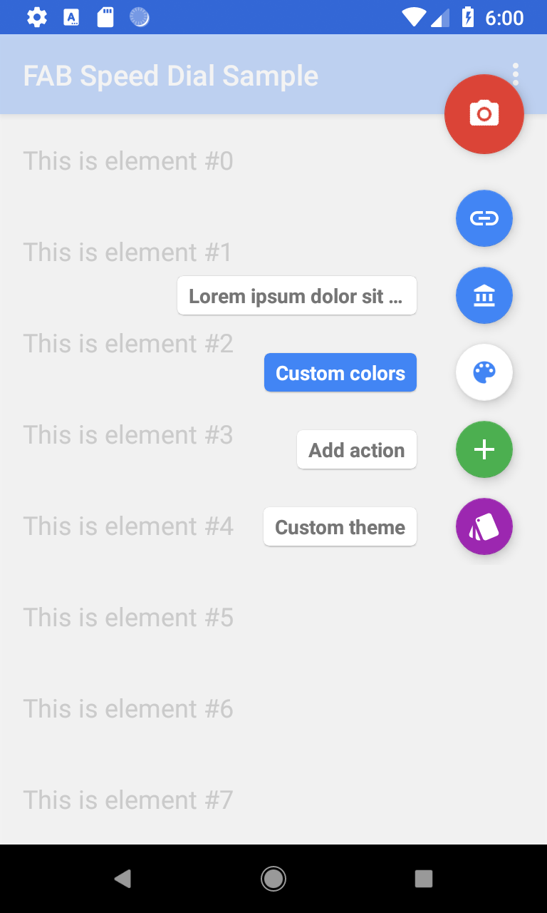
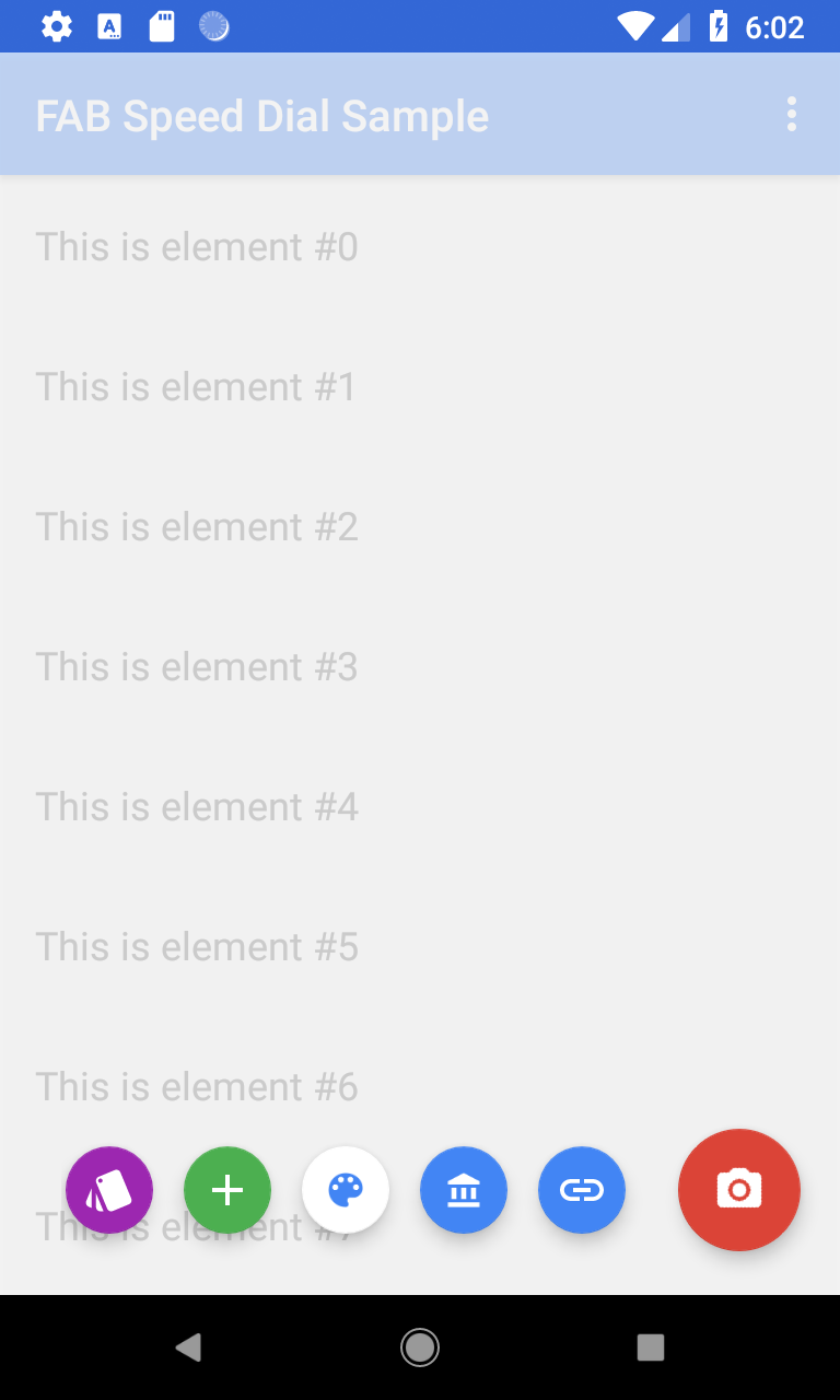
API 27, API 16, bottom and left expansion
FAQ
How can I create a new resource ID, required by the SpeedDialActionItem.Builder?
It can be done in XML using the <item type="id" />:
<resources>
    <item name="fab_action1" type="id" />
    <item name="fab_action2" type="id" />
    <item name="fab_action3" type="id" />
    <item name="fab_action4" type="id" />
</resources>
How can I change the maximum length of the label?
You can set a different value for the max length of the label overriding sd_label_max_width:
<dimen name="sd_label_max_width">240dp</dimen>
More info here.
How can I change the color of the overlay / touch guard layout?
The color of the SpeedDialOverlayLayout can be changed simply using the android:background attribute or, programmatically, using the equivalent setter like any other view.
How can I prevent the overlay / touch guard layout from going over the Toolbar inside a CoordinatorLayout?
It can be done using the attribute app:layout_behavior="@string/appbar_scrolling_view_behavior":
<com.leinardi.android.speeddial.SpeedDialOverlayLayout
    android:id="@+id/overlay"
    android:layout_width="match_parent"
    android:layout_height="match_parent"
    app:layout_behavior="@string/appbar_scrolling_view_behavior" />
Changelog
See the CHANGELOG.md
Credits
This project is based on floating-action-menu by ArthurGhazaryan.
Licenses
Copyright 2019 Roberto Leinardi.

Licensed to the Apache Software Foundation (ASF) under one or more contributor
license agreements.  See the NOTICE file distributed with this work for
additional information regarding copyright ownership.  The ASF licenses this
file to you under the Apache License, Version 2.0 (the "License"); you may not
use this file except in compliance with the License.  You may obtain a copy of
the License at

  http://www.apache.org/licenses/LICENSE-2.0

Unless required by applicable law or agreed to in writing, software
distributed under the License is distributed on an "AS IS" BASIS, WITHOUT
WARRANTIES OR CONDITIONS OF ANY KIND, either express or implied.  See the
License for the specific language governing permissions and limitations under
the License.


