sourcechord / Gridextra
Labels
Projects that are alternatives of or similar to Gridextra
GridExtra
GridExtra is a custom panel library for WPF/UWP.
- ResponsiveGrid
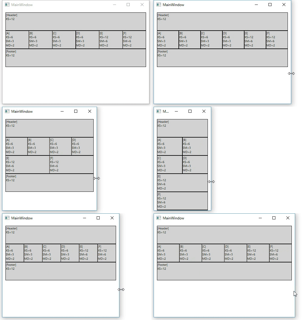
- Custom Panel class that provides bootstrap like grid system.
- Grid system
- switch layout with window width.
- XS(<768px), SM(<992px), MD(<1200px), LG(1200px<=)
- 12 columns across the page.(customizable with MaxDivision property)
- switch layout with window width.
- GridEx
- Helper class that defines usefull attached properties for Grid panel.
- WrapPanelEx
- Helper class that provide adaptive layout for WrapPanel.
install
Nuget Package
Install-Package GridExtra
https://www.nuget.org/packages/GridExtra/
Preparation
Add xmlns to xaml code.
For WPF
xmlns:ge="clr-namespace:SourceChord.GridExtra;assembly=GridExtra.Wpf"
For UWP
xmlns:ge="using:SourceChord.GridExtra"
Usage
ResponsiveGrid
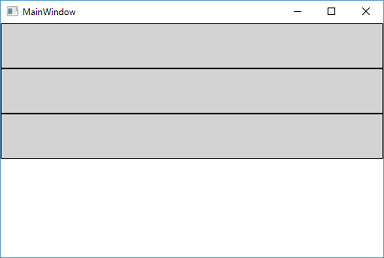
ResponsiveGrid provides the grid layout system that is similar to Bootstrap framework.
Example
    <Grid>
        <Grid.Resources>
            <Style TargetType="{x:Type Border}">
                <Setter Property="BorderBrush" Value="Black" />
                <Setter Property="BorderThickness" Value="1" />
                <Setter Property="Background" Value="LightGray" />
                <Setter Property="Height" Value="60" />
            </Style>
        </Grid.Resources>
        <rg:ResponsiveGrid>
            <Border ge:ResponsiveGrid.XS="12" ge:ResponsiveGrid.SM="3" />
            <Border ge:ResponsiveGrid.XS="12" ge:ResponsiveGrid.SM="6" />
            <Border ge:ResponsiveGrid.XS="12" ge:ResponsiveGrid.SM="3" />
        </rg:ResponsiveGrid>
    </Grid>
Properties
Dependency Properties
| Property Name | Type | Description |
|---|---|---|
| MaxDivision | int | Gets or sets a value that determines grid divisions. |
| BreakPoints | BreakPoints class | |
| ShowGridLines | int | Gets or sets a value that indicates whether grid column's lines are visible within this ResponsiveGrid. |
Attached Properties
| Property Name | Type | Description |
|---|---|---|
| XS SM MD LG |
int | Gets or sets a value that determines grid columns for XS(extra small), SM(small), MD(medium), LG(large) devices. |
| XS_Offset SM_Offset MD_Offset LG_Offset |
int | Gets or sets a value that determines grid columns offset for XS(extra small), SM(small), MD(medium), LG(large) devices. |
| XS_Push SM_Push MD_Push LG_Push |
int | Gets or sets a value that moves columns to right from the original position. |
| XS_Pull SM_Pull MD_Pull LG_Pull |
int | Gets or sets a value that moves columns to left from the original position. |
Compared to bootstrap
| bootstrap | ResponsiveGrid |
|---|---|
| col-xs col-sm col-md col-lg |
XS SM MD LG |
| col-xs-offset col-sm-offset col-md-offset col-lg-offset |
XS_Offset SM_Offset MD_Offset LG_Offset |
| col-xs-push col-sm-push col-md-push col-lg-push |
XS_Push SM_Push MD_Push LG_Push |
| col-xs-pull col-sm-pull col-md-pull col-lg-pull |
XS_Pull SM_Pull MD_Pull LG_Pull |
| visibility-xs, visibility-sm,… hidden-xs, hidden-sm,... |
(T.B.D.) |
attention
ResponsiveGrid is not suitable for ItemsPanel, because it isn't implemented VirtualizingPanel class.
If you use ResponsiveGrid in ListBox as ItemsPanel. Your ListBox become to not virtualize items of ListBox.
GridEx
GridEx is Helper class for defining Grid properties.
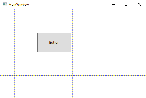
Example1 (Row/Column Definition)
    <Grid ge:GridEx.RowDefinition="*, *, *, *"
          ge:GridEx.ColumnDefinition="50, 75, *, 2*"
          ShowGridLines="True">
        <Button Grid.Row="1"
                Grid.Column="2"
                Margin="5"
                Content="Button" />
    </Grid>
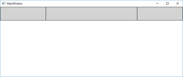
Row/Column Definition with Min/Max size
    <Grid ge:GridEx.RowDefinition="*, *, *, *"
          ge:GridEx.ColumnDefinition="50, *(50-200), 2*(80-), 2*(-300)"
          ShowGridLines="True">
        <Button Grid.Row="1"
                Grid.Column="2"
                Margin="5"
                Content="Button" />
    </Grid>
ge:GridEx.ColumnDefinition="50, *(50-200), 2*(80-), 2*(-300)" is similar to below definition.
        <Grid.ColumnDefinitions>
            <ColumnDefinition Width="50"/>
            <ColumnDefinition Width="*" MinWidth="50" MaxWidth="200"/>
            <ColumnDefinition Width="2*" MinWidth="80"/>
            <ColumnDefinition Width="2*" MaxWidth="300"/>
        </Grid.ColumnDefinitions>
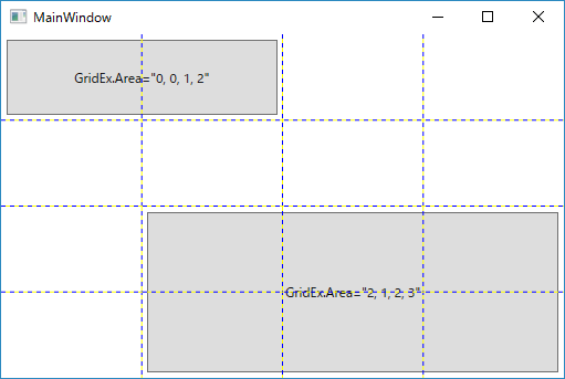
Example2 (Area Definition)
Area property provides the way of defineing Row/Column/RowSpan/ColumnSpan.
<Grid ge:GridEx.RowDefinition="*, *, *, *"
ge:GridEx.ColumnDefinition="*, *, *, *"
ShowGridLines="True">
<Button Margin="5"
ge:GridEx.Area="0, 0, 1, 2"
Content="GridEx.Area="0, 0, 1, 2"" />
<Button Margin="5"
ge:GridEx.Area="2, 1, 2, 3"
Content="GridEx.Area="2, 1, 2, 3"" />
</Grid>
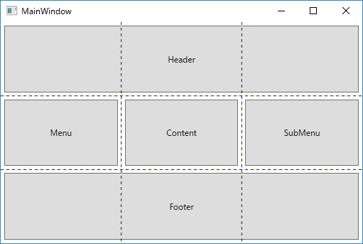
Example3 (Named Template Area)
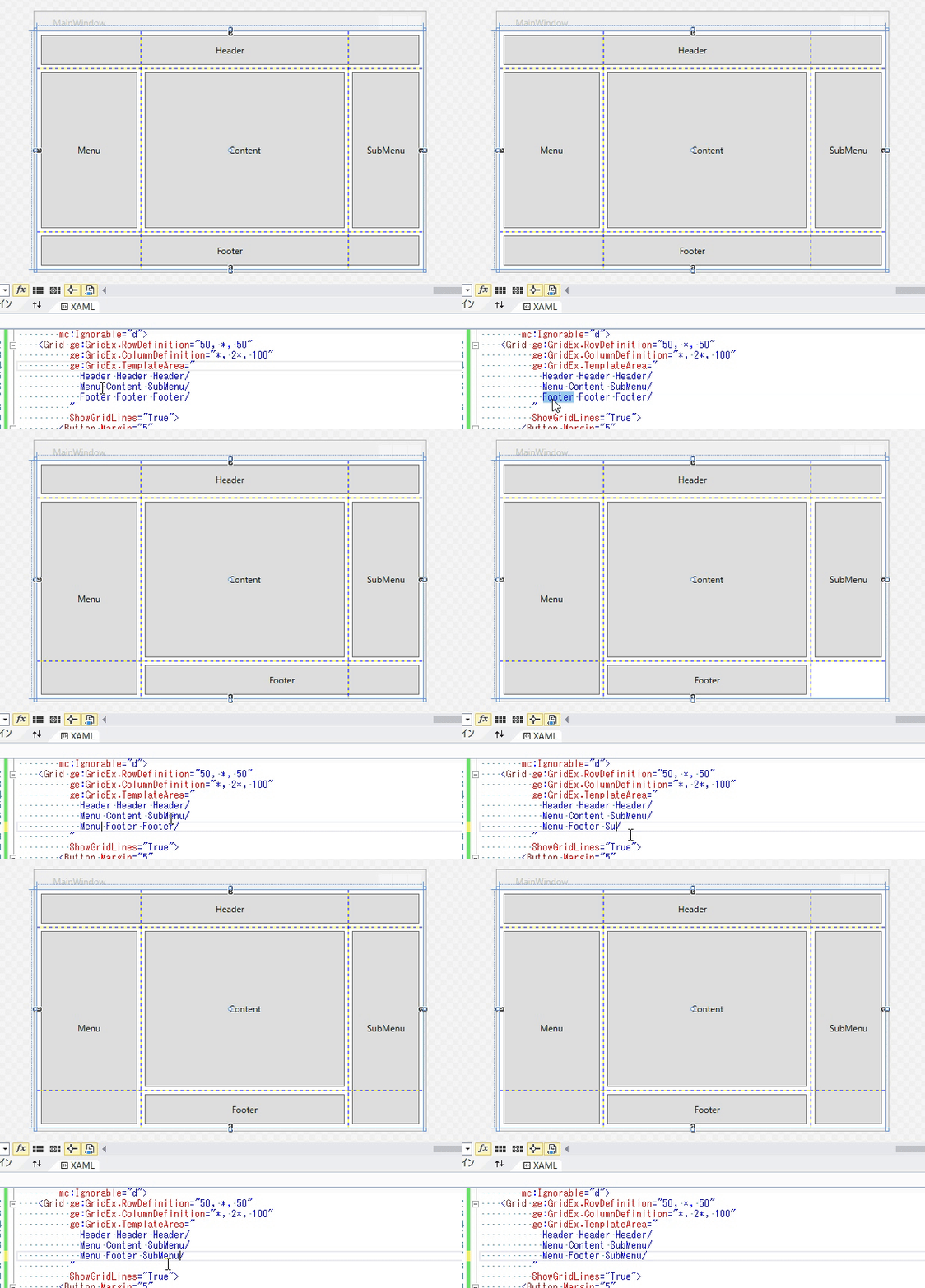
TemplateArea provides named grid areas, like CSS Grid Layout Module Level 1.
TemplateArea property makes row/column definition. And, define region's name.
Children of Grid can be placed with region's name, that is defined by TemplateArea property.
<Grid ge:GridEx.TemplateArea="
Header Header Header
Menu Content SubMenu
Footer Footer Footer
"
ShowGridLines="True">
<Button Margin="5"
ge:GridEx.AreaName="Header"
Content="Header" />
<Button Margin="5"
ge:GridEx.AreaName="Menu"
Content="Menu" />
<Button Margin="5"
ge:GridEx.AreaName="Content"
Content="Content" />
<Button Margin="5"
ge:GridEx.AreaName="SubMenu"
Content="SubMenu" />
<Button Margin="5"
ge:GridEx.AreaName="Footer"
Content="Footer" />
</Grid>
Row devision is defined by line feed or /.
- line feed
-
\n(.cs) -
(xaml)
-
/
    <Grid ge:GridEx.TemplateArea="
            Header Header Header/
            Menu Content SubMenu/
            Footer Footer Footer/
          ">
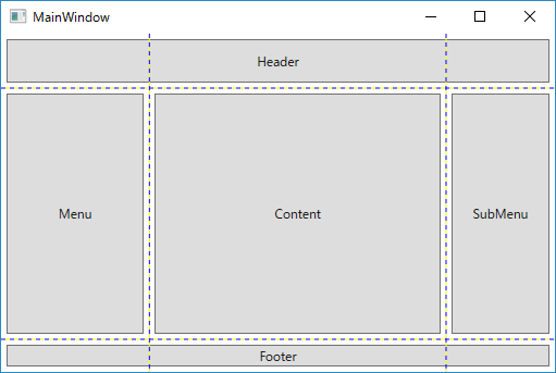
Example4 (Named Template Area, working with RowDefinition/ColumnDefintion)
    <Grid ge:GridEx.RowDefinition="50, *, 30"
          ge:GridEx.ColumnDefinition="*, 2*, 100"
          ge:GridEx.TemplateArea="
            Header Header Header/
            Menu Content SubMenu/
            Footer Footer Footer/
          "
          ShowGridLines="True">
        <Button Margin="5"
                ge:GridEx.AreaName="Header"
                Content="Header" />
        <Button Margin="5"
                ge:GridEx.AreaName="Menu"
                Content="Menu" />
        <Button Margin="5"
                ge:GridEx.AreaName="Content"
                Content="Content" />
        <Button Margin="5"
                ge:GridEx.AreaName="SubMenu"
                Content="SubMenu" />
        <Button Margin="5"
                ge:GridEx.AreaName="Footer"
                Content="Footer" />
    </Grid>
Attached Properties(for Grid)
| Property Name | Type | Description |
|---|---|---|
| RowDefinition | string | Sets a value that determines row definition of Grid. |
| ColumnDefinition | string | Sets a value that determines column definition of Grid. |
| TemplateArea | string | Sets a definition of grid devision and area names. |
Attached Properties(for Grid children)
| Property Name | Type | Description |
|---|---|---|
| Area | string | Sets a value that determines Row, Column, RowSpan, ColumnSpan properties. |
| AreaName | string | Sets a name of regions for item's belong.(use with TemplateArea property) |
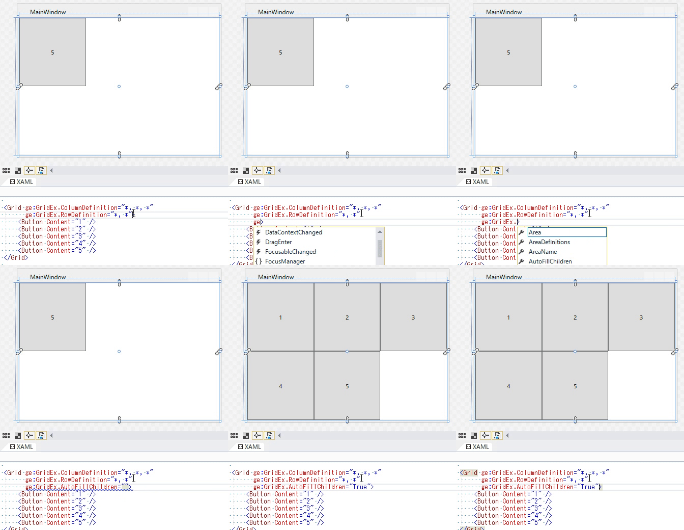
Example5 (Auto fill children)
Attached Properties(for Grid)
| Property Name | Type | Description |
|---|---|---|
| AutoFillChildren | string | Gets or sets a value that indicates whether the Grid arranges its children to each cell. |
| AutoFillOrientation | string | Sets a value that determines auto fill orientation. |
Attached Properties(for Grid children)
| Property Name | Type | Description |
|---|---|---|
| AutoFillSpan | string | Sets a value that determines cell span value that is used during AutoFill process. |
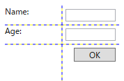
    <Grid ge:GridEx.ColumnDefinition="*, *"
        ge:GridEx.RowDefinition="Auto, Auto, Auto"
        ge:GridEx.AutoFillChildren="True"
        ShowGridLines="True">
        <TextBlock Text="Name:" />
        <TextBox VerticalAlignment="Top" Margin="5"/>

        <TextBlock Text="Age:" />
        <TextBox VerticalAlignment="Top" Margin="5"/>

        <Button ge:GridEx.Area="2, 1, 1, 1"
            Margin="5" Width="60"
            HorizontalAlignment="Right"
            Content="OK" />
    </Grid>
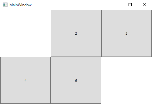
AutoFillChildren with Hidden/Collapsed items
    <Grid ge:GridEx.ColumnDefinition="*, *, *"
          ge:GridEx.RowDefinition="*, *"
          ge:GridEx.AutoFillChildren="True">
        <Button Content="1" Visibility="Hidden"/>
        <Button Content="2" />
        <Button Content="3" />
        <Button Content="4" />
        <Button Content="5" Visibility="Collapsed" />
        <Button Content="6" />
    </Grid>
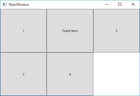
AutoFillChildren with pinned items
    <Grid ge:GridEx.ColumnDefinition="*, *, *"
          ge:GridEx.RowDefinition="*, *"
          ge:GridEx.AutoFillChildren="True">
        <Button Content="1" />
        <Button Content="2" />
        <Button Content="3" />
        <Button Content="4" />
        <Button Content="Fixed Item" ge:GridEx.Area="0,1,1,1"/>
    </Grid>
WrapPanelEx (WPF Only)
WrapPanelEx is Helper class that provide adaptive layout for WrapPanel.
Example1
WrapPanelEx.AdaptiveLayout property makes WrapPanel into UWP Community Toolkit's AdaptiveGridView like layout.
    <Grid>
        <Grid.RowDefinitions>
            <RowDefinition />
            <RowDefinition Height="Auto"/>
        </Grid.RowDefinitions>
        <WrapPanel ItemWidth="200" ItemHeight="70"
                   Orientation="Horizontal"
                   ge:WrapPanelEx.AdaptiveLayout="{Binding IsChecked, ElementName=chkIsAdaptive}">
            <Button />
            <Button />
            <Button />
            <Button />
            <Button />
            <Button />
            <Button />
        </WrapPanel>
        <CheckBox x:Name="chkIsAdaptive"
                  Grid.Row="1" Margin="5"
                  Content="WrapPanelEx.AdaptiveLayout"/>
    </Grid>

