heidji / Ionic4 Hidenav
Programming Languages
Labels
Projects that are alternatives of or similar to Ionic4 Hidenav
Hide Navigation Bar for Ionic 4
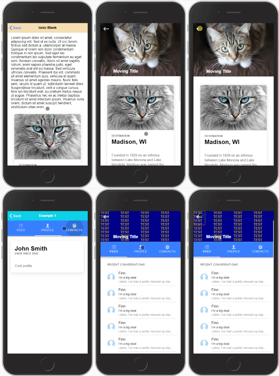
With this module you can:
- implement an expansible header that stretches when pulling the page down
- auto-hide the page header when scrolling down
🔥 ..Also works with Supertabs 🔥
Check out the example
Note:
Both should not be used together on the same page, either you want to make room for reading content or you want to add an expansible header, not both together :)
This plugin is also made as generic as possible, making it maybe a bit harder to setup but giving the user much more freedom to design what he wants.
Installation
npm i ionic4-hidenav
Implementation
Create (or modify if you already have) a shared.module.ts in your project root folder:
import { NgModule } from '@angular/core';
import {HidenavModule} from 'ionic4-hidenav';

@NgModule({
    imports: [HidenavModule],
    exports: [HidenavModule]
})
export class SharedModule { }
and import the SharedModule on every page you intend to use this plugin:
import { NgModule } from '@angular/core';
import { CommonModule } from '@angular/common';
import { FormsModule } from '@angular/forms';
import { Routes, RouterModule } from '@angular/router';

import { IonicModule } from '@ionic/angular';

import { HomePage } from './home.page';
import {SharedModule} from '../shared.module';

const routes: Routes = [
    {
        path: '',
        component: HomePage
    }
];

@NgModule({
    imports: [
        CommonModule,
        FormsModule,
        IonicModule,
        RouterModule.forChild(routes),
        SharedModule
    ],
    declarations: [HomePage]
})
export class HomePageModule {
}
Part 1: Expansible header
This is a custom component defined using this HTML tag:
<hidenav-stretchheader></hidenav-stretchheader>
This component must be defined outside of <ion-content> and comes with required and optional child DOM elements:
Creating the expansible header element
home.page.html
#shrinkexpand: This is the element that will shrink and expand with scrolling the page
#static: Element(s) with this tag will be left alone. You can use these to create buttons on your header for example.
<hidenav-stretchheader header-height="50">
    <div #shrinkexpand><!-- Expanding DOM element --></div>
    <div #static><!-- Title --></div>
    <div #static><!-- Nav button --></div>
</hidenav-stretchheader>
Inputs for <hidenav-stretchheader>:
| input | type | Description |
|---|---|---|
header-height |
required | height to which the header shrinks to |
opacity-factor |
optional / default = 0 |
1 - 10 opacity of shrunk header overlay |
opacity-color |
optional / default = black | accepts any css color description (name, rgb, # ..) |
blur-factor |
optional / default = 0 | the maximum blur when the header is collapsed (accepts integer) |
init-expanded |
optional / default = false | set to true if you want the header to initiate expanded |
no-border |
optional / default = false | set to true if you want to remove the bottom styling of the header |
| Tabspage params only: | ||
preserve-header |
optional / default = false | set to true if you want to keep the header state separate on each tab |
Adding your Header to a simple page:
add the hidenav-sh-content directive to your <ion-content>
<hidenav-stretchheader header-height="50">
    <div #shrinkexpand>...</div>
</hidenav-stretchheader>
<ion-content hidenav-sh-content>
    ....
</ion-content>
Adding your Header to a Supertabs Page:
You need to give the the <ion-content> that holds the <super-tabs> element the directive hidenav-sh-tabscontent then you need to add to each <ion-content> on every tab two directives: hidenav-sh-content and hidenav-tabspage
<hidenav-stretchheader header-height="50">
  <div #shrinkexpand style="background: darkblue; color: gold" (click)="expand()" >...</div>
</hidenav-stretchheader>
<ion-content hidenav-sh-tabscontent>
  <super-tabs>
    <super-tabs-toolbar slot="top">
      <super-tab-button>...</super-tab-button>
      <super-tab-button>...</super-tab-button>
    </super-tabs-toolbar>
    <super-tabs-container>
      <super-tab>
        <ion-content hidenav-sh-content hidenav-tabspage>...</ion-content>
      </super-tab>
      <super-tab>
        <ion-content hidenav-sh-content hidenav-tabspage>...</ion-content>
      </super-tab>
    </super-tabs-container>
  </super-tabs>
</ion-content>
Events:
you can subscribe to the (scroll) event for example like:
<hidenav-stretchheader (scroll)="handleScrollEvent($event)">...</hidenav-stretchheader>
The $event variable returns the current header height.
Functions:
-
expand(duration): scrolls content to top and expands the header. -
shrink(duration): scrolls just about enought to shrink the header if it is expanded. -
toggle(duration): toggles betweenexpand()andshrink().
Note that duration is optional and defaults to 200.
Part 2: Hide Header on scroll
This function is fairly simple to implement than the previous one, all you will have to do is define directives hidenav-header and hidenav-content in the page you want to use.
Adding the hidenav component to a simple page
In the following example, both header and content carry the previously mentioned directives.
<ion-header hidenav-header>...</ion-header>
<ion-content hidenav-content>...</ion-content>
Adding the hidenav component to a Supertabs page
Give the <ion-header> the hidenav-header directive and the <ion-content> that holds the <super-tabs> component the directive hidenav-tabscontent.
As for the <ion-content> elements in each of the tabs give them the hidenav-content and hidenav-tabspage directive.
<ion-header hidenav-header>...</ion-header>
<ion-content hidenav-tabscontent>
  <super-tabs>
    <super-tabs-toolbar slot="top">
      <super-tab-button>...</super-tab-button>
      <super-tab-button>...</super-tab-button>
    </super-tabs-toolbar>
    <super-tabs-container>
      <super-tab>
        <ion-content hidenav-content hidenav-tabspage>...</ion-content>
      </super-tab>
      <super-tab>
        <ion-content hidenav-content hidenav-tabspage>...</ion-content>
      </super-tab>
    </super-tabs-container>
  </super-tabs>
</ion-content>
PS.: as mentioned in the beginning, you should not use both methods (Part1 and Part2) together on one page. It was never tested and is not intended to be used.


