KawalPemilu Visualized
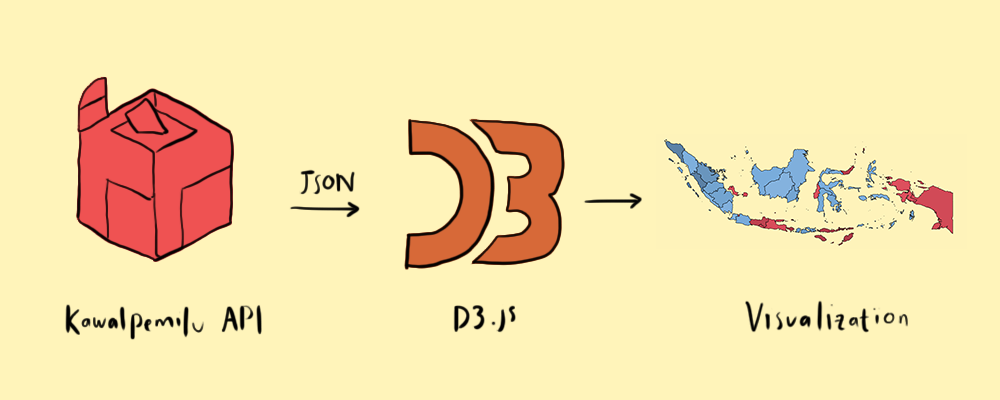 KawalPemilu Visualized is a data visualization of the result of Indonesia's recent election built using D3.js and KawalPemilu API. KawalPemilu Visualized is a static web page and the data visualizations are rendered on the client-side. (For more information about KawalPemilu please visit kawalpemilu.org).
KawalPemilu API Information
KawalPemilu API can be accessed via
https://kawal-c1.appspot.com/api/c/[REGION CODE]?[TIME]/
REGION CODEis a number ranging from 1~... that denotes the location of the place where the votes were collectedTIMEis pretty self-explanatory, to generate time in Javascript useDate.now()
Example of request:
https://kawal-c1.appspot.com/api/c/0?1555803179480/
This will request votes data in JSON format for all provinces on Sunday, 21st April 6:33 AM GMT+7.
JSON file
The JSON file consists of two bigger parts, the first one is the value of "children". It consists of an array of arrays of the information about the provinces (if the REGION CODE is 0).
Example:
[1,"ACEH",15610,1734674,1789100]
The first element is the code number to access the data from the API so if the REGION CODE that is being used is 1 it will give the votes data for the REGENCY and CITY in ACEH province.
The second element corresponds to the total number of voting places in the region.
The second part is made of the vote data. To access the value, use the REGION CODE obtained from the first element of the former part as the key. The objects returned are pretty much self-explanatory, please cross check to KawalPemilu tabular data columns in case of doubt.
Start the Development on your PC
You need to have Python3++ installed or any code editor with Live Preview extension will do (e.g. VS Code or Brackets)
$ git clone https://github.com/hariesramdhani/kawalpemilu-visualized.git && cd kawalpemilu-visualized

$ python -m http.server 5500
It can be accessed via localhost:5500 on your browser
What to Implement/Do Next
- Show past results; it'd be nice if the user can see the past results not only the updated ones. I'm planning to use python, psycopq2 and heroku postgresql to store the data, this way KawalPemilu Visualized can retrieve the data from there.
- Color map by; the user can choose a different filter for the colors of the map, like color the map regarding the number of TPS, the number of data collected etc.
- Regencies/cities visualization; when the user clicks the province a pop up will appear showing the visualization of the number of votes in cities/regencies of the provinces. This was how I expected it'd look like
- Tweak the CSS and Javascript codes; right now there are tons of redundant lines of codes. It would be nice if it can be cleaned. Especially the CSS on
index.html. Cleaning the inconsistency of ES6 and ES5 would also be nice. - Error Handling; the page doesn't come with a clever error handling so when the API is changed/down the page will show nothing. A pop-up message would be nice.
- Add Kaltara to the main topojson file; hadn't had the time to do so, the easiest way would be to use GEOjson.io to add it.
- Clever way to translate the map; at the moment I translated the map X, Y position manually. There must be a clever way to do this.
- Test, test, test; there are no tests at the moment
- Take Color Blindness into account;
Thanks to
- KawalPemilu.org - For the API
- @Sejuk_Indonesia - For the Pileg visualization idea
- u/sayamemangdemikian - For the gradient idea
New ideas and contributions are always welcome!