holgerbrandl / Kravis
Programming Languages
Projects that are alternatives of or similar to Kravis
kravis - A {k}otlin {gra}mmar for data {vis}ualization
Visualizing tabular and relational data is the core of data-science. kravis implements a grammar to create a wide range of plots using a standardized set of verbs.
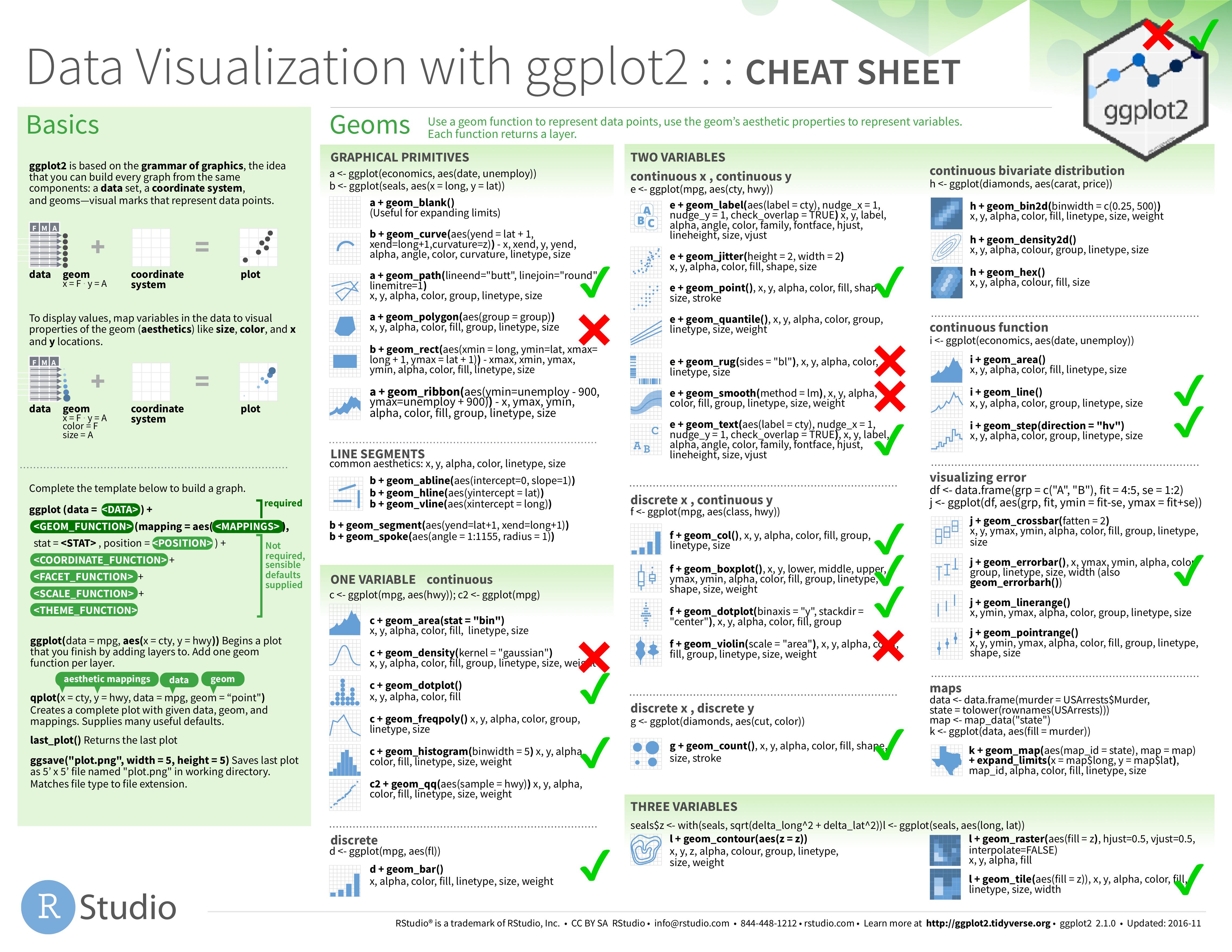
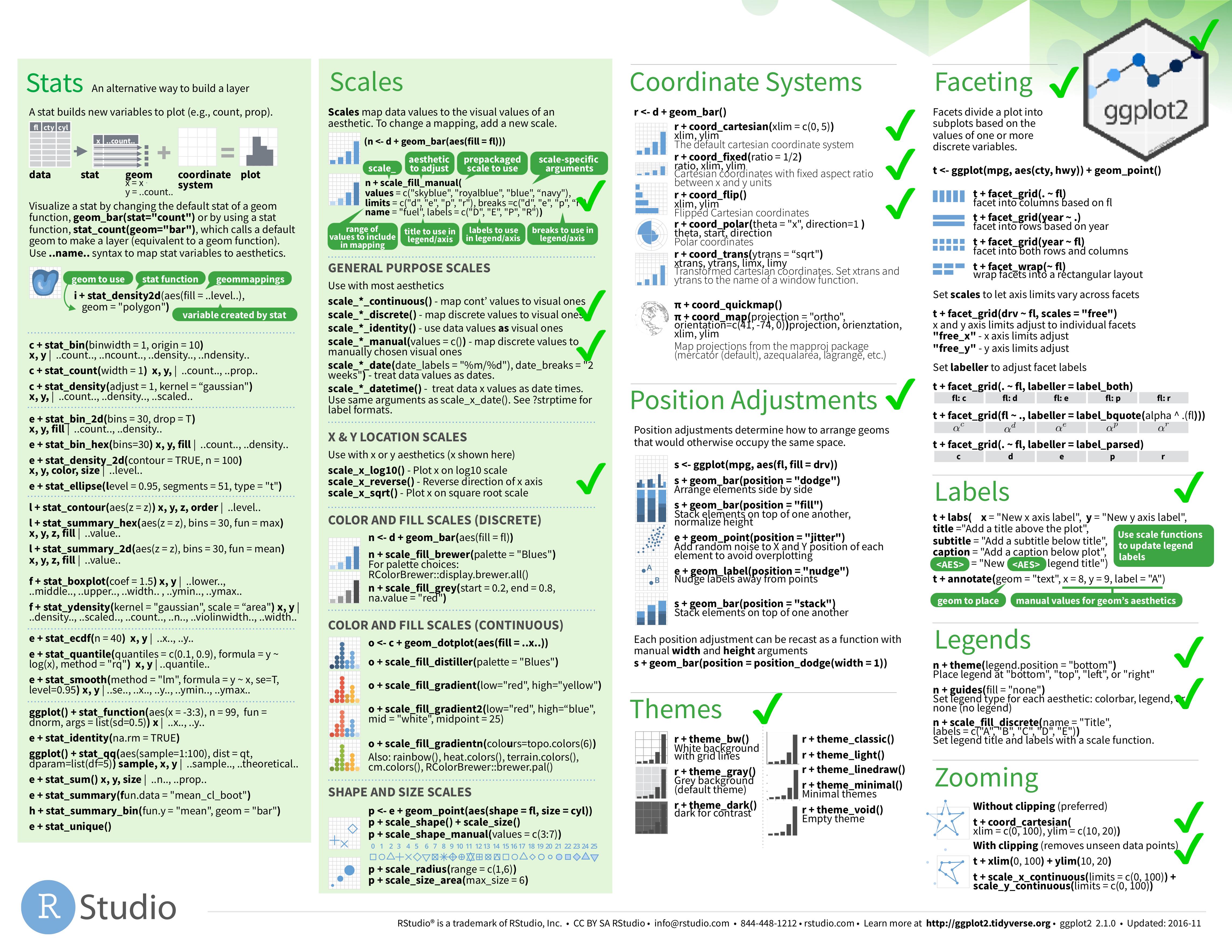
The grammar implemented by kravis is inspired from ggplot2. In fact, all it provides is a more typesafe wrapper around it. Internally, ggplot2 is used as rendering engine. The API of kravis is highly similar to allow even reusing their excellent cheatsheet.
R is required to use ggplot. However, kravis works with various integration backend ranging such as docker or remote webservices.
This is an experimental API and is subject to breaking changes until a first major release
Jupyter
An easy way to get started with kravis is with jupyter, you simply need to install the kotlin-jupyter kernel.
See here for a notebook example.
Setup
Add the following artifact to your gradle.build
compile "com.github.holgerbrandl:kravis:0.7.4"
You can also use JitPack with Maven or Gradle to build the latest snapshot as a dependency in your project.
repositories {
    maven { url 'https://jitpack.io' }
}
dependencies {
        compile 'com.github.holgerbrandl:kravis:-SNAPSHOT'
}
To build and install it into your local maven cache, simply clone the repo and run
./gradlew install
First Example
Let's start by analyzing mamalian sleep patterns
import krangl.*
import kravis.*

sleepData
    .addColumn("rem_proportion") { it["sleep_rem"] / it["sleep_total"] }
        // Analyze correlation
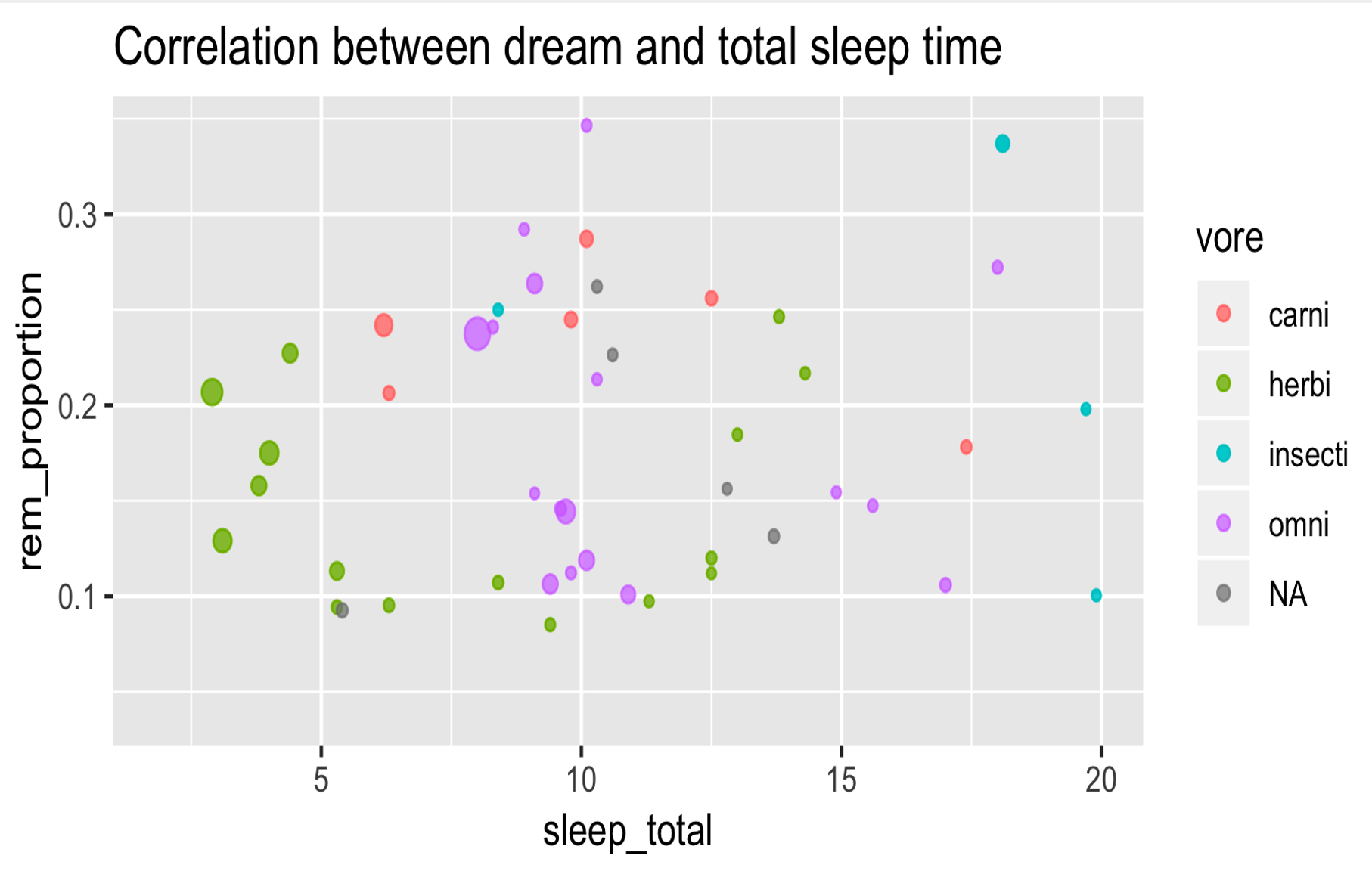
    .plot(x = "sleep_total", y = "rem_proportion", color = "vore", size = "brainwt")
        .geomPoint(alpha = 0.7)
        .guides(size = LegendType.none)
        .title("Correlation between dream and total sleep time")
Find more examples in our gallery {comding soon}.
The Grammar of Graphics
ggplot2 and thus kravis implement a grammar for graphics to build plots with
aesthetics+layers+coordinates system+transformations+facets
Which reads as map variables from data space to visual space + add one or more layers + configure the coordinates system + optionally apply statistical transformations + optionally add facets. That's the way!
Module Architecture
Supported Data Input Formats
Iterators
Every Iterable<T> is a valid data source for kravis, which allows to create plots using a type-save builder DSL. Essentially we first digest it into a table and use it as data source for visualization. Here's an example:
//  deparse records using property references (which will allow to infer variable names via reflection)
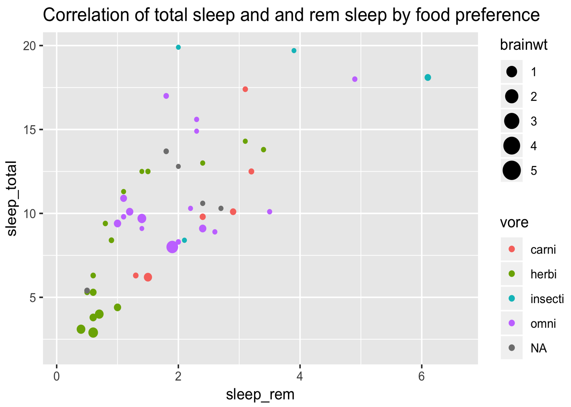
val basePlot = sleepPatterns.plot(
        x = SleepPattern::sleep_rem,
        y = SleepPattern::sleep_total,
        color = SleepPattern::vore,
        size = SleepPattern::brainwt
    )

basePlot
    .geomPoint()
    .title("Correlation of total sleep and and rem sleep by food preference")
    .show()
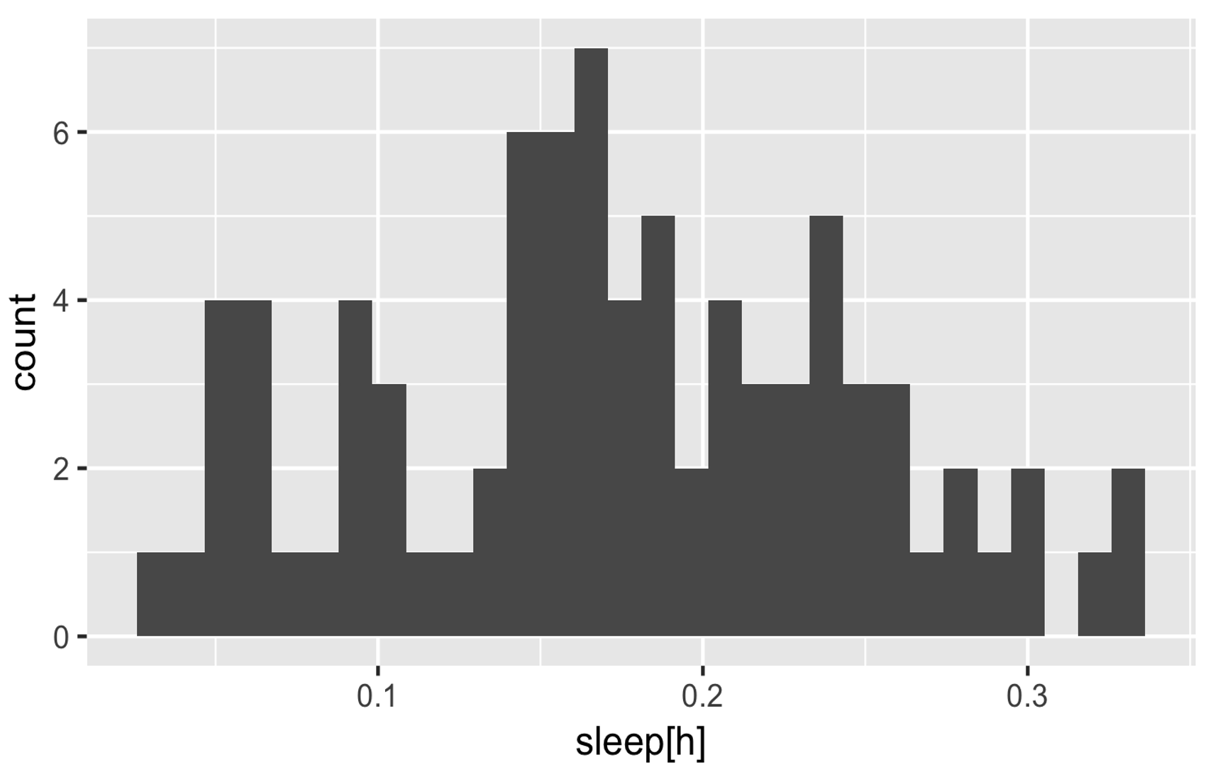
In the previous example we have used property references. kravis also supports an extractor lambda function syntax, which allow for on-the-fly data transformations when deparsing an Iterable<T>. The (not yet solved) disadvantage is that we need to assign axis labels manually
sleepPatterns
    .plot(x = { sleep_total/60 })
    .geomHistogram()
    .xLabel("sleep[h]")
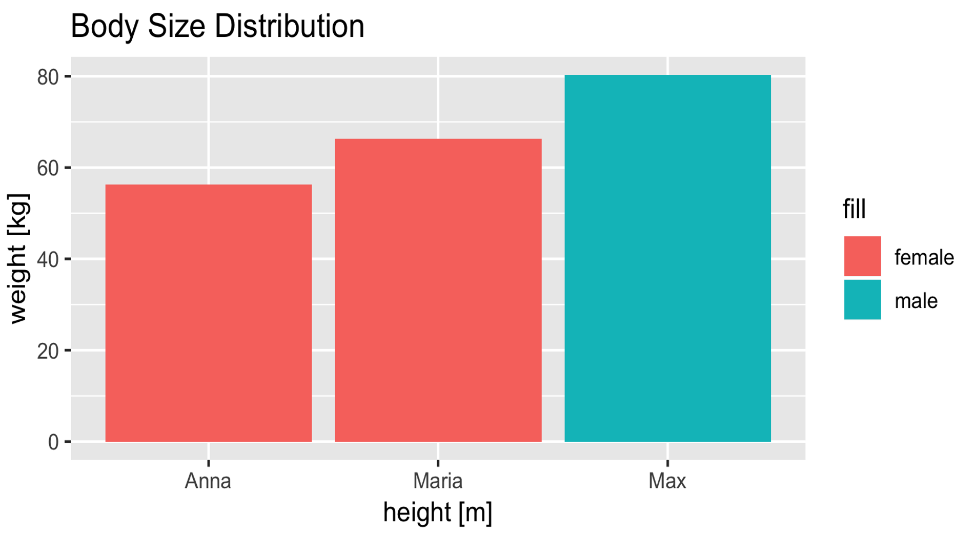
And here's another example using a custom data class:
enum class Gender { male, female }

data class Person(val name: String, val gender: Gender, val heightCm: Int, val weightKg: Double)

// define some persons
val persons = listOf(
    Person("Max", Gender.male, 192, 80.3),
    Person("Anna", Gender.female, 162, 56.3),
    Person("Maria", Gender.female, 172, 66.3)
)

// visualize sizes by gender
persons.plot(x = {name}, y = { weightKg }, fill = { gender.toString() })
    .geomCol()
    .xLabel("height [m]")
    .yLabel("weight [kg]")
    .title("Body Size Distribution")
Tables
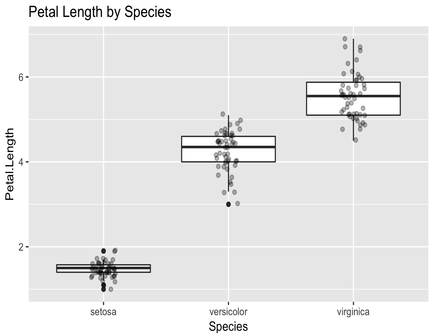
kravis can handle any kind of tabular data via krangl data-frames
import kravis.*
import krangl.irisData

irisData.plot(x="Species" , y="Petal.Length" )
    .geomBoxplot()
    .geomPoint(position = PositionJitter(width = 0.1), alpha = 0.3)
    .title("Petal Length by Species")
Output Devices
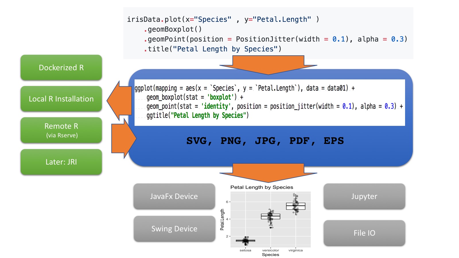
kravis auto-detects the environment, and will try to guess the most reasonable output device to show your plots. The following output devices are available.
- A swing graphics device for rendering when running in interactive mode.
- A javaFX graphics device for rendering when running in interactive mode.
- It can render directly into files
- will render directly into jupyter notebooks.
By default kravis will render as png on all devices, but it also supports vector rendering using svg as output format.
The preferred output can be configured using the SessionPrefs object
SessionPrefs.OUTPUT_DEVICE = SwingPlottingDevice()
Rendering
Currently kravis provided 3 different options to bind an R engine which is required to render plots.
(1) Local R
This is the default mode which can be configured by using
SessionPrefs.RENDER_BACKEND = LocalR()
(2) Dockerized R.
SessionPrefs.RENDER_BACKEND = Docker()
This will pull and use by default the container rocker/tidyverse:3.5.1, but can be configured to use more custom images as needed.
(3) Rserve
An (optionally) remote backend based using Rserve
Simply install the corresponding R package and start the daemon with
R -e "install.packages('Rserve',,'http://rforge.net/',type='source')"
R CMD Rserve
For configuration details see https://www.rforge.net/Rserve/doc.html
Alternatively, in case you don't have or want a local R installation, you can also run it dockerized locally or remotly with
# docker run -p <public_port>:<private_port> -d <image>
docker run -dp 6311:6311 holgerbrandl/kravis_rserve
See Dockerfile for the spec of this image.
To use the Rserve backend, configure the kravis SessionPrefs accordingly by pointing to the correct host and port.
SessionPrefs.RENDER_BACKEND = RserveEngine(host="localhost", port=6302)
Plot Immutability
Plots are -- similar to krangl data-frames -- immutable.
val basePlot = mpgData.plot("displ" to x, "hwy" to y).geomPoint()

// create one version with adjusted axis text size
basePlot.theme(axisText = ElementText(size = 20.0, color = RColor.red))

// create another version with unchanged axis labels but using a log scale instead
basePlot.scaleXLog10()
API Coverage
Currently we just map a subset of the ggplot2 API.
- Checks - implemented already
- Crosses - Planned but not yet done
Feel welcome to submit a ticket or PR if some important usecase is missing.
How to use missing API elements from ggplot2?
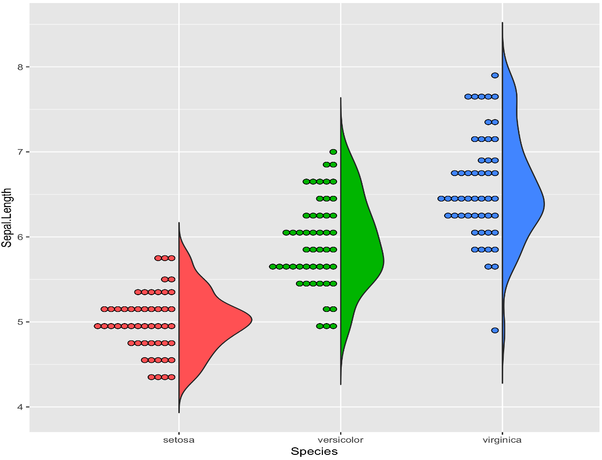
Since kravis just mimics some parts of ggplot2, and because user may want to create more custom plots we do support preambles (e.g. to define new geoms) and custom layer specs.
Example
irisData.plot(x = "Species", y = "Sepal.Length", fill = "Species")
    .addPreamble("""devtools::source_url("https://git.io/fAiQN")""")
    .addCustom("""geom_flat_violin(scale = "count", trim = FALSE)""")
    .geomDotplot(binaxis = "y", dotsize = 0.5, stackdir = "down", binwidth = 0.1, position = PositionNudge(-0.025))
    .theme(legendPosition = "none")
    .labs(x = "Species", y = "Sepal length (cm)")
References
You don't like it? Here are some other projects which may better suit your purpose. Before you leave, consider dropping us a ticket with some comments about whats missing, badly designed or simply broken in kravis.
GGplot Wrappers
- gg4clj Another ggplot2 wrapper written in java
Other JVM visualization libraries ordered by -- personally biased -- usefullness
- SmilePlot provides data visualization tools such as plots and maps for researchers to understand information more easily and quickly.
- XChart is a light-weight Java library for plotting data
- data2viz is a multi platform data visualization library with comprehensive DSL
- Kubed is a Kotlin library for manipulating the JavaFX scenegraph based on data.
- TornadoFX provides some Kotlin wrappers around JavaFX
- plotly-scala which provides scala bindings for plotly.js and works within jupyter
- breeze-viz which is a Visualization library backed by Breeze and JFreeChart
- grafana is an open platform for beautiful analytics and monitoring
- Jzy3d is an open source java library that allows to easily draw 3d scientific data: surfaces, scatter plots, bar charts
Other
- https://github.com/bloomberg/bqplot is a plotting library for IPython/Jupyter Notebooks
Vega-lite based
- Vegas aims to be the missing MatPlotLib for Scala + Spark
- altair provides declarative statistical visualization library for Python
- vega-embed allows to publish Vega visualizations as embedded web components with interactive parameters.
- hrbrmstr/vegalite provides R ggplot2 "bindings" for Vega-Lite
Acknowledgements
Thanks to vega-lite team for making this project possible.
Thanks to the ggplot2 team for providing the best data vis API to date.
