JordanADavies / Liquid_progress_indicator
Licence: mit
A liquid progress indicator for Flutter
Stars: ✭ 176
Programming Languages
dart
5743 projects
Projects that are alternatives of or similar to Liquid progress indicator
React Sweet Progress
A way to quickly add a progress bar to react app 🌈
Stars: ✭ 239 (+35.8%)
Mutual labels: progress-bar, progress-circle
ALProgressView
Animated and fully customizable progress view with 2 styles: ring and bar.
Stars: ✭ 72 (-59.09%)
Mutual labels: progress-bar, progress-circle
Percircle
⭕️ CSS percentage circle built with jQuery
Stars: ✭ 217 (+23.3%)
Mutual labels: progress-bar, progress-circle
Hgcircularslider
A custom reusable circular / progress slider control for iOS application.
Stars: ✭ 2,240 (+1172.73%)
Mutual labels: progress-bar, progress-circle
Dockprogress
Show progress in your app's Dock icon
Stars: ✭ 813 (+361.93%)
Mutual labels: progress-bar, progress-circle
react-sweet-progress
A way to quickly add a progress bar to react app 🌈
Stars: ✭ 250 (+42.05%)
Mutual labels: progress-bar, progress-circle
XCArcProgressView
Android开口圆环比例进度View(高仿猎豹清理大师内存占用比例View)
Stars: ✭ 28 (-84.09%)
Mutual labels: progress-bar, progress-circle
React Native Loading Spinner Overlay
💈 React Native loading spinner overlay
Stars: ✭ 1,369 (+677.84%)
Mutual labels: progress-bar, progress-circle
Avatarview
A circular Image View with a lot of perks. Including progress animation and highlight state with borders and gradient color.
Stars: ✭ 429 (+143.75%)
Mutual labels: progress-bar, progress-circle
Mkringprogressview
⭕️ Ring progress view similar to Activity app on Apple Watch
Stars: ✭ 1,140 (+547.73%)
Mutual labels: progress-bar, progress-circle
Jocircularslider
A highly customisable and reusable circular slider for iOS applications.
Stars: ✭ 128 (-27.27%)
Mutual labels: progress-bar, progress-circle
Progresshud
ProgressHUD is a lightweight and easy-to-use HUD for iOS.
Stars: ✭ 2,045 (+1061.93%)
Mutual labels: progress-bar
Progress
[==..] Progress bar for Crystal Programming Language
Stars: ✭ 124 (-29.55%)
Mutual labels: progress-bar
Ascii Progress
🍓 Ascii progress-bar(s) in the terminal.
Stars: ✭ 167 (-5.11%)
Mutual labels: progress-bar
Vue Wait
Complex Loader and Progress Management for Vue/Vuex and Nuxt Applications
Stars: ✭ 1,869 (+961.93%)
Mutual labels: progress-bar
Hcdprocessview
A concise water wave animation process view.纯代码手写的一个现实充电进度的动画控件
Stars: ✭ 119 (-32.39%)
Mutual labels: progress-circle
Bar Of Progress
A small, easy & zero-dependency progress bar component
Stars: ✭ 116 (-34.09%)
Mutual labels: progress-bar
liquid_progress_indicator
Liquid progress indicator for Flutter.
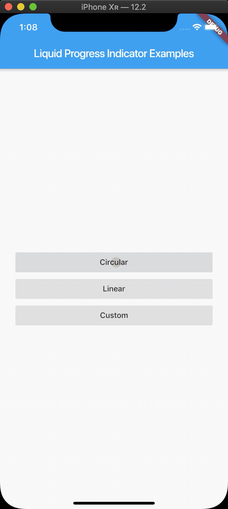
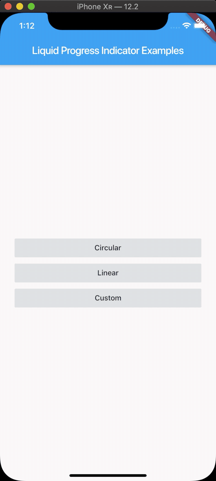
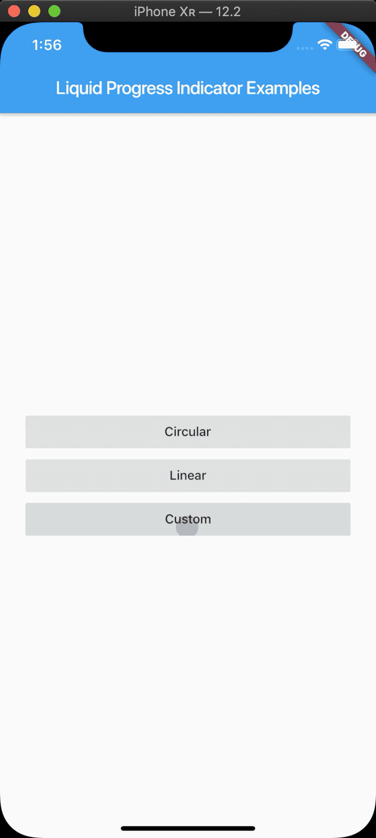
Features
- Liquid circular progress indicator.
- Liquid linear progress indicator.
- Liquid custom progress indicator.
- Works similarly to Flutters own ProgressIndicator.
- Customise colors, borders, direction, etc.
Usage
import 'package:liquid_progress_indicator/liquid_progress_indicator.dart';
LiquidCircularProgressIndicator
LiquidCircularProgressIndicator(
  value: 0.25, // Defaults to 0.5.
  valueColor: AlwaysStoppedAnimation(Colors.pink), // Defaults to the current Theme's accentColor.
  backgroundColor: Colors.white, // Defaults to the current Theme's backgroundColor.
  borderColor: Colors.red,
  borderWidth: 5.0,
  direction: Axis.horizontal, // The direction the liquid moves (Axis.vertical = bottom to top, Axis.horizontal = left to right). Defaults to Axis.vertical.
  center: Text("Loading..."),
);
LiquidLinearProgressIndicator
LiquidLinearProgressIndicator(
  value: 0.25, // Defaults to 0.5.
  valueColor: AlwaysStoppedAnimation(Colors.pink), // Defaults to the current Theme's accentColor.
  backgroundColor: Colors.white, // Defaults to the current Theme's backgroundColor.
  borderColor: Colors.red,
  borderWidth: 5.0,
  borderRadius: 12.0,
  direction: Axis.vertical, // The direction the liquid moves (Axis.vertical = bottom to top, Axis.horizontal = left to right). Defaults to Axis.horizontal.
  center: Text("Loading..."),
);
LiquidCustomProgressIndicator
LiquidCustomProgressIndicator(
  value: 0.2 // Defaults to 0.5.
  valueColor: AlwaysStoppedAnimation(Colors.pink), // Defaults to the current Theme's accentColor.
  backgroundColor: Colors.white, // Defaults to the current Theme's backgroundColor.
  direction: Axis.vertical, // The direction the liquid moves (Axis.vertical = bottom to top, Axis.horizontal = left to right).
  shapePath: _buildBoatPath(), // A Path object used to draw the shape of the progress indicator. The size of the progress indicator is created from the bounds of this path.
)
Note that the project description data, including the texts, logos, images, and/or trademarks,
for each open source project belongs to its rightful owner.
If you wish to add or remove any projects, please contact us at [email protected].