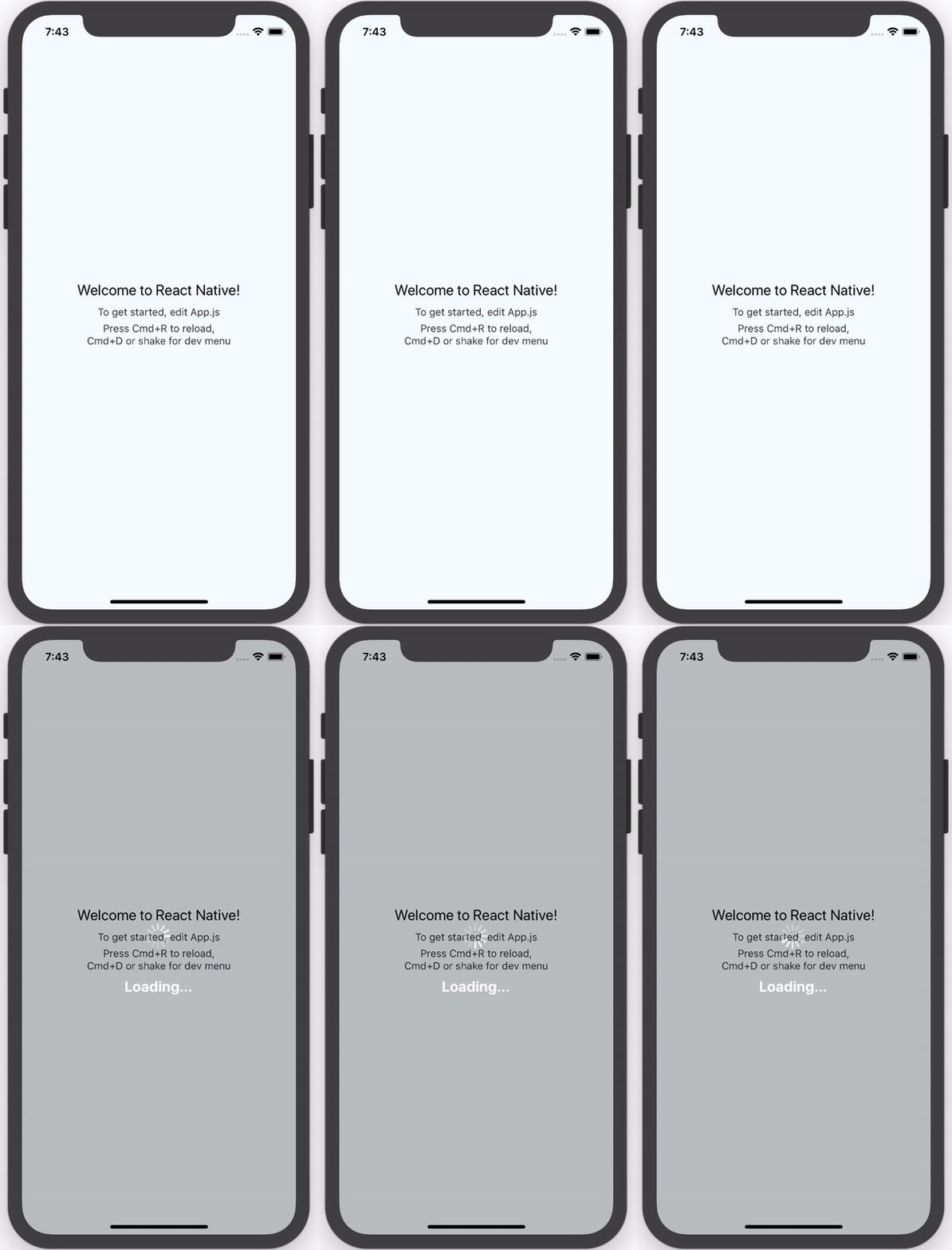
joinspontaneous / React Native Loading Spinner Overlay
Licence: mit
💈 React Native loading spinner overlay
Stars: ✭ 1,369
Programming Languages
javascript
184084 projects - #8 most used programming language
Projects that are alternatives of or similar to React Native Loading Spinner Overlay
busy-load
A flexible loading-mask jQuery-plugin
Stars: ✭ 76 (-94.45%)
Mutual labels: overlay, spinner, loading
Vue Full Loading
Full overlay loading with spinner for Vue
Stars: ✭ 148 (-89.19%)
Mutual labels: loading, spinner, overlay
Vue Loading Overlay
Vue.js component for full screen loading indicator 🌀
Stars: ✭ 784 (-42.73%)
Mutual labels: loading, spinner, overlay
React Nprogress
⌛️ A React primitive for building slim progress bars.
Stars: ✭ 173 (-87.36%)
Mutual labels: loading, progress-bar, spinner
React Layer Stack
Layering system for React. Useful for popover/modals/tooltip/dnd application
Stars: ✭ 152 (-88.9%)
Mutual labels: portal, modal, overlay
Android Spinkit
Android loading animations
Stars: ✭ 8,096 (+491.38%)
Mutual labels: loading, progress-bar, spinner
Vue Wait
Complex Loader and Progress Management for Vue/Vuex and Nuxt Applications
Stars: ✭ 1,869 (+36.52%)
Mutual labels: loading, progress-bar, spinner
react-layer-stack
Layering system for React. Useful for popover/modals/tooltip/dnd application
Stars: ✭ 158 (-88.46%)
Mutual labels: overlay, modal, portal
Ngx Ui Loader
Multiple Loaders / spinners and Progress bar for Angular 5, 6, 7 and 8+
Stars: ✭ 368 (-73.12%)
Mutual labels: loading, progress-bar, spinner
React Overlays
Utilities for creating robust overlay components
Stars: ✭ 809 (-40.91%)
Mutual labels: modal, overlay
Dockprogress
Show progress in your app's Dock icon
Stars: ✭ 813 (-40.61%)
Mutual labels: progress-bar, progress-circle
Reoverlay
The missing solution for managing modals in React.
Stars: ✭ 91 (-93.35%)
Mutual labels: modal, overlay
Whirl
CSS loading animations with minimal effort!
Stars: ✭ 774 (-43.46%)
Mutual labels: loading, spinner
Webannoyances
Fix and remove annoying web elements such as sticky headers, floating boxes, floating videos, dickbars, social share bars and other distracting elements.
Stars: ✭ 831 (-39.3%)
Mutual labels: modal, overlay
Angular Loading Feedback
Angular directive to indicate loads in app
Stars: ✭ 8 (-99.42%)
Mutual labels: loading, spinner
Spinners
A Sass mixin to generate fully customizable, pure CSS3 loading/busy indicators
Stars: ✭ 33 (-97.59%)
Mutual labels: loading, spinner
Jquery Popup Overlay
jQuery plugin for responsive and accessible modal windows and tooltips
Stars: ✭ 511 (-62.67%)
Mutual labels: modal, overlay
React Circle
Renders a svg circle + progress, it just works 💘
Stars: ✭ 925 (-32.43%)
Mutual labels: loading, spinner
Terminal layout
The project help you to quickly build layouts in terminal,cross-platform(一个跨平台的命令行ui布局工具)
Stars: ✭ 98 (-92.84%)
Mutual labels: loading, progress-bar
React Native Loading Spinner Overlay

Table of Contents
Install
npm:
npm install react-native-loading-spinner-overlay
yarn:
yarn add react-native-loading-spinner-overlay
Example
See the example App.js file for an example implementation.
Options
| Property | Type | Default | Description |
|---|---|---|---|
| cancelable | Boolean | false |
Android: If set to false, it will prevent spinner from hiding when pressing the hardware back button. If set to true, it will allow spinner to hide if the hardware back button is pressed. |
| color | String | "white" |
Changes the spinner's color (example values are red, #ff0000, etc). For adjusting the contrast see overlayColor prop below. |
| animation | String (enum) none, slide, fade
|
"none" |
Changes animation on show and hide spinner's view. |
| overlayColor | String | rgba(0, 0, 0, 0.25) |
Changes the color of the overlay. |
| size | String (enum) small, normal, large
|
"large" |
Sets the spinner's size. No other cross-platform sizes are supported right now. |
| textContent | String | "" |
Optional text field to be shown. |
| textStyle | StyleSheet | - |
The style to be applied to the <Text> that displays the textContent. |
| visible | Boolean | false |
Controls the visibility of the spinner. |
| indicatorStyle | StyleSheet | undefined |
Additional styles for the ActivityIndicator to inherit |
| customIndicator | Element | undefined |
An alternative, custom component to use instead of the default <ActivityIndicator />
|
| children | Element | undefined |
Children element(s) to nest inside the spinner |
Recommended Implementation
We recommend that you follow two rules when implementing this component.
-
Integrate it inside the parent-most/top-level/root component in your app
-
Wrap usage of actions after attempting to stop the spinner with
setTimeoutto avoid the non-stop spinner issue:this.setState({ spinner: false }); setTimeout(() => { Alert.alert('Oops!', err.message); }, 100);
Contributors
| Name | Website |
|---|---|
| Nick Baugh | http://niftylettuce.com |
| Spencer Snyder | http://spencersnyder.io |
| Luciano Lima | |
| George Savvidis | |
| Sandro Machado | |
| Ben Sutter | |
| Ivan Kuznetsov | |
| Darren Camp | |
| Rigo B Castro | |
| Raj Kissu | |
| Ivan Pusic | |
| Antonio Grass | |
| Vijay Chouhan | |
| Jacob Lee | |
| Matt Labrum |
License
MIT © Nick Baugh
Note that the project description data, including the texts, logos, images, and/or trademarks,
for each open source project belongs to its rightful owner.
If you wish to add or remove any projects, please contact us at [email protected].


