4face-studi0 / Materialbottombar
Documentation
Stars: ✭ 148
Labels
Projects that are alternatives of or similar to Materialbottombar
Material Dashboard React
React version of Material Dashboard by Creative Tim
Stars: ✭ 1,947 (+1215.54%)
Mutual labels: material-design
Material
A lightweight Material Design library for Angular based on Google's Material Components for the Web.
Stars: ✭ 143 (-3.38%)
Mutual labels: material-design
Vue Smart Table
A simple table component for interactive tables built with Vue.js
Stars: ✭ 145 (-2.03%)
Mutual labels: material-design
Nextjs Material Kit
NextJS version of Material Kit React by Creative Tim
Stars: ✭ 141 (-4.73%)
Mutual labels: material-design
Maoni
Lightweight library for collecting and handling user feedback from within Android applications.
Stars: ✭ 142 (-4.05%)
Mutual labels: material-design
Pixiv Android
Pixiv( P站 ) / Hitokoto( 一言 ) client for android (Material Design)
Stars: ✭ 138 (-6.76%)
Mutual labels: material-design
Materialdrawer
The flexible, easy to use, all in one drawer library for your Android project. Now brand new with material 2 design.
Stars: ✭ 11,498 (+7668.92%)
Mutual labels: material-design
Flutter demo
A beautiful app designed with Material Design by using Flutter.
Stars: ✭ 143 (-3.38%)
Mutual labels: material-design
Materialedittext
Material Design EditText with a delightful linear ripple in background
Stars: ✭ 143 (-3.38%)
Mutual labels: material-design
Cafebar
An upgraded Snackbar for Android that provides more options and easy to use
Stars: ✭ 142 (-4.05%)
Mutual labels: material-design
Android Multi Theme Ui
Android multi theme UI implementation with day night mode. This repository cover theme changes at runtime, user can select theme from pre-defined multiple themes and changes reflect dynamically on the go.
Stars: ✭ 142 (-4.05%)
Mutual labels: material-design
Timetable
📅 Customizable flutter calendar widget including day and week views
Stars: ✭ 140 (-5.41%)
Mutual labels: material-design
Translatr
💬 Translate to multiple languages at once
Stars: ✭ 145 (-2.03%)
Mutual labels: material-design
Ptemplate
A personal website template that's not a pain in the ass to setup and use
Stars: ✭ 143 (-3.38%)
Mutual labels: material-design
Smooth App Bar Layout
Smooth version of Google Support Design AppBarLayout
Stars: ✭ 1,787 (+1107.43%)
Mutual labels: material-design
Material Theme
Material Theme, the most epic theme for Sublime Text 3 by Mattia Astorino
Stars: ✭ 11,093 (+7395.27%)
Mutual labels: material-design
Chromaterial
ChroMATERIAL is an IntelliJ Platform coloring scheme that expresses the chromatic nature of Material Design within IntelliJ and Android Studio. It is intended to highlight the most import aspects of your code.
Stars: ✭ 143 (-3.38%)
Mutual labels: material-design
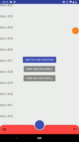
Material Bottom bar


Material Bottom Bar is an Android library that let you implement a customized BottomAppBar and a bottom drawer with just few simple steps.
Dsl ready
Navigation Component ready
Wiki
Full wiki
Docs
MaterialBottomBar Doc
Navigation Doc
Setup
Add the library:
implementation "studio.forface.materialbottombar:materialbottombar:$version"
Add the optional navigation extension:
implementation "studio.forface.materialbottombar:materialbottombar-navigation:$version"
Getting started
Layout ( minimal )
First you need to use a MaterialBottomDrawerLayout as parent of MaterialBottomAppBar.
<studio.forface.materialbottombar.layout.MaterialBottomDrawerLayout
    xmlns:android="http://schemas.android.com/apk/res/android"
    android:id="@+id/drawerLayout"
    android:layout_width="match_parent"
    android:layout_height="match_parent">

	<!-- Here it goes your content -->

    <studio.forface.materialbottombar.appbar.MaterialBottomAppBar
        android:layout_width="match_parent"
        android:layout_height="wrap_content"
        android:layout_gravity="bottom"/>

</studio.forface.materialbottombar.layout.MaterialBottomDrawerLayout>
More info about MaterialBottomDrawerLayout and MaterialBottomAppBar
Drawer ( minimal )
with DSL
drawerLayout.drawer = drawer {
    header {
        iconUrl = IMAGE_URL
        titleText = "My drawer"
    }
    body {
        onItemClick = { id, title -> /* do something */ }
        primaryItem( "Messages" ) {
            id = 1
            iconResource = R.drawable.ic_message_black_24dp
        }
        primaryItem( contactsSpannable ) {
            id = 2
            iconDrawable = contactsDrawable
        }
        divider()
        primaryItem( R.string.settings_drawer_title ) {
            id = 3
            iconBitmap = settingsBitmap
        }
    }
}
without DSL:
val header = MaterialDrawer.Header()
    .iconUrl( IMAGE_URL )
    .titleText( "My drawer" )

val messages = PrimaryDrawerItem()
    .id( 1 )
    .titeText( "messages" )
    .iconResource( R.drawable.ic_message_black_24dp )

val contacts = PrimaryDrawerItem()
    .id( 2 )
    .titleSpannable( contactsSpannable )
    .iconDrawable( contactsDrawable )

val settings = PrimaryDrawerItem()
    .id( 3 )
    .titleRes( R.string.settings_drawer_title )
    .iconBitmap( settingsBitmap )

val body = MaterialDrawer.Body()
    .itemClikListener { id, title -> /* do something */ }
    .items( listOf(
        messages,
        contacts,
        Divider(),
        settings
    ) )

drawerLayout.drawer = MaterialDrawer( header, body )
More info about Drawer and Panels
Android Navigation Components integration
with DSL ( constructor injected NavController )
navDrawer( navController ) {
    header { ... }
    body {
        primaryItem( "messages" ) {
            navDestinationId = myDestinationId
            navDestinationBundle = myBundle
        }
        primaryItem( "contacts" ) {
            navDestination( myDestinationId ) { mapOf( "arg1" to 15 ) }
        }
        secondaryItem( "favorites" ) {
            navDirections = myNavDirections
        }
    }
}
NavController can also be set later
navDrawer {
    ...
}
in the following ways:
myNavDrawer.navController = navControllermyToolbar.setupWithNavController( navController, myNavDrawer, myNavPanel1, myNavPanel2 )myMaterialBottomDrawerLayout.setupWithNavController( navController )
without DSL
val header = MaterialDrawer.Header()
    .iconUrl( IMAGE_URL )
    .titleText( "My drawer" )

val messages = PrimaryNavDrawerItem()
    .titeText( "messages" )
    .navDestination( myDestinationId )
    .navDestinationBundle( myBundle )

val contacts = PrimaryNavDrawerItem()
    .titeText( "contacts" )
    .navDestination( myDestinationId ) { mapOf( "arg1" to "hello" ) }

val body = MaterialNavPanel.Body()
    .itemClickListener { id, title -> /* do something */ }
    .items( listOf( messages, contacts ) )

drawerLayout.drawer = MaterialNavDrawer( header, body )
TIPS
The lib is built on 3 focal points:
- Customization
- Easiness
- Compactness
The first two are pretty self-explanatory, while the third one means that you should be able to write your fully customized Drawer with the less lines of code as possible; in other word is suggested to use an approach like this:
with DSL:
drawer {
    header { ... }
    body {
        val myBadge = Badge {
            backgroundCornerRadiusDp = 999f // Round badge
            backgroundColorRes = R.color.color_badge_background
            contentColorRes = R.color.color_badge_content
        }
        allPrimary {
            badgeItem = myBadge
            titleSizeSp = 20f
            titleColor = Color.RED
        }
        primaryItem( "First" ) { badgeContentText = "1" " }
        primaryItem( "Second" ) { /* No badge content, so the badge will be hidden */ }
    }
}
withou DSL:
val myBadge = BadgeItem()
    .backgroundCornerRadiusDp( 999f ) // Round badge
    .backgroundColorRes( R.color.color_badge_background )
    .contentColorRes( R.color.color_badge_content )

class MyPrimaryDrawerItem() { init {
    badge( myBadge )
    titleSizeSp( 20f )
    titleColor( Color.RED )
} }

val firstItem = MyPrimaryDrawerItem()
    .titleText( "First")
    .badgeContentText( "1" )

val secondItem = MyPrimaryDraweItem()
    .titleText( "Second" )
    // No badge content, so the badge will be hidden.
Note that the project description data, including the texts, logos, images, and/or trademarks,
for each open source project belongs to its rightful owner.
If you wish to add or remove any projects, please contact us at [email protected].