joielechong / Materialfancybuttons
Programming Languages
Projects that are alternatives of or similar to Materialfancybuttons
Material Fancy Button
README in Bahasa Indonesia : README-ID.md
Beautiful Fancy Button on endorphins.
Icons, Borders, Radius ... for Android buttons. With selectable 21 Icon Fonts precompiled!
No need to manually using  for icon font character anymore!

Overview

Demo Application : Download APK
Features
- Border (stroke, radius, color)
- Top left border
- Top right border
- Bottom left border
- Bottom right border
- Background (normal, focus)
- Icon (Drawable, font icon)
- Community Material
- Devicon
- Dripicons
- Entypo
- Fontawesome
- Foundation Icons
- Glyphicons Halflings
- Google Material Design Icons
- Ionicons
- Material Design Iconic Font
- MFGLabs Iconset
- Meteocons
- Mobirise Icons
- Octicons
- Open Iconic
- PICOL
- Pixden7Stroke
- Themify Icons
- Typeicons
- Vaadin Icons
- Weather Icons
- Custom font
- Icon (Position, size)
- right
- left
- top
- bottom
- Icon Size
- Icon Padding
Installation
compile 'com.rilixtech:materialfancybuttons:1.8.8'
Add maven to your build.gradle:
maven {
      url "http://dl.bintray.com/rilixtech/maven"
    }
Choose your desired icon fonts from a precompiled font list, add the font that you want to use from below list:
compile 'com.rilixtech:community-material-typeface:1.9.32.2'
compile 'com.rilixtech:devicon-typeface:2.0.0.3'
compile 'com.rilixtech:dripicons-typeface:2.0.0'
compile 'com.rilixtech:entypo-typeface:1.0.0.3'
compile 'com.rilixtech:fontawesome-typeface:4.7.0.4'
compile 'com.rilixtech:foundation-icons-typeface:3.0.0.3'
compile 'com.rilixtech:glyphicons-halflings-typeface:1.0.0'
compile 'com.rilixtech:google-material-typeface:3.0.1.1.original'
compile 'com.rilixtech:mfglabs-iconset-typeface:1.0'
compile 'com.rilixtech:material-design-iconic-typeface:2.2.0.3'
compile 'com.rilixtech:meteocons-typeface:1.1.0.3'
compile 'com.rilixtech:mobirise-icons-typeface:1.0.0'
compile 'com.rilixtech:ionicons-typeface:2.0.1.3'
compile 'com.rilixtech:octicons-typeface:3.2.0.3'
compile 'com.rilixtech:open-iconic-typeface:1.1.1'
compile 'com.rilixtech:picol-typeface:1.0.0'
compile 'com.rilixtech:pixeden-7-stroke-typeface:1.2.0.1'
compile 'com.rilixtech:themify-icons-typeface:0.1.2'
compile 'com.rilixtech:typicons-typeface:2.0.7.3'
compile 'com.rilixtech:vaadin-icons-typeface:4.1.0'
compile 'com.rilixtech:weather-icons-typeface:2.0.10.3'
Icon Font List:
The following list is within this format:
- Font Icon link
- "Prefix", this is prefix for each icon in the font
-
compile 'com.rilixtech:...', this is the dependency to use the icon font.
Icon List:
-
- "cmdi"
compile 'com.rilixtech:community-material-typeface:1.9.32.2'
-
- "devi"
compile 'com.rilixtech:devicon-typeface:2.0.0.3'
-
- "drpi"
compile 'com.rilixtech:dripicons-typeface:2.0.0'
-
- "enti"
compile 'com.rilixtech:entypo-typeface:1.0.0.3'
-
- "fawi"
compile 'com.rilixtech:fontawesome-typeface:4.7.0.4'
-
- "foui"
compile 'com.rilixtech:foundation-icons-typeface:3.0.0.3'
-
- "glyi"
compile 'com.rilixtech:glyphicons-halflings-typeface:1.0.0'
-
- "gmdi"
compile 'com.rilixtech:google-material-typeface:3.0.1.1.original'
-
- "ioni"
compile 'com.rilixtech:ionicons-typeface:2.0.1.3'
-
- "gmii"
- Google Material Iconic
compile 'com.rilixtech:material-design-iconic-typeface:2.2.0.3'
-
- "mfgi"
compile 'com.rilixtech:mfglabs-iconset-typeface:1.0'
-
- "meti"
compile 'com.rilixtech:meteocons-typeface:1.1.0.3'
-
- "mbri"
compile 'com.rilixtech:mobirise-icons-typeface:1.0.0'
-
- "octi"
compile 'com.rilixtech:octicons-typeface:3.2.0.3'
-
- "opic"
compile 'com.rilixtech:open-iconic-typeface:1.1.1'
-
- "pici"
compile 'com.rilixtech:picol-typeface:1.0.0'
-
- "pe7i"
compile 'com.rilixtech:pixeden-7-stroke-typeface:1.2.0.1'
-
- "thei"
compile 'com.rilixtech:themify-icons-typeface:0.1.2'
-
- "typi"
compile 'com.rilixtech:typicons-typeface:2.0.7.3'
-
- "vaai"
compile 'com.rilixtech:vaadin-icons-typeface:4.1.0'
-
- "wici"
compile 'com.rilixtech:weather-icons-typeface:2.0.10.3'
Licenses for all included fonts are linked inside the class or can be found on the corresponding repositories.
Basic Usage Example
1 - Add MaterialFancyButton to your dependencies:
compile 'com.rilixtech:materialfancybuttons:1.8.7'
2 - Include MaterialFancyButton namespace to the root element:
xmlns:fancy="http://schemas.android.com/apk/res-auto"
3 - Add the MaterialFancyButton View:
<com.rilixtech.materialfancybutton.MaterialFancyButton
    android:id="@+id/btn_preview"
    android:layout_width="wrap_content"
    android:layout_height="wrap_content"/>
4 - Select the font that you desire, for example FontAwesome. Add it as dependencies:
compile 'com.rilixtech:fontawesome-typeface:4.7.0.4'
All icon font characters will be included in String Resource.
5 - Add the attribute for icon font character that you want, for example star icon. It should be in prefix_icon_name format.
Because we use FontAwesome the prefix is fawi and the icon character is fawi_star. Use fancy:mfb_icon attribute:
fancy:mfb_icon="@string/fawi_star"
So it become:
<com.rilixtech.materialfancybutton.MaterialFancyButton
    android:id="@+id/btn_preview"
    android:layout_width="wrap_content"
    android:layout_height="wrap_content"
    fancy:mfb_icon="@string/fawi_star"/>
This is the recommended way, so you don't need to manually copy the font and remembering all the characters of the font, which is very tedious and error prone.
Custom Font
If you want to use custom Font, follow this easy steps:
1 - Paste your font inside assets/fonts/ folder for Text fonts or inside assets/iconfonts/ for icon fonts eg : fontawesome
2 - Then add the following attribute:
For text:
fancy:mfb_textFont="robotothin.ttf"
fancy:mfb_text="your text"
so it will be look like this:
<com.rilixtech.materialfancybutton.MaterialFancyButton
    android:id="@+id/btn_preview"
    android:layout_width="wrap_content"
    android:layout_height="wrap_content"
    fancy:mfb_textFont="robotothin.ttf"
    fancy:mfb_text="your text"/>
For icon:
fancy:mfb_iconFont="fontawesome.ttf"
fancy:mfb_fontIconResource=""
so it will be look like this:
<com.rilixtech.materialfancybutton.MaterialFancyButton
android:id="@+id/btn_preview"
android:layout_width="wrap_content"
android:layout_height="wrap_content"
fancy:mfb_iconFont="fontawesome.ttf"
fancy:mfb_fontIconResource=""/>
Please be noted that when using fancy:mfb_icon you don't need to use fancy:mfb_iconFont and fancy:mfb_fontIconResource. If both value is present, they will be override and ignored.
Supported Attributes
| XML Attribute | Java Method | Description |
|---|---|---|
| fancy:mfb_text | setText(String) | Text of the button |
| fancy:mfb_textColor | setTextColor(int) | Text Color of the button |
| fancy:mfb_textSize | setTextSize(int) | Size of the text |
| fancy:mfb_textFont | setCustomTextFont(String) | FontFamily of the text |
| fancy:mfb_textGravity | setTextGravity(Int) | Gravity of the text |
| fancy:mfb_icon | setIcon(String), setIcon(char) | Set icon from icon font list. Need the font library (fontawesome_typeface_library, etc) to works. This will override fancy:mfb_fontIconResource and fancy:mfb_iconFont |
| fancy:mfb_iconResource | setIconResource(Drawable) | Drawable icon of the button |
| fancy:mfb_iconPosition | setsetIconPosition(int) | Position of the icon : Left, Right, Top, Bottom |
| fancy:mfb_fontIconResource | setIconResource(String) | font icon of the button |
| fancy:mfb_fontIconSize | setFontIconSize(int) | Size of the icon |
| fancy:mfb_iconFont | setCustomIconFont(String) | FontFamily of the icon |
| fancy:mfb_borderWidth | setBorderWidth(int) | Width of the border |
| fancy:mfb_borderColor | setBorderColor(int) | Color of the border |
| fancy:mfb_defaultColor | setBackgroundColor(int) | Background color of the button |
| fancy:mfb_focusColor | setFocusBackgroundColor(int) | Focus Color of button background |
| fancy:mfb_disabledColor | setDisableBackgroundColor(int) | Disabled Color of button background |
| fancy:mfb_disabledTextColor | setDisableTextColor(int) | Disabled Color of button text |
| fancy:mfb_disabledBorderColor | setDisableBorderColor(int) | Disabled Color of button border |
| fancy:mfb_radius | setRadius(int) | Radius of the button |
| fancy:mfb_radiusTopLeft | setRadiusTopLeft(int) | Radius top left of the button |
| fancy:mfb_radiusTopRight | setRadiusTopRight(int) | Radius top right of the button |
| fancy:mfb_radiusBottomLeft | setRadiusBottomLeft(int) | Radius bottom left of the button |
| fancy:mfb_radiusBottomRight | setRadiusBottomRight(int) | Radius bottom right of the button |
| fancy:mfb_iconPaddingLeft | setIconPadding(int,int,int,int) | Icon Padding |
| fancy:mfb_iconPaddingRight | setIconPadding(int,int,int,int) | Icon Padding |
| fancy:mfb_iconPaddingTop | setIconPadding(int,int,int,int) | Icon Padding |
| fancy:mfb_iconPaddingBottom | setIconPadding(int,int,int,int) | Icon Padding |
| fancy:mfb_ghost | setGhost(boolean) | Ghost (Hollow) |
For setting the radius of the button, you can also use setRadius(int radiusTopLeft, int radiusTopRight, int radiusBottomLeft, int radiusBottomRight)
Also you can use Attributes with default prefix (android:) which makes migrating of your project more fast. Default Attributes have more priority than Attributes with prefix fancy.
Supported default Attributes
| XML Attribute |
|---|
| android:enabled |
| android:text |
| android:textSize |
| android:textAllCaps |
| android:textStyle |
Supported Getters
| Method | Description |
|---|---|
| getText() | Returns Text Value of the button |
| getTextViewObject() | Returns TextView Object |
| getIconFontObject() | Returns icon defined by fb_fontIconResource |
| getIconImageObject() | Returns icon defined by fb_iconResource |
Sample
1 - Spotify Button
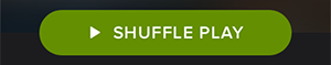
<com.rilixtech.materialfancybutton.MaterialFancyButton
android:id="@+id/btn_spotify"
android:layout_width="wrap_content"
android:layout_height="wrap_content"
android:paddingBottom="10dp"
android:paddingLeft="20dp"
android:paddingRight="20dp"
android:paddingTop="10dp"
android:textStyle="bold"
fancy:mfb_borderColor="#FFFFFF"
fancy:mfb_borderWidth="1dp"
fancy:mfb_defaultColor="#7ab800"
fancy:mfb_focusColor="#9bd823"
fancy:mfb_iconFont="fontawesome.ttf"
fancy:mfb_fontIconResource=""
fancy:mfb_iconPosition="left"
fancy:mfb_radius="30dp"
fancy:mfb_text="SHUFFLE PLAY"
fancy:mfb_textColor="#FFFFFF" />
2 - Facebook Button
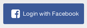
MaterialFancyButton facebookLoginBtn = new MaterialFancyButton(this);
facebookLoginBtn.setText("Login with Facebook");
facebookLoginBtn.setBackgroundColor(Color.parseColor("#3b5998"));
facebookLoginBtn.setFocusBackgroundColor(Color.parseColor("#5474b8"));
facebookLoginBtn.setTextSize(17);
facebookLoginBtn.setRadius(5);
foursquareBtn.setIconFont("fontawesome.ttf");
facebookLoginBtn.setIconResource("\uf082");
facebookLoginBtn.setIconPosition(FancyButton.POSITION_LEFT);
facebookLoginBtn.setFontIconSize(30);
See the example project for more samples


FAQ
How to add new fonts ?
Just Paste your font inside assets/fonts/ folder for Text fonts or inside assets/iconfonts/ for icon fonts eg : entypo
Contributions
MaterialFancyButtons needs you to build the missing features:
- Supporting Circular buttons
- Add elevation (Material Design)
Credits
- El Mehdi Sakout The creator of FancyButtons which is the origin of this project.
- mikepenz.com He is the creator of Android-Iconics which is the origin of the icon font project.
Developed By
License
Copyright 2017 Joielechong

Licensed under the Apache License, Version 2.0 (the "License");
you may not use this file except in compliance with the License.
You may obtain a copy of the License at

   http://www.apache.org/licenses/LICENSE-2.0

Unless required by applicable law or agreed to in writing, software
distributed under the License is distributed on an "AS IS" BASIS,
WITHOUT WARRANTIES OR CONDITIONS OF ANY KIND, either express or implied.
See the License for the specific language governing permissions and
limitations under the License.