JNKKKK / Moretoggles.css
Projects that are alternatives of or similar to Moretoggles.css
MoreToggles.css


MoreToggles.css is a pure CSS library that provides you with a variety of nice-looking toggles.
You only have to add a new ClassName to the wrapper div and MoreToggles.css will do the magic for you.
Check out all available styles here
Features
🔹 Pure CSS
🔹 13 different styles (more styles are coming)
🔹 Perfect scaling
Usage
Import the stylesheet into your document's <head>
<head>
  <link rel="stylesheet" href="https://cdn.jsdelivr.net/gh/JNKKKK/[email protected]/output/moretoggles.min.css">
</head>
Wrap an extra div around your <input> and <label>. Pick a style here
. Add the corresponding mt-* class to <div>.
<div class="mt-ios">
  <input id="1" type="checkbox" />
  <label for="1"></label>
</div>
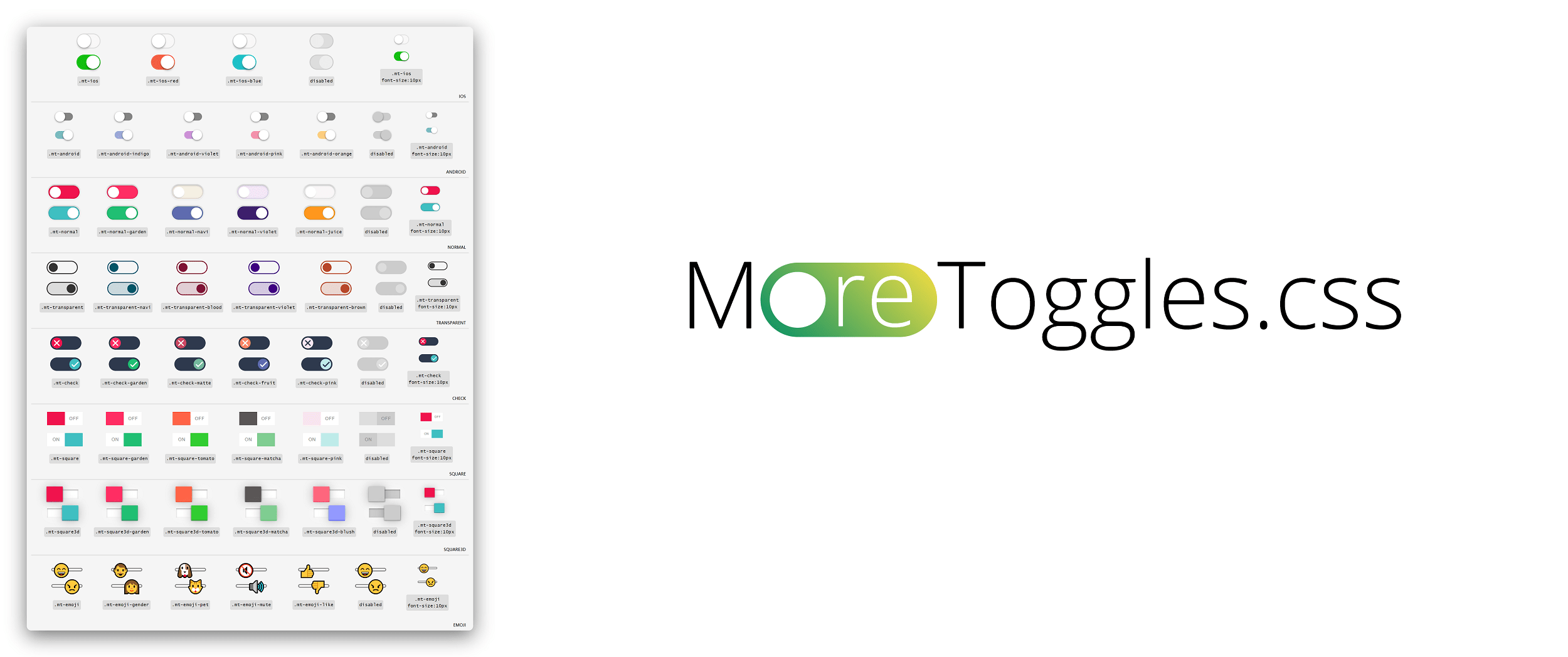
Styles
MoreToggles.css currently has 13 different styles. And for each style, several color patterns are provided.
Check out all available styles here
List of all the available class names:
IOS Style
mt-ios mt-ios-red mt-ios-blue
Android Style
mt-android mt-android-indigo mt-android-violet mt-android-pink mt-android-orange
IO Switch Style
mt-io mt-io-yellow mt-io-garden mt-io-navi mt-io-violet
Normal Style
mt-normal mt-normal-garden mt-normal-navi mt-normal-violet mt-normal-juice
Transparent Style
mt-transparent mt-transparent-navi mt-transparent-violet mt-transparent-blood mt-transparent-brown
Check Style
mt-check mt-check-garden mt-check-matte mt-check-fruit mt-check-pink
Yes No Style
mt-yesno mt-yesno-garden mt-yesno-matte mt-yesno-fruit mt-yesno-blush
Square Style
mt-square mt-square-garden mt-square-tomato mt-square-matcha mt-square-pink
Square 3d Style
mt-square3d mt-square3d-garden mt-square3d-tomato mt-square3d-matcha mt-square3d-blush
Emoji Style
mt-emoji-mood mt-emoji-gender mt-emoji-pet mt-emoji-mute mt-emoji-like
Star Style
mt-star mt-star-garden mt-star-tomato mt-star-pink mt-star-golden
Heart Style
mt-heart mt-heart-blush mt-heart-indigo mt-heart-pink mt-heart-golden
Icon Switch Style
mt-icon-music mt-icon-ring mt-icon-mic mt-icon-cam mt-icon-pin
Import Only a Single Style
If you care about the size of CSS files. Instead of import moretoggles.min.css, you can import the styles you want sepsrately.
In the /output folder, you can find all of the built CSS files. The naming convention is moretoggles.STYLE_NAME.min.css
Example for importing only Android Style
<head>
  <link rel="stylesheet" href="https://cdn.jsdelivr.net/gh/JNKKKK/[email protected]/output/moretoggles.android.min.css">
</head>
Scaling
You can scale the toggles by assign a font-size attribute style="font-size:10px;" to the wrapper div. You can try different numbers and the toggle will scale smoothly.
<div class="mt-ios" style="font-size:10px;">
  <input id="3" type="checkbox" />
  <label for="3"></label>
</div>
Disabled Toggles
Just like regular checkbox, you can add disabled attribute to <input> tag.
<div class="mt-ios">
  <input id="4" type="checkbox" disabled/>
  <label for="4"></label>
</div>
Listening to the change event
Since the toggle is actually an <input> with type="checkbox", you can use addEventListener to listen to the onchange event.
<div class="mt-ios">
  <input id="5" type="checkbox" />
  <label for="5"></label>
</div>

<script>
  const toggle = document.getElementById('5');

  toggle.addEventListener('change', (event) => {
    if (event.target.checked) {
      alert('checked');
    } else {
      alert('not checked');
    }
  });
</script>
Notice
Nest the <input> directly inside the <label> is NOT supported, although it is valid HTML syntax.
Don't ☹️
<div class="mt-ios">
  <label>
    <input type="checkbox" />
  </label>
</div>
Do 😃
<div class="mt-ios">
  <input id="1" type="checkbox" />
  <label for="1"></label>
</div>
License
MoreToggles.css is licensed under the MIT license. (https://opensource.org/licenses/MIT)
Contributing
This project is still in very early stage. Your contribution is very welcome. Feel free to submit a pull request!