All Projects → matecode → Snacky

matecode / Snacky

Licence: apache-2.0
Snacky is a small library to help you adding a Snackbar to your android project.

Programming Languages

java
68154 projects - #9 most used programming language

Projects that are alternatives of or similar to Snacky

Light
🍭 The usual Snackbar, but elegant
Stars: ✭ 542 (+12.45%)
Mutual labels:  material-design, ui-components, snackbar
Cafebar
An upgraded Snackbar for Android that provides more options and easy to use
Stars: ✭ 142 (-70.54%)
Mutual labels:  material-design, ui-components, snackbar
Noty
A simple library for creating animated warnings/dialogs/alerts for Android.
Stars: ✭ 136 (-71.78%)
Mutual labels:  material-design, snackbar
React Native Snackbar Component
A snackbar component for Android and iOS
Stars: ✭ 137 (-71.58%)
Mutual labels:  material-design, snackbar
Material
A UI/UX framework for creating beautiful applications.
Stars: ✭ 11,870 (+2362.66%)
Mutual labels:  material-design, snackbar
Ct Material Kit Pro
Premium Bootstrap 4 UI Kit based on Google's Material Design
Stars: ✭ 123 (-74.48%)
Mutual labels:  material-design, ui-components
Material Ui Time Picker
A time picker for Material-UI.
Stars: ✭ 126 (-73.86%)
Mutual labels:  material-design, ui-components
Material
A lightweight Material Design library for Angular based on Google's Material Components for the Web.
Stars: ✭ 143 (-70.33%)
Mutual labels:  material-design, ui-components
Togglebuttons
Android toggle buttons that adhere to the Material Design documentation.
Stars: ✭ 88 (-81.74%)
Mutual labels:  material-design, ui-components
Ej2 React Ui Components
Syncfusion React UI components library offer more than 50+ cross-browser, responsive, and lightweight react UI controls for building modern web applications.
Stars: ✭ 166 (-65.56%)
Mutual labels:  material-design, ui-components
Ej2 Angular Ui Components
Syncfusion Angular UI components library offer more than 50+ cross-browser, responsive, and lightweight angular UI controls for building modern web applications.
Stars: ✭ 159 (-67.01%)
Mutual labels:  material-design, ui-components
Material Backdrop
A simple solution for implementing Backdrop pattern for Android
Stars: ✭ 221 (-54.15%)
Mutual labels:  material-design, ui-components
Smart Webcomponents
Web Components & Custom Elements for Professional Web Applications
Stars: ✭ 110 (-77.18%)
Mutual labels:  material-design, ui-components
Datingapp
Dating UI kit is used for online meet up with girls and boys . The screen contains more than 30 icons and most of all required elements required to design an application like this. The XML and JAVA files contains comments at each and every point for easy understanding. Everything was made with a detail oriented style and followed by today's web trends. Clean coded & Layers are well-organized, carefully named, and grouped.
Stars: ✭ 97 (-79.88%)
Mutual labels:  material-design, ui-components
Nativescript Floatingactionbutton
Material Design Floating Action Button in NativeScript apps.
Stars: ✭ 133 (-72.41%)
Mutual labels:  material-design, ui-components
Android Art
🎄 Android™ 设计相关的在线工具: 图标制作、配色方案、尺寸修改、截图加壳等,持续更新...
Stars: ✭ 95 (-80.29%)
Mutual labels:  material-design, ui-components
Material Bread
Cross Platform React Native Material Design Components
Stars: ✭ 287 (-40.46%)
Mutual labels:  material-design, ui-components
Tc Material Design
Série de artigos sobre o Material Design Android
Stars: ✭ 64 (-86.72%)
Mutual labels:  material-design, snackbar
Snackbarbuilder
[ARCHIVED] Builder pattern for support library Snackbars, that makes them easier to customise and use
Stars: ✭ 71 (-85.27%)
Mutual labels:  material-design, snackbar
Notistack
Highly customizable notification snackbars (toasts) that can be stacked on top of each other
Stars: ✭ 2,562 (+431.54%)
Mutual labels:  material-design, snackbar

API

Donate

Snacky

Snacky is a small library to help you adding a Snackbar to your layout with ease. It was created because of my own needs and is inspired by Toasty. Snacky uses an easy builder pattern to build a Snackbar and gives you some template designs like ERROR, WARNING, INFO and SUCCESS as well as some customization options. See code samples below

‼️ As of version 1.1.4 Snacky is is only compatible with androidX and not longer with support library apps! ‼️

Screenshots
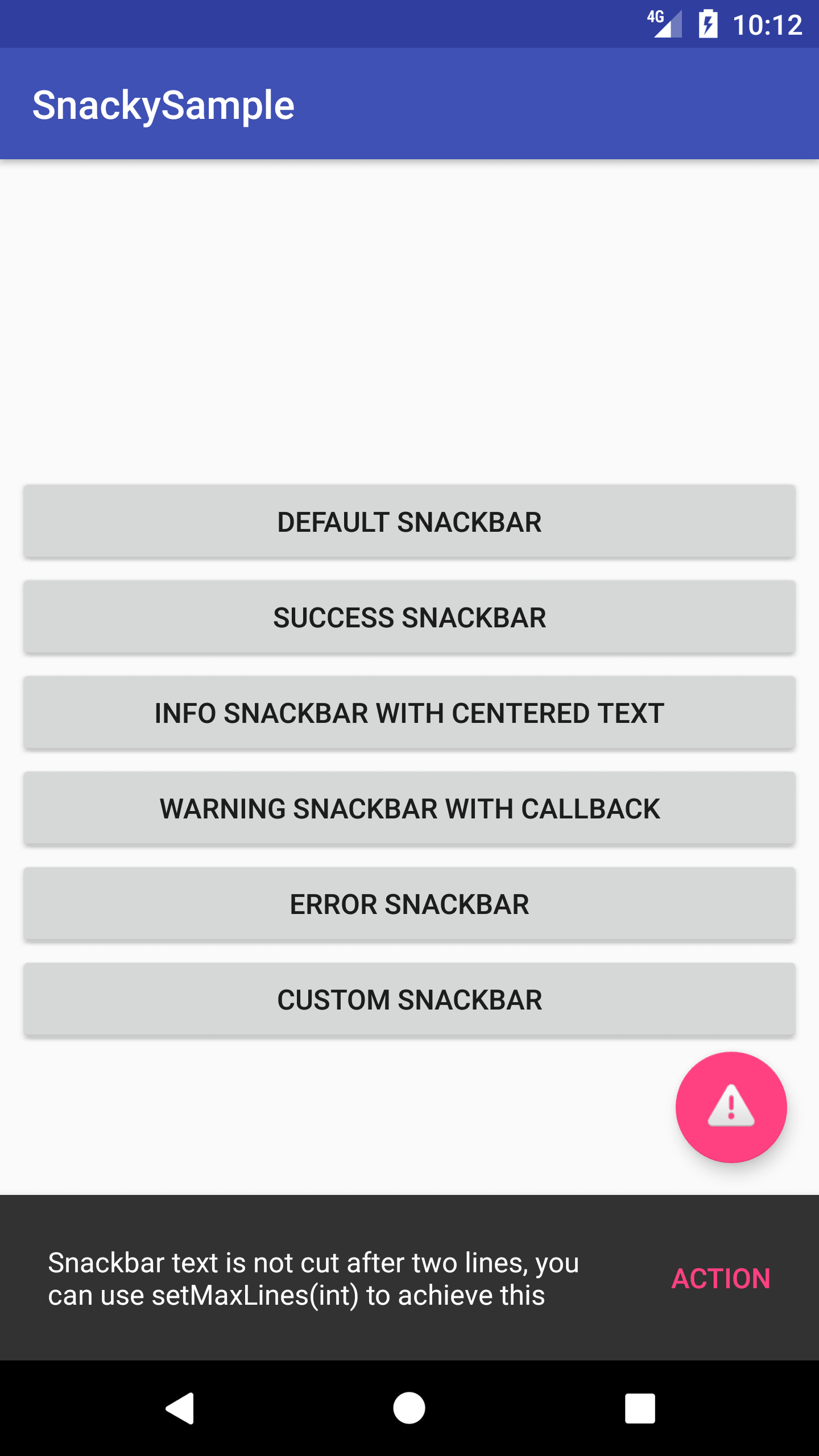
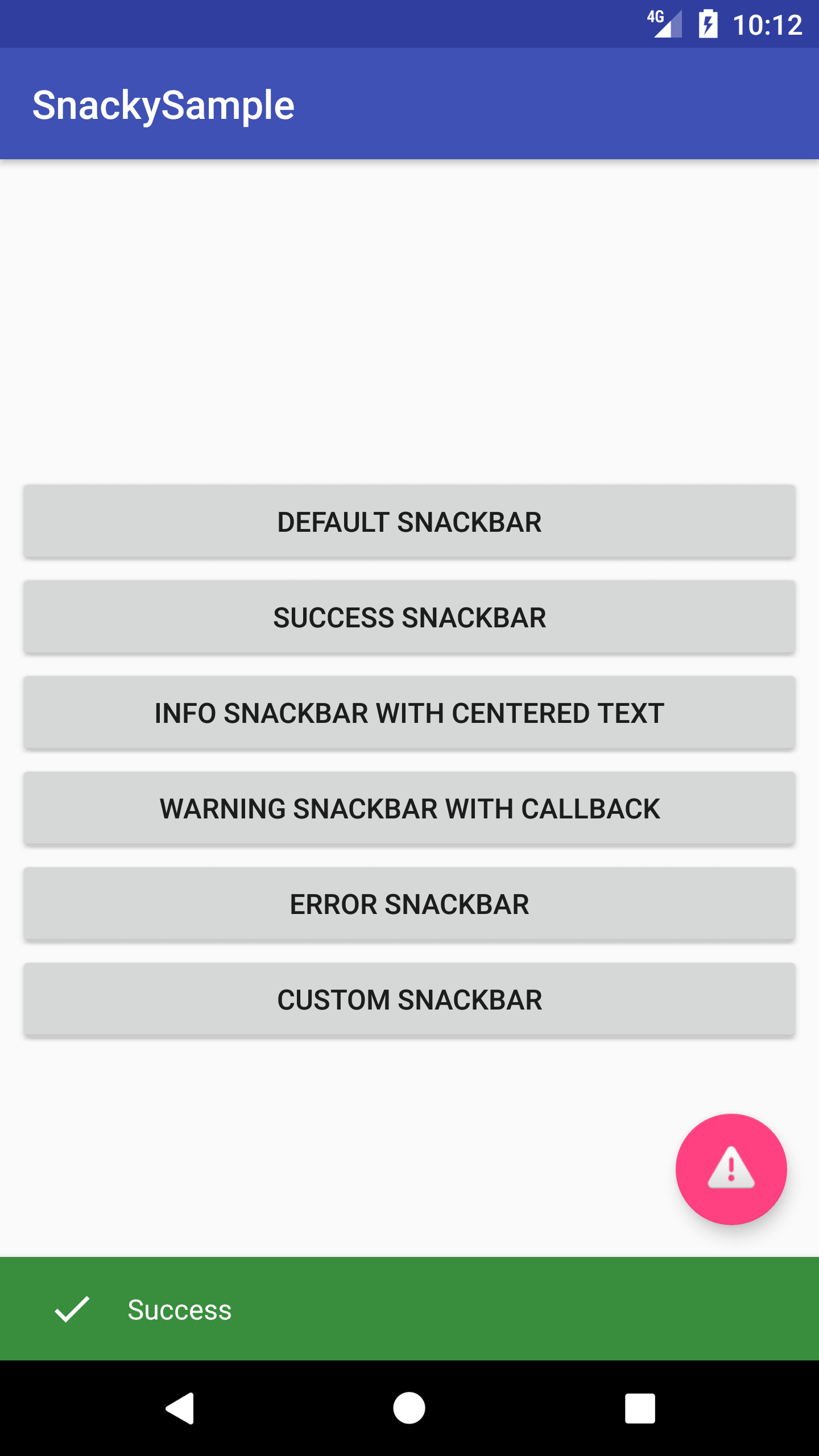
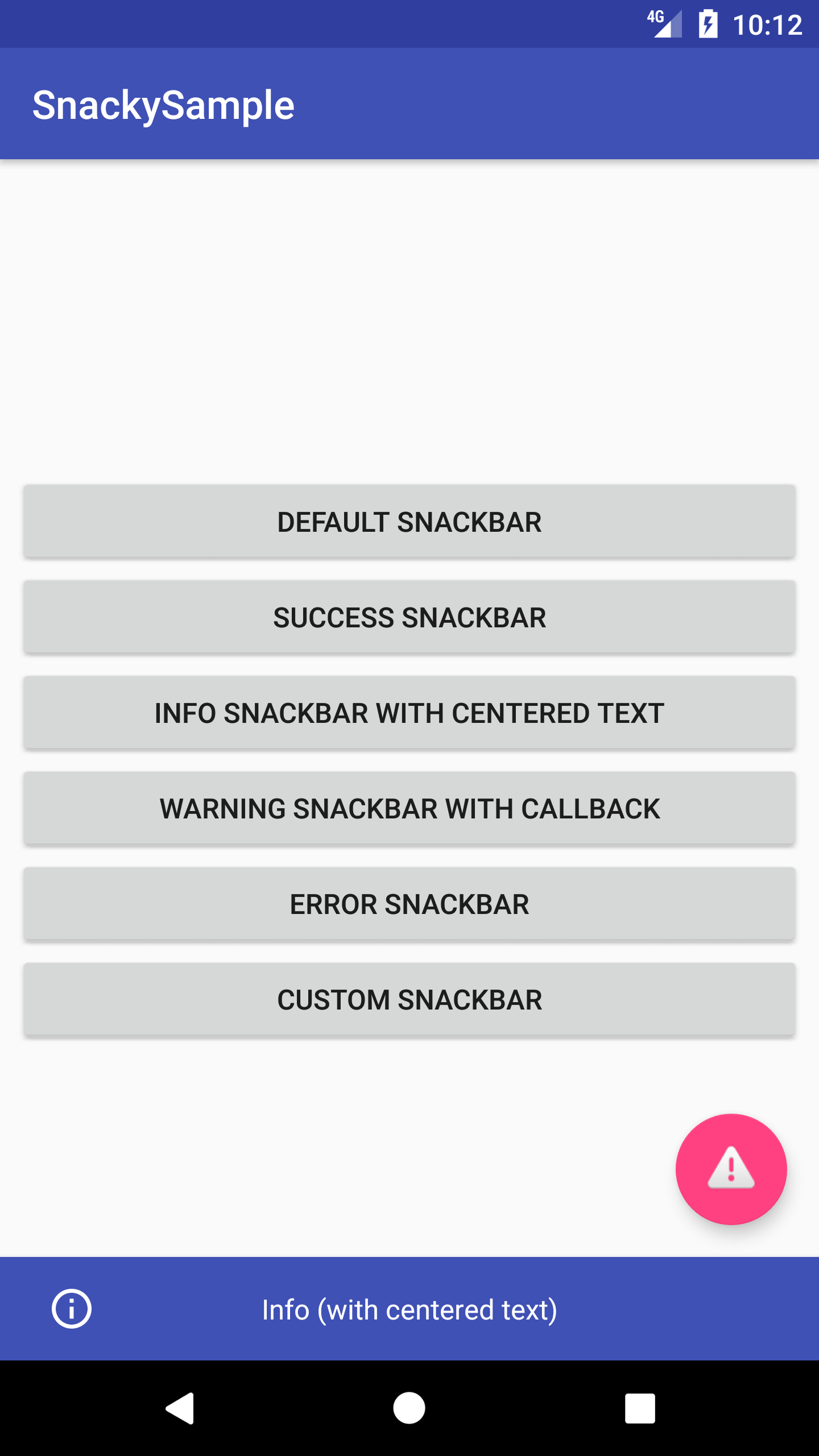
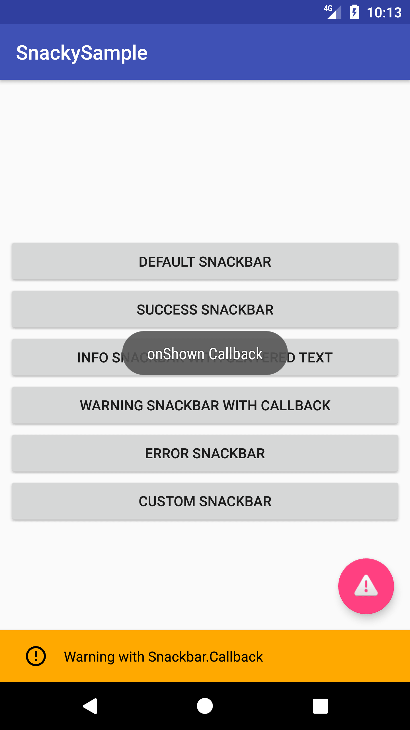
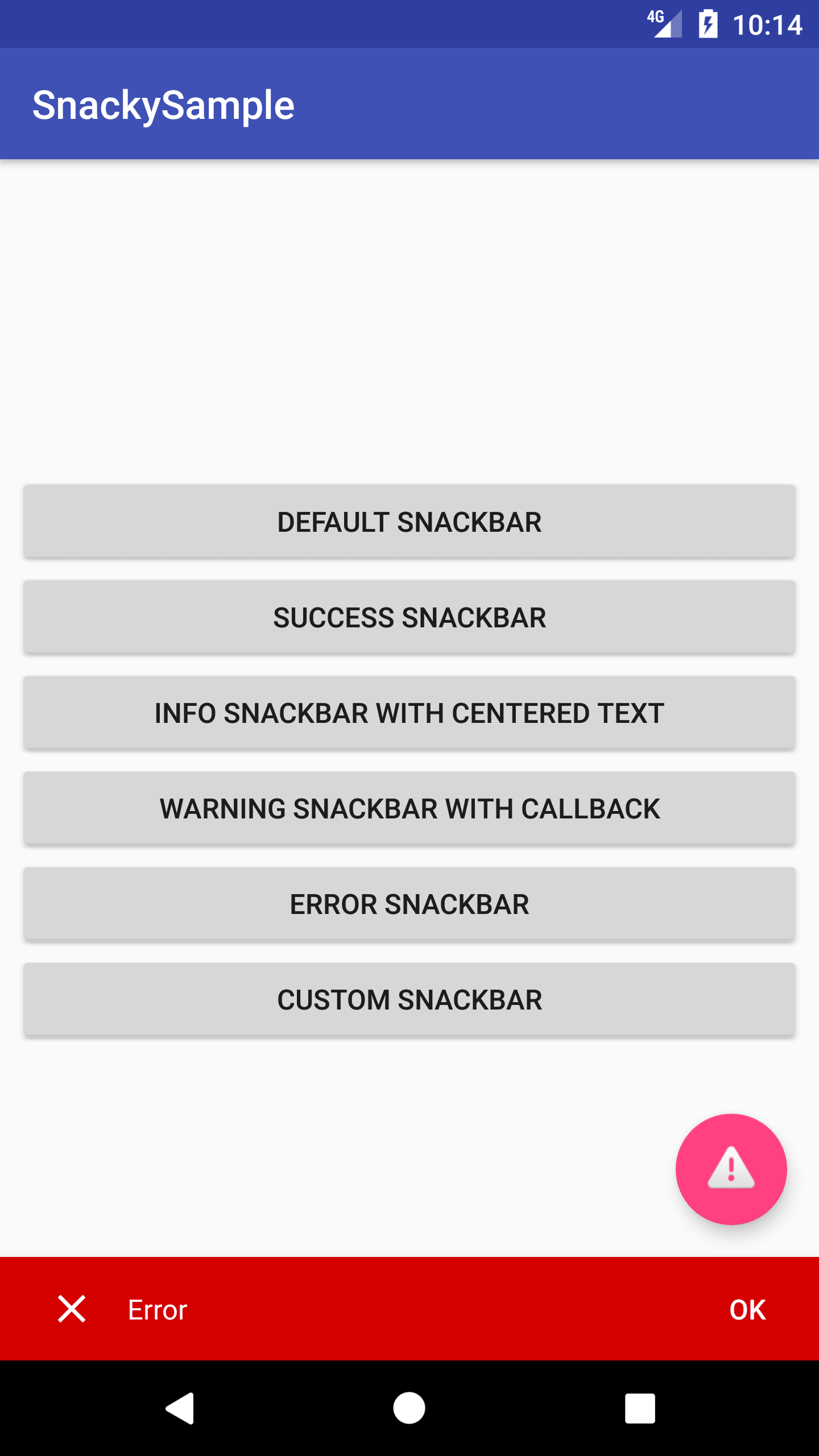
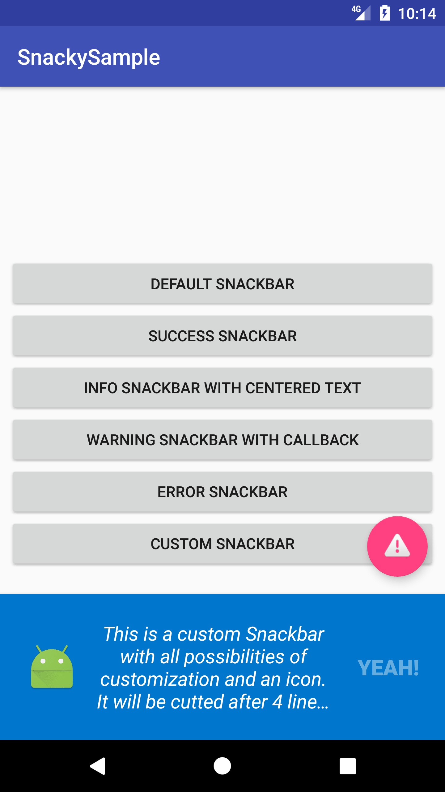
Default Success Info Warning Error Custom

Usage

Using Snacky is really simple.

Initialisation

Start with Snacky.builder() to get a Builder.

It is necessary to set an activity or View for the snackbar.

.setView(View view) will use the view for the snackbar to show, or you choose

.setActivity(Activity activity) which will automatically find the root view of the activity

Customization

most of them are self-explaining, all colors are not Resource Ids, but parsed colors, so use ContextCompat.getColor() if you want to use Resource-colors)

.setBackgroundColor() Color

.setText() Charset or IntRes for text

.setTextColor() Color or ColorStateList

.setTextSize() size in SP or with ComplexUnit

.setTextTypeface() Typeface

.setTextTypefaceStyle() NORMAL, BOLD, ITALIC, BOLD_ITALIC from Typeface

.setMaxLines() max lines of Snackbar, off by default

.centerText() centers the text

.setActionText()

.setActionTextColor() Color or ColorStateList

.setActionTextSize()

.setActionTextTypeface()

.setActionTextTypefaceStyle() like .setTextTypefaceStyle()

.setActionClickListener(View.OnClickListener)

.setDuration(Snacky.DURATION) SHORT, LONG, INDEFINITE

.setIcon() Drawable to be shown, in my opinion ist best to use small drawables with 24dp size

Building

.build() gives you the Snackbar, but you can also use some predefined templates:

.success()

.error()

.info()

.warning()

All give you a snackbar object, but some set predefined values if you didn't customize them before.

Using the snackbar

After that you can handle the snackbar as you know it:

.addCallback(SnackBar.Callback) adds a callback to the snackbar

.show() shows the snackbar

Example

See ExampleActivity.java for a list of examples as shown in Screenshots.

There you can also the see the right use of CoordinatorLayout and FloatingActionButton. For Snacky Builder just use the view from OnClickListener in FAB to animate it on click.

Installation

Snacky is published via Jitpack. Add this in your root build.gradle file (not your module build.gradle file):

allprojects {
    repositories {
        ...
        maven { url "https://jitpack.io" }
    }
}

Add this to your module's build.gradle file (make sure the version matches the JitPack badge above):

dependencies {
    ...
    implementation 'com.github.matecode:Snacky:1.1.5'
    implementation 'com.google.android.material:material:1.0.0'
}

Licence

Copyright 2018 Mate Siede

Licensed under the Apache License, Version 2.0 (the "License");
you may not use this file except in compliance with the License.
You may obtain a copy of the License at

    http://www.apache.org/licenses/LICENSE-2.0

Unless required by applicable law or agreed to in writing, software
distributed under the License is distributed on an "AS IS" BASIS,
WITHOUT WARRANTIES OR CONDITIONS OF ANY KIND, either express or implied.
See the License for the specific language governing permissions and
limitations under the License.
Note that the project description data, including the texts, logos, images, and/or trademarks, for each open source project belongs to its rightful owner. If you wish to add or remove any projects, please contact us at [email protected].