yonat / Multislider
Licence: mit
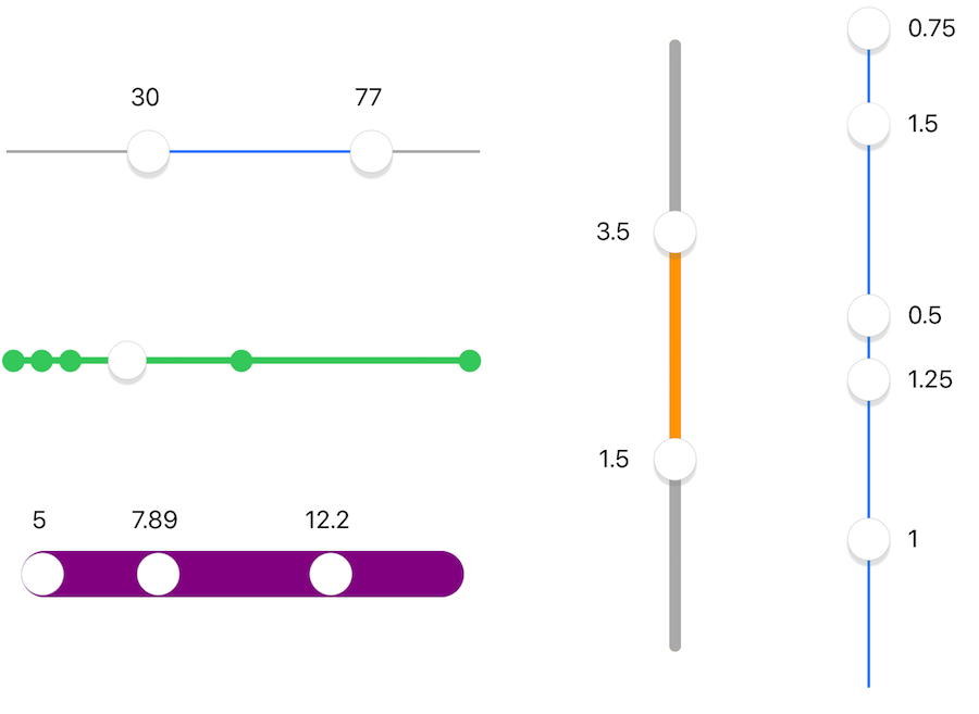
UISlider clone with multiple thumbs and values, range highlight, optional snap intervals, optional value labels, either vertical or horizontal.
Stars: ✭ 182
Programming Languages
swift
15916 projects
Labels
Projects that are alternatives of or similar to Multislider
vue-histogram-slider
Range slider with histogram for Vue.js
Stars: ✭ 111 (-39.01%)
Mutual labels: range-slider
Formvuelar
Vue form components with server-side validation in mind
Stars: ✭ 263 (+44.51%)
Mutual labels: range-slider
Angularjs Slider
Slider directive for AngularJS 1.X. No dependencies and mobile friendly.
Stars: ✭ 1,236 (+579.12%)
Mutual labels: range-slider
data-driven-range-slider
D3.js based data-driven range slider, date time support
Stars: ✭ 21 (-88.46%)
Mutual labels: range-slider
RangeUISlider
📱 🔵➖🔵 An iOS range selection slider compatible with UIKit and SwiftUI. Developed using autolayout and highly customizable using IBDesignabled and IBInspectable or programmatically. It support also RTL (right to left) languages automatically out of the box.
Stars: ✭ 98 (-46.15%)
Mutual labels: range-slider
Nouislider
noUiSlider is a lightweight, ARIA-accessible JavaScript range slider with multi-touch and keyboard support. It is fully GPU animated: no reflows, so it is fast; even on older devices. It also fits wonderfully in responsive designs and has no dependencies.
Stars: ✭ 5,127 (+2717.03%)
Mutual labels: range-slider
React Slider Kit
react-slider-kit is going to be a comprehensive solution to slider feature in react.
Stars: ✭ 219 (+20.33%)
Mutual labels: range-slider
Rangeslider
Simple, small and fast vanilla JavaScript polyfill for the HTML5 `<input type="range">` slider element.
Stars: ✭ 161 (-11.54%)
Mutual labels: range-slider
vue-round-slider
A round slider component for Vue JS, with range slider support. Also it can be any kind of arc slider such as pie shape, half / semi-circle, quarter circle shape sliders.
Stars: ✭ 45 (-75.27%)
Mutual labels: range-slider
Sdrangeslider
Double range slider selector in iOS/iOS双滑块范围选择器
Stars: ✭ 28 (-84.62%)
Mutual labels: range-slider
slider
Vue 3 slider component with multihandles, tooltips merging and formatting (+Tailwind CSS support).
Stars: ✭ 162 (-10.99%)
Mutual labels: range-slider
react-native-range-slider
A high-quality, cross platform, native iOS range slider for react native. A slider, similar in style to UISlider, but which allows you to pick a minimum and maximum range; inspired by react-native-range-slider
Stars: ✭ 46 (-74.73%)
Mutual labels: range-slider
React Slider
Accessible, CSS agnostic, slider component for React.
Stars: ✭ 627 (+244.51%)
Mutual labels: range-slider
range-slider-element
🍬 <range-slider> custom element
Stars: ✭ 45 (-75.27%)
Mutual labels: range-slider
Verlyrangeslider
Range sliders with some verlet physics magic.
Stars: ✭ 84 (-53.85%)
Mutual labels: range-slider
Flutter xlider
A material design slider and range slider with rtl support and lots of options and customization for flutter
Stars: ✭ 264 (+45.05%)
Mutual labels: range-slider
Vue Slider Component
🌡 A highly customized slider component
Stars: ✭ 2,158 (+1085.71%)
Mutual labels: range-slider
Boxedverticalseekbar
A vertical seekbar for Android
Stars: ✭ 133 (-26.92%)
Mutual labels: range-slider
React Input Range
React component for inputting numeric values within a range (range slider)
Stars: ✭ 680 (+273.63%)
Mutual labels: range-slider
MultiSlider
UISlider clone with multiple thumbs and values, range highlight, optional snap intervals, optional value labels, either vertical or horizontal.
Features
- Multiple thumbs
- Range slider (optional) - track color between thumbs different from track color outside thumbs
- Vertical (optional)
- Value labels (optional)
- Snap interval (optional)
- Haptic feedback
- Configurable thumb image, minimum and maximum images.
- Configurable track width, color, rounding.
Usage
let slider = MultiSlider()
slider.minimumValue = 1    // default is 0.0
slider.maximumValue = 5    // default is 1.0

slider.value = [1, 4.5, 5]

slider.addTarget(self, action: #selector(sliderChanged(_:)), for: .valueChanged) // continuous changes
slider.addTarget(self, action: #selector(sliderDragEnded(_:)), for: . touchUpInside) // sent when drag ends
SwiftUI
Use MultiValueSlider from the swiftui branch.
Getting multiple thumb values
Use value to get all thumbs values, and draggedThumbIndex to find which thumb was last moved.
func sliderChanged(slider: MultiSlider) {
    print("thumb \(slider.draggedThumbIndex) moved")
    print("now thumbs are at \(slider.value)") // e.g., [1.0, 4.5, 5.0]
}
Range slider
slider.outerTrackColor = .lightGray // outside of first and last thumbs
Vertical / horizontal orientation
slider.orientation = .horizontal // default is .vertical
slider.isVertical = false // same effect, but accessible from Interface Builder
Value labels
slider.valueLabelPosition = .left // .notAnAttribute = don't show labels
slider.isValueLabelRelative = true // show differences between thumbs instead of absolute values
slider.valueLabelFormatter.positiveSuffix = " 𝞵s"
slider.valueLabelColor = .green
slider.valueLabelFont = someFont
Snap interval
slider.snapStepSize = 0.5 // default is 0.0, i.e. don't snap
slider.isHapticSnap = false // default is true, i.e. generate haptic feedback when sliding over snap values
Changing Appearance
slider.tintColor = .cyan // color of track
slider.trackWidth = 32
slider.hasRoundTrackEnds = true
slider.showsThumbImageShadow = false // wide tracks look better without thumb shadow
Images
// add images at the ends of the slider:
slider.minimumImage = UIImage(named: "clown")
slider.maximumImage = UIImage(named: "cloud")

// change image for all thumbs:
slider.thumbImage = UIImage(named: "balloon")

// or let each thumb have a different image:
slider.thumbViews[0].image = UIImage(named: "ball")
slider.thumbViews[1].image = UIImage(named: "club")
Distance/Overlap Between Thumbs
// allow thumbs to overlap:
slider.keepsDistanceBetweenThumbs = false

// make thumbs keep a greater distance from each other (default = half the thumb size):
slider.distanceBetweenThumbs = 3.14
Disabling/freezing thumbs
slider.disabledThumbIndices = [1, 3]
Requirements
- iOS 9.0+
- Xcode 10
Installation
CocoaPods:
pod 'MultiSlider'
Legacy versions:
| Swift version | MultiSlider version |
|---|---|
| 4.0 (Xcode 9.4) |
pod 'MiniLayout', '~> 1.2.1'pod 'MultiSlider', '~> 1.6.0'
|
| 3 |
pod 'MiniLayout', '~> 1.1.0'pod 'MultiSlider', '~> 1.1.2'
|
| 2.3 |
pod 'MiniLayout', '~> 1.0.1'pod 'MultiSlider', '~> 1.0.1'
|
Swift Package Manager:
dependencies: [
    .package(url: "https://github.com/yonat/MultiSlider", from: "1.11.2")
]
Meta
Note that the project description data, including the texts, logos, images, and/or trademarks,
for each open source project belongs to its rightful owner.
If you wish to add or remove any projects, please contact us at [email protected].


