willmendesneto / Ngx Skeleton Loader
Programming Languages
Projects that are alternatives of or similar to Ngx Skeleton Loader
NGX Skeleton loader


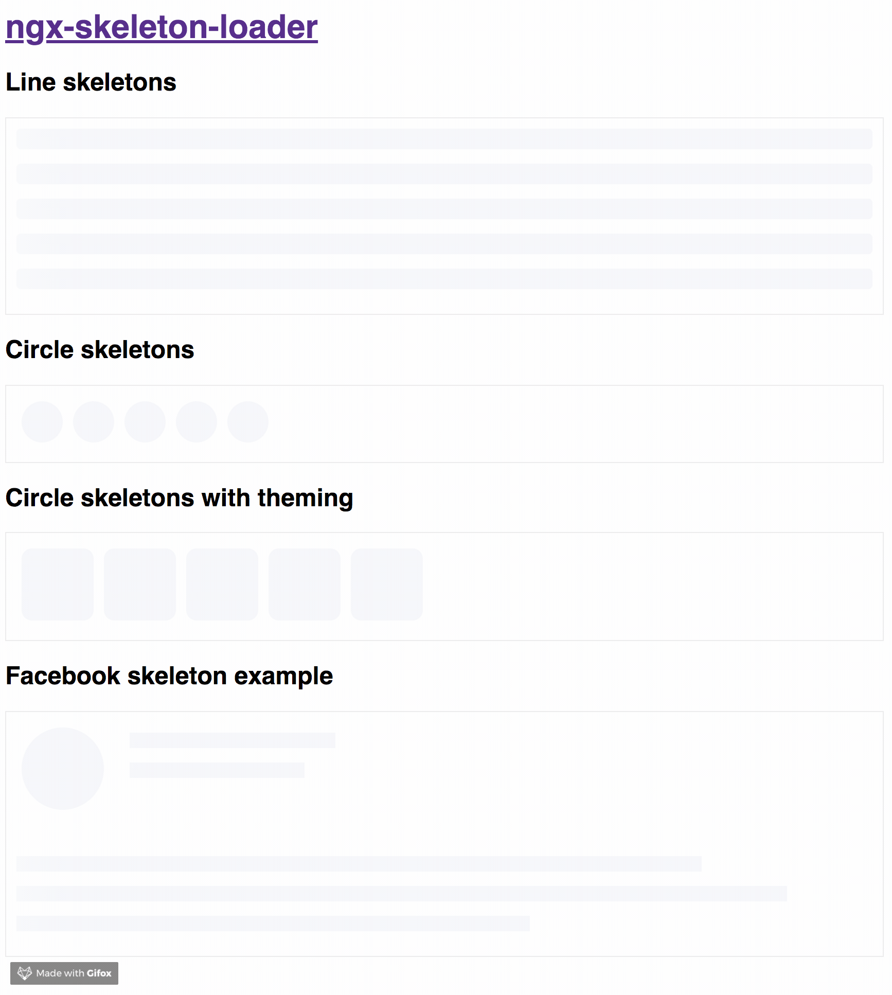
Why skeletons?
If you want to get more details about that, please read "NGX-Skeleton-Loader — States, Animations, Performance, and Accessibility for your Angular App" blog post at Medium
The idea of this component is make the process transparent and easier. So the main point is integrate this component with other tooling process, such as:
- Server-side rendering;
- Progressive rendering;
- Any other that you like :)
It's totally transparent for you and you can integrate easier in your application, improving your user experience 🎉
Demo
Try out our demos on Stackblitz!
- Usage: animations, appearance, and themes
- User Card Component Loading simulation using NGX Skeleton Loader
Install
You can get it on NPM installing ngx-skeleton-loader module as a project dependency.
npm install ngx-skeleton-loader --save
Setup
You'll need to add NgxSkeletonLoaderModule to your application module. So that, the <ngx-skeleton-loader> components will be accessible in your application.
...
import { NgxSkeletonLoaderModule } from 'ngx-skeleton-loader';
...

@NgModule({
  declarations: [
    YourAppComponent
  ],
  imports: [
    ...
    NgxSkeletonLoaderModule,
    ...
  ],
  providers: [],
  bootstrap: [YourAppComponent]
})

export class YourAppComponent {}
After that, you can use the ngx-skeleton-loader components in your templates, passing the configuration data into the component itself.
-
ngx-skeleton-loader: Handle the skeleton animation and the skeleton styles of your app;
<div class="item">
  <ngx-skeleton-loader count="5" appearance="circle"></ngx-skeleton-loader>
</div>
Using NgxSkeletonLoaderModule.forRoot()
Also, you can import the module in your app by calling NgxSkeletonLoaderModule.forRoot() when adding it. So it will be available across your Angular application.
...
import { NgxSkeletonLoaderModule } from 'ngx-skeleton-loader';
...

@NgModule({
  declarations: [
    YourAppComponent
  ],
  imports: [
    ...
    NgxSkeletonLoaderModule.forRoot(),
    ...
  ],
  providers: [],
  bootstrap: [YourAppComponent]
})

export class YourAppComponent {}
<div class="item">
  <ngx-skeleton-loader count="5" appearance="circle"></ngx-skeleton-loader>
</div>
WAI-ARIA values
- loadingText - default
Loading...: attribute that defines the text value foraria-valuetextattribute. Defaults to "Loading..."
Appearance
You can also define which appearance want to use in your skeleton loader by passing the options in your component via [appearance] attribute.
Options
-
''- default: it will use it''as appearance. At the end, it will render like a line, but line is not a expected appearance to be passed; -
circle: it will usecircleas appearance. Great for avatar skeletons, for example :);
Animations
You can also define which CSS animation you want to use - even not use any, if it's the case - in your skeleton loader by passing the options in your component via [animation] attribute.
Options
-
"false"(as string): it will disable the animation; -
false(as boolean): it will disable the animation. Animation will receivefalseas string when attribute field it's not using binding. Component now can receivefalse(boolean), "false" (string), or any other animation type via binding; -
progress- default: it will use itprogressas animation; -
progress-dark: it will use itprogress-darkas animation. Recommended if your color schema is darken; -
pulse: it will usepulseas animation;
progressis the default animation, used as the single one previously. If you don't pass the animation attribute, it defaults toprogress.
<!--
If you need to change all the background wrapper
you need to apply the style changes on the
`ngx-skeleton-loader` component wrapper
-->
<div class="item">
  <!-- Disables the animation -->
  <ngx-skeleton-loader animation="false"></ngx-skeleton-loader>
  <!-- Disables the animation, but receiving boolean value from binding -->
  <!-- Via binding it can receive `false` (boolean), "false" (string), or any other animation type -->
  <ngx-skeleton-loader [animation]="classAttributeWithBooleanFalseValue"></ngx-skeleton-loader>
  <!-- Uses `progress` as animation -->
  <ngx-skeleton-loader animation="progress"></ngx-skeleton-loader>
  <ngx-skeleton-loader></ngx-skeleton-loader>
  <!-- Uses `pulse` as animation -->
  <ngx-skeleton-loader animation="pulse"></ngx-skeleton-loader>
</div>
You can check the code details in the Stackblitz Live Demo Link
Theming
You can also define different styles for the skeleton loader by passing an object with the css styles - in dashed case - into the component via [theme] attribute.
<!--
If you need to change all the background wrapper
you need to apply the style changes on the
`ngx-skeleton-loader` component wrapper
-->

<div style="background: #FF0001; padding: 10px;">
  <ngx-skeleton-loader
    count="5"
    [theme]="{
      'border-radius': '5px',
      height: '50px',
      'background-color': '#992929',
      border: '1px solid white'
    }"
  ></ngx-skeleton-loader>
</div>
The [theme] attribute now accepts the same configuration as ngStyle as well. That means you can manage to use like you're doing with the built-in directive, having a pleasure and beautiful experience
<!--
Note that we are using a combination of styles and ngStyle inside theme object,
having `height.px` receiving a number and `background-color` receiving a HEX Color
-->
<div style="background: #FF0001; padding: 10px;">
  <ngx-skeleton-loader
    count="5"
    [theme]="{
      'height.px': 50,
      'background-color': '#992929'
    }"
  ></ngx-skeleton-loader>
</div>
⚠️ This is here only as a documentation, but it's not encouraged to be used. Please consider use it with caution ⚠️
Also, you can use CSS to add theme styles into your component. However, there are some implications:
- You're using
:hostin your stylesheet, which means you are aware of any possible problem:hostcan create for your app at that level since it's based on:hostDOM style scoping - You're adding stylesheet based on
<ngx-skeleton-loader>internal classes. It means that class naming changes on module's side will be breaking changes for your application as well.
As an example, your Component file is like this
import { Component } from '@angular/core';

@Component({
  selector: 'my-ngx-skeleton-loader-with-theming',
  templateUrl: './my-ngx-skeleton-loader-with-theming.component.html',
  styleUrls: ['./my-ngx-skeleton-loader-with-theming.component.css'],
})
export class MyNGXSkeletonLoaderWithThemingComponent {
  /* ... code goes here*/
}
And your component HTML code is
<!--
file: my-ngx-skeleton-loader-with-theming.component.html

As an example, it's not using themes via [theme] attributes.
-->

<ngx-skeleton-loader count="5" animation="pulse"></ngx-skeleton-loader>
You can apply theme changes in our stylesheet. At the end it will be
/* file: `my-ngx-skeleton-loader-with-theming.component.css`
 *
 * You can find more details about `:host` at
 * Angular Component Style Docs https://angular.io/guide/component-styles#host
 */
:host >>> ngx-skeleton-loader .loader {
  border-radius: 5px;
  height: 50px;
  background-color: #992929;
  border: 1px solid white;
}
You should change the styles on the skeleton wrapper element in case you need to change the background color. You can check the code details in the Stackblitz Live Demo Link or check it out a content load simulation in this Stackblitz Live Demo Link
Development
Run demo locally
- This project uses Angular CLI as base. That means you just need to run
npm startand access the linkhttp://localhost:4200in your browser
Run tests
- Run
npm testfor run tests. In case you want to test using watch, please usenpm run tdd
Publish
this project is using np package to publish, which makes things straightforward. EX: np <patch|minor|major> --contents=dist/ngx-skeleton-loader
For more details, please check np package on npmjs.com
Contribute
For any type of contribution, please follow the instructions in CONTRIBUTING.md and read CODE_OF_CONDUCT.md files.
Author
Wilson Mendes (willmendesneto)