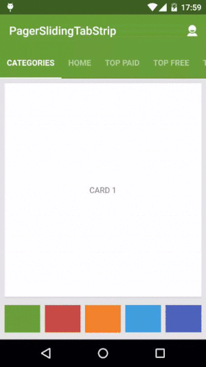
Android PagerSlidingTabStrip (default Material Design)
This library is not maintained anymore and there will be no further releases. For most of the cases you can use TabLayout instead of this library.
Interactive paging indicator widget, compatible with the ViewPager from the
Android Support Library.
 ------
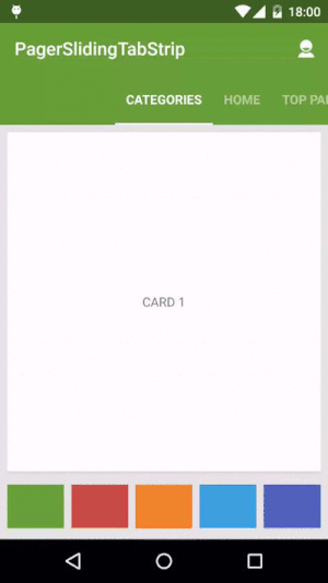
Usage
For a working implementation of this project see the sample/ folder.
- Include the following dependency in your
build.gradlefile.
compile 'com.jpardogo.materialtabstrip:library:1.1.1'Or add the library as a project. I tried to send a pull request, but looks like the original developer doesn't maintain it anymore.
- Include the
PagerSlidingTabStripwidget in your layout. This should usually be placed above theViewPagerit represents.
<com.astuetz.PagerSlidingTabStrip
    android:id="@+id/tabs"
    android:layout_width="match_parent"
    android:layout_height="?attr/actionBarSize"
android:background="?attr/colorPrimary" />- In your
onCreatemethod (oronCreateViewfor a fragment), bind the widget to theViewPager:
// Initialize the ViewPager and set an adapter
ViewPager pager = (ViewPager) findViewById(R.id.pager);
pager.setAdapter(new TestAdapter(getSupportFragmentManager()));

// Bind the tabs to the ViewPager
PagerSlidingTabStrip tabs = (PagerSlidingTabStrip) findViewById(R.id.tabs);
tabs.setViewPager(pager);
That's all you need to do, but if you want to use your own tabs, then...
-
If your adapter implements the interface
CustomTabProvideryou can paste your custom tab view/s.-
In case the the view returned contains the id
R.id.psts_tab_title, this view should be aTextViewand will be used to placed the title and set the view state (pressed/selected/default). -
If you don't want the library manage your TextView title for the tab, use a different id than
R.id.psts_tab_titlein your tab layout. -
The interface provide callbacks for selection and unselection of tabs as well.
-
If your adapter doesn't implement the interface
CustomTabProviderthe default tab will be used, which is aTextViewwith idR.id.psts_tab_title).
-
-
(Optional) If you use an
OnPageChangeListenerwith your view pager you should set it in the widget rather than on the pager directly.
// continued from above
tabs.setOnPageChangeListener(mPageChangeListener);
Customization
From theme:
android:textColorPrimaryvalue (from your theme) will be applied automatically to the tab's text color (Selected tab with 255 alpha and non selected tabs with 150 alpha), underlineColor, dividerColor and indicatorColor, if the values are not defined on the xml layout.
Notes about some of the native attributes:
android:paddingLeftorandroid:paddingRightlayout padding. If you apply both, they should be balanced. Check issue #69 for more information.
Custom attributes:
pstsIndicatorColorColor of the sliding indicator.textColorPrimarywill be it's default color value.pstsIndicatorHeightHeight of the sliding indicator.pstsUnderlineColorColor of the full-width line on the bottom of the view.textColorPrimarywill be it's default color value.pstsUnderlineHeightHeight of the full-width line on the bottom of the view.pstsDividerColorColor of the dividers between tabs.textColorPrimarywill be it's default color value.pstsDividerWidthStroke width of divider line, defaults to 0.pstsDividerPaddingTop and bottom padding of the dividers.pstsShouldExpandIf set to true, each tab is given the same weight, default false.pstsScrollOffsetScroll offset of the selected tab.pstsPaddingMiddleIf true, the tabs start at the middle of the view (Like Newsstand google app).pstsTabPaddingLeftRightLeft and right padding of each tab.pstsTabBackgroundBackground drawable of each tab, should be a StateListDrawable.pstsTabTextSizeTab text size (sp).pstsTabTextColorTab text color that can either be a color (text color won't changed) or a selector with a color per state: pressed (tab pressed), selected (tab active), default (active non active). The order of states in the selector is important. Check issue #68 for more information.pstsTabTextStyleSet the text style, default normal on API 21, bold on older APIs.pstsTabTextAllCapsIf true, all tab titles will be upper case, default true.pstsTabTextAlphaSet the text alpha transparency for non selected tabs. Range 0..255. 150 is it's default value. It WON'T be used ifpstsTabTextColoris defined in the layout. IfpstsTabTextColoris NOT defined, It will be applied to the non selected tabs.pstsTabTextFontFamilySet the font family name. Defaultsans-serif-mediumon API 21,sans-serifon older APIs.
Almost all attributes have their respective getters and setters to change them at runtime. To change dynamically pstsTabTextFontFamily and pstsTabTextStyle you can call:
public void setTypeface(Typeface typeface, int style). It can be used to define custom fonts in default tabs. Otherwise you can use custom tabs withCustomTabProvider.
Please open an issue if you find any are missing.
Developed By
- Javier Pardo de Santayana Gomez - jpardogo.com - [email protected]
- Andreas Stuetz - [email protected]
- And contributors.
Contributions
- Please, read the README file before opening an issue, thanks.
- Please, all the Pull Request must be sent to the dev branch, thanks..
Credits
- Kirill Grouchnikov - Author of an explanation post on Google+
License
Copyright 2013 Andreas Stuetz

Licensed under the Apache License, Version 2.0 (the "License");
you may not use this file except in compliance with the License.
You may obtain a copy of the License at

   http://www.apache.org/licenses/LICENSE-2.0

Unless required by applicable law or agreed to in writing, software
distributed under the License is distributed on an "AS IS" BASIS,
WITHOUT WARRANTIES OR CONDITIONS OF ANY KIND, either express or implied.
See the License for the specific language governing permissions and
limitations under the License.