MindorksOpenSource / Radialprogressbar
Licence: apache-2.0
Radial ProgressBar inspired by Apple Watch OS. It is highly Customisable
Stars: ✭ 141
Projects that are alternatives of or similar to Radialprogressbar
React Sweet Progress
A way to quickly add a progress bar to react app 🌈
Stars: ✭ 239 (+69.5%)
Mutual labels: progress, progress-bar, progressbar
angular-progress-bar
This component allow you to easy incorporate progress-bar to angular/ionic project, providing binding and color options
Stars: ✭ 26 (-81.56%)
Mutual labels: progress, progress-bar, progressbar
react-sweet-progress
A way to quickly add a progress bar to react app 🌈
Stars: ✭ 250 (+77.3%)
Mutual labels: progress, progress-bar, progressbar
Roundprogresstextview
TextView with Round Pogress
Stars: ✭ 18 (-87.23%)
Mutual labels: progress, progress-bar, progressbar
Delayedprogress
ProgressDialog that waits a minimum time to be dismissed before showing. Once visible, the ProgressDialog will be visible for a minimum amount of time to avoid "flashes" in the UI.
Stars: ✭ 95 (-32.62%)
Mutual labels: progress, progress-bar, progressbar
Alive Progress
A new kind of Progress Bar, with real-time throughput, ETA, and very cool animations!
Stars: ✭ 2,940 (+1985.11%)
Mutual labels: progress, progress-bar, progressbar
React Nprogress
⌛️ A React primitive for building slim progress bars.
Stars: ✭ 173 (+22.7%)
Mutual labels: progress, progress-bar, progressbar
Tqdm
A Fast, Extensible Progress Bar for Python and CLI
Stars: ✭ 20,632 (+14532.62%)
Mutual labels: progress, progress-bar, progressbar
VHProgressBar
Vartical and Horizontal ProgressBar
Stars: ✭ 23 (-83.69%)
Mutual labels: progress, progress-bar, progressbar
Vue Step Progress
A simple Vue component that displays a Progress Bar with labels for each step
Stars: ✭ 26 (-81.56%)
Mutual labels: progress, progress-bar, progressbar
Python Progressbar
Progressbar 2 - A progress bar for Python 2 and Python 3 - "pip install progressbar2"
Stars: ✭ 682 (+383.69%)
Mutual labels: progress, progress-bar, progressbar
ProBar
this script will allow you to configure a progress bar with a timer with other options
Stars: ✭ 0 (-100%)
Mutual labels: progress, progress-bar, progressbar
LineProgressbar
A light weight jquery progressbar plugin
Stars: ✭ 34 (-75.89%)
Mutual labels: progress, progress-bar, progressbar
Multiprogressview
📊 An animatable view that depicts multiple progresses over time. Modeled after UIProgressView
Stars: ✭ 614 (+335.46%)
Mutual labels: progress, progress-bar, progressbar
Ruby Progressbar
Ruby/ProgressBar is a text progress bar library for Ruby.
Stars: ✭ 1,378 (+877.3%)
Mutual labels: progress, progress-bar, progressbar
Missme
Same Old Android Progress Dialog
Stars: ✭ 49 (-65.25%)
Mutual labels: progress-bar, progressbar
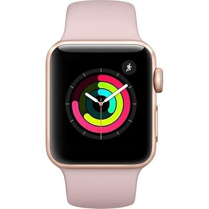
Radial Progress Bar
Radial ProgressBar inspired by Apple Watch OS. It is highly Customisable
Preview of Radial Progress Bar

Getting Started
Step 1. Add the JitPack repository to your Add it in your root build.gradle at the end of repositories:
allprojects {
    repositories {
   	   maven { url 'https://jitpack.io' }
    }
}
Step 2. Add the dependency
dependencies {
	        implementation 'com.github.MindorksOpenSource:RadialProgressBar:v1.3'
	}
Step3. To use this in XML File, use
  <com.mindorks.RadialProgressBar
            android:layout_width="200dp"
            android:layout_height="200dp"
            android:id="@+id/progress_view"
            app:useRoundedCorner="true"
            app:innerMaxProgress="100"
            app:outerMaxProgress="100"
            app:centerMaxProgress="100"
            app:isAnimationOn="true"
            app:innerProgress="50"
            app:centerProgress="50"
	    app:hasTwoProgressView="false"
            app:hasOneProgressView="false"
   />
Step 4. Link the XML in Activity File using,
val radialProgressBar = findViewById(R.id.progress_view)

or

RadialProgressBar rpb = findViewById(R.id.progress_view) //if using Java
thats it and how you can use the RadialProgressView in your project.
To Customise it according to your need you can use,
| Feature | XML | Activity (Java/Koltin) | Default |
|---|---|---|---|
| Set Start Angle OuterView | app:outerProgressStartAngle="angle" | rpb.setStartAngleOuterView(angle) | 270 |
| Set Start Angle CenterView | app:centerProgressStartAngle="angle" | rpb.setStartAngleCenterView(angle) | 270 |
| Set Start Angle InnerView | app:innerProgressStartAngle="angle" | rpb.setStartAngleInnerView(angle) | 270 |
| Set EmptyProgressColorOuterView | app:outerEmptyProgressColor="color" | rpb.setEmptyProgressColorOuterView(color) | #F5F5F5 |
| Set EmptyProgressColorCenterView | app:centerEmptyProgressColor="color" | rpb.setEmptyProgressColorCenterView(color) | #F5F5F5 |
| Set EmptyProgressColorInnerView | app:innerEmptyProgressColor="color" | rpb.setEmptyProgressColorInnerView(color) | #F5F5F5 |
| Set MaxProgressOuterView | app:outerMaxProgress="Integer" | rpb.setMaxProgressOuterView(Integer) | 100 |
| Set MaxProgressCenterView | app:centerMaxProgress="Integer" | rpb.setMaxProgressCenterView(Integer) | 100 |
| Set MaxProgressInnerView | app:innerMaxProgress="Integer" | rpb.setMaxProgressInnerView(Integer) | 100 |
| Set OuterProgress | app:outerProgress="Integer" | rpb.setOuterProgress(Integer) | 0 |
| Set CenterProgress | app:centerProgress="Integer" | rpb.setCenterProgress(Integer) | 0 |
| Set InnerProgress | app:innerProgress="Integer" | rpb.setInnerProgress(Integer) | 0 |
| Set OuterProgressColor | app:outerProgressColor="color" | rpb.setOuterProgressColor(listOfColor) | #f52e67 |
| Set CenterProgressColor | app:centerProgressColor="color" | rpb.setCenterProgressColor(listOfColor) | #c2ff07 |
| Set InnerProgressColor | app:innerProgressColor="color" | rpb.setInnerProgressColor(listOfColor) | #0dffab |
| Set Elevation | app:hasElevation="true/false" | rpb.hasElevation(true/false) | false |
| Set EmptyProgressBar | app:hasEmptyProgressBar="true/false" | rpb.hasEmptyProgressBar(true/false) | false |
| Set Animation | app:isAnimationOn="true/false" | rpb.setAnimationInProgressView(true/false) | true |
| Set RoundedCorner | app:useRoundedCorners="true/false" | rpb.useRoundedCorners(true/false) | true |
| Set ProgressValues | ---- | rpb.setProgressValues(int,int,int) | ---- |
| Set MaxProgressValues | ---- | rpb.setMaxProgressValues(int,int,int) | ---- |
| Set Only OuterProgress | app:hasOneProgressView="true/false" | rpb.setOneProgressView(true/false) | false |
| Set Only Outer and CenterProgress | app:hasTwoProgressView="true/false" | rpb.setTwoProgressView(true/false) | false |
| Set Circle Thickness*** | app:circleThickness="float" | rpb.setCircleThickness(float) | 1f |
| Set Circle Padding | app:circlePadding="float" | rpb.setCirclePadding(float) | 10f |
**angle = 0/90/180/270
***circleThickness between 0f to 1f
You can also get value related to the RadialProgressView,
| Feature | Value |
|---|---|
| Get Outer Progress | rpb.getOuterProgress() |
| Get Inner Progress | rpb.getInnerProgress() |
| Get Center Progress | rpb.getCenterProgress() |
| Get Start Angle OuterProgress | rpb.getStartAngleOuterView() |
| Get Start Angle InnerProgress | rpb.getStartAngleInnerView() |
| Get Start Angle CenterProgress | rpb.getStartAngleCenterView() |
| Get Start Angle OuterProgress | rpb.getMaxProgressOuterView() |
| Get Start Angle InnerProgress | rpb.getMaxProgressInnerView() |
| Get Start Angle CenterProgress | rpb.getMaxProgressCenterView() |
For Gradient Shade,
 val outerColor = ArrayList<Int>()
        outerColor.add(Color.parseColor("#fbab00"))
        outerColor.add(Color.parseColor("#f5004b"))
        progress.setOuterProgressColor(outerColor)
Todo
- If using One progressbar, user can also have an option to display the value in text
If this library helps you in anyway, show your love ❤️ by putting a ⭐️ on this project ✌️
Check out Mindorks awesome open source projects here
Contributor
Note that the project description data, including the texts, logos, images, and/or trademarks,
for each open source project belongs to its rightful owner.
If you wish to add or remove any projects, please contact us at [email protected].