Elv13 / Radical
Programming Languages
Labels
Projects that are alternatives of or similar to Radical
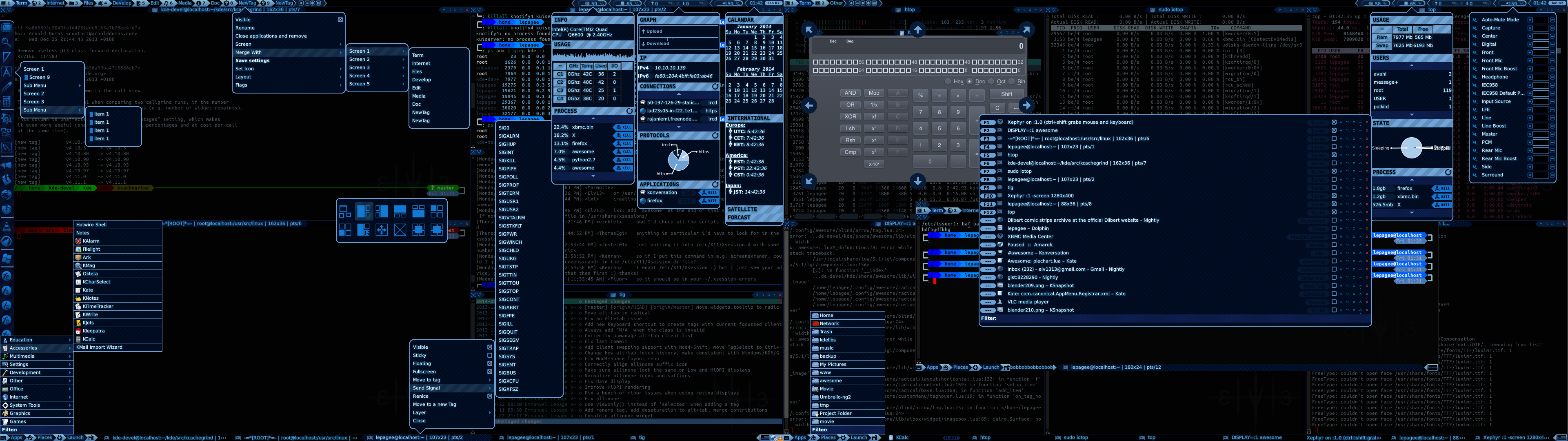
Radical menu system for AwesomeWM
=======================================
Warning If you use Awesome git master, please use the awesome3.6 branch
This is Radical, one of the largest Awesome extension module. It provide un unified interface to generate multiple types of menus.
News
December 2016
This module master branch is now for Awesome 4.0+. If you use Awesome 3.5,
please use the awesome3.5 branch.
Installation
Installing Radical is simple, just move to ~/.config/awesome and clone the repository
cd ~/.config/awesome
git clone https://github.com/Elv13/radical.git
The require it at the top of your rc.lua:
local radical = require("radical")
Usage
Unlike awful.menu, radical act like other Awesome 3.5 layouts. You need to add items one by one. This have the benefit of letting you interact with the items themselves programatically.
The most simple kind of menus, contexts one, can be created like this:
    local menu = radical.context{}
    menu:add_item {text="Screen 1",button1=function(_menu,item,mods) print("Hello World! ") end}
    menu:add_item {text="Screen 9",icon= beautiful.awesome_icon}
    menu:add_item {text="Sub Menu",sub_menu = function()
        local smenu = radical.context{}
        smenu:add_item{text="item 1"}
        smenu:add_item{text="item 2"}
        return smenu
    end}

    -- To add the menu to a widget:
    local mytextbox = wibox.widget.textbox()
    mytextbox:set_menu(menu, "button::pressed", 3) -- 3 = right mouse button, 1 = left mouse button

    -- To add a key binding on a "box" menu (and every other types)
    menu:add_key_binding({"Mod4"},",")
In this example, a simple 3 item menu is created with a dynamically generated submenu. Please note that generating submenus using function will generate it every time it is being shown. For static menus, it is faster to simply create them once and passing the submenu object to the "sub_menu" item property.
:set_menu can also take a lazy-loading function instead of a
menu. The second and third parameters are not mandatory, the defaults are
"button::pressed" and 1, respectively.
:add_key_binding will add a key binding. It can also take a function as 3rd
parameter. However, it wont correctly place "context" menu as it have no idea
where you expect them. It work better with "box" menus.
Menu types
The current valid types are:
- Context: Regular context menu
- Box: Centered menus (think Windows alt-tab menu)
- Embed: Menus in menus. This can be used as subsections in large menus
- Bar: A compact horizontal wibox widget
- Flexbar: An extensible horizontal wibox widget
- Dock: OS X like dock with auto hiding and rectangular items
Menu style
Each menus come in various styles for various applications. New style can also be created by beautiful themes. The current ones are:
- Arrow: Gnome3 and Mac OSX like menus with border radius and an arrow
- Classic: Replicate awful.menu look
Arrow also have a few types:
- radical.base.arrow_type.NONE
- radical.base.arrow_type.PRETTY
- radical.base.arrow_type.CENTERED
Note that both menu and items have a margins property to ajust details:
    my_menu.margins.left = 12
    local item = my_menu:add_item {test="Need room"}
    item.margins.top = 3
Item style
Like menus, items can have their own style. Valid values:
- Basic: The most simple kind of items, no borders or special shape
- Classic: 1px border at the end of each items
- Rounded: A 3px border radius at each corner
- Arrow_alt: "Powerline" arrow with alternating colors
- Arrow_prefix: The item prefix are "Powerlined"
-
Arrow_single: The item start with a
<and end with a>
Menu layouts
On top of each styles, menu can also have different layouts to display items:
- Vertical: Items are displayed on top of each other
- Horizontal: Items are displayed alongside each other
- Grid: Items are displayed as a 2D array
Item layout
Item layouts are how widgets (icons, label, prefix) are disposed in the item
- horizontal: Default layout used by the context style
- icon: Look like a desktop icon, used by horizontal menus
- centerred: Align widgets at the center instead of using all space
Using styles and layouts
    local radical = require("radical")

    local m = radical.context {
        style      = radical.style.classic      ,
        item_style = radical.item.style.classic ,
        layout     = radical.layout.vertical    }
Tooltip
Radical also have its own styled tooltip widget. It can be used in menus, but
also in every widgets using the set_tooltip method:
local mytextbox = wibox.widget.textbox()
mytextbox:set_tooltip("foo bar")
Options
Radical offer a (very, very) wide range of options to allow the creation of rich and novel menus. The options are available in 2 formats: menu wide and item specific. Menu wide options will take effect on all items and on the way the menu itself is being displayed while items ones apply only to a specific item. Multiple items can have multiple sets of options.
Menu options
| Name | Description | Type |
|---|---|---|
| bg_header | Header (see widgets section) color | String/gradient/pattern |
| bg_prefix | Prefix background for item_styles that support it | String/gradient/pattern |
| border_color | Border color | String/gradient/pattern |
| item_border_color | Alternative border color for item separation | String/gradient/pattern |
| border_width | Border width | number |
| item_height | Default height of items | number |
| item_width | Default width of items | number |
| width | Original width | number |
| default_width | Default menu width | number |
| icon_size | Icon size | number |
| auto_resize | Resize menu if items are too large | boolean |
| parent_geometry | Set the menu parent | geometry array |
| arrow_type | Set the arrow type when use arrow style | see "arrow_type" enum |
| visible | Show or hide the menu | boolean |
| direction | The direction from which the arrow will point | "left","right","top","bottom" |
| row | Number of row (in grid layout) | number |
| column | Number of columns (in grid layout) | number |
| layout | The menu layout (default:vertical) | see "Menu layouts" section |
| style | The menu style (default:arrow) | see "Menu style" |
| item_style | The item style (default:basic) | see "Item style" |
| filter | Filter the menu when the user type | boolean |
| show_filter | Show a filter widget at the bottom | boolean |
| filter_string | Default filter string | string |
| fkeys_prefix | Display F1-F12 indicators for easy navigation | boolean |
| filter_prefix | Text to be shown at begenning of the filter string | string |
| max_items | Maximum number of items before showing scrollbar | number |
| enable_keyboard | Enable or disable keyboard navigation / hooks | boolean |
| disable_markup | Disable pango markup in items text | boolean |
| x | X position (absolute) | number |
| y | Y position (absolute) | number |
| sub_menu_on | Show submenu on selection or when clicking | see "event" enum |
| select_on | The event used to trigger item selection | see "event" enum |
| overlay | A layer on top of the item | function(data,item,cr,w,h) |
| opacity | Make this menu translucent (require a compositor) | number (0 to 1) |
| icon_transformation | Hijack the icon drawing function | function(icon,data,item) |
| icon_per_state | Call icon_transformation when state change | boolean |
| disable_submenu_icon | Do not show the submenu icon (arrow) | boolean |
| margins | Read/Write table (left,right,top and bottom) | dynamic table |
| visible_row_count | Number of visible items -(#max-(#total-#filtered)) | number |
| default_item_margins | Default margins for items ({left=1,right=1...}) | array of direction |
| default_margins | Default margins for the menu ({left=1,right=1...}) | array of direction |
Item options
| Name | Description | Type |
|---|---|---|
| text | The item text | string |
| height | The item height | number |
| icon | The item icon | string or pattern |
| sub_menu | Add a submenu to this item | menu or function |
| selected | Select this item | boolean |
| checkable | Is the item dual state (a checkbox) | boolean |
| checked | Is the item checked or not | boolean |
| prefix_widget | Widget to append at the begenning of the item | widget |
| suffix_widget | Widget to append at the end of the item | widget |
| style | Custom item_style for this item | item_style |
| layout | Custom item_layout for this item | item_layout |
| tooltip | A tooltip shown on the side or bottom | string |
| button1 | Left mouse button action | function |
| button2 | Mid mouse button action | function |
| button3 | Right mouse button action | function |
| button4 | Scroll up action | function |
| button5 | Scroll down action | function |
| overlay | See menu.overlay | function |
| margins | Read/Write table (left,right,top and bottom) | dynamic table |
| infoshapes | See the infoshapes widget documentation | array of infoshapes |
| overlay_draw | Draw a custom painter on top of the item | draw function |
| font | Set a custom font | font_string |
Colors options
The colors option are available for both menus and items objects.
| Name | State | Description |
|---|---|---|
| bg | --- | Default background |
| fg | --- | Default foreground |
| bg_disabled | theme.state.DISABLED | The item cannot be interracted with |
| fg_disabled | theme.state.DISABLED | The item cannot be interracted with |
| bg_urgent | theme.state.URGENT | The item request immediate attention |
| fg_urgent | theme.state.URGENT | The item request immediate attention |
| bg_focus | theme.state.SELECTED | Focussed / Selected items |
| fg_focus | theme.state.SELECTED | Focussed / Selected items |
| bg_pressed | theme.state.PRESSED | The item is being pressed |
| fg_pressed | theme.state.PRESSED | The item is being pressed |
| bg_hover | theme.state.HOVERED | The mouse is over the item |
| fg_hover | theme.state.HOVERED | The mouse is over the item |
| bg_changed | theme.state.CHANGED | The item recently changed |
| fg_changed | theme.state.CHANGED | The item recently changed |
| bg_used | theme.state.USED | The item is used |
| fg_used | theme.state.USED | The item is used |
| bg_checked | theme.state.CHECKED | The item is checked |
| fg_checked | theme.state.CHECKED | The item is checked |
| bg_alternate | theme.state.ALTERNATE | Alternative to bg |
| fg_alternate | theme.state.ALTERNATE | Alternative to fg |
| bg_highlight | theme.state.HIGHLIGHT | The item is hightlighted |
| fg_highlight | theme.state.HIGHLIGHT | The item is hightlighted |
Common methods
All menus provide a bunch of methods. Most of them have been coverred above, but here is the list:
| Name | Description | Arguments | Return |
|---|---|---|---|
| add_item | Add new item to a menu | array of options | item |
| add_items | Add new items to a menu | array of items arrays | array |
| add_widget | Add a new widget instead of an item | a widget, args | --- |
| add_widgets | Add new widgets | array of widgets | --- |
| add_embeded_menu | Add an inline menu to another menu | an "embed" menu | --- |
| add_key_binding | Add a global key binding to a menu | mod array, key | --- |
| add_key_hook | Add a callback when a key is pressed | mod, key, event, func | --- |
| clear | Remove all items | --- | --- |
| scroll_down | If the menu is cropped, scroll down | --- | --- |
| scroll_up | If the menu is cropped, scroll up | --- | --- |
| hide | Hide a menu and all sub menus | --- | --- |
| swap | Swap 2 items | both items | --- |
| move | Move an item | the item, the new idx | --- |
| remove | Remove the item | the item | --- |
| append | Append an existing (but unused) item | the item | --- |
| add_prefix_widget | Add a widget at the beginning of the menu | the widget | --- |
| add_suffix_widget | Add a widget at the end of the menu | the widget | --- |
| add_colors_namespace | Use prefixed colors from beautiful | the namespace name | --- |
| add_colors_group | Add a new color group (see below for details) | the group name | --- |
Signals
Menu also emit many signals, the syntax is usually PROPERTY_NAME::changed.
Some others are item::moved, item::swapped, item::removed, item::appended
Here is an example of how to catch an "opacity" change:
    mymenu:connect_signal("opacity::changed",function(value)
        -- Do something
    end)
Most item_layout also repackage the default widget signals. It usually does the
same as using the buttonX menu attributes, but is preferrable in some scenarios
like when a modifier is applied.
| Name | Description | Arguments |
|---|---|---|
| button::press | A button press | menu,item,button_id,mods,geo |
| button::release | A button release | menu,item,button_id,mods,geo |
| mouse::enter | When the mouse enter | menu,item |
| mouse::leave | When the mouse leave | menu,item |
| long::hover | The mouse is hover 1.5 sec | menu,item |
| long::press | The mouse is pressed 1.5 sec | menu,item |
mods is an array with the applied modifier as key. If the value is nil,
then the modifier is not present. Usual modifiers are Control, Shift, mod1
(Alt) and mod4.
An example of how to use them:
    local menubar = radical.bar{}
    menubar:connect_signal("button::press",function(data,item,button,mods)
        if mods.Control then
            print("Foo menu pressed!",item.text,button,data.rowcount)
        end
    end)

    -- Also work on items
    menubar:add_item{text="bar"}:connect_signal("button::release",function(d,i,b,m)
        print("bar click released!")
    end)
Beautiful options
Radical also use the some of the same theme options as awful.menu, plus some:
| Name | Description | Type |
|---|---|---|
| menu_height | Menu height | String/Gradient/Pattern |
| menu_width | Menu default/minimum width | Number |
| menu_border_width | Border width | Number |
| menu_border_color | Border color | String/Gradient/Pattern |
| menu_fg_normal | Text/Foreground color | String/Gradient/Pattern |
| menu_bg_focus | Selected item color | String/Gradient/Pattern |
| menu_bg_header | Header widget background color | String/Gradient/Pattern |
| menu_bg_alternate | Scrollbar and other widget color | String/Gradient/Pattern |
| menu_bg_normal | Default background | String/Gradient/Pattern |
| menu_bg_highlight | Highlighted item background | String/Gradient/Pattern |
| menu_submenu_icon | Sub menu pixmap (aka >) | Path/Pattern |
| menu_separator_color | Menu separator color | String/Gradient/Pattern |
| menu_opacity | Use your favorite compositor | Number (0=0%, 1=100%) |
| menu_draw_underlay | Function returning the underlay pixmap | function(array,width) |
| menu_icon_transformation | The function used to draw the icon | function(image,data,item) |
| menu_corner_radius | Arrow based menu corner radius | Number (default = 10) |
| dock_corner_radius | The dock menu type corner radius | Number (default 10) |
| menu_outline_color | Arrow menu outer border color | String/Gradient/Pattern |
| menu_checkbox_style | The style used for checkboxes | "holo" or "default" |
Styling can also be done using the icon_transformation option. This feature allow masks such as desaturation, tinting, invert or some matrix to be applied on the pixmap before it is being drawn. This function take the path/surface as only parameter and return the transformed surface.
Other elements can be added to items such as prefix and siffixes.
Those elements sometime need extra color groups. The add_color_group method
allow to register such new category.
Some generic menu can also register beautiful namespaces using the
add_colors_namespace method. For example, the tasklist namespace can be used
by adding elements such as beautiful.tasklist_bg_urgent to your theme.
Extending Radical
Radical is not designed to be used "as is". Every menus are different. While common ones can be created without extending Radical capabilities, more advanced one most likely will. Good news, this is what Radical have been designed for. The previous generations proved to me that any lack or native extensibility will cause the code to bloat when it come to adding a feature. Radical horizontal design allow to add more modules and properties without having to touch the "core" files.
Object model
The Radical object model is similar to the Awesome one. Each objects have a set
of signals developers can listen to to have changes notification. The big
difference is that Radical object model automatically generate the properties
themselves. If one desire to add a new one, it is possible to listen to item::added
to apply it on the item or apply it directly on the menu itself depending if the
property is for the menu or for an item. Here is an example how it work:
    local menu = radical.context{}

    -- Create the setter
    menu.set_foo = function(m,value)
        print("Setting value to:",value)
        m._foo_real = value
    end

    -- Create the getter
    menu.get_foo = function(m)
        print("Getter called, returning",m._foo_real)
    end

    -- The property is now created, this will call the setter:
    menu.foo = "my foo value"

    -- This will call the getter:
    print(menu.foo)

    -- The signals will be automatically generated
    data:connect_signal("foo::changed",function(m,value)
        print("foo changed:",value)
    end)

    -- New signals don't need to be registered and can be called right away
    data:connect_signal("my_new_signal::action_name",function(m,value1,value2,value3)
        print("Callback",m,value1,value2,value3)
    end)

    -- Manually emiting a signal
    menu:emit_signal("my_new_signal::action_name",value1,value2,value3)
State model
Radical support multiple states per item at once. The "current state" is the one
with the smallest ID. A state ID is an integer from -inf to inf. More important
states, like urgent versus checked can be implemented by using an
appropriate ordering. The default set of states is subject to changes, so it
is wiser to use a completely different range if someone want to replace the
currents one. Each states can be assigned a background and foreground color
using the radical.theme.register_color(id, radical_name, beautiful_name, true )
method. Toggling a state can be done using the item.state[] meta table:
    local my_state_name = 9999 -- <== The ID
    local menu = radical.context{}
    local item = menu:add_item{text="text"}

    -- Activate a state
    item.state[my_state_name] = true

    -- Desactivate a state
    item.state[my_state_name] = nil
Radical will take care of choosing the current state and redraw the item with the right background and foreground colors.
Layout
TODO
Style
TODO
Item layout
TODO
Item style
TODO