DEPRICATED
Rationale
react/react-dom comes with 2 basic assumptions/ideas:
- every UI is hierarchical naturally. This why we have the idea of "
componentswrap each other" react-dommounts (physically) child component to its parent DOM node by default
The problem is that sometimes the second property isn't what you want in your specific case. Sometimes you want to mount your component into the different physical DOM node and hold the logical parent-child connection at the same time.
Canonical example is a Tooltip-like component: at some point, during development process, you could find that you need to add some description for your UI element: it'll be rendered in some fixed layer and it should know its coordinates (which are corresponding UI element coord or mouse coords) and at the same time it needs information whether it should be shown right now or not, its content and some context from parent components.
import React, { Component } from 'react';
import { Layer, LayerToggle } from 'react-layer-stack';
import FixedLayer from './demo/components/FixedLayer';

class Demo extends Component {
  render() {
    return (
      <div>
        <Layer to="screen" id="lightbox2">{ (_, content) => // Layer should have an unique ID
          <FixedLayer style={ { marginRight: '15px', marginBottom: '15px' } }>
            { content }
          </FixedLayer>
        }</Layer>

        <LayerToggle for="lightbox2">{({ show, hide }) => ( // Layer is accessible from any part of the tree.
                                                            // There could be several Toggles for one Layer.
            <button onMouseLeave={ hide } onMouseMove={ ({ pageX, pageY }) => {
              show(
                <div style={{
                      left: pageX, top: pageY + 20, position: "absolute",
                      padding: '10px',
                      background: 'rgba(0,0,0,0.7)', color: '#fff', borderRadius: '5px',
                      boxShadow: '0px 0px 50px 0px rgba(0,0,0,0.60)'}}>
                   “There has to be message triage. If you say three things, you don’t say anything.”
                </div>)
            }}>Yet another button. Move your pointer to it.</button> )}
          </LayerToggle>
      </div>
    )
  }
}
Another option could be use one of dozens complete implementations with different properties: https://js.coach/?search=popover
More examples
https://github.com/fckt/react-layer-stack/blob/master/demo/src/Demo.js
Live demo
https://fckt.github.io/react-layer-stack/
Installation
npm install --save react-layer-stack
API
3 components with a few properties.
<Layer />
id: string - a Layer identificator. There could be only one layer with the same id
to (optional) - the mount point to mount to. If to is not defined the layer will be rendered right in place
use: Array (optional) - array with context (closure) variables. Useful if you want to update the Layer if closure variables are changed
defaultArgs: Array (optional) - initial arguments for a Layer
defaultShow: Boolean (optional)
children: callback({ isActive, show: callback(args), showOnlyMe, hide, hideAll }, ...args): ReactElement - will be rendered into
<LayerToggle />
LayerToggle is a helper to have an access for show/hide callbacks and the current state of the layer. There could be multiple LayerToggles for the same Layer.
for: string - a Layer identificator which LayerToggle corresponds to
children: callback({ isActive, show: callback(args), showOnlyMe, hide, hideAll }): ReactElement - will be mounted (rendered) directly to its parent
<LayerStackMountPoint />
This is a mount point for Layers.
id: string (optional) - you can have multiple LayerStackMountPoint which could have different ID's
children: callback({ views, displaying, show: callback(id, args), hide, hideAll, mountPointId, mountPointArgs }): ReactElement - you can choose different strategies how to render Layers in LayerStackMountPoint instead of the default one
Real-world usage example
Public API consist 2 key components: Layer, LayerStackMountPoint and 1 additional: LayerToggle (sometimes toggle needs to know which popover is open now).
Set the LayerStackMountPoint somewhere on the top of the tree:
import { LayerStackProvider, LayerStackMountPoint } from 'react-layer-stack'
// ...
//  render() {
        return (
            <LayerStackProvider>
              <Container>
                <LayerStackMountPoint id="screen"/>
                <AppBar />
                <Container className={styles.container}>
                  {children}
                </Container>
              </Container>
            </LayerStackProvider>
        )
//  }
Define your Layer. This example shows how to propagate variables from lexical context (https://developer.mozilla.org/en/docs/Web/JavaScript/Closures) to the Layer, which will be displayed in the LayerStackMountPoint. Each layer should have an id and use properties. use property is needed to determine if we should update the lexical context of the anonymous function which renders Modal into Layer if Cell is updated.
import { Layer, LayerToggle } from 'react-layer-stack'
// ... for each `object` in array of `objects`
const modalId = 'DeleteObjectConfirmation' + objects[rowIndex].id
return (
    <Cell {...props}>
        // the layer definition. The content will show up in the LayerStackMountPoint when `show(modalId)` be fired in LayerToggle
        <Layer to="screen" use={[objects[rowIndex], rowIndex]} id={modalId}> {({
            hide, // alias for `hide(modalId)`
            index } // useful to know to set zIndex, for example
            , e) => // access to the arguments (click event data in this example)
          <Modal onClick={ hide } zIndex={(index + 1) * 1000}>
            <ConfirmationDialog
              title={ 'Delete' }
              message={ "You're about to delete to " + '"' + objects[rowIndex].name + '"' }
              confirmButton={ <Button type="primary">DELETE</Button> }
              onConfirm={ this.handleDeleteObject.bind(this, objects[rowIndex].name, hide) } // hide after confirmation
              close={ hide } />
          </Modal> }
        </Layer>

        // this is the toggle for Layer with `id === modalId` can be defined everywhere in the components tree
        <LayerToggle for={ modalId }> {({show}) => // show is alias for `show(modalId)`
          <div style={styles.iconOverlay} onClick={ (e) => show(e) }> // additional arguments can be passed (like event)
            <Icon type="trash" />
          </div> }
        </LayerToggle>
    </Cell>)
// ...
ReactDOM.unstable_createPortal
Facebook team is working on the similar feature called "portals" (by analogy with https://github.com/tajo/react-portal). That approach uses ReactDOM (API) which is fatal if browser is not the only target. There are other considerations also.
Alternatives
The is a lot of alternative ways to archive the desirable bottom-to-up link b/w components.
The most obvious (and naiive as well) way is to use redux (or another flux/data lib) as a transport to send data from one DOM branch to another. It's good and robust solution, but the problem is that it just feels like overkill. It seems not universal also, could consume some additional time to implement and grasp afterwards, not because of complications, but because you have to reinvent the same pattern again and again (slightly different in each case, see https://stackoverflow.com/questions/35623656/how-can-i-display-a-modal-dialog-in-redux-that-performs-asynchronous-actions).
Another solution is to use on of ready-to-use components. But sometimes are you need slightly different behavior/look and more productive to implement home-grown ad-hock solution.
And the last option is to find library like https://github.com/tajo/react-portal or https://react-bootstrap.github.io/react-overlays/, designed to address the needs of bottom-to-up communication. These libs are often quite opinionated to their cases and doesn't solve the problem in its roots. The goal of react-layer-stack is to give an answer how to organize bottom-to-up communication in the most natural, reasonable and flexible way.
The future
Obviously there is a lot of applications for the Layer API (https://github.com/fckt/react-layer-stack/blob/master/README.md#layer-). So, you can declare the entire React app as a Layer and manage it from the outer app!
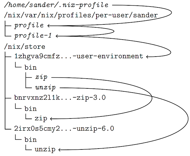
Images to understand the whole thing
View layers stack
Layer id and "use" property (sym/soft link)
Related Stackoverflow q&a
- http://stackoverflow.com/a/40461655/524034
- http://stackoverflow.com/questions/40443160/bootstrap-modal-like-behavior-in-react
- http://stackoverflow.com/questions/40444788/rendering-a-modal-in-react
- http://stackoverflow.com/questions/39805544/showing-list-of-buttons-displaying-modals-in-reactjs
- http://stackoverflow.com/questions/39913593/dynamically-displaying-data-from-a-clickable-table-row-into-a-modal
The easiest way to support react-layer-stack is to upvote the answers below.