react-modern-datepicker
A modern date picker for react library. (Now customizable) . Built using React, Dayjs and styled-components

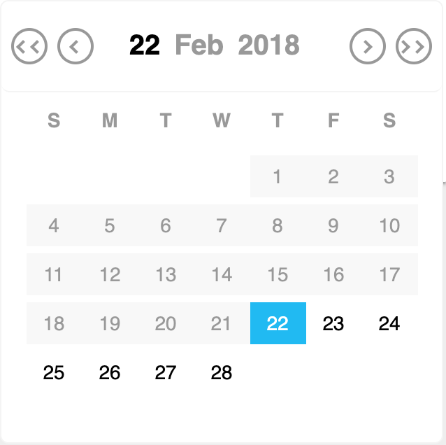
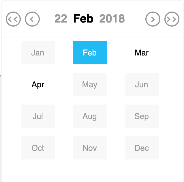
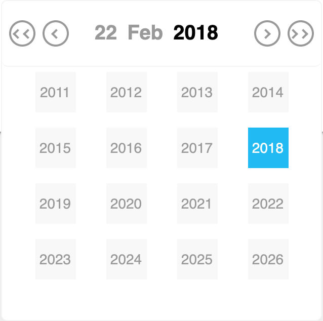
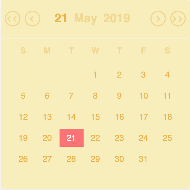
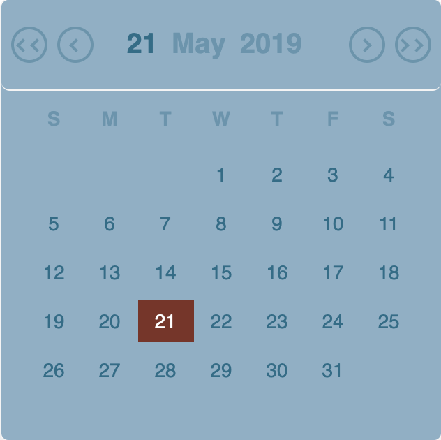
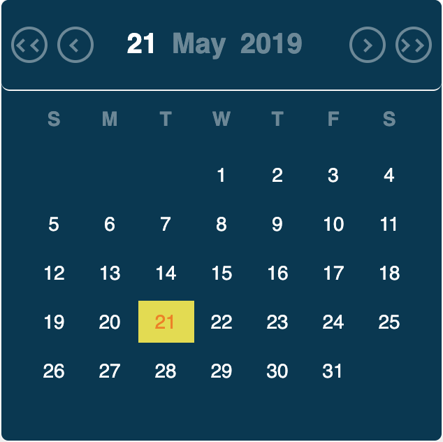
Customizable


Installation
The package can be installed via NPM:
npm install react-modern-datepicker --save
This package doesn't come with any dependency other than dayjs (momentjs deprecated) & styled-components. Threfore, You’ll need to install React, PropTypes separately since those dependencies aren’t included in the package. Below is a simple example of how to use the ModernDatepicker in a React view.
import React from 'react';
import ModernDatepicker from 'react-modern-datepicker';

class Example extends React.Component {
	constructor(props) {
		super(props);
		this.state = {
			startDate: new Date(), // can be any of these ['dayjs()', '', null, new Date(2018,12,1)]
		};
		this.handleChange = this.handleChange.bind(this);
	}

	handleChange(date) {
		this.setState({
			startDate: date,
		});
	}

	render() {
		return (
			<ModernDatepicker
				date={this.state.startDate}
				format={'DD-MM-YYYY'}
				showBorder
				onChange={date => this.handleChange(date)}
				placeholder={'Select a date'}
			/>
		);
	}
}
Important Note
The previous versions of this library ( < v0.8) were using momentjs as a dependency which has been replaced by dayjs (mostly due to the bundle size). Since momentjs has been removed, the support for locale i.e lang has also been removed.
Adding your own theme
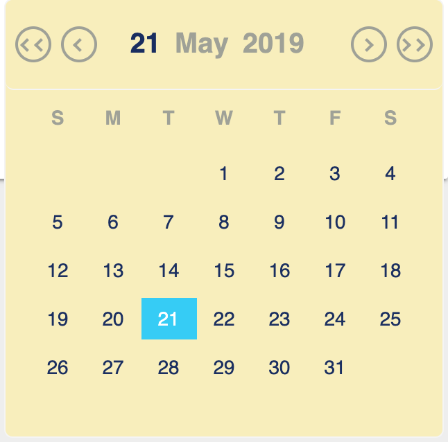
You can now add your own theme to customize the ModernDatepicker.You can do this with the help of primaryColor, secondaryColor, primaryTextColor, secondaryTextColor props. The following example shows how to customize the ModernDatepicker.
import React from 'react';
import ModernDatepicker from 'react-modern-datepicker';
import dayjs from 'dayjs';
import './App.css';
import icon from '../assets/icon.png'; // if you want to show an icon

class Example extends React.Component {
	constructor(props) {
		super(props);
		this.state = {
			startDate: new Date(), // can be any of these ['dayjs()', '', null, new Date(2018,12,1)]
		};
		this.handleChange = this.handleChange.bind(this);
	}

	handleChange(date) {
		this.setState({
			startDate: date,
		});
	}

	render() {
		return (
			<ModernDatepicker
				date={this.state.startDate}
				format={'DD-MM-YYYY'}
				showBorder
				allowEdit
				className="color"
				id="someId"
				icon={icon}
				maxDate={dayjs().add('1', 'day')} // can be a javascript date object also (new Date(2018,12,12))
				minDate={dayjs().subtract('2', 'day')}// can be a javascript date object also (new Date(2018,12,1))
				onChange={date => this.handleChange(date)}
				placeholder={'Select a date'}
				primaryColor={'#d9b44a'}
				secondaryColor={'#75b1a9'}
				primaryTextColor={'#4f6457'}
				secondaryTextColor={'#acd0c0'}
			/>
		);
	}
}
Please note that these props (primaryColor, secondaryColor, primaryTextColor, secondaryTextColor) , takes a valid color scheme as a string.(like HEX or RGB format).
Adding your own CSS
You can also pass your own css to style the input element.The following example shows how to style the input element using your own css.
./App.css
//Please  note that, for this class to take the precedence over the
//default css, we should repeat the class name like below (instead of .color, we are
// using .color.color)
.color.color {
	border-radius: 0;
	-moz-border-radius: 0;
	-webkit-border-radius: 0;
	font-size: 15px;
	font-weight: 600;
	padding: 10px 10px 10px 5px;
	border-bottom: 1px solid #ebebeb !important;
	border: none;
	box-sizing: border-box;
	margin-top: 22px;
	box-shadow: none;
	font-family: Open Sans, sans-serif;
}
./App.js
import React from 'react';
import ModernDatepicker from 'react-modern-datepicker';
import dayjs from 'dayjs';
import './App.css';
import icon from '../assets/icon.png'; // if you want to show an icon

class Example extends React.Component {
	constructor(props) {
		super(props);
		this.state = {
			startDate: dayjs(),
		};
		this.handleChange = this.handleChange.bind(this);
	}

	handleChange(date) {
		this.setState({
			startDate: date,
		});
	}

	render() {
		return (
			<ModernDatepicker
				date={this.state.startDate}
				format={'DD-MM-YYYY'}
				showBorder
				className="color"
				icon={icon}
				onChange={date => this.handleChange(date)}
				placeholder={'Select a date'}
			/>
		);
	}
}
Passing min and max date
You can also pass min and max date to the component.The following example shows how to pass min and max date.
import React from 'react';
import ModernDatepicker from 'react-modern-datepicker';
import dayjs from 'dayjs';
import './App.css';
import icon from '../assets/icon.png'; // if you want to show an icon

class Example extends React.Component {
	constructor(props) {
		super(props);
		this.state = {
			startDate: dayjs(),
		};
		this.handleChange = this.handleChange.bind(this);
	}

	handleChange(date) {
		this.setState({
			startDate: date,
		});
	}

	render() {
		return (
			<ModernDatepicker
				date={this.state.startDate}
				format={'DD-MM-YYYY'}
				showBorder
				allowEdit
				className="color"
				id="someId"
				icon={icon}
				maxDate={dayjs().add('1', 'day')}
				minDate={dayjs().subtract('2', 'day')}
				onChange={date => this.handleChange(date)}
				placeholder={'Select a date'}
			/>
		);
	}
}
If you pass invalid min or max date, it will show the corresponding error.
Passing Language and Label (This feature has been deprecated as of now.)
You can also pass language and label to the component.The following example shows how to pass language and label, using props lang and label.
Configuration
The most basic use of the ModernDatepicker can be described with:
<ModernDatepicker date={this.state.date} onChange={this.handleChange} showBorder />The default format prop is DD-MM-YYYY if not specified.
Options
The following are the props that you can pass to ModernDatepicker Component :
| props | Default | Optional | Description |
|---|---|---|---|
| date | null | true | This prop takes the date that you want to show, in string format, a javascript date object(new Date()) or as an instance of dayjs |
| format | 'DD-MM-YYYY' | true | This prop takes the format you want to set for your date |
| showBorder | false | true | This prop takes a boolean to show or not to show borders around the input |
| allowEdit | false | true | This prop takes a boolean to edit the input field manually |
| onChange | null | false | This props takes a function, with the date passed to its parameters |
| placeholder | null | true | This props takes a string to show when no date is selected |
| className | null | true | This props takes any external css/scss you want to use to override the default one. |
| icon | null | true | This props takes an image you want to add as an icon. |
| iconClass | null | true | This props takes any external css/scss, that you want to use to style your icon |
| maxDate | null | true | This props takes the maximum date. (expects you to provide the same format as the date) |
| minDate | null | true | This props takes the minimum date. (expects you to provide the same format as the date) |
| id | null | true | This props takes the id as a string, that you want to pass to the input element |
| label | null | true | This props takes the label as a string, that you want to show for the input element |
| labelClass | null | true | This props takes any external css/scss, that you want to use to style your label |
| onFocus | null | true | This props takes the function to call on onFocus event |
| onBlur | null | true | This props takes the function to call on onBlur event |
| primaryColor | null | true | This props takes the color code in string format, and applies it to the selected date section |
| secondaryColor | null | true | This props takes the color code in string format, and applies it to the body of the datepicker |
| primaryTextColor | null | true | This props takes the color code in string format, and applies it to the text of the body of the datepicker |
| secondaryTextColor | null | true | This props takes the color code in string format, and applies it to the selected text of the body of the datepicker |
Compatibility
React
Compatible with the latest version of react i.e v16.X.X
Latest compatible versions:
- React 16.0.0 or newer: All above React-datepicker v.0.2.0
Browser Support
The date picker is compatible with the latest versions of Chrome, Firefox, and IE10+.
License
Apache License see LICENSE for the full license.