iyegoroff / React Native Collapsible Header Views
Licence: mit
ScrollView, FlatList, SectionList with collapsible headers + HOC for wrapping custom scrollables
Stars: ✭ 120
Programming Languages
typescript
32286 projects
Projects that are alternatives of or similar to React Native Collapsible Header Views
Sticky Parallax Header
A simple React Native library, enabling to create a fully custom header for your iOS and Android apps.
Stars: ✭ 792 (+560%)
Mutual labels: header
React Native Collapsible Toolbar
Pure JS based collapsible toolbar for react native on Android and iOS
Stars: ✭ 50 (-58.33%)
Mutual labels: collapsible
React Collapsing Table
react-collapsing-table: a React rewrite of the jQuery table plugin from "datatables.net". Inspired by a lack of similar table behaviors, notably collapsibility and responsivity.
Stars: ✭ 21 (-82.5%)
Mutual labels: collapsible
Cmsis Header Stm32
CMSIS device headers for all STM32 devices
Stars: ✭ 47 (-60.83%)
Mutual labels: header
Android Advancedrecyclerview
RecyclerView extension library which provides advanced features. (ex. Google's Inbox app like swiping, Play Music app like drag and drop sorting)
Stars: ✭ 5,172 (+4210%)
Mutual labels: header
Collapsible Resource Manager
A custom sidebar menu with collapsible groups
Stars: ✭ 100 (-16.67%)
Mutual labels: collapsible
Stickytabbarviewcontroller
Sticky and Collapsible View on top of tab bar
Stars: ✭ 82 (-31.67%)
Mutual labels: collapsible
Genesis Header Nav
WordPress plugin that registers a menu location and displays it inside the header for a Genesis Framework child theme.
Stars: ✭ 67 (-44.17%)
Mutual labels: header
Machdump
A very basic C Mach-O Header Dump tool written for practicing purposes. Works With x86 and x86_64 binaries
Stars: ✭ 25 (-79.17%)
Mutual labels: header
Kiss Headers
💡Python package for HTTP/1.1 style headers. Parse headers to objects. Most advanced available structure for http headers.
Stars: ✭ 91 (-24.17%)
Mutual labels: header
Pullrefreshlayout
下拉刷新,上拉加载,真实的回弹(overscroll)效果(媲美qq),且大小只有37KB(是其他主流刷新库或回弹库的1/2,1/3,甚至是1/4),同时,自定义header和footer,可以实现任何你想的到的功能(例如:自动触发加载更多、二级刷新等)
Stars: ✭ 639 (+432.5%)
Mutual labels: header
React Grid Table
A modular table, based on a CSS grid layout, optimized for customization.
Stars: ✭ 57 (-52.5%)
Mutual labels: header
Artifacts Kit
Pseudo-malicious usermode memory artifact generator kit designed to easily mimic the footprints left by real malware on an infected Windows OS.
Stars: ✭ 99 (-17.5%)
Mutual labels: header
Floatthead
Fixed <thead>. Doesn't need any custom css/html. Does what position:sticky can't
Stars: ✭ 1,193 (+894.17%)
Mutual labels: header
react-native-collapsible-header-views


ScrollView, FlatList, SectionList with collapsible headers + HOC for wrapping custom scrollables
Getting started
$ npm install react-native-collapsible-header-views --save
Demo
| Android | iOS |
|---|---|
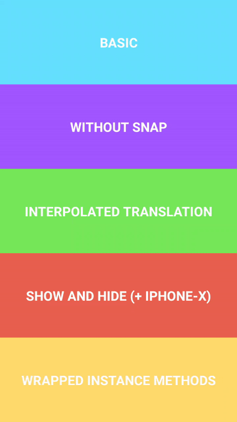 |
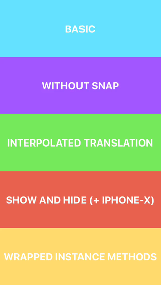 |
Example
import * as React from 'react';
import { View, Platform } from 'react-native';
import { CollapsibleHeaderScrollView } from 'react-native-collapsible-header-views';

export const Basic = () => (
  <CollapsibleHeaderScrollView
    CollapsibleHeaderComponent={<View style={{ backgroundColor: 'white' }} />}
    headerHeight={100}
    statusBarHeight={Platform.OS === 'ios' ? 20 : 0}
  >
    <View style={{ height: 2000, backgroundColor: 'wheat' }} />
  </CollapsibleHeaderScrollView>
);
Description
Library exports three components CollapsibleHeaderScrollView, CollapsibleHeaderFlatList,
CollapsibleHeaderSectionList and a HOC withCollapsibleHeader for wrapping custom scrollable
components. Provided components support all props and instance methods of corresponding wrapped
components. Note that components are also wrapped with Animated.createAnimatedComponent under the
hood.
Reference
Props
CollapsibleHeaderScrollViewProps, CollapsibleHeaderFlatListProps, CollapsibleHeaderSectionListProps
-
CollapsibleHeaderComponent: React.ReactElement<unknown> | React.ComponentType<CollapsibleHeaderProps>- React element or component/function that receivesCollapsibleHeaderPropsobject. Required; -
headerHeight: number- height ofCollapsibleHeaderComponent. Required; -
statusBarHeight?: number- height of status bar. Defaults to0; -
headerContainerBackgroundColor?: string- background color forCollapsibleHeaderComponentand status bar container. Defaults to'white'; -
disableHeaderSnap?: boolean- passtrueto disable header snap animations. Defaults tofalse; -
headerAnimationDuration?: number- duration of snap andshowHeader,hideHeaderanimations. Defaults to350; -
clipHeader?: boolean- iftrueheader will be clipped withoverflow: 'hidden'style.
Also some of ScrollView props have new defaults: bounces defaults to false, overScrollMode
to 'never' and scrollEventThrottle to 1.
CollapsibleHeaderProps
-
interpolatedHeaderTranslation: (from: number, to: number) => Animated.AnimatedInterpolation- creates newAnimatedInterpolationobject, whose input range corresponds to header translation and output range is specified byfromandtoparams. Can be used for custom animations, like setting opacity etc.; -
showHeader: (options: { animated: boolean } | unknown) => void- pushes header down with animation enabled by default; -
hideHeader: (options: { animated: boolean } | unknown) => void- pulls header up with animation enabled by default.
Methods
CollapsibleHeaderScrollView, CollapsibleHeaderFlatList, CollapsibleHeaderSectionList
-
animatedComponent: () => any | null- returns result ofAnimated.createAnimatedComponentapplied to original component; -
showHeader: (options: { animated: boolean } | unknown) => void- pushes header down with animation enabled by default; -
hideHeader: (options: { animated: boolean } | unknown) => void- pulls header up with animation enabled by default.
withCollapsibleHeader
-
function withCollapsibleHeader<T extends ScrollViewProps>(Component: React.ComponentClass<T>): React.ComponentClass<CollapsibleHeaderViewProps<T>>- creates new component with collapsible header, it is assumed that input component has all ofScrollViewprops.
Credits
- Key concepts were taken from collapsible-navbar demo by @janicduplessis
Note that the project description data, including the texts, logos, images, and/or trademarks,
for each open source project belongs to its rightful owner.
If you wish to add or remove any projects, please contact us at [email protected].