sohobloo / React Native Modal Dropdown
Licence: mit
A react-native dropdown/picker/selector component for both Android & iOS.
Stars: ✭ 1,103
Programming Languages
javascript
184084 projects - #8 most used programming language
Projects that are alternatives of or similar to React Native Modal Dropdown
react-native-select-pro
React Native dropdown (select) component developed by Mobile Reality
Stars: ✭ 79 (-92.84%)
Mutual labels: select, dropdown, picker, react-native-component
React Native Picker Select
🔽 A Picker component for React Native which emulates the native <select> interfaces for iOS and Android
Stars: ✭ 1,229 (+11.42%)
Mutual labels: picker, select, dropdown
Autocomplete
🔮 Fast and full-featured autocomplete library
Stars: ✭ 1,268 (+14.96%)
Mutual labels: modal, select, dropdown
Mobile Select
手机移动端选择组件 支持是否级联/单选到多选/可异步更新数据等..
Stars: ✭ 829 (-24.84%)
Mutual labels: picker, select, selector
Pd Select
vue components ,like ios 3D picker style,vue 3d 选择器组件,3D滚轮
Stars: ✭ 101 (-90.84%)
Mutual labels: picker, select, selector
Customalertviewdialogue
Custom AlertView Dialogue is the world's most advanced alert view library. Custom AlertView Dialogue includes simple message popups, confirmation alerts, selector popups, action sheet bottom menus, and input/feedback contact forms.
Stars: ✭ 100 (-90.93%)
Mutual labels: modal, select, selector
React Native Dropdown Picker
A single / multiple, categorizable & searchable item picker (dropdown) component for react native which supports both Android & iOS.
Stars: ✭ 230 (-79.15%)
Mutual labels: picker, select, dropdown
react-native-multi-selectbox
Platform independent (Android / iOS) Selectbox | Picker | Multi-select | Multi-picker. The idea is to bring out the common user interface & user experience on both platforms.
Stars: ✭ 169 (-84.68%)
Mutual labels: dropdown, picker, react-native-component
React Native Actions Sheet
A Cross Platform(Android & iOS) ActionSheet with a flexible api, native performance and zero dependency code for react native. Create anything you want inside ActionSheet.
Stars: ✭ 412 (-62.65%)
Mutual labels: picker, modal
React Cool Portal
😎 🍒 React hook for Portals, which renders modals, dropdowns, tooltips etc. to <body> or else.
Stars: ✭ 458 (-58.48%)
Mutual labels: modal, dropdown
Vue Select
Everything you wish the HTML <select> element could do, wrapped up into a lightweight, extensible Vue component.
Stars: ✭ 4,115 (+273.07%)
Mutual labels: select, selector
React Select Search
⚡️ Lightweight select component for React
Stars: ✭ 379 (-65.64%)
Mutual labels: select, dropdown
React Dropdown Tree Select
Lightweight, accessible, customizable and fast Dropdown Tree Select component for React
Stars: ✭ 345 (-68.72%)
Mutual labels: select, dropdown
Vue Multiselect
Universal select/multiselect/tagging component for Vue.js
Stars: ✭ 5,988 (+442.88%)
Mutual labels: select, dropdown
Angular Chosen
AngularJS Chosen directive is an AngularJS Directive that brings the Chosen jQuery in a AngularJS way
Stars: ✭ 695 (-36.99%)
Mutual labels: select, dropdown
Easydropdown
A lightweight library for building beautiful styleable <select> elements
Stars: ✭ 337 (-69.45%)
Mutual labels: select, dropdown
Mkdropdownmenu
🔻 Dropdown Menu for iOS with many customizable parameters to suit any needs
Stars: ✭ 523 (-52.58%)
Mutual labels: picker, dropdown
react-native-modal-dropdown
A react-native dropdown/picker/selector component for both Android & iOS.
Features
- Pure JS.
- Compatible with both iOS and Android.
- Auto position. (Won't be covered or clipped by the edge of screen.)
- Zero configuration. (Options are needed of course or a loading indicator will show.)
- Highly customizable.
- Controllable with API by code. (Show/Hide/Select)
- Change everything into a dropdown list trigger.
Demo
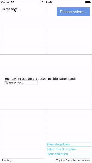
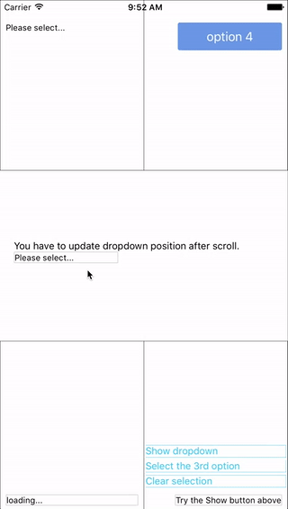
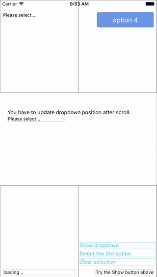
You can find them in the example.
Update History
v0.7.0
- Quick fix for react native 0.60. (Thanks to @ibtesamlatif2997)
Installation
npm i react-native-modal-dropdown -save
Usage
Basic
Import this module:
import ModalDropdown from 'react-native-modal-dropdown';
Use as a component:
<ModalDropdown options={['option 1', 'option 2']}/>
Use as a wrapper / container:
<ModalDropdown options={['option 1', 'option 2']}>
  ...
</ModalDropdown>
Customization
Give the style props as your choice:
-
style: Change the style of the button (basic mode) / container (wrapper mode). -
textStyle: Change the style of text of the button. Invalid in wrapper mode. -
dropdownStyle: Change the style of dropdown container.
You can also render your option row and row separator by implement renderRow and renderSeparator function.
API
Props
| Prop | Type | Optional | Default | Description |
|---|---|---|---|---|
disabled |
bool | Yes | false | disable / enable the component. |
defaultIndex |
number | Yes | -1 | Init selected index. -1: None is selected. This only change the highlight of the dropdown row, you have to give a defaultValue to change the init text.
|
defaultValue |
string | Yes | Please select... | Init text of the button. Invalid in wrapper mode. |
options |
array | Yes | Options. The dropdown will show a loading indicator if options is null/undefined.
|
|
animated |
bool | Yes | true | Disable / enable fade animation. |
showsVerticalScrollIndicator |
bool | Yes | true | Show / hide vertical scroll indicator. |
style |
object | Yes | Style of the button. | |
textStyle |
object | Yes | Style of the button text. Invalid in wrapper mode. | |
dropdownStyle |
object | Yes | Style of the dropdown list. | |
dropdownTextStyle |
object | Yes | Style of the dropdown option text. | |
dropdownTextHighlightStyle |
object | Yes | Style of the dropdown selected option text. | |
adjustFrame |
func | Yes | This is a callback after the frame of the dropdown have been calculated and before showing. You will receive a style object as argument with some of the props like width height top left and right. Change them to appropriate values that accord with your requirement and make the new style as the return value of this function. |
|
renderRow |
func | Yes | Customize render option rows: function(option,index,isSelected) Will render a default row if null/undefined.
|
|
renderSeparator |
func | Yes | Customize render dropdown list separators. Will render a default thin gray line if null/undefined.
|
|
renderButtonText |
func | Yes | Use this to extract and return text from option object. This text will show on button after option selected. Invalid in wrapper mode. | |
onDropdownWillShow |
func | Yes | Trigger when dropdown will show by touching the button. Return false can cancel the event.
|
|
onDropdownWillHide |
func | Yes | Trigger when dropdown will hide by touching the button. Return false can cancel the event.
|
|
onSelect |
func | Yes | Trigger when option row touched with selected index and value. Return false can cancel the event.
|
|
accessible |
bool | Yes | true | Set accessibility of dropdown modal and dropdown rows |
keyboardShouldPersistTaps |
enum('always', 'never', 'handled') | Yes | 'never' | See react-native ScrollView props |
Methods
| Method | Description |
|---|---|
show() |
Show the dropdown. Won't trigger onDropdownWillShow.
|
hide() |
Hide the dropdown. Won't trigger onDropdownWillHide.
|
select(idx) |
Select the specified option of the idx. Select -1 will reset it to display defaultValue. Won't trigger onSelect.
|
Next version
Any suggestion is welcome.
Note that the project description data, including the texts, logos, images, and/or trademarks,
for each open source project belongs to its rightful owner.
If you wish to add or remove any projects, please contact us at [email protected].