nysamnang / React Native Raw Bottom Sheet
Licence: mit
Add Your Own Component To Bottom Sheet Whatever You Want (Android and iOS)
Stars: ✭ 771
Programming Languages
javascript
184084 projects - #8 most used programming language
Projects that are alternatives of or similar to React Native Raw Bottom Sheet
React Native Actions Sheet
A Cross Platform(Android & iOS) ActionSheet with a flexible api, native performance and zero dependency code for react native. Create anything you want inside ActionSheet.
Stars: ✭ 412 (-46.56%)
Mutual labels: picker, modal, bottom-sheet
React Native Bottom Sheet
A performant interactive bottom sheet with fully configurable options 🚀
Stars: ✭ 2,695 (+249.55%)
Mutual labels: modal, bottom-sheet
React Native Bottomsheet Reanimated
React Native bottom sheet with fully native 60 FPS animations and awesome user experience
Stars: ✭ 80 (-89.62%)
Mutual labels: modal, bottom-sheet
React Native Modal Datetime Picker
A React-Native datetime-picker for Android and iOS
Stars: ✭ 2,412 (+212.84%)
Mutual labels: picker, modal
React Native Modal Dropdown
A react-native dropdown/picker/selector component for both Android & iOS.
Stars: ✭ 1,103 (+43.06%)
Mutual labels: picker, modal
react-spring-bottom-sheet
Accessible ♿️, Delightful ✨, & Fast 🚀
Stars: ✭ 604 (-21.66%)
Mutual labels: modal, bottom-sheet
Bottomdialogs
An Android library that shows a customizable Material-based bottom sheet. API 11+ required.
Stars: ✭ 624 (-19.07%)
Mutual labels: bottom-sheet
Linear Time Picker
Gorgeous Android Time and Date picker library inspired by the Timely app
Stars: ✭ 613 (-20.49%)
Mutual labels: picker
Css Components
☕️ A set of common UI Components using the power of CSS and without Javascript.
Stars: ✭ 592 (-23.22%)
Mutual labels: modal
React Modal
Accessible modal dialog component for React
Stars: ✭ 6,716 (+771.08%)
Mutual labels: modal
Django Admin Interface
django's default admin interface made customizable. popup windows replaced by modals. :mage: ⚡️
Stars: ✭ 717 (-7%)
Mutual labels: modal
Wheelpicker
A smooth, highly customizable wheel view and picker view, support 3D effects like iOS. 一个顺滑的、高度自定义的滚轮控件和选择器,支持类似 iOS 的 3D 效果
Stars: ✭ 684 (-11.28%)
Mutual labels: picker
Louvre
A small customizable library useful to handle an gallery image pick action built-in your app. 🌄🌠
Stars: ✭ 629 (-18.42%)
Mutual labels: picker
Splarkcontroller
Custom transition between controllers. Settings controller for your iOS app.
Stars: ✭ 693 (-10.12%)
Mutual labels: modal
Rmodal.js
A simple 1.2 KB modal dialog with no dependencies
Stars: ✭ 613 (-20.49%)
Mutual labels: modal
Simplelightbox
Touch-friendly image lightbox for mobile and desktop
Stars: ✭ 744 (-3.5%)
Mutual labels: modal
Agcircularpicker
AGCircularPicker is helpful component for creating a controller aimed to manage any calculated parameter
Stars: ✭ 592 (-23.22%)
Mutual labels: picker
Vue Ctk Date Time Picker
VueJS component to select dates & time, including a range mode
Stars: ✭ 707 (-8.3%)
Mutual labels: picker
react-native-raw-bottom-sheet


- Super Lightweight Component
- Add Your own Component To Bottom Sheet
- Customize Whatever You Like
- Support Drag Down Gesture
- Support All Orientations
- Support Both Android And iOS
- Smooth Animation
- Zero Configuration
- Zero dependency
- Top Search Ranking (react native bottom sheet) at npms.io
| Showcase iOS | Showcase Android |
|---|---|
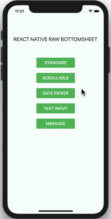 |
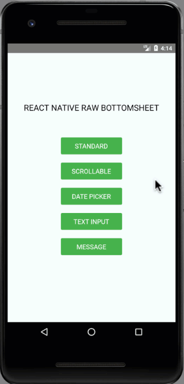 |
Installation
npm i react-native-raw-bottom-sheet --save
or
yarn add react-native-raw-bottom-sheet
Example
Class component
import React, { Component } from "react";
import { View, Button } from "react-native";
import RBSheet from "react-native-raw-bottom-sheet";

export default class Example extends Component {
  render() {
    return (
      <View style={{ flex: 1, justifyContent: "center", alignItems: "center" }}>
        <Button title="OPEN BOTTOM SHEET" onPress={() => this.RBSheet.open()} />
        <RBSheet
          ref={ref => {
            this.RBSheet = ref;
          }}
          height={300}
          openDuration={250}
          customStyles={{
            container: {
              justifyContent: "center",
              alignItems: "center"
            }
          }}
        >
          <YourOwnComponent />
        </RBSheet>
      </View>
    );
  }
}
Functional component
import React, { useRef } from "react";
import { View, Button } from "react-native";
import RBSheet from "react-native-raw-bottom-sheet";

export default function Example() {
  const refRBSheet = useRef();
  return (
    <View
      style={{
        flex: 1,
        justifyContent: "center",
        alignItems: "center",
        backgroundColor: "#000"
      }}
    >
      <Button title="OPEN BOTTOM SHEET" onPress={() => refRBSheet.current.open()} />
      <RBSheet
        ref={refRBSheet}
        closeOnDragDown={true}
        closeOnPressMask={false}
        customStyles={{
          wrapper: {
            backgroundColor: "transparent"
          },
          draggableIcon: {
            backgroundColor: "#000"
          }
        }}
      >
        <YourOwnComponent />
      </RBSheet>
    </View>
  );
}
Dynamic Bottom Sheet
renderItem = (item, index) => (
  <View>
    <Button title={`OPEN BOTTOM SHEET-${index}`} onPress={() => this[RBSheet + index].open()} />
    <RBSheet
      ref={ref => {
        this[RBSheet + index] = ref;
      }}
    >
      <YourOwnComponent onPress={() => this[RBSheet + index].close()} />
    </RBSheet>
  </View>
);
Props
| Props | Type | Description | Default |
|---|---|---|---|
| animationType | string | Background animation ("none", "fade", "slide") | "none" |
| height | number | Height of Bottom Sheet | 260 |
| minClosingHeight | number | Minimum height of Bottom Sheet before close | 0 |
| openDuration | number | Open Bottom Sheet animation duration | 300 (ms) |
| closeDuration | number | Close Bottom Sheet animation duration | 200 (ms) |
| closeOnDragDown | boolean | Use gesture drag down to close Bottom Sheet | false |
| dragFromTopOnly | boolean | Drag only the top area of the draggableIcon to close Bottom Sheet instead of the whole content | false |
| closeOnPressMask | boolean | Press the area outside to close Bottom Sheet | true |
| closeOnPressBack | boolean | Press back android to close Bottom Sheet (Android only) | true |
| onClose | function | Callback function when Bottom Sheet has closed | null |
| onOpen | function | Callback function when Bottom Sheet has opened | null |
| customStyles | object | Custom style to Bottom Sheet | {} |
| keyboardAvoidingViewEnabled | boolean | Enable KeyboardAvoidingView | true (ios) |
Available Custom Style
customStyles: {
  wrapper: {...}, // The Root of Component (You can change the `backgroundColor` or any styles)
  container: {...}, // The Container of Bottom Sheet
  draggableIcon: {...} // The Draggable Icon (If you set closeOnDragDown to true)
}
Methods
| Method Name | Description |
|---|---|
| open | Open Bottom Sheet |
| close | Close Bottom Sheet |
Note
- If you combind
RBSheetwith react-native-gesture-handler, the components inside RBSheet will not fire onPress event on Android #37. - The demo source codes are in
example folder.
License
This project is licensed under the MIT License - see the LICENSE.md file for details
Author
Made with ❤️ by NY Samnang.
Note that the project description data, including the texts, logos, images, and/or trademarks,
for each open source project belongs to its rightful owner.
If you wish to add or remove any projects, please contact us at [email protected].