code-mc / Linear Time Picker
Programming Languages
Projects that are alternatives of or similar to Linear Time Picker
Linear Time Picker Library
Gorgeous Time and Date picker library inspired by the Timely app
Demo
Stats

- MinSdk 11
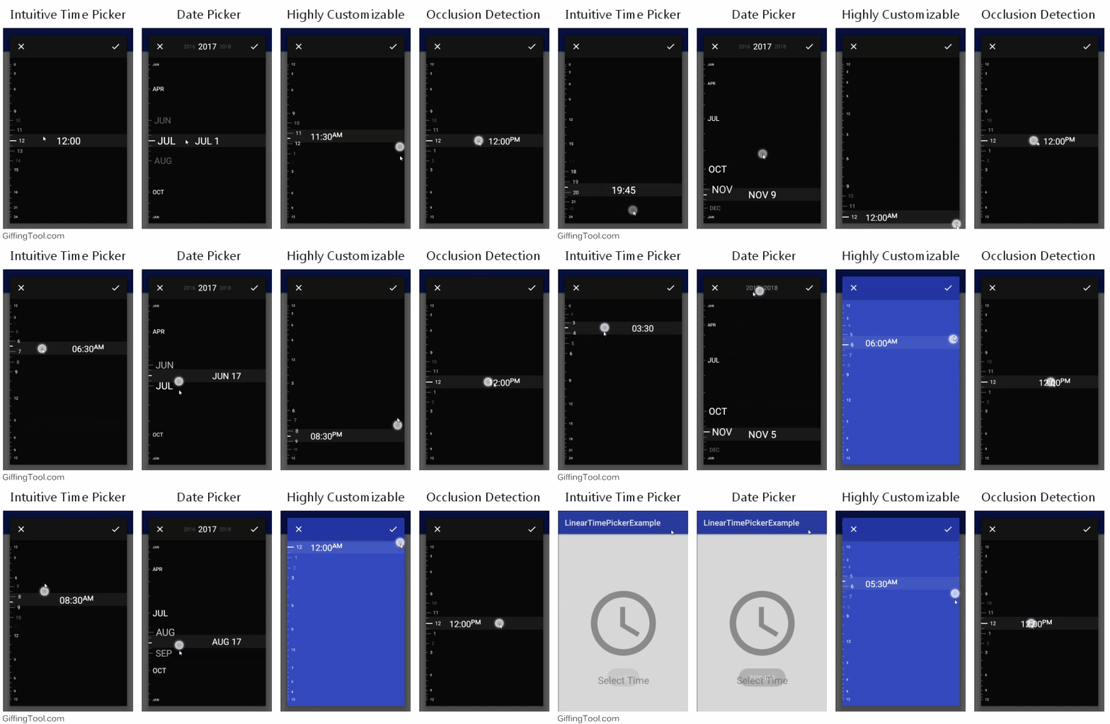
- Unique and intuitive Time and Date pickers
- Gorgeous "grow" effect on the linear dial
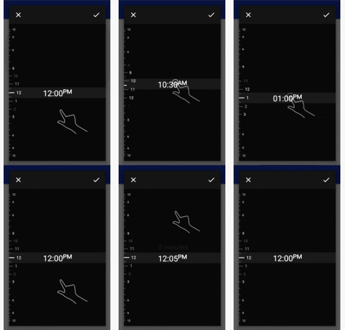
- Automated short 10 second tutorial to onboard users
- Customizable to fit your application design
- Occlusion detection
- 24 hour and AM/PM modes based on the device's time settings
- Public API you can use to create your own Linear Picker View
Usage
Step 1
Gradle
dependencies {
    compile 'net.codecrafted:lineartimepicker:1.0.0'
}
Step 2
LinearTimePickerDialog
To construct a dialog, the builder pattern is used. The following scaffold contains the minimum code required to construct a dialog.
LinearTimePickerDialog dialog = LinearTimePickerDialog.Builder.with(context)
    /* methods to further customize the dialog go here */
    .build();
Showing the dialog is identical to any other Android AlertDialog:
dialog.show();
To further customize the LinearTimePickerDialog, the following builder methods are available:
// Set the background color of the dialog (1)
setDialogBackgroundColor(int color)

// Set the background color of the picker inside the dialog (2)
setPickerBackgroundColor(int color)

// Set the color of the unselected lines in the linear dial (3)
setLineColor(int color)

// Set the color of all the displayed text
setTextColor(int color)

// Show a short 10 second automated tutorial to onboard the user
setShowTutorial(boolean showTutorial)

// Set the background color of the "handle" (4)
setTextBackgroundColor(int color)

// Set the color of the two buttons at the top of the dialog (5)
setButtonColor(int color)

// Register a callback when the selection process is completed or canceled
setButtonCallback(new LinearTimePickerDialog.ButtonCallback() {
    @Override
    public void onPositive(DialogInterface dialog, int hour, int minutes) {
        Toast.makeText(MainActivity.this, "" + hour + ":" + minutes, Toast.LENGTH_SHORT).show();
    }

    @Override
    public void onNegative(DialogInterface dialog) {

    }
})
LinearDatePickerDialog
To construct a dialog, the builder pattern is used. The following scaffold contains the minimum code required to construct a dialog.
LinearDatePickerDialog dialog = LinearDatePickerDialog.Builder.with(context)
    /* methods to further customize the dialog go here */
    .build();
Showing the dialog is identical to any other Android AlertDialog:
dialog.show();
To further customize the LinearDatePickerDialog, the following builder methods are available:
// Year that will be selected when the dialog is shown
setYear(int year)

// Minimum year that is allowed to be selected (inclusive)
setMinYear(int year)

// Maximum year that is allowed to be selected (inclusive)
setMaxYear(int year)

// Set the background color of the dialog (1)
setDialogBackgroundColor(int color)

// Set the background color of the picker inside the dialog (2)
setPickerBackgroundColor(int color)

// Set the color of the unselected lines in the linear dial (3)
setLineColor(int color)

// Set the color of all the displayed text
setTextColor(int color)

// Show a short 10 second automated tutorial to onboard the user
setShowTutorial(boolean showTutorial)

// Set the background color of the "handle" (4)
setTextBackgroundColor(int color)

// Set the color of the two buttons at the top of the dialog (5)
setButtonColor(int color)

// Register a callback when the selection process is completed or canceled
setButtonCallback(new LinearDatePickerDialog.ButtonCallback() {
    @Override
    public void onPositive(DialogInterface dialog, int year, int month, int day) {
        Toast.makeText(MainActivity.this, "" + year + " - " + month + " - " + day, Toast.LENGTH_SHORT).show();
    }

    @Override
    public void onNegative(DialogInterface dialog) {

    }
})
Advanced Usage
For those who want to code their own "Linear Picker View" there is a public API available to build upon:
LinearPickerView
This view can be inflated and appended to a layout. To control what the view draws to the screen a LinearPickerAdapter
should be provided. There are currently 2 ways to create your own adapter.
LinearPickerAdapter interface
This is the most barebones and also most complex way of the two methods. But it allows for the highest level of customization and can provide stunning results. Following methods have to be implemented:
// Should provide the number of large pips to display (constant value)
int getLargePipCount();

// Should provide the number of small pips between 2 large pips to display (constant value)
int getSmallPipCount();

// Should provide the number of "invisible pips" or substeps between any 2 visible pips (can vary between pips)
// For more info on the visiblePipIndex, see the pip section below
int getInvisiblePipCount(int visiblePipIndex);

// This method is called once by the LinearPickerView every time it draws itself
// You can use this to draw a custom background as all the other elements will be drawn on top
//
// The array elementBounds contains the exact space and location that every element on the linear dial may use
void onDraw(Canvas canvas, Rect[] elementBounds, Gravity gravity);

// This method is called by the LinearPickerView every time a dial element has to be drawn
// index denotes the visible pip index of the dial element (see pip section)
// bounds gives a hint to where you should draw the dial element and also the size of the element
// yOffset An yOffset of 1f corresponds to a dial element that is located the distance between
//     2 big pips from the handle. In the picker examples this is used to fade out the small pips
// gravity Currently unused, part of a future API
void onDrawElement(int index, Canvas canvas, Rect bounds, float yOffset, Gravity gravity);

// This method is called last. Draw the handle here.
// index corresponds to the currently selected visible pip index.
// intermediate corresponds to the invisible pip step (0 -> visible pip selected, > 0 -> invisible pip selected)
// bounds The bounds inside which you should draw the handle (once again just a hint)
// occluded Which half of the screen the user's finger is currently touching
// gravity Currently unused, part of a future API
void onDrawHandle(int index, int intermediate, Canvas canvas, Rect bounds, Gravity gravity, ScreenHalf occluded);
BaseTextAdapter abstract class
This abstract class implements the required LinearPickerAdapter and provides a complete solution for getting
similar results as the two provided pickers. In case you just want to display a handle with text that scrolls
through a linear dial in which the pips also contain just text, this is an optimal solution.
There's only 5 methods that need to be implemented:
// This method provides a pip index (of all visible pips) and expects the
// text value to display next to this pip.
protected abstract String getLabelText(int index)

// This method provides the index of the currently selected pip and the index of the selected invisible pip.
// It expects the string to display on the handle.
protected abstract String getHandleText(int index, int step)

// The following 3 methods originate from the LinearPickerAdapter interface

// Should provide the number of large pips to display (constant value)
int getLargePipCount();

// Should provide the number of small pips between 2 large pips to display (constant value)
int getSmallPipCount();

// Should provide the number of "invisible pips" or substeps between any 2 visible pips (can vary between pips)
// For more info on the visiblePipIndex, see the pip section below
int getInvisiblePipCount(int visiblePipIndex);
pip
To make use of the adapter in this library it is important you have a good understanding of what the different pip types are and how each type is addressed.
There are in total 3 pip types:
- Large pip: This is the largest visible pip that signifies a top level entry (e.g. a full hour in the time picker)
- Small pip: This is the smaller visible pip kind that signifies a sub entry (e.g. 30 minute increments in the time picker)
- Invisible pip: These are further sub entries between the different visible pips (e.g. 5 minute increments in the time picker)
Let's assume the following example:
// The visiblePipIndex argument is the relative index to the total visible pip count.
//
//  Large pip count = 4
//  Small pip count = 2
//  => total visible pip count = 2 * (4-1) + 4 = 10
//
//  -- (0)
//  -  (1)
//  -  (2)
//  -- (3)
//  -  (4)
//  -  (5)
//  -- (6)
//  -  (7)
//  -  (8)
//  -- (9)
//
//  If now a visiblePipIndex of 2 is passed you know this is located inside (floor(2/(2+1)) == 0) the first large pip
//  on the (2 % (2+1) == 2) second small pip. (0 would be the large pip itself)
Visible pips are always addressed by using an index relative to the total visible pip count. Above example illustrates how one would derive the relevant pip from this index.
When an invisible pip is addressed it is always by both the visible pip index described above, and a second step index that indicates the index of the invisible pip (or step) relative to the visible pip index. It is important to note that invisible pips do not use an index that is relative to the total amount of pips, as that would be extremely complex to derive a position from.
License
Released under the Apache 2.0 License


