wadackel / React Stack Grid
Programming Languages
Projects that are alternatives of or similar to React Stack Grid
react-stack-grid


Pinterest like layout components for React.js.
Table of Contents
- Live Demo
- Install
- Quick Example
- Props
- Instance API
- Animations
- Tips
- Thanks
- License
- ChangeLog
- Author
- Development
- Contribution
Live Demo
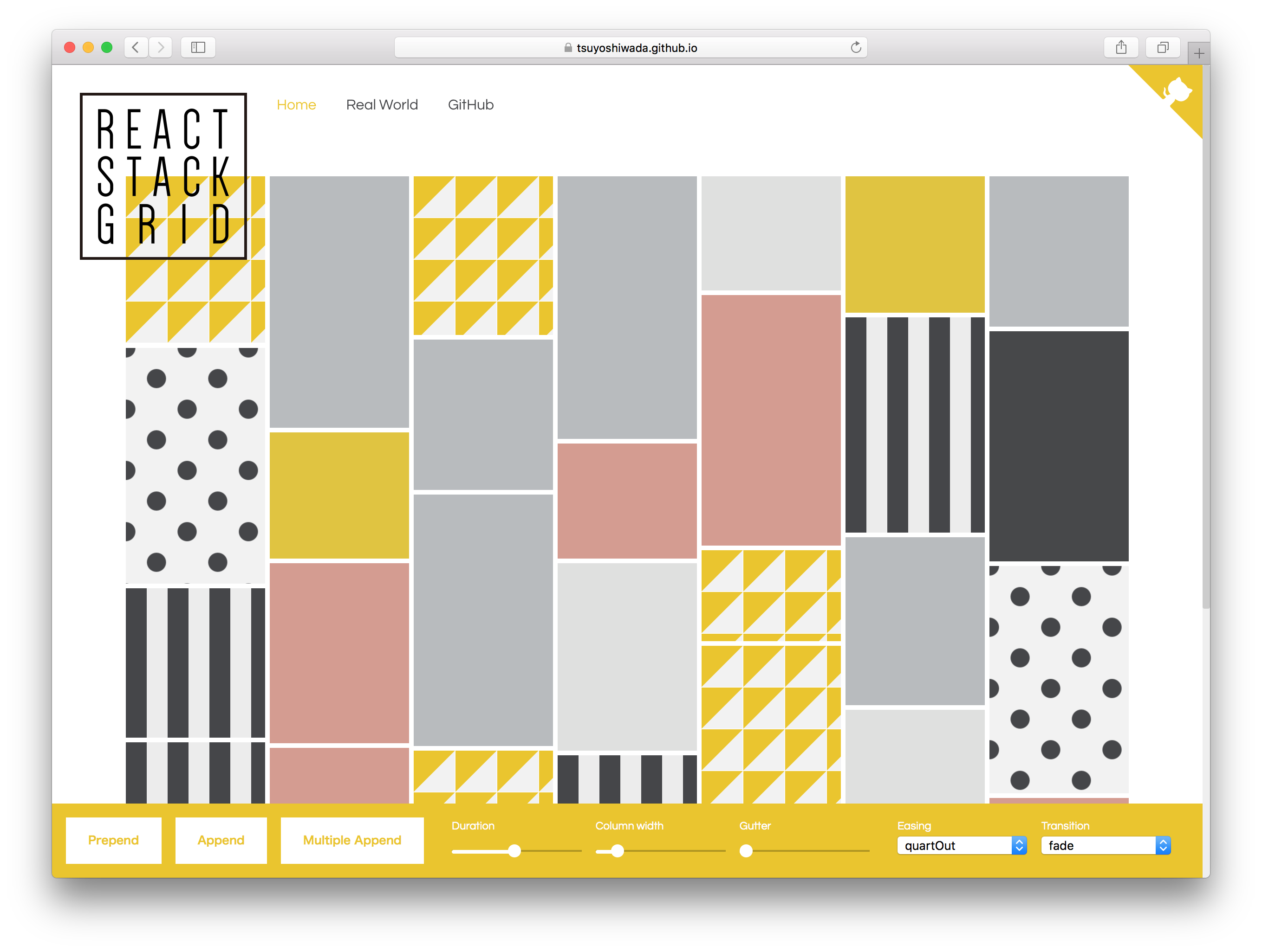
https://tsuyoshiwada.github.io/react-stack-grid/
Install
You can install the react-stack-grid from npm.
$ npm install react-stack-grid
Quick Example
Following code is simplest usage.
import React, { Component } from "react";
import StackGrid from "react-stack-grid";

class MyComponent extends Component {
  render() {
    return (
      <StackGrid
        columnWidth={150}
      >
        <div key="key1">Item 1</div>
        <div key="key2">Item 2</div>
        <div key="key3">Item 3</div>
      </StackGrid>
    );
  }
}
width of parent is managed by react-sizeme.
Props
You can set the following properties.
| Property | Type | Default | Description |
|---|---|---|---|
className |
PropTypes.string |
undefined |
Specify className of component. |
style |
PropTypes.object |
{} |
Original style of component. Following styles are ignored. (position, height, transition) |
gridRef |
PropTypes.func |
null |
Reference the instance of StackGrid. Unlike ordinary ref, it accepts only functions. |
component |
PropTypes.string |
"div" |
See ReactTransitionGroup |
itemComponent |
PropTypes.string |
"span" |
Specify the component of the grid item. |
columnWidth |
PropTypes.oneOfType([PropTypes.number, PropTypes.string]) |
150 |
Specify column width as an number(px), or percentage string. (Example "33.33%") |
gutterWidth |
PropTypes.number |
5 |
Specify gutter width as an number. |
gutterHeight |
PropTypes.number |
5 |
Specify gutter height as an number. |
duration |
PropTypes.number |
480 |
Specify duration of animation in ms. |
easing |
PropTypes.string |
easings.quartOut |
Specify a css valid transition-timing-function string. It can be easily specification by using easings. |
appearDelay |
PropTypes.number |
30 |
Specify delay of the initial animation in ms. |
appear |
PropTypes.func |
fadeUp.appear |
See Animations section. |
appeared |
PropTypes.func |
fadeUp.appear |
... |
enter |
PropTypes.func |
fadeUp.appear |
... |
entered |
PropTypes.func |
fadeUp.appear |
... |
leaved |
PropTypes.func |
fadeUp.appear |
... |
units |
PropTypes.func |
{ length: "px", angle: "deg" } |
... |
monitorImagesLoaded |
PropTypes.bool |
false |
If set to true, images reading is monitored. use imagesloaded. |
vendorPrefix |
PropTypes.bool |
false |
If set to true, add a vendor prefix to styles add dynamically. |
userAgent |
PropTypes.string |
undefined |
Specify userAgent for determinig the vendor prefix. See inline-style-prefixer. |
enableSSR |
PropTypes.bool |
false |
Render component on the server side. More info. |
onLayout |
PropTypes.func |
null |
It is called at the timing when the layout is confirmed, or at the updated timing. (Called only by client.) |
horizontal |
PropTypes.bool |
false |
The transposed (horizontal) order of drawing elements. Retains the original order of the items. |
rtl |
PropTypes.bool |
false |
When true, items are placed right-to-left instead of the default left-to-right. Useful for RTL languages such as Arabic and Hebrew. |
Instance API
updateLayout(): void
Update the current layout.
Animations
The following function must return styles related to animation.
See ReactTransitionGroup for details.
appearappearedenterenteredleaved
You can use extended syntax for transform's style. For example properties like translateX andscale.
See easy-css-transform-builder.
Each function is given the following arguments.
rect: { top: number; left: number; width: number; height: number; }containerSize: { width: number; height: number; }index: number
It is easiest to use them because you have several presets.
fadefadeDownfadeUpscaleDownscaleUpfliphelix
It's an actual use example.
import StackGrid, { transitions } from "react-stack-grid";

const { scaleDown } = transitions;

class MyComponent extends Component {
  render() {
    return (
      <StackGrid
        ...
        appear={scaleDown.appear}
        appeared={scaleDown.appeared}
        enter={scaleDown.enter}
        entered={scaleDown.entered}
        leaved={scaleDown.leaved}
      >
        ...
      </StackGrid>
    );
  }
}
Please try actual demonstration in live demo.
Tips
Performance when using images
When true is specified for monitorImagesLoaded, reloading occurs when the image loading is completed.
If you know the size in advance, specify monitorImagesLoaded as false.
When animation is unnecessary
By default animation is enabled.
If it's not necessary, specify 0 for duration property.
<StackGrid
  ...
  duration={0}
>
  ...
</StackGrid/>
How to manually update layout ?
If the size of an item is changed by an action such as a click event, there are cases where you want to update the layout manually.
You can manually update the layout by referring to the StackGrid instance with gridRef and executing theupdateLayout() method.
class MyComponent extends React.Component {

  // When the size of the item is changed...
  something = () => {
    this.grid.updateLayout();
  };

  render() {
    return (
      <StackGrid
        gridRef={grid => this.grid = grid}
      >
        {/* items ... */}
      </StackGrid>
    );
  }
}
Responsive layout
You can get width using react-sizeme and change columnWidth according to width.
This is a solution, but we can respond in other ways!
import React, { Component } from 'react';
import sizeMe from 'react-sizeme';
import StackGrid from 'react-stack-grid';

class YourComponent extends Component {
  render() {
    const {
      size: {
        width
      }
    } = this.props;

    return (
      <StackGrid
        // more...
        columnWidth={width <= 768 ? '100%' : '33.33%'}
      >
        // Grid items...
      </StackGrid>
    );
  }
}

export default sizeMe()(YourComponent);
Thanks
- Layout inspired by Pinterest.
- API inspired by dantrain/react-stonecutter.
License
Released under the MIT Licence
ChangeLog
See CHANGELOG.md
Author
Development
Initialization of the project.
$ cd /your/project/dir
$ git clone https://github.com/tsuyoshiwada/react-stack-grid.git
Install some dependencies.
$ npm install
Start the development and can you see demo page (access to the http://localhost:3000/).
$ npm start
Run lint and testing.
$ npm test
Generates build file.
$ npm run build
Contribution
Thank you for your interest in react-stack-grid.js.
Bugs, feature requests and comments are more than welcome in the issues.
Before you open a PR:
Be careful to follow the code style of the project. Run npm test after your changes and ensure you do not introduce any new errors or warnings.
All new features and changes need documentation.
Thanks!